
Lake Como W.I.P./Demo (continued)
/Well I promised color in my last post, so let's get started! I don't know if I mentioned it lately, but I have been experimenting with expanded palettes for my latest paintings, and that exploration continues with this one. Regular readers may remember that I have for a long while used a limited palette of red, yellow, and blue, plus white (like this one). For this painting, my palette is (as I lay it out from left to right) Titanium White, Cadmium Yellow Light, Golden Ochre (Rembrandt), Cadmium Orange, Cadmium Red, Alizarin Permanent (Gamblin), Cobalt Blue, and Ultramarine Blue. (I've specified brands where color names are specific to a particular brand.) I haven't used any pre-mixed greens, as you can really mix a zillion different greens with this palette. I have used most of these colors off and on, with the exception of Cobalt Blue. To be honest, I was really hoping that I wouldn't like it, because it is a terribly expensive tube of paint. Of course, I love it! It is a cooler blue than Ultramarine, which has more red in it. I still love Ultramarine, but Cobalt has some really wonderful possibilities. Any way, back to the painting...I start by painting in the sky, which contains the light source and is also the farthest in distance. The sky is Cobalt blue plus white, with cad yellow lt. added as it nears the horizon. For the clouds I've mixed a combination of blues and cads red and orange + white for the shadows, and Cad orange and red + white for the highlights.
Working from back to front, I next paint in the distant cliffs, which have a beautiful shadow casting down over them from low-lying clouds. The photo is a bit dark here (apologies) but I will try to get some more accurate photos in subsequent blog posts so you can get a better idea of the colors.
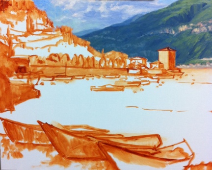
The distant mountains complete, I block in the buildings that jut out into the harbor, as they will serve as my area of interest in the painting, and everything will kind of flow to lead the eye towards them. I also decide to lay down my pattern of darks, to restate the plan I made in my notan sketch. Again, this photo just blackens everything out, but I had to make a choice between using my time blogging or photo editing, and at this point, I've chosen blogging.

Next, I work on the terraced hillside in the middle distance. What a joy it is to paint...all of those shadows and varied greens! A nice round bristle brush is great for painting in those cypress trees, which have always struck me as distinctive punctuation marks in the Italian landscape. .

A mahl stick (shown in the next photo on my easel below the painting) is a handy tool to have to steady the hand without smudging the painting, when painting details like architecture and tall skinny cypress trees.
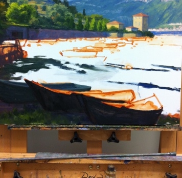
I have yet to paint in the highlights on the cypresses, but once I've done that I will be ready to move on to the middle distant water and boats, and finally the boats in the foreground. All that will be left after that point will be fine tuning wherever's needed.


