
Carlson, trees and me
/Well I really do need to stop saying I'm "back in business", because no sooner do I say it then something goes awry. Mid-way into the James River studio piece I posted about in my last blog, Ma Nature delivered to us a belated white Christmas and sub-freezing temperatures. School closed for three days (!) but in fits and starts I got 'er done.
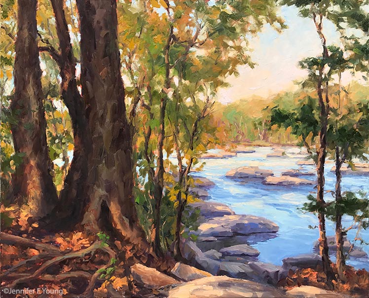
"Take Me to the River", Oil on linen, 24x30: ©Jennifer E Young
There's quite an investment in paint in this piece, but since I was able to work at least a little bit on it each day over our surprise break, it stayed open and wet enough that I was able to work up a nice texture without the dreaded gumming up of paint that can lead to over-work.
Lately I've been looking at and thinking a lot about one of my painting heroes, John F. Carlson. If you paint landscapes (or are the connoisseur of them), you may already know about his well-loved book "Carlson's Guide to Landscape Painting". If you haven't heard of it, I highly recommend picking up a copy if you are serious about the study of painting in this genre.
Carlson was a Swedish-American Impressionist born in 1875. His family immigrated to New York in 1884. Carlson went on to study art at the Art Students League in New York City, and achieve a fine career as a landscape painter, with prestigious exhibitions and a position as the director of the Woodstock School of Landscape Painting.
While he painted a variety of subjects, he made many powerful works based on scenes containing primarily groupings of trees. Carlson really was a master of form and negative space. The simplicity of his subject matter in many of his better-known paintings belied the abstract power of his compositions.
So in addition to thinking about light and shadow, variations in color, etc., I thought a lot about variation in shapes, both negative and positive. The James River series really does lend itself to this kind of study, as many paths to the river are wooded before you arrive at its rocky banks. Twisted roots along the forest floor add an additional element of interest to the composition. I had such a good time with this painting that I am developing a companion. More about that coming soon.


