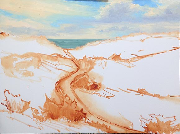
Progress on the large Hatteras painting
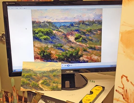
Here are a few progress shots on the Hatteras Island Dunes painting I last blogged about:

Work in progress landscape painting by Jennifer E. Young

Though I am trying hard to address the picture as a whole, it is some kind of work just getting the canvas covered. I have been painting pretty small lately so I am kind of shocked at the amount of paint I'm mixing and using. I think this is especially true because I'm not used to using such an absorbent surface.

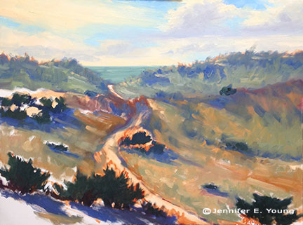
In the process of working solely from my painted studies, I've noticed that one of the main reasons I love the smaller alla prima pieces is the amount of broken color in the painting. Color is laid next to color, sometimes within the same stroke, and brush strokes aren't overly licked or blended. The result is that you can achieve a really fresh look with the little ones. It's not impossible to do this with the larger paintings, but you do have to really work wet-into-wet the whole time, and start loading on the paint to get that kind of effect. To have that kind of expectation with a painting of this size may very well be an exercise in futility, especially since I am not able to paint on it every day. On the other hand it is really impossible to replicate stroke-for-stroke what I have done in the smaller studies, as the brush size-to-canvas ratio would mean I'd likely have to turn to using house paint brushes!

So with these "reality checks" in mind, I am still striving to capture that fresh, breezy, beachy essence, even if the nature of this beast is very different from the original. I find myself working more background to foreground on the bigger paintings (rather than strictly dark to light) in order to keep the paint surface workable. Nevertheless, I am saving most of the lightest highlights toward the end because they are the most opaque and have the thickest application.

Hatteras Island W.I.P.

I'm starting something new (and big) today of the Hatteras Island dunes. It's a motif I have been exploring for a while now, though mostly in my field studies.

Outer Banks coastal landscape painting Jennifer Young

I'm painting this on a 30x40" gallery wrapped canvas, which is a little more absorbent and has a bit more tooth than my usual stretched linen. Hopefully this won't fight against me too much. I need bigger brushes! I want to keep this loose and fresh, like the plein airs, with not too much detail (but just enough.)

Right now I am referencing an image of my inspiration plein air (now sold) on my monitor,  and a second study painted to scale up to 30x40" that I worked up in the studio. The colors are really off in this snapshot, but you get the idea:

©Jennifer E Young

©Jennifer E Young

In the second study I tried to recreate the feeling of the original plein air, but  with a few compositional adjustments to the horizon, sky, and beach path.

It feels good to be working on something large. I have avoided it lately because of my sporadic schedule, but things don't seem to be changing much in that area of my life any time soon, so what the heck.

Back at the beach

First I forgot the white paint. Then, there were the fire ants. Next came the wind. "Why exactly do I do this?" I'm thinking to myself. But then I saw the Jolly Roger flapping in the breeze, and I was hooked. So I held on to my hat (and easel) and set to work.

"Good Morning Jolly Roger", Oil on panel, 8x8" (NFS) ©Jennifer E Young

"Good Morning Jolly Roger", Oil on panel, 8x8" (NFS) ©Jennifer E Young

This little 8x8" oil was done from our gazebo on the Outer Banks Dunes, looking out at the neighboring gazebos. The clouds were what attracted me but the Jolly Roger flag was a fun little detail that sealed the deal.

Featured in Plein Air Magazine's OutdoorPainter.com!

I'm on the road and struggling with mobile blogging right now, so I will keep this post brief. But I'm excited to announce that Plein Air Magazine has featured me and my work in their EZine article about "My Favorite Place to Paint".  The location may surprise you. Check it out! http://www.outdoorpainter.com/news/my-favorite-place-to-paint-jennifer-young.html

The Crape on the Corner

I've long admired this pretty crape myrtle on my summer morning walks in my Bellevue neighborhood, so I decided to pay it a little tribute today:

"The Crape on the Corner" 8x10", Oil on Panel ©Jennifer E. Young

"The Crape on the Corner" 8x10", Oil on Panel ©Jennifer E. Young

When we see Crape Myrtles blooming in Richmond, we pretty much know summer is here to stay a while. And if the heat isn't already upon us, it  is sure to quickly follow. Yes, folks, it was definitely hot out there! This painting pretty much demanded some Permanent Rose, which (of course) wasn't among the supplies I packed. I suppose I could have gotten by with Alizarin, but it wouldn't have been the same. There are definitely advantages to painting in my neighborhood; my studio (and agreeable husband) were just a couple of blocks away.