Varenna mini gouache study

Thought I'd do a little experimenting with this fun little 5x6" study in gouache.

Varenna gouache landscape painting by Jennifer YoungColors of Varenna (study) Gouache on Cottonwood Arts Coldpress paper, 5x6"

Here I'm just trying to get an idea about my lights and shadows and the basic shapes, so I've not much detail. For this composition I experimented with using a compositional grid that we studied during Kevin Macpherson's workshop (you can probably make out some of it in pencil beneath the gouache. I mentioned it briefly in my last post, but basically this is a method to achieve an informal subdivision of space, as discussed in Andrew Loomis' book called Creative Illustration:

loomisgoldensection

After I learned more about this "grid thing", I realized that I had often been using this kind of subdivision intuitively. But it is good to have a tool handy to be more deliberate about it when one wants to, or if you are dealing with a complicated subject and are trying to decide what to leave in, what to edit out, and how to arrange a painting for the most pleasing effects.

It's been a while since I have worked with gouache and had forgotten that the colors shift a bit when they dry. Nevertheless I had a good time and really look forward to working with them again.

Painting water

A reader recently asked me in my comments section about painting water, and as I am in the middle of painting Venice scenes I thought it might be good to "reflect" a bit on it here (pun intended). As we all know, pure water is transparent and has no color. It's power, pictorially speaking, lies in the colors and shapes it reflects. It's always a bit dangerous to apply too many formulas to painting, but some general guidelines are useful (just be sure to verify these with your observing eyes!)

Obviously, if you are painting a still body of water like a pond or lake that reflects the surrounding landscape, the reflected elements are upside down and reversed in the water. Reflected shapes are sometimes foreshortened, and water's movement also distorts the shapes reflected, depending on how much of a breeze or current is at play.

A common error is to paint reflected items tone for tone exactly as they appear in their solid counterparts. But unless they are in deep shadow (which does sometimes happen in the narrow canals of Venice) dark elements usually appear lighter in their reflections, and light tones appear darker. For me, painting the reflections (and especially the dark values) fairly thinly works best, as standing water has a glass-like appearance.

A common error of beginners is to paint everything reflected in horizontal strokes, and in doing so, overwork and over-blend these areas until everything is kind of a muddy mess.

I like to paint the basic value-shapes of the reflections in downward or vertical strokes first to follow the forms above, and then add strokes of movement horizontally. For detail and highlights, it's easy to "overdo" them in reflections, so take a subtle approach to start. Sometimes that is the most effective. You can always add more touches later, but it's harder to take away unless you just scrape down or wipe the whole thing clean!

Moving water like rivers, rapids and ocean waves are another thing altogether. They have their own unique properties, and probably could benefit from their own (future) post!

Some of my favorite reference sources for painting techniques regarding water (and everything else!) are the books by Emile Gruppe. Gruppe was a wonderful impressionist painter and teacher who was a part of the Cape Ann School of artists. He worked in and around Gloucester and Rockport Massachusetts. He wrote a triad of books on painting and they are all invaluable to the landscape painter.

Monet's Garden Painting W.I.P.

While it may appear that my poor blog is suffering from benign neglect, I actually have been working on it, albeit on the back end. Recently my blog has been attacked and completely overrun by comment spammers. Hopefully the issue hasn't  been too evident to readers, but it completely overtook my blog (and my email) for a while . After a few attempts at a "quick fix," I decided I really had to take the time to do a Wordpress upgrade. It's something I should have done a long time ago, but have been loathe to do because it involved a good deal of time that I dearly need in order to attempt any kind of painting these days.  Unfortunately, upgrading has caused me to lose my sitemap and all of my prior post tags, so I am very bummed that I have yet to spend more time trying to figure out what happened to them. Hopefully I can recover them, but otherwise I guess I am looking at manually creating new tags for each post that has been added to my site since the dawn of man. Arrrgh!

Well, thanks for letting me get that off my chest!  I actually do have a painting under way, of Monet's Garden. Still quite a bit of work yet to do on this 18x24" canvas, but at least I've mapped out the main elements:

Monet's Garden painting work in progress by Jennifer Young

When I have free time in the evenings (which lately isn't that often) I have been watching a fascinating series of educational videos on the Impressionists produced by the University of Texas at Austin. It's basically a lecture format, which at first, kind of made me feel like I was back in art history class. But after a while it did draw me in, and it is probably the most through and in-depth investigation on this incredible group of artists that I have seen on DVD. It is so inspiring to go back in time and visit with these incredibly innovative masters (Manet, Monet, Pisarro, Renoir, Degas, Morisot, etc.)

So this was the spark that made me want to revisit my photos of Monet's garden. It has been a while since I painted this subject matter. What an amazing place ! Hopefully I can finish this painting soon. However, if the weather cooperates and I can find a chance to paint outside, I may do like the Impressionists and forgo the studio to grab the opportunity. We will see....

Time and process

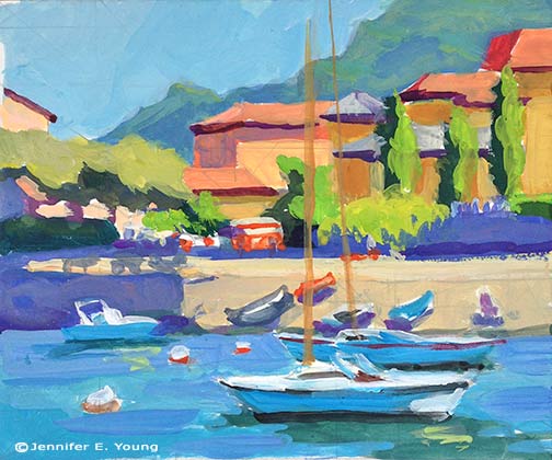
Well, for the most part, my resolve last week to get "back to painting" crumbled, as I found myself distracted by a number of other issues. I haven't been in the best command of the schedule I'd set up for myself, setting aside my painting time to do a million different errands and tend to personal issues as well. The tendinitis continues to bother me, too, which isn't helping my stick-to-itiveness.  In hindsight, in spite of my injuries, I  probably should have made myself stick as much as possible to the same schedule regardless of whether I'm actually "painting"-- filling the gaps with new art-related activities (like reading one of my gazillion art books!) In any event, I am starting again--finally-- with a color block-in which I'm including below:

tuscany painting in progress by Jennifer Young

Because of the shoulder/arm thing, I've had to make a few changes to the way I work so that I'm not in a huge amount of pain by the end of the day.  I've lowered my entire painting setup, paint for shorter intervals, and also set a timer when I am painting to go off every 30 minutes. It reminds me to stop and stretch and give my muscles a chance to release the locked position I tend to take when I'm hyper-focusing during painting.

Coincidentally, artist Robert Genn wrote an interesting little article last week in his twice-weekly newsltetter about the timed exercises he uses for  attention and focus, (which naturally caught my attention!)  In the article, Genn suggests that by imposing shorter time limits on a work session (in his example 37 minutes), one is required to come into sharp focus, thereby energizing mind and spirit (and often one's painting as well.) I don't think Genn is suggesting that one should always commit only 37 minutes to complete a painting! Rather, these are exercises to 'shake things up' and breathe new life and energy into old, comfy work habits.

It's a good idea. And it's one I've implemented myself (though  I used a kitchen timer rather than an elusive 37-minute hourglass.) While Genn required his students to complete small paintings in his timed exercises, I've also found that the practice works great for plein air and larger studio paintings when you want to track how long you spend working on each stage of the process.

For instance, in plein air painting, where the shifting light already imposes a certain time limitation, the amount of time you spend establishing your composition is important not only to the painting as a whole, but also because it will dictate how much time you have left for the block-in and finishing. So for a smallish painting, I might wish to limit myself to 15-20 minutes to lay in my composition- DING! And 40 minutes for a block-in-DING! That leaves another 30 minutes to (possibly) an hour to make changes, refine shapes and edges and finish before the light changes too drastically (DING! Brushes down.)

You can play around with division of time if you wish, but the result, as Genn suggests, is often that you learn to hone your focus and think better on your feet, without giving yourself the chance to "noodle around" endlessly or jump into detail  too early in the game. It helps in more ways too, than just keeping you on track. For some reason, the timer helps to address all of the canvas during each of the timed stages, thereby avoiding the tendency to  get lost in only working (or overworking) one section of the painting to the sacrifice of the others. I'm not sure why this is. Maybe it's just that using the timer stage-by-stage causes you to take a more deliberate, conscious approach at each stage, making the approach more methodical by breaking things down into digestible chunks.

While the timed-stages works particularly well for plein air painting (when time is truly of the essence,) I've found the same principal can also be worthwhile when applied in the studio, either by similarly timing myself at different stages in larger pieces, or, as Genn suggests, by (attempting to) finish an entire smaller piece in a short interval, as an exercise drill or a warm-up. So I thought I'd try it for the painting above, timing the initial compositional sketch and the color block-in at 15 and 40 minutes, respectively. I don't intend to finish this piece in just an additional hour. It's a 24x30" canvas and I certainly don't want it to look completely slapdash. On the other hand, I do hope to keep it as fresh as possible to re-energize myself now that I'm getting back to work.

Of course, anything can be annoying if taken to the extreme, but I can see how using the timer periodically can serve a useful purpose. It also provides good insight for me about my process, and just how much time I am spending therein.

Reclining nude II- WIP

I started this drawing on Friday in Robert Liberace's "Exploring the Figure" drawing class at the Art League School:

reclining nude figurative drawing by Jennifer Young

The upper portion is the least resolved so far, but the whole drawing is to be developed further by a kind of push/pull method of adding and subtracting layers of charcoal, followed by highlights in white conte chalk.

Rob started the class with a beautiful demonstration inspired by the techniques of a 19th century French academic artist named Pierre Paul Prud'hon. I had not heard much about this artist, but enjoyed seeing the exquisite reproductions that Rob shared by way of this book:

Rob made particular note of the way in which Prud'hon defined form, and his unique method of shading and highlighting. As this article by artist Rebecca Alzofon  explains very well, Prud'hon had a unique method of shading--in part by creating hatch lines that followed the direction of the form, then stumping and hatching again in a similar manner with highlighting chalks. So in our class, our challenge (should we choose to accept it) is to experiment with working in a similar manner from our model. From my understanding we will work on the same pose for another two or 3 sessions.

In Rob's demonstration he used a Canson gray tinted paper (at about a value #4) which worked well, as it created a light-mid value to contrast with highlighting with white Conte. I again found myself without the proper materials to perform the task. I must have gotten an incomplete or outdated supplies list or something, but all I had was an off-white Rives BFK paper, with which I just made-do by shading with vine charcoal to give me somewhat of a "tone".  I'm not sure at this point how far I can continue developing the current drawing or if it will produce the desired effect. At some point I may just start again with the proper paper, but I'd like to at least take this a little further to see what more I can do.

It has occurred to me that this method of very refined drawing is somewhat more polished than what I'm normally drawn to. Even in the Prud'hon reproductions in the book, I found myself lingering in the passages  of his drawings that were less "finished" and showed more gesture, more of the decision making process, and more of the hand of the artist.

In my own drawing, I notice myself secretly wanting to stop before I lose too much of the gesture. This is probably because in my landscape painting I've set a goal for myself to find ways of stating things more simply...to say "more with less", so to speak and to do it a bit more loosely. At the same time, the whole reason I signed up for this class is to experiment and maybe even learn something new in the process! You can't do that if you are too beholden to your own agenda.

I've been reading a great little book right now by George Leonard called Mastery: The Keys to Success and Long-Term Fulfillment. Leonard is an aikido master so a lot of his analogies in the book are drawn from the martial arts and Zen philosophy. According to the author, one of the keys of mastery is entitled "Surrender":

"The courage of a master is measured by his or her willingness to surrender. This means surrendering to your teacher and to the demands of your discipline. It also means surrendering your own hard-won proficiency from time to time in order to reach a higher or different level of proficiency."

Hmmm. I suspect it probably also means surrendering your own agenda from time to time as well.

How not to succeed at your goals while really trying ;-)

Happy New Year everyone! This past week, I've taken some time to reflect on the common practice of new year goal-setting, and I've enjoyed browsing around the blogosphere to see what others (and particularly other artists) are writing about the subject. Actually artist Katherine Tyrrell has made this task easy for me with the  great series of year end roundup posts she's provided on her blog Making a Mark--  the topics of which extend far beyond goal-setting (though there is a good deal of that too, including Katherine's own set of goals for the new year.) *Note of thanks to Katherine for foot-noting my blog posts on studio lighting in her "art studios in 2009" subsection of "Who's Made a Mark This Week". For myself, unlike previous years I am taking my time and being a bit more reflective about goal setting. Obviously there is value to goal-setting --otherwise there wouldn't be so many people finding satisfaction in doing it. But why is it that so often goal- setting fails to achieve the desired results? I think that in the past I've sometimes been guilty of goal-setting just for the sake of getting things accomplished, without really examining whether the goals are really worthy ones. Taking this approach  leaves me feeling either unfulfilled even if things get "done" or disappointed  because I didn't accomplish more. It also keeps me so in the mode of wanting to "get there already" that I don't enjoy the process nearly as well. 

So in thinking about how to set more meaningful goals for myself, I've also been thinking about why goal-setting so often doesn't satisfy. There are any number of reasons, of course, but here's a shortlist that I've come up against.

How not to succeed at your goals while really trying:

  • Don't ask "WHY?" Why do I want (or think I want) to do, be, have, or achieve this?  What do I hope to gain? How will this improve my life, my work, or the lives of others? These seem like  obvious questions, but without asking these essential questions first, it's easy to find yourself pursuing goals that aren't meaningful, and sometimes aren't even yours! (see bullet #2) In a nutshell, asking the essential "Why?" helps to get to the heart of what is driving you. 
  •  Set goals that deep down you don't really care about just because you think you should or because others think you should. For an artist, these might include things like setting a goal to get work into a gallery or earn a certain dollar amount from your art, for fear that failing to do so will mean you will be perceived as "unsuccessful". Or setting a goal to paint in a certain manner  or by a certain method because you feel others think it is a more legitimate form or method than some other one. Mind you, none of these are wrong choices as long as they support what you want deep down. But here's a tip; if there are a lot of "shoulds" in your goals, that's worth examining before you commit to them, to see if they really serve you. Otherwise, setting these kinds of goals can often set you up for feelings of "failure". If your heart isn't really in it all the way, you're likely to go for it halfway or not at all. 
  •  Be unrealistic- It's been my personal experience that my trouble has not been the size of the goal, but the timeline I set to achieve it. Setting far greater goals than you can possibly achieve in a given timeline creates more stress than inspiration.
  • Set goals that aren't challenging enough- Being realistic about time and/or resources doesn't mean  you should feel bored. If your goal leaves you feeling flat-lined, are you really going to be inspired to devote the time needed to go for it? In order to motivate myself, my goal has to be beyond my comfort zone. I want any goal I set this year to make my heart go pitter-patter. It should inspire, excite, ignite and sometimes maybe even feel a little scary.
  • Be over-expansive. It has taken me a number of years to get this, (41 to be exact) but I think (I hope) I am finally learning that setting too many goals in a given time-period is not only hard to manage in terms of time, but it also splits my focus too much. I'm finding it's better for me to limit myself to fewer more meaningful goals in order to really give them the proper attention required.   This doesn't mean that I won't break the big stuff down into smaller milestones, but the milestones and activities should support one of my main goals, not set me off in 100 different directions.
  • Set goals without making a plan to go about it.  It does me no good whatsoever to set even meaningful goals without breaking them down into plans of action. In order to track progress, a high level goal could then be broken down into:
    • milestones along the way (these should be measurable)
    • activities needed to reach those milestones
    • a schedule  to carry out those activities (monthly and weekly schedules are good, but for me it has to be daily).
  • Lack balance- This is a very personal matter. Some people do just fine with letting other matters drop for a while in order to hyper-focus on achieving one goal. Not so with me. I'm already an "uber-focuser" and unless I intentionally set goals that address all important aspects of my life, I miss out on fun stuff (like, oh,  sleep, proper diet and exercise, fulfilling relationships,  and time for fun, for instance!) And without those things in balance, soon there is no joy even in the things I dearly want to achieve artistically.

It's easy to jump into a litany of to-do's, but it may take a little longer to step back first and examine the big picture to see if your goals really speak to the greater vision you have for yourself. As I go through my own process I am finding I do have an overarching theme that I want to focus on this year in relationship to my art.

Back to school

Ideally this would include "real-time" instruction and mentoring, and I am hopeful I will be able to find the time and resources to pursue that. But after all, I have a ton of art books to keep me busy and they will help me to commit myself to a regular staple of study through experimentation, self-guided lessons, etc. *Note: For a fascinating and inspiring look at one artist's documented learning processes, check out Paul Foxton's wonderful info-packed site Learning to See.

Also, I love landscape painting and I will continue with this tract, but I'm feeling a great desire to become reacquainted with and develop a greater understanding of the human form. Along those lines, I will make a greater commitment to paint much more often from life--if not daily, nearly so.  Whether this means painting en plein air or still life or portraiture, (or even if it is a 5 minute sketch waiting for my haircut) I continue to see so much benefit to this practice and its time to commit to working from life as a regular discipline.

Obviously all of this will need to be worked out in greater detail into more specific goals and a measurable plan, but this is where I'm heading as for the year ahead. I guess if I had to boil everything down to one word I'd say that what it is I'm after is to achieve a greater level of mastery with my work.

Mastery

Now that's a big, expansive scary word if I ever saw one! And  while it's really too broad to write down as a year long goal,  it can be a guidepost by which my artistic goals can be set. It is said that it takes 10,000 hours to achieve mastery at something. Whether or not this is exact, what it tells me is that it's not something that's likely to be attained in a year!  It's not as if I'm starting from zero, but even so, in truth it may not even be attained in a lifetime, for that matter, even with a disciplined plan.

I do wonder though, as an artist, how do you really know you've arrived? Do you suddenly wake up one day and say, "I'm a master!" It seems a bit of a moving target. Each new level of understanding inevitably leads to new questions, new challenges, and raising the bar ever higher. To quote Gertrude Stein, "There is no there there."

To my mind, arriving really isn't the point. The way I see it, mastery has more to do with a state of being than a state of arriving. It's more about process than it is about product. It's a state of flow. Certainly there is tangible accomplishment produced as well, and I guess the accomplishment part is what we tend to focus on when we think of someone mastering something. But I really see those kinds of results as more of a by-product of something much greater. And yet, it is the by-products that are the most measurable so that's the starting point I'll use to make my plan.  Better get to it. 10000 hours is a long way off.

Annapolis Day 2- A fine morning with guidance from Gruppe

Had a few technical difficulties to overcome before I could post again, but I'm picking up where I last left off writing about the Annapolis paint out. Day two of the paint-out started off great, mainly because I had been able to do a little planning the day before. Painting in an unfamiliar place can always be a little overwhelming. It takes a little bit of time to get your bearings and find locations that appeal to you. This task can also be a little more daunting if you are also painting unfamiliar subject matter. (In my case, not living near a harbor or having much boating experience,  that subject matter would be the preponderance of boats.) To tackle the first obstacle, I spent some time on the first day (in between my morning and afternoon paintings) just wandering around scouting out possible painting locations along the many small harbors. One thing to consider is the path the sun will take across the sky throughout the day from sunrise to sunset. Having already done one morning painting the first day, I began to get a feel for which locations would make good morning setups and which would work better for me in the evenings. (I will also sometimes carry a compass with me to accomplish this task.)  As a result, I found a location in Eastport that I knew would be perfect for an early morning sunrise scene. And in contrast to the first morning when I got started late, I was able to arrive early on day 2 and start painting between 7 and 7:30 a.m.

As for the second obstacle.... the first thing I had to do was to recognize that no matter what I am painting, all I really need to do is paint shapes and the play of light on forms. If you can accurately see what is in front of you as abstract shapes and light patterns (and get a good grasp especially on painting the shapes of the negative space between the forms as well,) form naturally happens.  Having said that, the mind plays tricks on the untrained eye--even sometimes on the eye that has had a bit of training. Boats (like trees and the human face) are some of the things that the mind has long tended to see as symbols. They're some of the things that so many of us drew when we were kids --a sort of half-circle topped with two triangles. So one can easily fall into the trap of painting a symbol of a boat (or a tree or a face) instead of painting the actual shape.

While intellectually I know that all of the above is true, for my own peace of mind, I found it also helpful to consult one of my favorite art books of all time by Emile A. Gruppe. Gruppe was a fine New England painter of landscapes, townscapes and most notably to me, marinescapes . He was active in the 30's on up until the 70's and received training at the Art Students League in New York, and from famed American landscape painters Charles Hawthorne and John F. Carlson. Gruppe was also a wonderful teacher in his own right, both through the school that he established, and through his series of books on painting ("Brushwork," "Gruppe on Color" and "Gruppe on Painting; Direct Techniques in Oil" ).   

All three of these books are fabulous. They are also out of print, making the ones that are still available quite pricey and difficult to acquire. I haven't written much about these books before because there is just sooo much I would want to to say. I can't give proper honor to each of them now without making this post even longer than it already is, but suffice it to say that despite the cost and the regardless of sad quality of the painting reproductions within, they are three incredibly worthwhile and inspiring (if not essential) additions to any landscape painter's library.

For my money, Gruppe was a master of brushwork and composition. Living in New England, he was also a frequent painter of harbors and coastal scenes, which made his book, "Gruppe on Painting; Direct Techniques in Oil," a perfect traveling companion on my trip to Annapolis. I'm glad I grabbed it as I was walking out the door, especially since this particular book has a whole section on painting harbor scenes.  This is not a book of formulas, but rather a thoughtful book with a wealth of things to consider. For instance, here is an excerpt on drawing boats:

"...students have  preconceptions about what a boat should look like. They think of boats they drew as children, boats that were shaped like wooden shoes or bananas, curling up at the bow and stern. And that's how they draw them. But probably no shape could be less like that of a real ocean-going dragger; all those concave lines suggest weakness while the character of the dragger is strong and tough......Remember that the gunwhale of the boat is straight as it nears the bow--it doesn't sweep up like a gondola! And the bow goes into the water in a fairly straight line--it doesn't cut under sharply. Use strong lines to suggest a strong subject."

Just that one snippet helped me immensely, and yet there is so much more in this section alone; on cast shadows, masts, rigging, refraction, smaller boats, and docks and wharves. The conversational tone and the passion in Gruppe's writing helped me to internalize his teachings and carry them with me as I addressed the subjects and painted them from life. Here, finally, is the painting that resulted. I may need to touch it up when I return to the studio, but I was pretty happy about it overall:

coastal marine plein air painting annapolis 

Daybreak in Annapolis Oil on Multimedia Artboard, 11x14" SOLD

On this second day of painting, I was happy to meet more of the artist members of the MAPAPA, so I felt a little more connected and a little less lost. In fact, as I was finishing up the above piece, an artist came up to me with a rather dazed and confused look. She said it was her first day at the paint-out, and she'd been driving around for an hour trying to decide what to paint. I had to chuckle (not at her, but with her.) Been there, done that!

Wet panel carriers, plus more on pochade boxes

I have a new painting to share, but the rain we're getting is making it hard for me to get good light for a photo. Hopefully I'll get something to show a little later today. Meanwhile, those readers who are "gear-heads" like me might enjoy some light reading on plein air gear: Wet Panel Carriers:

Raymar's wet panel carrier for plein air paintingEver wonder how to carry those wet paintings around after a day of plein air painting? Never fear, that's why wet panel carriers were invented. :-)  There are a number of commercially available boxes designed with interior slots to hold a few wet panels at a time. Raymar is well known  among plein air painters for their lightweight and moderately priced wet panel carrier made out of corrugated plastic.

But with very little time, ingenuity, and even less cash, it's easy to make your own, even if you aren't into gagetry or woodworking. The folks on the WetCanvas plein air forum have discussed this topic endlessly. Here are a few of the solutions I've bookmarked:

  1. Marc Hanson's wet panel carrier, cheap and fast.
  2. Cost Cutter Ideas from Larry Seiler and others- includes wet panel carriers and other home made solutions for some of your plein air painting gadgetry.
  3. And lastly, here's Wayne Gaudon's solution, and the one I've tried myself (with a few modifications.) Easy!  It uses el-cheapo Walmart picture frames and a few very simple tools. I pretty much ditched the tools and came up with the lazy woman's version. As soon as I photograph it I'll write about my own experience with this version of the home made panel carrier.

Pochade boxes

Don't worry, you'll not get another thousand-word dissertation from me on plein air easels (but if you missed it the first time, you can read my thoughts here, here  here and here).

This time, Charlie Parker has taken good care of this task on his most interesting art blog Lines and Colors. If you're in the market for a pochade box and feel overwhelmed by the choices, this post will go a long way towards helping you along in your decision. I was happy to see that he wrote about  a new pochade box I've been lusting after myself- made by Alla Prima Pochade.

I first saw one of these boxes (the Bitterroot Lite)  demo'ed in France by fellow artist-traveler Joyce Gabriel, and I was impressed with the many thoughtful and unique features, and how all of it folded up into one neat little package to fit inside her everyday backpack.

P.S. If you have extra reading time, check out the rest of Charlie's site for lots of great art coverage, including his latest post on a painter I've long admired, Richard Schmid.  This is a timely post for me personally, as this summer I've been re-reading Schmid's wonderful book, "Alla Prima" (also available in a more  affordable paperback) and doing the color charts he recommends (incredibly enlightening!)  You also might enjoy Joyce's posts and pics on her trip to France . I met Joyce at Le Vieux Couvent where I'll be teaching my own workshop next spring.

Sketches from France- plus a brag

Just before I left for France my dear friends Jack and Mikki sent me some wonderful books on travel sketching. My favorite from the group is Artist En Routeby Betty Lynch. (A quick look at the price that this book is now going for makes me glad that I got this as a gift!) Betty is a very talented watercolorist, but I am partial to her simple pen and ink sketches, and they inspired me to keep my own little art journal for my trip.

Art travel sketching Jennifer YoungI brought a 5x8" moleskine journal with me, which fit nicely into my carryall bag. Never one to be without as many options as possible, I chose the notebook that would accept watercolors (though most of my sketches were pen and ink.) Here's one with my notes of the Abbey I blogged about yesterday:

France travel sketches Jennifer Young

Most of these were just quick little jots, but the journal really helped me to lock in the memories in place, and keep track of the places we visited in sequential order. So many times on action packed trips like these, all of the memories start to blend together after a while, so I really recommend this combination of traveling, sketching and journaling. 

On the same day that we visited Abbaye Nouvelle, we also visited the village of Beynac (in the Dordogne), with its fascinating 12th century chateau perched atop dramatic limestone cliffs. Only time for a quick sketch for this part of the itinerary, which I did after our picnic lunch by the river bank. We are steeped deep into Medieval history here; this castle is where Richard the Lionheart met his death!

Travel sketches of the French countryside

***And now, we interrupt this art travel log for a quick brag ;-). There is a fine new oil painter in the Young family, and she's got a blog! Check out my very talented niece, Molly Young and her Daily Painting blog. Molly Young

Molly came all the way up from Texas to take my April workshop this past spring, and I got the chance to see her talent in person. I wish I could say I had something to do with it, but she's been cutting her own path for a while now and I look forward to seeing where she takes it. Her blog is brand new, but she's been painting for a couple of years, and she's a quick study to boot.

The fruit trees of early spring were all abloom while Molly was here visiting, and we took advantage of it by heading up to Monticello for a quick visit.  Here's a shot of the two of us at Monticello:

Jennifer Young and Molly Young at Monticello 

Molly's got some wonderful new paintings from that visit on her blog. Here's one of my faves.

New stuff coming soon, I promise!

I have many notes on things I'd like to blog about, but it seems this whole month has been crammed packed with activity. I'm getting ready for the art walk this Friday, and  a trip to France in just over a couple of  weeks.  But I will post new work this week, even if it's just a few small plein air pieces. And I've plenty of other things I'd like to write about too, if I can find the time:

I may not get to everything, but I will surely get to a number of these topics over the next couple of weeks before I sign off to head for 10 days of computer-free travel.

Plein Air Easels- A pochade box for travel

This is my 4th in a series of posts about artist's easels. You can see the other installments here:Part I: On the quest for the perfect easel Part II: Guerilla Painters' Pochade Box Part III: My Soltek Easel

After having already written extensively about my Soltek love, it may seem curious that I'd have yet another pochade- style easel to write about. But what I've found (and I'm sure other plein air painters can empathize) is that the quest for the most versatile and easy to use plein air easel must be tempered with the quest for the lightest possible plein air setup. This is especially important if you're an artist who likes to travel.

With the airline regulations being what they are, it has become more and more of a challenge trying to figure out what items to check (if any) and what items to carry on in the ever-diminishing size of the acceptable carry on bag. While I may not be able to bring all of my art supplies with me on the plane, I prefer to have my easel in my carry-on. When traveling overseas, this sometimes means carrying my bag while running to make a flight connection, so a lightweight and compact bag becomes all the more important.

While the Soltek is lighter than many other setups, I still found myself wondering, "Can I go lighter?"  The answer is, of course, yes. Surely there are many options for going lighter, but the one I chose was the "Prochade Kit" by EasyL,  referenced in a book I blogged about a while back by Kevin Macpherson;  Landscape Painting Inside & Out.

I had seen other EasyL paint boxes and I was impressed by the setup. In fact, if I hadn't already gotten a Soltek I might have seriously considered the EasyL Versa, which offers a good deal of versatility while still being lightweight, and at a much more wallet-friendly price. But having already made my "primary" plein air easel selection, I honed in on the Prochade Kit for travel.

EasyL Prochade box

At first, I thought I'd only get the little box. After all, I already had a tripod and a couple of bags. But after really examining the Kit, which included a lighter-weight tripod, a GREAT bag, and a number of other nifty add-ons and doo-dads, I justified that it was a decent buy, considering. I really feel like a lot of thought went into the design of the kit, and with everything weighing in at around 10 lbs, I couldn't imagine as detailed a  setup that is much lighter.

When I first got this little box, I was a bit wary. Compared to the other models I'd experienced, the box seemed a little TOO light, and I was concerned about its fragility. The adaptive panel holder appears to raise and lower by the means of some kind of internal spring. I wasn't used to this kind of mechanism and wondered if it would hold up, but after several months of use it has so far worked fine. It does come with a warning, however, not to extend this mechanism beyond the 10" high limit. It holds panel heights from 6 to 10 inches, and any reasonable width. Since I usually paint on the small side out of doors, and particularly when I'm traveling, this was actually fine for me. And while I feel the external latches that close the box are on the flimsy side, the knob and sliding hinge are of a quality that is actually quite good.

But probably what I like most about this kit is the bag. It has a perfect number of slots, pockets, and compartments, making packing and organizing supplies a breeze. While this bag isn't suitable for larger easels or thicker pochade boxes, it is perfect for a true cigar-style pochade box, whether purchased from EasyL or home-made. It is  the right size for the airline carry-on regulations; and while it is lightweight, it is extremely durable and has enough padding to make it comfortable to carry.

Overall I have been quite happy with the kit, for the main reason that it met my specific needs of a travel box that is lightweight, but complete enough so that I can do more than just light sketching. But I don't know that I'd recommend this kit as a primary setup for the every day plein air. Even weighted down,  it does not hold up in the wind--and I've found myself holding on to it for dear life during some unexpected wind gusts.

I'll close this little book on plein air easels with some final thoughts.

  • Do plenty of research before you buy your plein air easel, but beyond that, give some thought to the way you typically paint. If you don't paint large, you probably don't need an easel that accomodates a 30" high canvas. Perhaps even consider writing down the key features that are important to you in a plein air easel before shopping.

  • You don't have to spend a lot of money to paint en plein air. There are a number of options that are quite inexpensive that you can start with before taking the leap of buying a fancier model:

    • One of the most inexpensive commercially available models I've found is the Studio RTA simple tripod steel easel. Nothing fancy, but quite sturdy and lightweight (though because of this it will probably not stay put in strong wind.) With this model, you'll have to hold your palette and find somewhere to put your supplies, but at $40 it's a decent deal. I have a couple of these easels at my studio for workshops and they work quite well.

    • Another option is just to consider making your own plein air setup if you are particularly handy. I've promised my husband that this is going to be my next pochade box . Cost? Under $15! (hand slapping squarely on forehead.) Thank you to Ellie Clemons for the wonderfully detailed instructions, and to artist John Haynes' thoughtful blog  that I just discovered for pointing me to Ellie's page. Also check out artist David Cornelius' hand made work-in-progress "easel pal" for some additional ideas.

  • If your art travels involve flying, be sure to check out the many (and seemingly ever-changing) guidelines and regulations before deciding what to bring and what to leave at home. The Gamblin website has some useful tips about traveling with your paints. Artist Robert Genn had a good discussion going not too long ago on this subject also, on "The Painter's Keys" --a website that offers artists tips on matters both practical and inspirational.

  • Have fun and happy painting!

Do you Squidoo? My new lens on hanging artwork.

According to Wikipedia,

"Squidoo is a network of user-generated lenses --single pages that highlights one person's point of view, recommendations, or expertise."

According to me, it's pretty addictive! I've really been enjoying surfing it, and I've also created a couple of lenses of my own. My most recent lens is: Hanging Artwork and Caring for Your Art Collection. While I've blogged some of this information before, I've included new content on my lens that I hope will be of interest to art lovers and art collectors. I've also just updated my other lens on landscape painting with new content, so check them out! And if you enjoy my lenses, please consider leaving a star rating for them at the top of the screen.

Art Books; Landscape Painting Inside & Out

In my last post I mentioned Kevin Macpherson's latest book, Landscape Painting Inside & Out. This is a nice companion to his first wonderful book Fill Your Oil Paintings With Light and Color. The latter focuses primarily on plein air painting, while the former encompases both plein air and studio work. In his newest book, the author does a pretty thorough job of describing his supplies and tools of the trade for both his permanent studio and his portable one. Personally I really enjoyed the photos he's included of his indoor studio, (which is dreamy!) as it gives the artist (who likes to dream) some good ideas about how to plan a good setup. It was interesting for me to see that he puts his taboret in front of his easel, so that his color mixing palette is directly in front of him rather than off to the side, mimicking the setup one would have on a smaller scale outdoors. I work in the exact same way, with a mini-taboret on wheels my husband rigged up for me using a small laundry cart.

Subsequent sections touch on the different qualities of light and their effect on your subject, as well as value relationships and shape relationships. He has an interesting way of explaining the importance of describing elements in the landscape in terms of shape rather than rendering every minute detail. Here the book shows various black and white silhouettes to explain that an accurate contour is what describes an object. For example, one should be more concerned with the shape of a tree and largely indicate this  as one mass, using details such as individual leaves sparingly and just to accent and better define the subject.

This book touches on a lot of different concerns for the landscape painter. Aside from the ones I mentioned above, the author addresses edges, color temperature, and includes a very interesting section on planning and designing the painting. Several of these subjects are covered in just one or two pages, but they are well articulated and will give the serious landscape painter a starting point for further investigation.

After this overview comes what I consider the "meat" of the book--a large section on painting outside on location and another substantial one on translating your outdoor studies into larger studio works. In these sections, as in his previous book, Macpherson provides several very well described demonstrations of his processes. These sections appeal to me very much. I personally love demos, as it is easier for me to understand visually than it is having it explained.

What is particularly interesting to me about this part is the way the author encourages experimentation. He includes a few demos using different limited palettes that give the reader some ideas-- experimenting with an earth primary palette, using a strong color palette, or using a set palette with a monochrome (grey) underpainting.

Different from his last book, Macpherson includes a final section on "The Path to Success". This is really a topic worthy of an entire book (or a series of books). Macpherson goes into no detail at all about how to manage one's art career, but merely touches on some things to think about. Largely he writes about things like being inspired, doing what you love, setting goals, blah blah blah. Sure, all of this is important, but it's dealt with in a pretty vague manner and personally this is the least informative section of the book which covers about the last 15 pages. I suppose it is really just meant to be inspiring, so as long as you don't expect more, you may really enjoy this part.

Overall, this is a very interesting book with some very beautiful color reproductions of the artist's lush, impressionistic paintings. The demos are good, and I like that the breakout topics are geared more towards experienced painters who might be looking to experiment or deepen their understanding of landscape painting.  Macpherson does do a  good bit of selling of his other products, such as his other book, video and his "Kevin Macpherson Plein Air Palette" and "Kevin Macpherson Prochade Kit".  But this to me is only mildly annoying because I'd probably do the same thing if I offered these kinds of products. ;-) And heck! It must have worked...I've ordered his Prochade Kit for myself and will probably blog about it once I've had a chance to try it out.

Morning Meadow; Blue Ridge Mountain landscape painting

I have been spending so much time doing small studies lately that it really felt good to do a big-honkin' painting in the studio of the beautiful Blue Ridge mountains. Ahhhh! Big canvas, big brushes, and lots of paint.

Landscape painting Blue Ridge Mountains Jennifer Young

SOLD

Okay, so this painting is 30x40"--not massive but respectably large for me. I've painted other variations of this scene before but they sold before I could get a high quality photograph taken of them. This snapshot is off somewhat and caught a bit of glare but I will post a better image once I've finished the painting (a bit more minor tweaking to do.) ***Update***This painting has sold, but you can see the finshed painting here.

I decided to try this with a limited palette of five colors (ultramarine blue, cadmium red light, alizarin crimson permanent, cadmium yellow light, pthalo green and white.)

Oil painting limited palette

Basically this is the palette Kevin Macpherson often cites in his very good book: Landscape Painting Inside & Out, (which I will write about more extensively in my next post.)

This pallette differs from the one that Kenn Backhaus uses that I had been experimenting with a couple of weeks ago painting on location in Easton Md. I rather find myself gravitating more towards the Macpherson palette, which varies the colors and omits the black. The jury is still out though and I will continue to experiment with both, as I do think I am learning a lot about color.

Art Books

I have begun to compile a list of Art Books that I have enjoyed or gotten a lot out of. I went to art school, but landscape painting was NOT the focus there. So after I started painting landscapes I went about furthering my own education, primarily through art books and experimentation. I also took a workshop here and there as I got more involved, but books have always been an important componenet in my art studio. Follow this link to see my art library. I only just begun, but will be adding more to this as time allows. Tags: art painting landscape painting art books plein air 

Mixing Greens

I live in Virginia, and one of the most beautiful things about this area in the milder months is the vast arrays of greens.  As a landscape painter this is also one of the most challenging aspects about painting in this area! Virginia landscape paintingIn my opinion it is a good idea to try and mix your own greens as much as possible. It is easy to spot a painting that uses a lot of out-of-the-tube greens. It's not that tube greens are bad (and I definitely carry at least one when I paint en plein air because of the need for speed.) But painters can become over-reliant on them to the point where the same green is used for everything (trees, grass, shrubs, etc.) and the painting lacks nuance or variation.

The possibilities for mixing greens are seemingly endless. Here are some of the combinations (for oil painting) that I use often:

  • Warm blue (like pthalo)+ cool yellow (lemon) gives you a strong, kelly green
  • Cool blue (ultramarine) + warm yellow (cad. yellow) yields a duller, muted green
  • Cobalt blue is a true blue, and will yield a little cleaner green than ultramarine because ultramarine blue has red in it.
  • Experiment mixing warms and cools and you'll get greens that fall in the middle of these two extremes!
  • A good replacement for Sap Green: try mixing Prussian Blue or Pthalo Blue with Indian yellow. This will give you a similar dark, transparent green.
  • Lightening your greens can get a little tricky. Add too much white and your greens appear chalky. White also cools your colors considerably. Add too much yellow and your greens get brighter and warmer, which may not be what you're going for. The key is balance and a lot of experimentation (a.k.a trial and error!)
  • For distant greens, like at the horizon line of a distant field, try mixing white with a touch of blue and orange, and blending that into your greens as the field recedes.
  • Alternately, you could gray your greens down ever so slightly with a touch of a complimentary color like Alizarin crimson plus white.

Mixing greens is definitely a practiced skill, so my best advice if you are a landscape painter is to practice! It helps to create your own color charts with all of the various combinations of greens that you can mix, labled with the paints used to achieve each mixture. Within this chart, also try and mix a value scale, to see what the green mixture would look like lighter or darker.

Here's an idea if you want even more of a challenge: Try limiting your palette to Permanent Alizarin, Ultramarine or Cobalt Blue, Cadmium Yellow Light, and Titanium White, and see if you can execute the whole painting with just those colors. When you've practiced this for a while, add Phtalo or Windsor green to your palette. This is what Kevin Macpherson suggests in his excellent book Fill Your Oil Paintings With Light and Color.

Do you have a favorite green color mixture for your landscape paintings? Share your ideas by leaving a comment!

Tags: art painting landscape painting artist Virginia landscape paintings plein airÂ