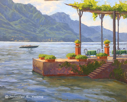
Pescallo cafe complete

We have had a bout of sickness at our house (first me, then my daughter) but I finally had a chance to get back to my Pescallo painting over the holiday weekend. Let's wrap this up! Picking up from my last installment, I am ready to paint in the flowers. Bougainvillea spills over the arbor with mixtures of alizarin crimson, permanent rose and a touch of cadmium red to warm things up. Normally I would block those colors in sooner but I was still trying to decide about the placement of that arbor structure and reds are such high staining colors that I didn't want to put them in until I had the composition pretty well established. Now I guess I am committed! ;)

alfrescoinpescallowip1_jenniferyoung

Geraniums in shades of red fill out the planters using the same colors as the bougainvillea (but in much different ratios).  I also flesh out the columns on the terrace and I am nearly done with the pier.

Now it's time to move down to finish the foreground water and reflections. There is a lot of movement in this water, and with much of this water in semi-shadow, reflections are subtle and broken by waves rather than the strong, mirror-like reflections seen in still water. For the darkest shades I mix Ultramarine and Gold Ochre, warmed or cooled by touches of Cadmium Orange or Sevres blue as the situation allows. Water highlights are deeper shades of the sky color.

alfrescoinpescallowip2_jenniferyoung

My finale is to include the rest of my vertical lines- the mast on the boat and the railing along the pier. These verticals act as a strong counter-balance to the horizontals of the mountains, boat and pier. I think the railing also serves to further push the background more firmly in the distance.

"Alfresco in Pescallo" Oil on Linen, 24x30" ©Jennifer Young

"Alfresco in Pescallo" Oil on Linen, 24x30" ©Jennifer Young

This piece was a challenge to me, largely because of all of the interruptions I had, which caused the painting to set up quite a bit more in between sessions. I much prefer painting wet-into-wet, to avoid the extra work of opening the painting back up and scraping the dry paint down off of my palette. But sometimes it just can't be helped. In any event, I hope you like the final piece!

No babysitting this week, so there will be lots of trips to playgrounds and possibly the zoo, and I likely won't have much in the way of new work to post until after my daughter is back in preschool on the 9th.

Moving forward

Before I could really tackle the foreground on my Pescallo painting-in-progress, I needed to establish the background water. It shimmers with a pale sparkling light in the distance, the color becoming deeper and more varied in contrast as it moves in waves toward the viewer.

pescallopaintingwip_jenniferyoung

Lest I got too caught up in the romance of Italy or the gentle waves of Lake Como, my husband brings me back to reality with a screeching halt and a critique of my painting. His opinion is to flip the direction of the boat so that it leads into the painting rather than out. I have to agree with him here, so being the always obedient wife (ha ha) I do as I'm told.

Next, I really need to address what is happening on the pier so that I can paint the reflections in the foreground water. I paint the tires that hang along the pier and serve as a rustic contrast to the elegant beauty of the backdrop. This epitomizes Pescallo to me; it is rustic but beautiful, quaint but elegant, sleepy but exciting, all at the same time. The tires are in higher contrast on the sunny side and in low contrast in the shadows.

Black is not black and white is never white. By this I mean that I don't use a tube black to paint black-colored objects, or a straight out of the tube white for most white-colored objects. This would create very flat, dead color. Instead, I mix my "blacks" with my darkest translucent colors on my palette, ultramarine blue and alizarin crimson, and just the tiniest bit of cad. orange or yellow to neutralize some of that purple undertone.

Flowers and flowering vines grow out of every crack and cranny around these parts, and I paint those in delicately so as not to overpower. The showy flowers will be the geraniums and bougainvillea to come.

School is back in session, which means that our babysitter has become a lot less available now that she's returned to college classes. It also means I will have less time to paint over the next two weeks until my daughter returns to preschool. I didn't get the time to paint outside last week, but my goal is to finish this studio piece with one more session tomorrow, so that I can still fit in a plein air session by week's end. I'm close...wish me luck!

Pescallo cafe painting demo (cont'd)

Here's a little more progress on the Pescallo painting I started in my last post.  I'm trying to write this as a demo of sorts, which means that with my  time constraints it is taking longer for me to post than I'd like. But noting ventured nothing gained, and I'm now ready to talk about some color! My palette for this painting is as follows: titanium white cadmium yellow light cadmium orange cadmium red alizarin crimson ultramarine blue sevres blue (Rembrandt- it's like a cerulean but more intense) burnt sienna gold ochre

This is a bit more expanded than the single primary I have experimented with a lot in the past, but with limited time in the studio now, it is helpful to have a few more "convenience" colors in my arsenal. With the tonal drawing laid to canvas as my guide, I begin by blocking in my color, starting with the sky and mountains. I start with very general shapes at first and then work to refine them as I move along. For the sky I am using combinations of sevres and ultramarine and white, and for the clouds, touches of cadmium orange and red, plus white. The mountains are basically varying degrees of cadmium orange and ultramarine blue.

lake como Italy painting in progress by Jennifer Young

Since so much of the background peeks through what I will have going on in the fore, I decide to work out the background first, fleshing out the highlights of the mountains. The greens of the mountains are very grayed down- just the slightest amount of cad yellow light is used, in combination with the blues. I also add a little alizarin crimson to neutralize it further.

Italian landscape painting in progress by Jennifer Young

I decide to soften the sky a bit to make the background stay back and be less busy. Then I start to lay in a first pass at the water. I use a slightly darker variation of the blues from the sky for the distant water, using less white as I move forward. I also add in some cadmium orange to the blues as the water edges closer to the pier and foreground. This won't be the final word on the water, but I have gotten rid of that white canvas and have enough of the background tones to start laying in the foreground. Next I will begin work on establishing the shadows and highlights of the pier.

lake como Italy painting in progress by Jennifer Young

Quite a lot still to go, but things are starting to take shape. But as they say, the devil's in the details.

Pescallo Cafe (in progress)

Call us crazy, but we are seriously entertaining the idea of returning to Italy next year-- with a toddler along for the ride. I am not really certain where we will go or how this will work with me painting, us touring, and one of us being only 3 1/2, but the fact that we are seriously talking about it seems fairly miraculous in and of itself. Every time I go through my photos and sketches of past travels, I end up wanting to return to this region or that region, and I am no closer to settling on a destination than when we started talking about this trip last winter. And then there are the places we haven't even gotten to yet. Each part of Italy seems to have its own alluring qualities, unique to themselves but quintessentially Italian.

Lake Como remains near the top of my list (so far) in terms of sheer beauty and aesthetic pleasure. It's not heavily endowed with art history or artifacts, (compared to, say, Rome, Florence, or Venice) but what it lacks in museums it makes up for in natural beauty and storybook enchantment.

This is a quick sketch of a composition I have been playing around with for a little while. It is of a little cafe set upon a pier in Pescallo. Not a great photo, but hopefully you get the general idea.

This was drawn to scale on my sketchpad so that when I "scale up" that there will not be a great distortion when I put it to canvas. There will still be some adjustments along the way, but by remaining in the same format, there shouldn't be any major surprises.

Here is the line composition drawn out in oil (burnt sienna) on canvas. I do some toning here to work out a value pattern, but it's not a 100% tonal drawing-- just enough to cement my concept in my mind and get me excited about the piece.

tonal sketch Lake Como cafe by Jennifer E. Young

Stay tuned for more to come soon as the painting progresses.

Revisions, revisions...and finally the final!

Well is this the slowest moving demo ever, or what?  Sorry about that, and thanks for sticking with me! I  haveenjoyed this painting, but  I struggled with the foreground boats I had planned to include.  I took them out and put them back in several times. I felt like I wanted something there to lead the eye into the picture, but the boats as I had them seemed to block my entrance  rather than aid it. So I finally settled on a single rowboat to lead the eye in while still allowing some breathing room.

After that was all hashed out (whew! ) I set about laying in the background boats against the retaining wall, half of which are in shadow, and half in light.

Next came the masts, sails, and water. The reflections in this scene were very soft and shimmery. Light reflections tend to cast a wee bit darker than what is being reflected, and dark ones are a tad lighter. I tried to keep the whites on the warm side, as they take on a lovely golden glow as they glimmer in the low angle of the sun.

"Pescallo Glow" Oil on Linen, 24x30" (SOLD) ©Jennifer Young

"Pescallo Glow" Oil on Linen, 24x30" (SOLD) ©Jennifer Young

So, did I keep with my grayscale plan I mapped out at the beginning of this demo?  You tell me:

pescalloglowbw_jenniferyoung
notan sketch
grayscale sketch by Jennifer Young

I must say that I liked having the grayscale notan and I actually did reference it often during the entire process of my painting. While I think it is a valuable tool, I think I would still have benefitted from doing a compositional line drawing in addition, especially with such a complicated scene. I probably reference the notan sketch more throughout the painting, but a strong compositional line plan may very well have eliminated the foreground boat dilemma I struggled with midway through the painting.  Live and learn!