Life post-Covid19 shutdown +Lake Como painting of the gardens at Villa Balbianello

Hi friends,

It is kind of strange to be posting this blog at this point in time. I had imagined I would restart my blogging with happy news—posting from the road perhaps during my plein air festivals, updating you all on social media with paintings from trips to the beach, the marshes, and the mountains. But that isn’t the way things have worked out for me this spring, or, I suspect, for a whole lot of other people who have found themselves in home confinement during this COVID19 pandemic.

This spring I’ve been mostly occupying myself with helping my daughter with her home study, adjusting to school closures and time without her friends. I’m also busy trying to secure groceries (and toilet paper!) and doing a whole lot more cooking and working in the garden. I’ve been trying to get myself and my family grounded as I feel the earth shift under all of our feet. In an effort to find some equilibrium, I’ve been organizing and updating my art files and reference photos, giving my website a tune-up, and generally trying to quell the sense of overwhelm I feel rising up from time to time.

Quite frankly I have been doing a little mourning too, not because we have experienced loss or illness at this point (thank God) but just because of the suffering I’m observing in the communities in the country and around the world. On a purely selfish level, loss of the simple things I took for granted pre-pandemic is also present.

Just before the shut down I upgraded my exhibition space at Crossroads Art Center here in Richmond, from a “wall” to a studio.

My Studio Space at Crossroads Art Center, located in building 2

My Studio Space at Crossroads Art Center, located in building 2

The March opening that was scheduled was to be my inaugural event in my new space. That opening went online, and the entire Art Center closed for a time to public entry, except for by-appointment showings. My plan for my new space was to set up and do a little painting there on a weekly basis, to meet customers and answer any questions, in hopes that I could be more accessible beyond the scheduled art openings. That plan is on hold for now. My studio is still maintained though, and Crossroads has gradually reopened with reduced hours and a 10-person-limit at a time, with masks required of all staff and visitors at the present time.

Like every other small business I am watching and waiting and hoping for signs of improvement. For now I am working in my home studio. It has, out of necessity, taken a back seat too this spring. But slowly I am adjusting and finding a little time to get back in there.

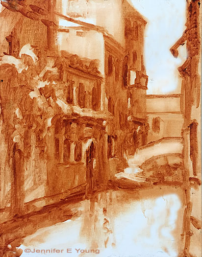
As I mentioned, I have lately been going through a lot of my files and photos, trying to get them organized. In the process I lingered over my past travel photos and I really enjoyed revisiting them—especially now when I can use any uplift. This is my first oil painting since before the schools closed in March.

“Giornata in Paradiso, Villa Balbianello,” Oil on linen, 20x24” ©Jennifer E. Young

“Giornata in Paradiso, Villa Balbianello,” Oil on linen, 20x24” ©Jennifer E. Young

It felt really great to be back in front of my easel and to completely lose myself for a time in this happy memory of my visits to Italy and Lake Como and the wonderful gracious people (very much in my thoughts lately) that my husband and I encountered along the way. This view was from the stunning terraced gardens of Villa Balbianello. I painted a smaller version of this piece a number of years ago, but I was interested to tackle it again, re-imagined. Click through on the image if you would like to read more about the painting and the place that inspired it.

Venetian market demo, continued

Today before I continue with my painting demo, I thought I would mention the colors I'm using on my palette. For many years I stuck with a fairly limited palette of about 5 or six colors (cad. yellow light, cadmium red, alizarin, ultramarine blue, pthalo green and white.) This was great for me as it really pushed me to learn how to mix color and not become reliant on pre-mixed colors from the tube. It also really helps lighten the load when I am packing my gear to take my studio outside and paint en plein air.

But these days in the studio, my time is more limited. I have a finite amount of hours each week to paint, blog, frame, ship, not to mention cook, eat, sleep, and care for my family. So I have allowed myself the luxury of an expanded palette to speed things along in certain areas. For instance, while I know how to mix secondary colors and some decent earth tones with a limited palette, things can move a bit faster if I have some premixed secondary colors (a.k.a. "convenience colors")  in my toolkit. So, for instance, red+yellow= orange., but cadmium orange is still a nice color to have both for it's purity and intensity and its convenience. In any case, whether I am using primaries or secondaries or pre-mixed earth colors, there is still plenty of color-mixing along the way, and  I don't ever use any color straight from the tube on my canvas.

Aside from the convenience, I am just enjoying playing with new colors. I've had less time to get out to doplein air painting, and I have missed it. So adding something new to experiment with in the studio keeps things fresh for me. On the palette I'm using right now I've introduced a few earth colors, plus some colors from Gamblin's radiant line. Aside from the colors listed with the asterisk *, I may not keep all of these colors out on my palette every time. But they have made an appearance in the studio often enough over the last few months that they are worth mentioning. All of these colors are Gamblin unless otherwise noted:

  • *Titanium white (Gamblin or Winsor Newton)
  • *Cadmium Yellow Light
  • Cadmium Yellow Deep
  • Indian Yellow (Winsor Newton)
  • *Cadmium Orange Deep
  • *Napthol Red
  • Radiant Red
  • *Quinacridone Violet
  • *Ultramarine Blue
  • Severes Blue-sometimes (Rembrandt)
  • *Radiant Turquoise
  • *Pthalo Green
  • Permanent Green Light
  • *Payne's Gray
  • *Brown Pink
  • Gold Ochre (Rembrandt)

 Now that I've gotten that bit of housekeeping out of the way, let's get back to painting! I spent my last post addressing the "shadow family" in this scene. In this picture you can see that much of the busy market scene is now at least suggested. But light is needed to delineate the forms and bring the scene alive.

venetianmarket_wip4_jenniferyoung

These images are a bit dark as I did not take the time to color correct the in-progress shots. But hopefully you can see that my approach has been to just focus on the general shapes of things without getting too bogged down in details. There are basically three large shapes of light spilling over this painting: the sky, the pavers, and the white awning, with lesser highlights on the figures.

Here is the final stage. I have kept things fairly loose because I wanted to keep the focus on the foreground figure, while still maintaining unity throughout the painting. Notice the difference in the color of the final piece below, taken under better lighting conditions to show the true nature of the colors in the painting.

"Il Mercato Veneziano", Oil on linen, 14x11" ©Jennifer E Young

"Il Mercato Veneziano", Oil on linen, 14x11" ©Jennifer E Young

Thanks for following along on my little painting journey to Venice! This piece is heading to City Art Gallery in Greenville, NC for their 30th Anniversary Celebration September 22nd. 30 years! Wow! Come join us for the party and see this painting (and yours truly)  in person! :-) 

Venetian Byway

As I've noted previously, I've been enjoying digging into subjects for my paintings by working small to large. Several of the recent studio paintings I've done have had their inception in smaller plein air pieces I have painted on site. Through this exercise I have come to appreciate the method of problem solving in the smaller piece. My latest "small" is this Venice piece I completed yesterday. At this point I'm not sure if I will rework this into a larger size. I will sit with it for a while and see what I can see from it with fresh eyes, as I work on other projects. 

"Venetian Byway", Oil on linen, 14x11" ©Jennifer E Young

"Venetian Byway", Oil on linen, 14x11" ©Jennifer E Young

A Venetian Companion

This week I am working out a companion piece to the little Venetian painting I posted the week prior. I often find that small paintings do well in pairs. Certainly a small piece can stand on its own, but it is often nice for the little guy to have someone to talk to. A pair can flank either side of a large mirror or mantle, or stack together on a tall narrow wall:

outerbankspaintings_jenniferyoung

I love grouping paintings, and while it doesn't work for every piece, I have started to try and think in terms of finding a  buddy for my little friends when it's possible. This is the start for our little Venetian companion:

venetiansepiasketch_jenniferyoung

A rough lay-in in burnt sienna gives a first pass at my light and shadow family. When I start to add color, I will keep those two families in mind. First up is the shadow family:

venicepainting_wip_jenniferyoung

You can see that even some of the "white" colors (around the door frames, etc, are still in shadow and will therefore generally be a darker value than anything in the light family. The eye can really trick you once you bring color into the picture, so it is something to be aware of at all times! More to come! Stay tuned.... 

A new thing-a-majig and a new painting

In the wake of the plein air weekend I wrote of in my last post, last week was mostly a recovery week for me. I did manage to get a new studio painting started, however. This is the initial tonal sketch on a 20x24" linen canvas.

Tonal sketch

Tonal sketch

This painting  may prove to be a challenge for me because much of this scene is in shadow. But there are a few pops of light that I am arranging in strategic places that I hope will carry the painting. Hey, you never know unless you try, right?

As with the other recent studio oils, I'm working with water miscible paints. One thing I'm noticing with these paints is that the paint blobs on my palette tend to gum up a little quicker once they are laid out, especially when I can't get back to the studio within a day. The manufacturer, Royal Talens recommends in their product info to mist the unused paints with a little water and cover  with foil to keep them moist and reduce the exposure to air. I have never liked putting plastic or foil directly on my paints though, because I feel that it wastes too much in the removal (yes I realize there is a bit of faulty logic in there but we all have our pet peeves).  So I'm experimenting with this:

cakepan_lid.jpg

What you are seeing is a basic 9x13" cake pan covered with a silicone doo-jobby that I found on Amazon. It is supposed to create an airtight seal, and the cake pan is deep enough that this cover-thing doesn't actually touch the paint. Whether it will be sufficient to keep the paint from oxidizing remains to be seen. I haven't been back at the easel since Saturday so I guess I will find out this morning when I go to work. I will report back with my findings, as well as an update on my progress with the painting, in an upcoming post.