A new thing-a-majig and a new painting

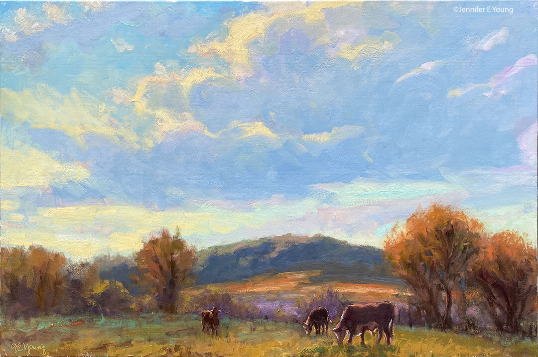
In the wake of the plein air weekend I wrote of in my last post, last week was mostly a recovery week for me. I did manage to get a new studio painting started, however. This is the initial tonal sketch on a 20x24" linen canvas.

Tonal sketch

Tonal sketch

This painting  may prove to be a challenge for me because much of this scene is in shadow. But there are a few pops of light that I am arranging in strategic places that I hope will carry the painting. Hey, you never know unless you try, right?

As with the other recent studio oils, I'm working with water miscible paints. One thing I'm noticing with these paints is that the paint blobs on my palette tend to gum up a little quicker once they are laid out, especially when I can't get back to the studio within a day. The manufacturer, Royal Talens recommends in their product info to mist the unused paints with a little water and cover  with foil to keep them moist and reduce the exposure to air. I have never liked putting plastic or foil directly on my paints though, because I feel that it wastes too much in the removal (yes I realize there is a bit of faulty logic in there but we all have our pet peeves).  So I'm experimenting with this:

cakepan_lid.jpg

What you are seeing is a basic 9x13" cake pan covered with a silicone doo-jobby that I found on Amazon. It is supposed to create an airtight seal, and the cake pan is deep enough that this cover-thing doesn't actually touch the paint. Whether it will be sufficient to keep the paint from oxidizing remains to be seen. I haven't been back at the easel since Saturday so I guess I will find out this morning when I go to work. I will report back with my findings, as well as an update on my progress with the painting, in an upcoming post.

Matt Smith workshop

Oh yeah, I have a blog! ;-) Actually, I didn't forget; I've been doing a little traveling up north to the New Hope School of Art to take a workshop from the very talented painter Matt Smith. The trip was noteworthy for a number of reasons. First, it was the first time I have been away from my daughter for more than a night. (That part was hard.) But second, it was also the first time I've had in 4 years to do nothing but paint and immerse myself in "art stuff" for four days straight. (And that part, my friends, was luxurious!) I haven't taken a workshop in a very long time. But now that my daughter is getting a little older, I really feel like it's time to amp up my art life in some significant way and infuse my work with new insights. So when I heard Matt was coming east to teach (he's based out West, so that's something I'd not caught wind of before around here) I knew it would be an excellent opportunity to do just that.

Please excuse the poor photo quality but this was shot with my iPhone in low light. Here you can see the very light way Matt holds his brush to apply paint and manipulate edges.

Matt hails from Arizona, and is best known as a painter of the Sonoran desert near his home, as well as the snow capped Canadian Rockies and other places out west that epitomize the classic western landscape. What initially attracted  me to his work though was not his subject matter, but the sensitivity in the handling of  his brushwork and edges. They are both bold and delicate at the same time.  But after seeing him demo and talk about his approach, I was equally impressed by the purposeful way he composed his paintings and orchestrated his compositions to createpowerful statements. I won't get into a blow by blow description of day 1-4 of class, but I will share some of the significant things I took away from it personally, most likely in more than one post.

The interesting thing about this workshop was that even though Matt is best known among artists as a plein air painter, the class was held entirely inside, in the studio. I'll be perfectly honest here and say that when I signed up for the class I was mildly disappointed that the format would not include at least part plein air painting, especially since Matt himself is a seasoned field painter and the area where the workshop was located was very scenic. (It was the birthplace, in fact, for an entire movement of landscape painters, known as The New Hope School and Pennsylvania Impressionism.) Largely though, that disappointment was entirely personal. My studio is my workhorse, but plein air painting is more exciting to me. Also with my life situation at present, I just don't get the longer stretches of time needed to trek out in the field as often to paint.

When I asked about the reason for the indoor class, Matt's response was that in his years of teaching, he has seen the same problems pop up again and again, whether in the field or in the studio. Maybe he felt it's better to address these fundamental issues in a controlled environment rather than adding another layer of difficulty with the environmental factors that plein air adds. In any event, the format turned out to be fine. In fact, there was plenty I needed to work on just with my studio work,  the studio environment definitely allowed Matt to get to each student several times a day with valuable feedback. As it turned out, the weather was not great any way, and we probably would have needed to seek shelter for at least two of the four days due to rain and wind.

Matt did several very good demos (using his photo references). He used a Strada easel, which I think was a rather new purchase for him. He talked a lot about equipment and painting gear, which, as any regular reader of my blog may have surmised, is a topic of great interest to me. The Strada is made of metal and looked like a neat little box (I think his was the mini, which is presently sold out.)

The Strada Mini Easel

But even without the two winged accessory attachments added to provide more workspace, it was a very heavy box for its size. Matt said he liked it because of its compact size (it easily fits into a backpack) and durability for travel, but personally I could not deal with the heft. A Gitzo travel tripod was also part of his setup, which looked great for its ease of use and small size when folded (also easily fitting into a backpack), but a quick Google search soon told me this item was way out of my price range. (Wowsa!)

Matt, by self-definition is not a colorist. In fact, of the fundamentals he sites as essential to a good painting (Drawing, Value, Design, and Color) the most expendable he says, is color. Even so,  I found his palette fairly wide, with four blues, two earths, two yellows, an orange, one red, a violet, and a couple of greens (plus, of course, white.) He used no medium other than his oil paint and a very tiny amount of Gamsol to thin his paints.

His start consists of a very light sketch, soon followed by masses of color, working broadly to get his main elements and shadows down. He then builds from there, thin to thick, dark to light, broad to more detailed. One thing I found interesting is that he almost always left his sky a white canvas until close to the very end of the process. Obviously this is working to his great advantage, but try as I might, I couldn't resist my normal method of putting the sky in early on. This was especially the case if there was any water in the landscape, as I find  I need that sky information to know what's being reflected.

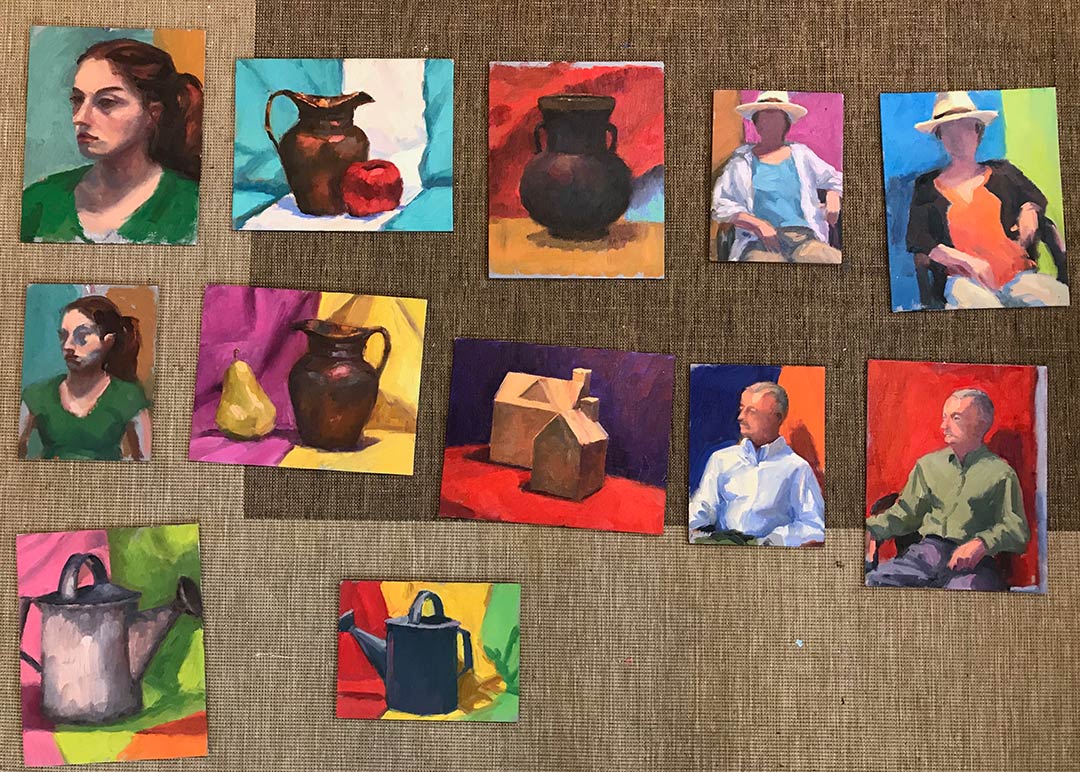
I've a lot more to say on the subject but I should probably try and paint something now! In my next post I'll share of few of my studies done in the workshop, as well as some valuable take-aways that I received from Matt's feedback.

A spring commission

With the spring shows hung and the winter commission complete, I was thinking I would be able to turn next to some plein air painting, or perhaps to develop a couple of my James River plein air paintings into larger studio works. But that will have to wait, as I have gotten another commission! :-) But first, a couple of shots of the garden, which, when last photographed was in a state of sad dishevelment! The gardens around the studio really come into greater color in the summer. But with the rubbish cleared and weeds pulled, things are coming alive in the side garden with Creeping Jenny on the path, flanked by Mountian Bluets (Bachelor's Buttons) and creeping phlox. A flowering Dogwood makes a nice canopy, and the lilac in the fore is just starting to put off its heady scent.

20130427-063451.jpg

Here's another shot below of the garden opposite the studio. In summer there are lilies, cone flowers, tall phlox and a butterfly bush. But my big thing lately is succulents. I love that they are water-wise and so marvelously sculptural. In the center is a succulent topiary I made last year. I will need to replenish a few of the tender plants that didn't survive our winter, but it hasn't been quite warm enough here to see much variety in the garden centers yet.

20130427-063539.jpg

Now that my daughter is a toddler, I can usually patch together enough time to noodle in the garden while she plays nearby. Working in the studio is a different story. At just 2 1/2 years old, her attention span is still pretty limited. So while she loves being in the studio, (and I love having her there,) I do have to shoo her out when it comes time to work, amidst howls of protest (and a certain amount of Mommy guilt as well).

...Which leads me to the commission! If you have been a reader for some time, this image might be familiar to you. In fact, I have painted variations of this scene a few times, beginning with the small painting done en plein air in the Blue Ridge mountains, and following with two larger 30x40 versions.

The commission came about as the result of my April show currently taking placein New Jersey. The client loved the painting "Morning Meadow" (click here to read my blog about this painting in the making) but it was much too large for her space. So my task is to recreate this scene in a 16x20 format.

Since a 30x40" painting doesn't exactly scale down to 16x20", we thought it best to start with a sketch of the new painting so that the client could have a visual idea of how it would look compositionally.

20130427-063621.jpg

While on the one hand, it may seem easier to recreate something I have basically already done a number of times, it can sometimes be a challenge to meet client expectations. Sometimes, though not always, a client may, for instance, expect the new painting to be exactly like the first, only smaller. So an effort always has to be made to explain in advance that as an original work of art, a painting can't be recreated stroke-for-stroke like the last.

The client does understand this, though she would like the color of the new piece to be as close as possible to the last. It was, after all, the combination of colors in Morning Meadow that she fell in love with.

Luckily, my prior blog post listed the exact color palette I used to create the larger piece! :) (I can't tell you how often I have referenced my own blog to get this kind of historical information.) So while I won't be able to remember exactly the combinations of color mixtures, I will be able to take some of the guesswork out of the process and use the same palette for this piece.

20130427-063635.jpg

Above is the sketch, reinterpreted onto canvas. At this point in sketch stage, I want to make sure I get an accurate placement for the various elements in the composition, so I've marked off in pencil the horizontal and vertical mid-points in the pencil sketch as well as on the painting to guide me. More to come in an upcoming post, where I will get into some color!

Lake Como W.I.P. & Demo

I mentioned in my last post that I had a new painting in the works, and I thought I'd attempt a little demo with this one. I say "attempt" because my laptop finally gave up the ghost, and these days I tend to do a lot of my writing via my mobile. Not only am I "all thumbs" (literally) but I have to sneak it in before my phone gets snatched away by the chubby little hands of my daughter who wants to "see pictures" whenever she sees it emerge from my pocket. This will be a painting of the beautiful fishing village of Pescallo. Pescallo is a tiny, sleepylittle place that sits just down the slope from Bellagio (also very beautiful). In fact, I could see Pescallo from the balcony of my Bellagio hotel, and the drama of the light as it poured over the mountains and harbor beckoned me to take a stroll down there many mornings before we started the day's touring.

I begin by sketching out a compositional plan that is also a value plan for the painting. I do this using light, middle, and dark value gray oil paints in my sketchbook. I often do a similar thing with Tombo pens (the grayscale ones), but mostly when I am painting outdoors as a way to quickly hone in and get a handle on my composition (in an environment that is bombarded with stimuli). But it is a good practice with studio work too. The oils are mentioned in Kevin Macpherson's book, "Landscape Painting Inside and Out," and I have long wanted to buy these paints so I could give it a try. They are Portland Gray Light, Medium, and Deep, by Gamblin. Hey, if it's good enough for "KMac", (as my husband calls him) it's good enough for me!

notan sketch
notan sketch

The point of this is to see if your painting has a strong underlying structure with a unifying value plan without getting bogged down in details. This is really supposed to be more of a notan sketch at this stage, which is a very simplified thing and addresses more of the armature of the painting rather than the pinpoint accuracy of objects and shapes. It's been a while since I've done this kind of study, and I realized at some point that I had not allowed much for the fourth value I was working with, which was the white of the paper. Oops! So I had to amend my sketch a little and add in some white for the lightest areas.

Still, I feel that my plan is solid and I'm ready to move forward by sketching out a line drawing on my 24x30" canvas.

oil sketch lake como painting by Jennifer Young

For this I am using burnt sienna (Winsor Newton), thinned with Gamsol mineral spirits. I don't much use this earth color in the rest of my painting stages, and while I could mix up  a good earth for such a job using my standard red, yellow, and blue, it is more of a convenience for me to use a premixed paint at this preliminary stage. I also like it because it lends a nice warm undertone to the canvas as I go along, and it doesn't bleed into my other colors (especially the light ones like the sky) when I move beyond the sketching stage.

Now that I have a plan, I am ready to start painting with color! I'll get into that in the next post .

Back to Tuscany; Vineyard W.I.P.

I think I will just make a deal with you readers (and, for that matter, with myself) to stop making lofty statements like, "I'm finally getting a regular schedule!" because something (like a 9 month-old cutting new teeth or reaching new milestones, for instance!) always seems to come up right afterwards. Still, I know I am fortunate to be able to do anything art-related at all, and  I have finally worked out my compositional pencil sketch for the next studio painting that  I thought I'd at least share. (Incidentally, I just want to say thank you to those of you who have sent me such nice, encouraging comments lately. I am glad to know that these W.I.P.s offer some interest. It's a format that works well for me in that it keeps me posting regularly here on the blog, so I will try to stick to it at least for a while.) This is again a scene of the visually dramatic area in Tuscany known as La Crete.

Tuscany pencil sketch

These little sketches are definitely not meant to be any kind of finished drawings, but with all the stops and starts in studio time nowadays, I am finding them really helpful. They help me to determine whether the composition will work , what I need to  edit out and include, how I might create interest with line,  light and shadow, etc. Though more detailed, they serve a similar purpose to the thumbnail sketches I have used from time to time while plein air painting.

Watercolorists know this approach well, but until recently it has typically not been my way with my studio oils. It takes a little bit more time when some days all I want to do is just dive right on into painting and get ON with it already! But with little sleep and even less free time, it's helped me to feel less disjointed and to backtrack less when I am standing in front of the easel, bleary-eyed with a cuppa jo, trying to get my brain to start.

In case you can't tell what this is to be, it's a vineyard in the fore with a small outbuilding in the middle ground and a little Tuscan hamlet in the distance. What interested me most about this scene is the movement of line from front to back. There is a lot of information in this scene, (maybe too much? We'll see...) and not much sky at all to speak of, so I feel that in order to make my present plan work I should use a canvas of at least 24x30". Well, that's a whole lot of writing for such a simple little sketch, but what can I say? Baby girl has napped well this morning. :-)