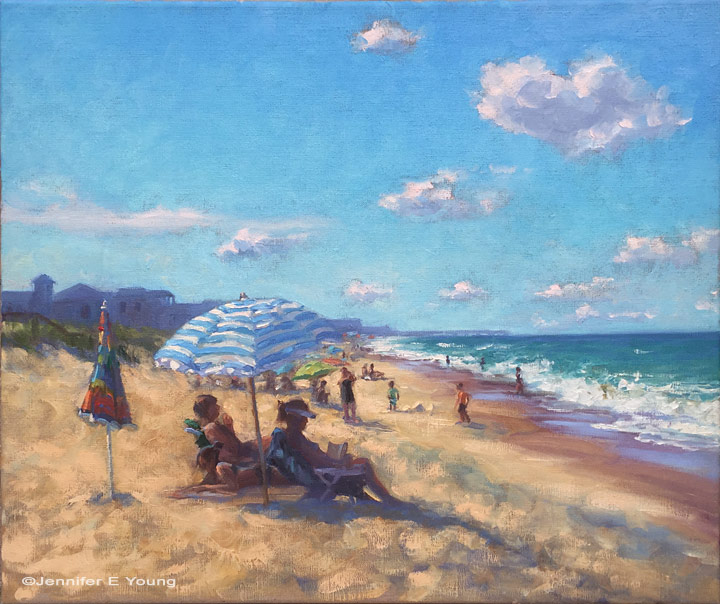
Treasure Hunting at Avalon Pier
/What a fall it has been so far. I thought once school started things would normalize (ha!) but the schedule continues it's craziness. Most days lately I have just enough time (and energy) to paint, and maybe quickly post here and there on social media. Last week was major at my husband's job, and he had to pull some of all-nighters out of town while I played the single parent at home.
Unfortunately this blog suffers during times like these, and my rhythm tends to stumble. I don't feel comfortable venturing too far away from my daughter's school when my husband is also far away, so I opt for studio painting instead of painting in the field. The set-up and cleanup is just quicker and more efficient when I need to head for the pickup line at the end of the school day, or should Iget a call from the school nurse or whatever. When the weather is gorgeous and fleeting as it has been, this sometimes makes me feel a little sad not to go out to some beautiful countryside location and paint outdoors.
On the up side, the studio allows me to experiment and try new things. Not only can I paint larger (yay!) but I can spend more time designing and composing. I can also decide how loyal I want to be to the image I'm working from, or whether I want to push that edge and see if I can manipulate the color more to create a certain color harmony or mood. So yeah, I was definitely going for a mood with this piece, and I have to admit I had a good time doing it!

"Treasure Hunting at Avalon Pier", Oil on linen, 24x30" ©Jennifer E Young
Due to the cloud cover and my auto settings on my camera, my photo references were somewhat washed out in terms of color. So, much of the color is inspired by my memory and another plein air painting I did in the summer:

"Anchored at Sunrise", Oil on panel, 9x12" ©Jennifer E Young
The image above has more warmth to it due to the time of day and the location of the sun so close to the horizon, but I loved the beautiful soft pastel colors in the sky and water and I felt that something similar would work well for the hazier light of a cloudy early evening, with just a tinge of the sunlight warming up the clouds as touches of blue sky break through.
During our beach trips to Kill Devil Hills, I often walk down toward Kitty Hawk to the Avalon Pier and enjoy the people watching as I go. I especially love to see the kids playing by the shore, so in-the-moment and involved in their play. I know that feeling all too well. It's the way I feel when I'm painting down there, though my time always seems to end all too soon.