
Rassawek Vineyard (plein air to studio)
/There have been a number of occasions where my plein air paintings get stashed away for a while, only to be discovered when I can't stand the mess of my studio space any longer and (finally!) decide to instill some order. Such was the case with this little plein air study I did this past May at Rassawek Vineyard during its annual Spring Jubilee:
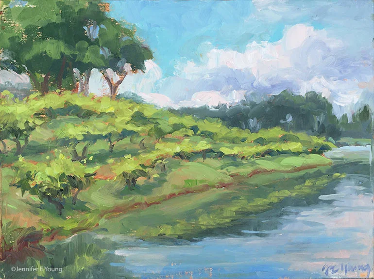
"Rassawek Vineyard, Study", oil on panel, 9x12" ©Jennifer E Young
It was a challenging session, as I recall, because those clouds kept morphing and changing the light and becoming more ominous as time advanced. In fact, I had to close up before I intended, in order to make a dash for my car before the sky opened up (and indeed, it WAS just in time.)
Nevertheless, there was something nice about this that I wanted to explore further, as it was such a lovely setting. For the larger painting I was planning however, I wanted to zoom out a bit to show the expansiveness of the landscape. So I searched my photo archives to see if I could find the view I had in mind. Voila! I found what I was looking for, which also included the roses marking the end of each row on the vineyard, (something I failed to note in the study.) I didn't get any progress shots of this painting because it has (ironically) been raining non-stop here for over a week, making the lighting insufficient for photography. In any event, I took a shot of the final studio piece outside during an all-too-brief pause in the rainfall.

"Rassawek Vineyard", Oil on linen, 30x40". ©Jennifer E Young


