Gallery Wrap

This week I'm working on some landscapes done with gallery wrapped canvas. It is a more time consuming because I am extending the painting to the edges, but I am really liking the effect. Here is a a small 12x12" work in progress. I'll be posting more work to my website this weekend.


Okay, so the fast has been a little harder than I thought- energy wise. May have been a better choice to start this after my next art opening, but oh well. I think I can still get the work done in plenty of time. I'll just need to manage my time wisely. 

In some instances the fast is easier than I would have imagined, but it is still not for the faint of heart. I am doing the "Master Cleanse," a modified juice fast and am on day 7. Haven't blogged before now because I am at the studio during the day and like milktoast by 8 p.m. every evening. Supposedly it gets better in respect to energy level and other things too. We will see. It might help if I stopped fantasizing about Pad Thai and garlicky spaghettini! I've not been all that hungry, but am having outrageous cravings. Still, I've gotten this far (with no coffee!) and am aiming for 10 days or more.

Happy New Year!

Just back from the holidays and about recovered from 2 weeks of travel to Texas to see family. The time between just before Christmas and just after New Years Day are typically slow for my art business, so I try to take advantage of the lull and take a little break for myself as well. However, I am returning to the studio this week so I'll be brushing off the cobwebs and getting back in gear to get ready for an upcoming February show at City Art Gallery in North Carolina. It was really good to have a break, but I have missed painting. Hopefully I won't be too rusty. Sometimes I find the short breaks can actually help my work though. Next week should be interesting because I am starting a 10 day juice fast to try and give my mind and body some clarity. I've struggled with some headaches and other health issues of late. I first thought the paint fumes might be the culprit, but I've been away from them for a while and the symptoms persist, though they come and go.

As it is with so many folks, the days leading up to the holidays were full of deadlines for me and I'd not been eating or exercising properly, which I think affected my overall energy level and sense of wellbeing. A detox seems in order. I will be interested to see if the paint fumes in my studio affect me or seem more acute during the fast. I have been so used to that smell that normally I can barely smell anything at all!

Painting Demo Part III

Things are really starting to take shape now. I've started to add more of the "local" color greens to the highlight side of my distant trees, allowing the deep blues and blue grays to act as the shadowed underside. I also begin to indicate the lines of the vineyards and the silvery olive trees that dot the distant countryside.  


The painting is looking close to being finished (at least in my mind). Just a few details to address now. I've given more dimension to the olive trees in front and have begun to restate the trunks, adding some of the bluish highlights just in places where the sun hits the gnarled forms. I keep my distant buildings soft and sketchy because they are farther away. Highlights on the distant trees are duller than the richer green colors that I put on the highlights in the foreground. I also add detail strokes to my cypresses. Now I take a nice long look at the painting to see what adjustments need to be made before I start finishing. Placing a mirror on the wall just opposite of your painting is an excellent tool for this purpose. It reflects the painting back in reverse, giving you a fresh viewpoint from which to see the painting anew. Sometimes when you've been staring at a painting for hours it's hard to see what needs to be changed.


Viola! Here is the painting in its finished (or nearly so) form. I've touched in the slight suggestion of windows on some of the buildings, taking care not to do too much of that in the distant ones. I've also developed my vineyards a little more and restated my tree branches. One adjustment I made with my reverse viewing/mirror technique was in the foreground trees. I didn't like how the tree line stopped just short of the edge of the picture plane. It made the composition feel too boxed in. So I extended the tree line out to the edge, which I think gives it a nicer sense of fluidity.


"Gli Olivi della Crete," Oil on Canvas, 30 x 40"

As you may have surmised that "Gli Olivi" means olive trees, and La Crete is the region in Tuscany that is depicted. Over the next week as I work on other paintings, I will prop this painting up in a visible spot in my studio and just keep looking at it. I may make minor adjustments to it if something really jumps out at me after a while, or I may deem it "finished" and put a coat of retouch varnish on it when it dries to the touch for protection.

Thanks for tuning in! If you'd like to see the entire demo again, please view the following links:

Painting Demo Part I Painting Demo Part II

To see more of my Italian Landscape paintings, click here.

Painting Demo Part II

I begin to block in some of the color here, laying in the foreground so that I can gauge the values and temperature of the rest of the color. I want to emphasize these wonderful olive trees and the sloping hill. The olive trees are so distinctive in the Tuscan countryside. At different distances and in different light they take on shades of green, silver, and even blue/violet. But back to the painting; the ground is too dark. The light from the sky is shining directly on the places that are not in shadow from the trees, so I will try to bring out some more highlights as I progress with the painting.

Here I am giving a little more form to the foreground trees, and I lay down the color for where I will show some of the bare land. All of the ground is still too dark in my opinion, but I begin to lighten it up a little.   


Blocking in more of the painting, the distance is starting to take shape. I lay in very cool colors in the far distance, using blues and cool greens. In general warm colors come forward and cool colors recede, so I will start with relatively cooler, lighter colors in the distance and stronger, warmer colors as the eye moves forward in the painting. I still use slightly darker blues, (ultramarine, plus a dab of cad red light and white/ or ultramarine plus a dab each of cad. orange and alizarin crimson and white) even in the middle ground, as I can always add more local color later. I've also lightened up the ochre ground colors throughout the painting, which I think looks better and more convincing.

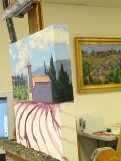
I start to feel more comfortable once the canvas is covered with paint and there aren't any unaddressed areas. Even if the value or color isn't quite right, it helps me to "see" the painting better if I can have everything more or less laid out. I have now indicated the buildings, more of the distant trees, and have added detail to the olive trees in the foreground, including giving them some more shadow areas. As I have worked in more color, you can see I've painted out some of the tree trunks and branches that were indicated before, so I will have to restate them again at some point.

As you can see, this is very much a push and pull exercise for me. Some artists start with the distance and work forward, and I used to try and do that too, but I always tend to want to lay in some of the foreground so that I can better determine what the distance will need.