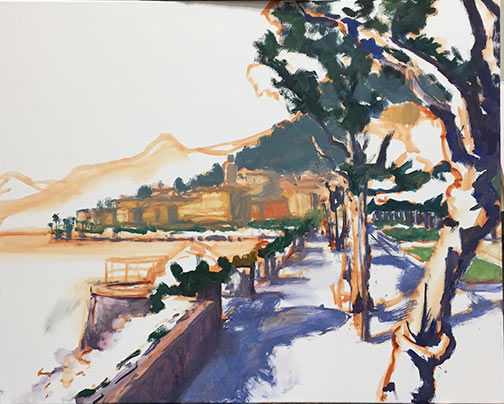
First painting since the move!

After re-reading my post from yesterday I started to feel like a wimp, complaining about the heat and all. Then I tried it and realized that heat stroke does not improve your art one iota! All kidding aside, it was boiling lava hot outside on my patio. I only lasted about an hour before I decided I'd have to leave it until the next day, and pick up where I left off. And so I painted this piece over two sessions, noting the time of day and returning to wrap up at the same time this morning.

"A Taste of Summer" Water soluble oils on Linen, 12x12"  Jennifer E Young

"A Taste of Summer" Water soluble oils on Linen, 12x12"  Jennifer E Young

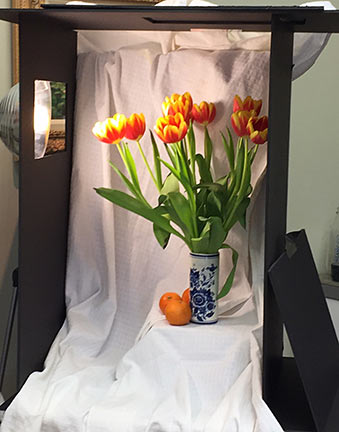
This little outdoor still-life setup includes the herbs and flowers I brought from my old place, as well as a big beautiful housewarming gift from our new neighbors (the pink and orange spray behind the basil). A  marriage of old and new,  I felt it was the perfect subject to kick off this new beginning.

I experimented with this painting using Cobra water-soluble oil paints by Royal Talens . I was inspired to try them when I started following the very talented painter Mark Hanson's discussions about them on Facebook and on his blog. I have friends who use water miscible oils, too, but having tried them before without success I haven't been compelled to try them again. But when Mark suggested that his migraine headaches may have gone away after switching to these oils, I took notice and decided to try this new (to me)  line of paints myself.

I have suffered from insomnia for years, and yet ever since we moved to the new house, I have only had two bad nights. That's pretty incredible! Coincidentally, with the exception of yesterday and today,  I have not painted since we've been here. Is it possible there is some other reason for my new-found improved sleep? Absolutely. But it's also possible the fumes were getting to me and I didn't even realize it. It has also bothered me for a while that I am eating as much organic and natural food as I can afford, I'm also inhaling volatile organic compounds on a daily basis in my work. And if we ultimately decide to set up my studio in our current attached garage, water soaked paper towels are going to be a lot safer than ones soaked with mineral spirits, odorless or not!

I first tried water-soluble oils several years ago. I believe they were Winsor & Newton's Artisan series. At the time I found the handling too gummy and tacky and not to my liking at all. I may not have given them a fair shake though, because in recent weeks I have read that you really should not thin your paints with water or it will produce that tacky, gummy effect and make the paints rather dull and cloudy looking. Instead, Mark advised not to rinse off your brushes too much with water, but to just wipe off the brushes as much as possible in between color mixture sinstead, and save the water for the final cleanup. If needed, use a water miscible oil painting medium created specifically for these paints rather than water to increase viscosity.

That advice made a world of difference and I found myself painting without fighting with my materials. There was a slight difference in the handling and a few old habits to overcome, but nothing so difficult as to put me off. I would say they did not flow as easily for me as my traditional oils, and the color intensity was a tad weaker, but not by a tremendous amount. On the other hand, they have absolutely no odor and seem like they would be great for travel.

From what I have read so far, the drying time may be a bit longer than what I'm used to. But that should not be an issue for ole' Pokey, here. I do hope they dry well and evenly, without any dull passages or great shifts in color or value. I will report back on this if I notice anything remarkable. I look forward to experimenting more with these paints. I really hope these will be my new go-to paints, and that I can ditch the OMS once and for all!

Winter Sunset complete

This morning I finished up my snow painting, the start of which I blogged about in my last post. Here is the final:

"Winter Sunset, North Run Creek", Oil on linen, 16x20" ©Jennifer Young

Winter Sunset, North Run Creek" Oil on linen, 16x20" ©Jennifer Young

This was one of those paintings that I was excited about from concept to finish. It had the feeling of a sunset, a snow painting, and a nocturne, all in one. I actually didn't want it to end.

I experimented with a new blue on my palette, which I am really enjoying--Indathrone Blue (Grumbacher). It's really a versatile and beautiful color.  It's along the lines of a Pthalo Blue, though not nearly as highly staining. I find that both Pthalo blue and green can easily take over a paint mixture with anything beyond the tiniest touch. (They also seem to have a way of getting all over me very easily!) Indathrone is different. It's transparent, less intense than Pthalo but "cleaner " than Prussian Blue, and very versatile to work with. I used it in various mixtures throughout the painting, but you can see a good bit of it in its purest form (tinted with white), in the frozen section of the creek on the lower left.  I doubt it will take the place of my tried and true Ultramarine, but it's a nice addition to have on the palette, and I can see a lot of potential for its use in still life and nocturnes.

Bellagio Promenade

As I mentioned in my last post, I've been working on a large(ish) painting of the Bellagio promenade that leads to the Villa Melzi. It took me a little longer to bring this painting to a conclusion and, because I painted at night, my progress shots were too bad to post. So what I am sharing today is the final piece:

"Bellagio Promenade" Oil on Linen, 24x30" Jennifer E Young

"Bellagio Promenade" Oil on Linen, 24x30" Jennifer E Young

 Because I had to work on this over a succession of days, I worked pretty lean until the last couple of sessions. In the end though, this bad boy has a lot of paint! Of all of the places I have visited so far in Italy, Lake Como in general, and Bellagio in particular, hovers near the top of my list for achieving that dazzling combination of natural and man-made beauty. The trifecta of pre-Alpine mountains, deep blue waters and classic Italian architecture dripping with flowers is pretty hard to beat.

New Lake Como painting in progress

School's out this week due to snow, so my painting time is catch as catch can. Nevertheless, we have been conspiring with other desperate parents to arrange play dates here and there, which allows a little painting and blogging time. So I thought I'd share the Bellagio painting I have my easel this week. This is a promenade on the outskirts of bella Bellagio, leading to the stunning grounds of the Villa Melzi.  This view however, looks back towards the town. Apologies in advance for the poor quality photos and the cast shadow of part of my easel on the painting. I don't have a lot of time to photo edit anything but the final these days, so I hope you will bear with me. I start in the usual fashion, with a loose sketch of my composition in Burnt Sienna:

Lake Como painting demo by Jennifer Young

Next I lay in the shadow family and darkest notes.

Lake Como painting demo by Jennifer Young

At this point I'm laying in some general blocks of color. Still no highlights yet...

Lake Como painting demo by Jennifer Young

And here's my starting point this morning:

Lake Como painting demo by Jennifer Young

Next I will continue blocking in, including the water and distant village. I'm still working up the nerve to paint outside while there's snow on the ground, but we will see. Not much of a fan of the cold, but that snow sure is pretty.

Still life shadow box

I mentioned in my last post that it's helpful to have some control over the lighting environment when painting the still life. A simple solution is to create a shadow box. This is not a new idea. If you google "still life shadow box", you can find lots of examples. I looked at a number of them, but given my tendency for being definitively un-handy when it comes to building things, I went for the low tech option as described by Lee A. Brown on his blog A Day Not Wasted. The only difference was that I didn't bother with the plastic corner moulding he mentions. Instead I found one of my favorite "building" supplies, some duct tape, (in black- SCORE!) when I was shopping for the foam core. Made this way, the box isn't indestructible, but it's sturdy enough since I don't really foresee needing to move it around all that much. The other difference in my box is that I made two windows for the light, one on top and one on the left side, which I can cover or uncover with the leftover scrap foam core, depending on which direction I want the light.  Here's what mine looks like:

Shadow box for still life painting

All of this is sitting on this Ikea kitchen cart on wheels, which I found on Craigslist for $10 (SCORE! again.) I'm only 5'4", so at my height, this cart brings my objects about as close to eye level as I can manage given the space I have to work with. I've gathered various boxes (gift boxes, jewelry boxes, etc. to help elevate my objects even further, and to provide some variety in the height I can achieve with various objects.  Here's a slightly different angle, with my last still life setup inside:

Still life setup

Still life setup

A simple large cardboard box, open on one end, and a shop light from Home Depot, is an even lower-tech version that would also work perfectly fine.