Lake Como Painting Progression (continued)
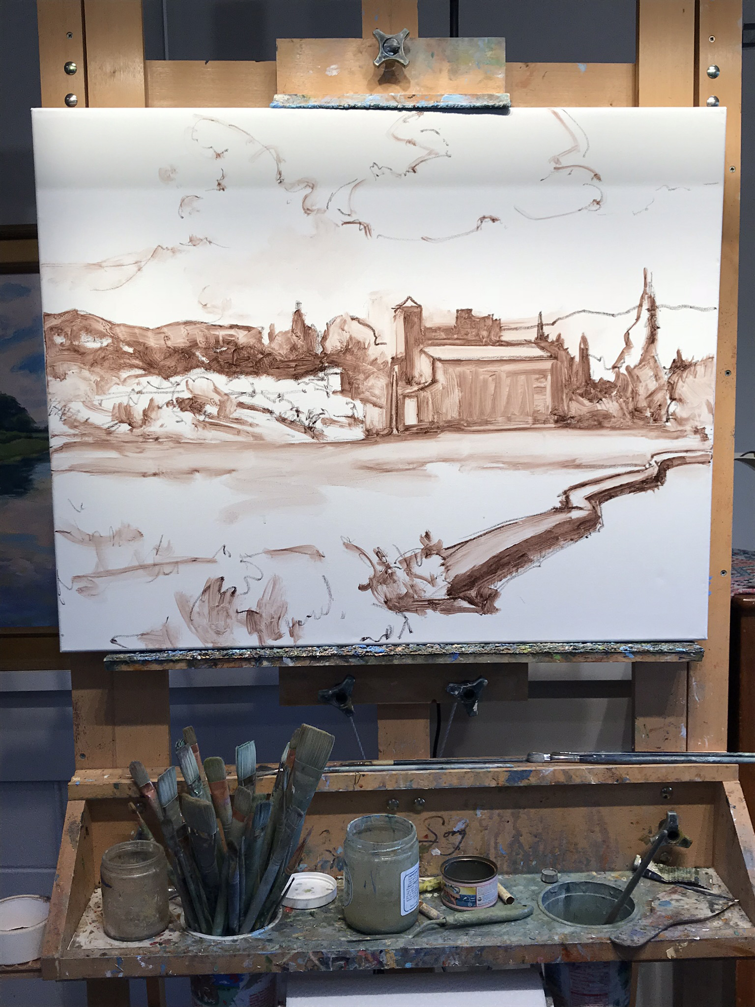
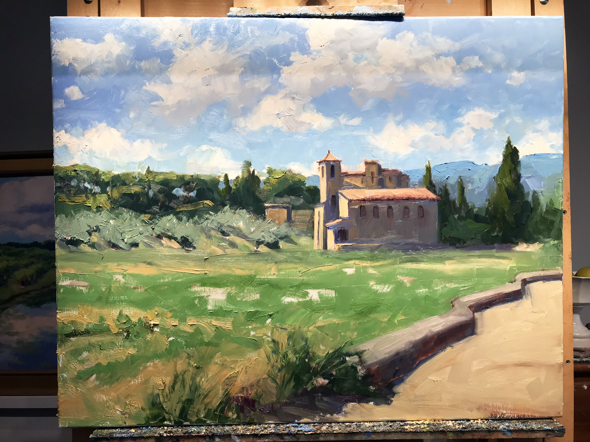
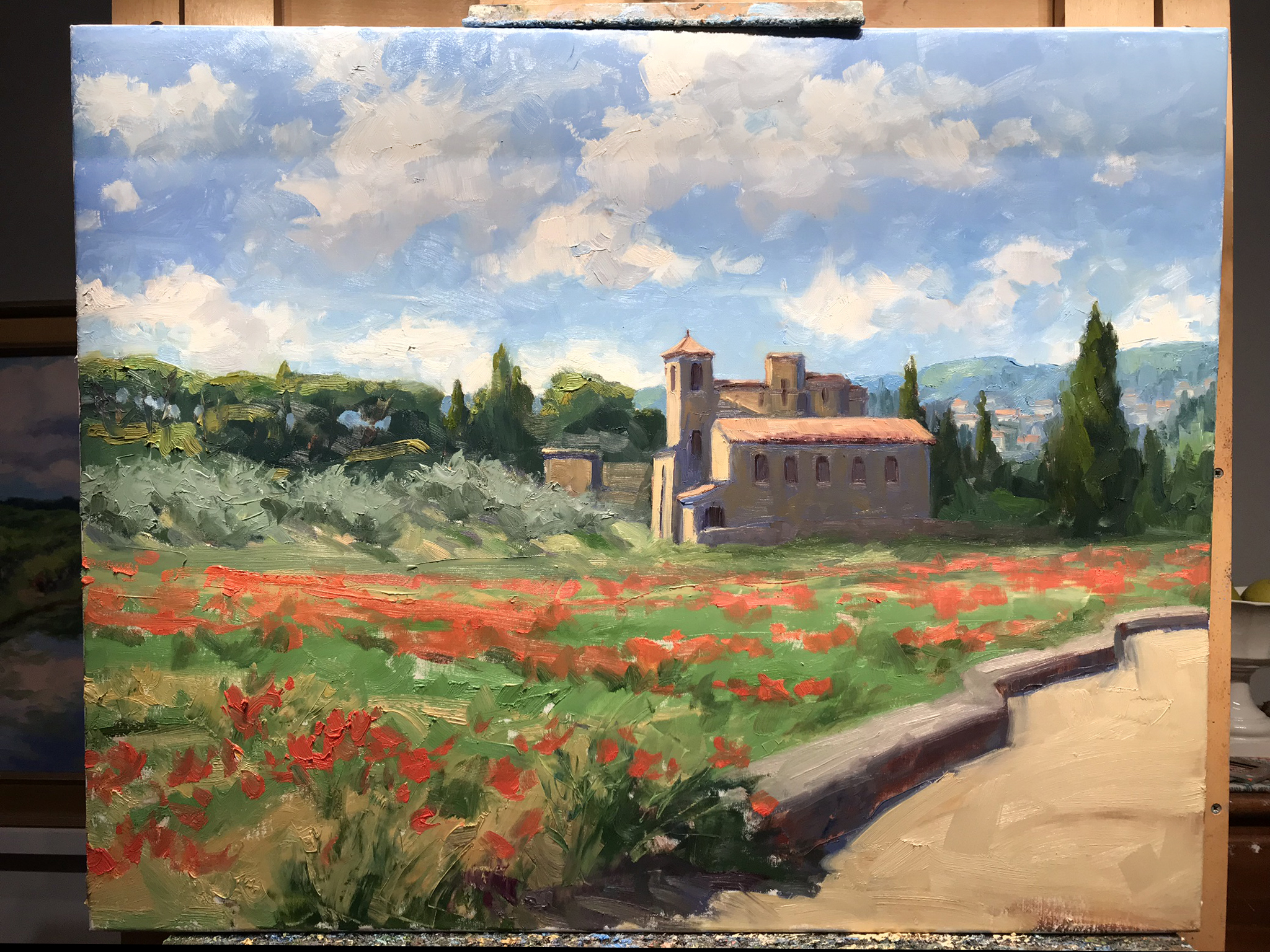
Well the time has really gotten away from me this week, as we are in the home stretch of my daughter’s “learn from home” work for her last weeks of fourth grade. But I HAVE been making progress on my painting of Varenna, the start of which I shared in my prior post.

First things first… I thought before going any further I would share a little about the colors currently on my palette, and what I’ve been using to work on this piece.

palette2.jpg

I will start by saying that this is a pretty big palette of colors for me, and definitely larger than what I use for my field work. But because I have such limited studio time, it helps to have a few more “convenience colors” to work with so I don’t spend so much time mixing. Plus look at those yummy colors. Sometimes it is just plain fun to indulge in them, as long as I don’t have to carry them around in my backpack! The paints listed with an asterisk* by their name are the kinds of colors I nearly always use. This is basically a double primary palette with the addition of an earth (brown pink) and a “black” (Payne’s Gray, which is really almost a dark blue).

I pretty much always lay my basic palette out the same way in a clockwise fashion. So for instance, starting with my earth colors in the lower left, I move up to white, which is always in my upper left, followed by colors from warm to cool, generally speaking. This palette has varied over time with a few colors added, or removed, or others substituted from time to time when I want to experiment. For instance, my two reds used to be Cadmium Red Light and Alizarin Crimson, but I switched to a cooler Napthol Red for my “warm” because when tinted it makes a cleaner, less orangey pink. I will use Quniacridone Violet in a similar manner to my former Alizarin Crimson for nice dark purples or browns, to modify other colors.

If you are new to painting I would recommend starting out with a double primary palette (a warm and cool of each primary color, yellow, red, and blue) plus white, and then slowly adding new colors over time as you get a good handle of what your primaries can mix. You might be surprised at what even a single primary palette can do.

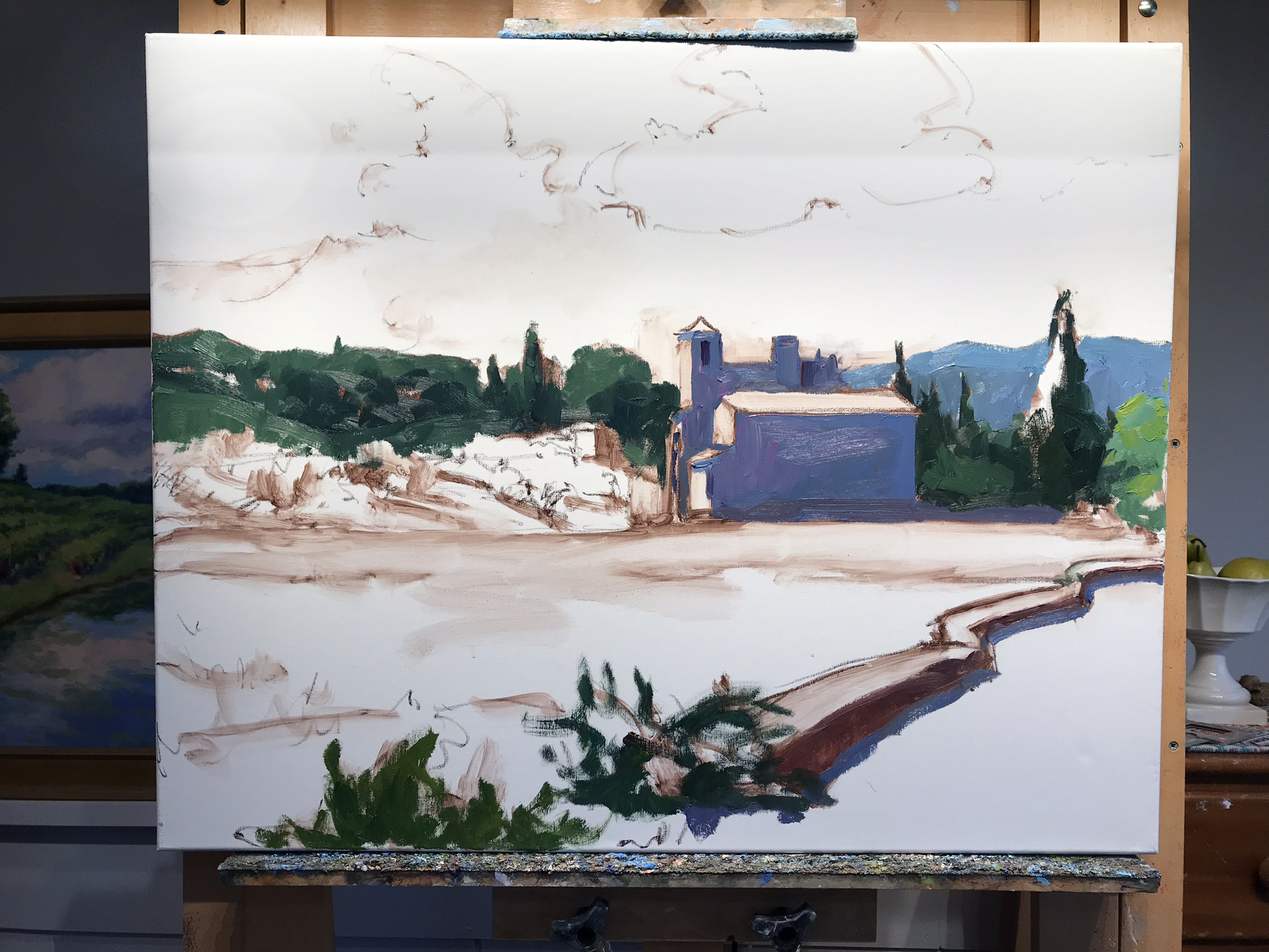
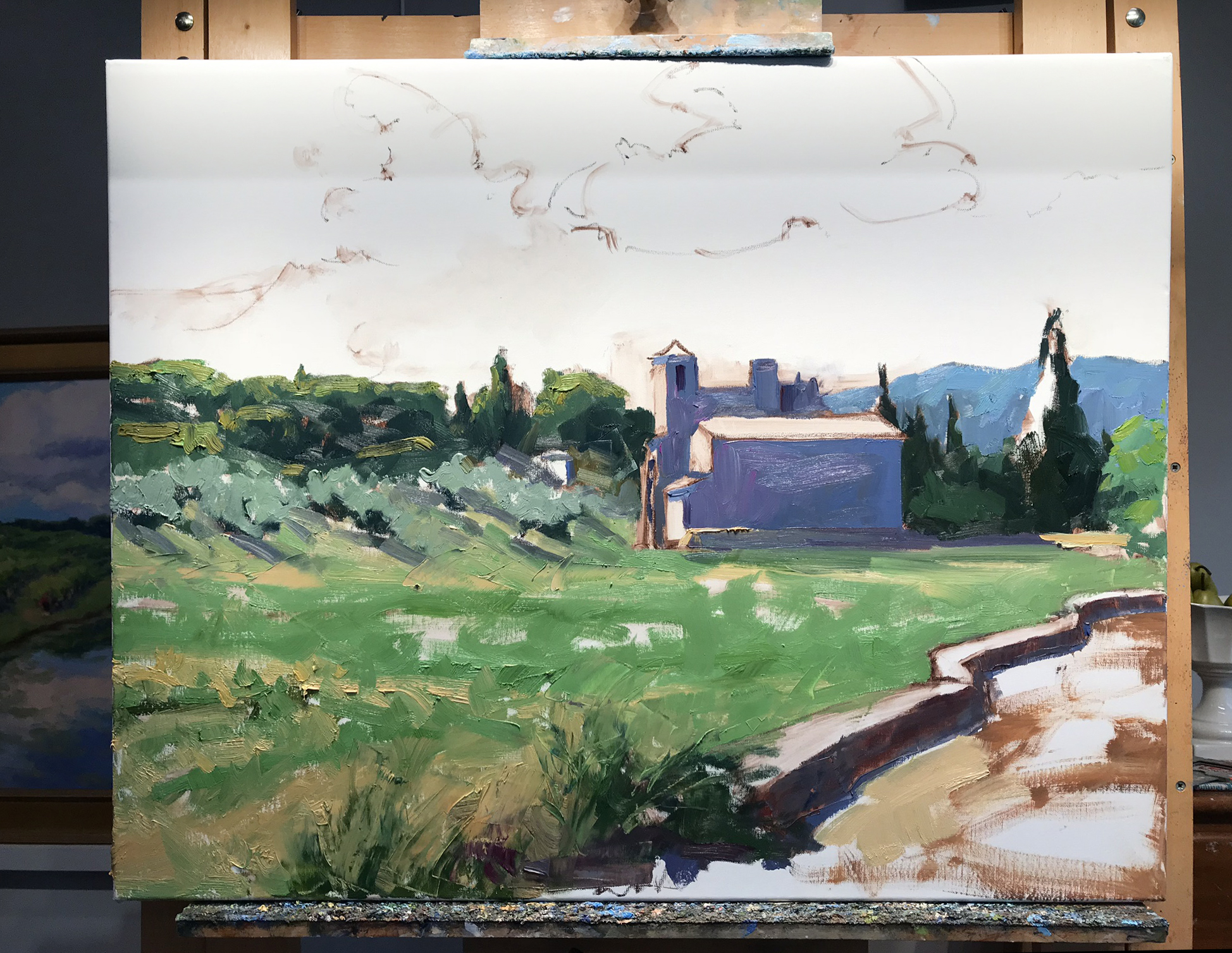
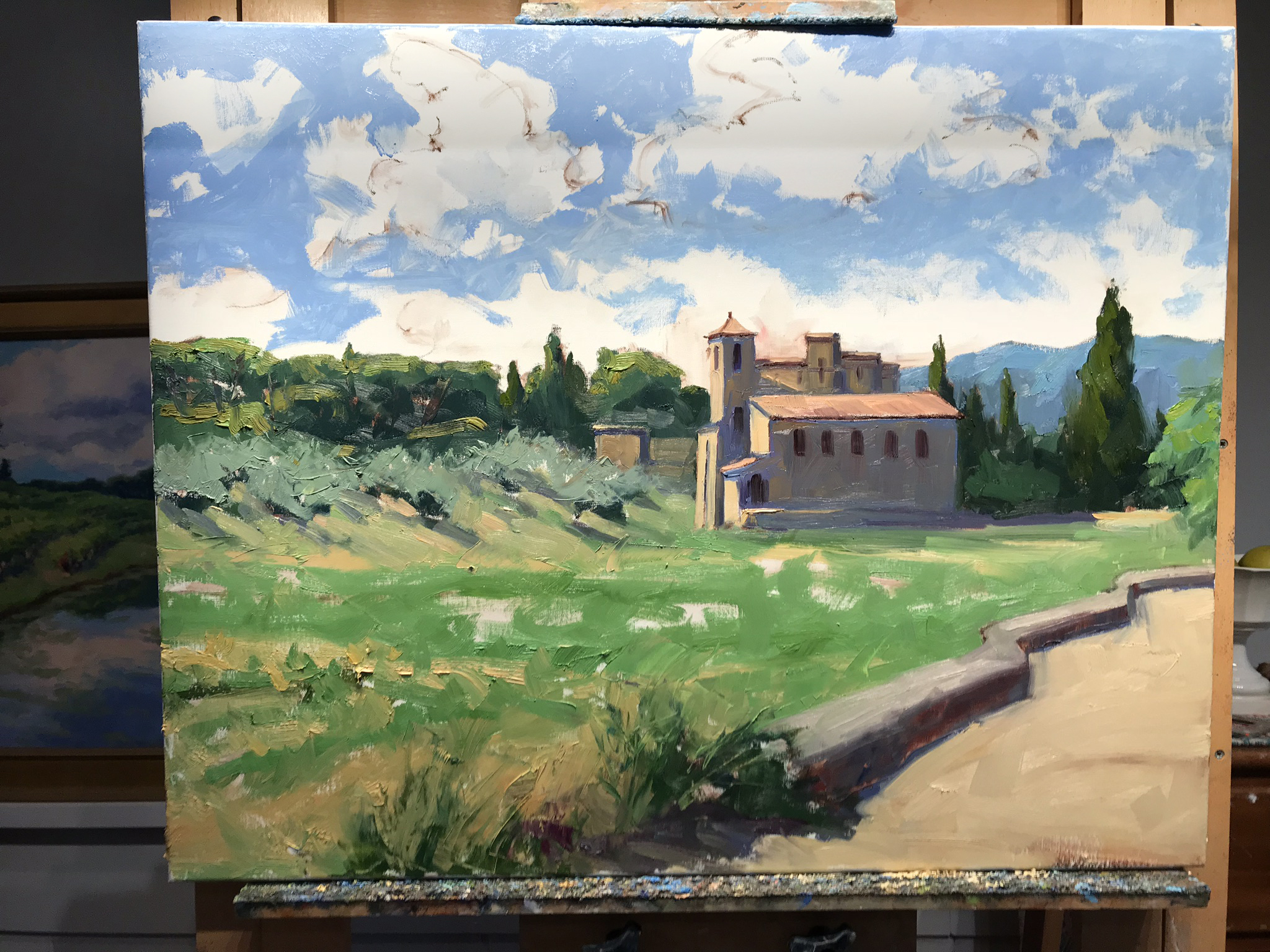
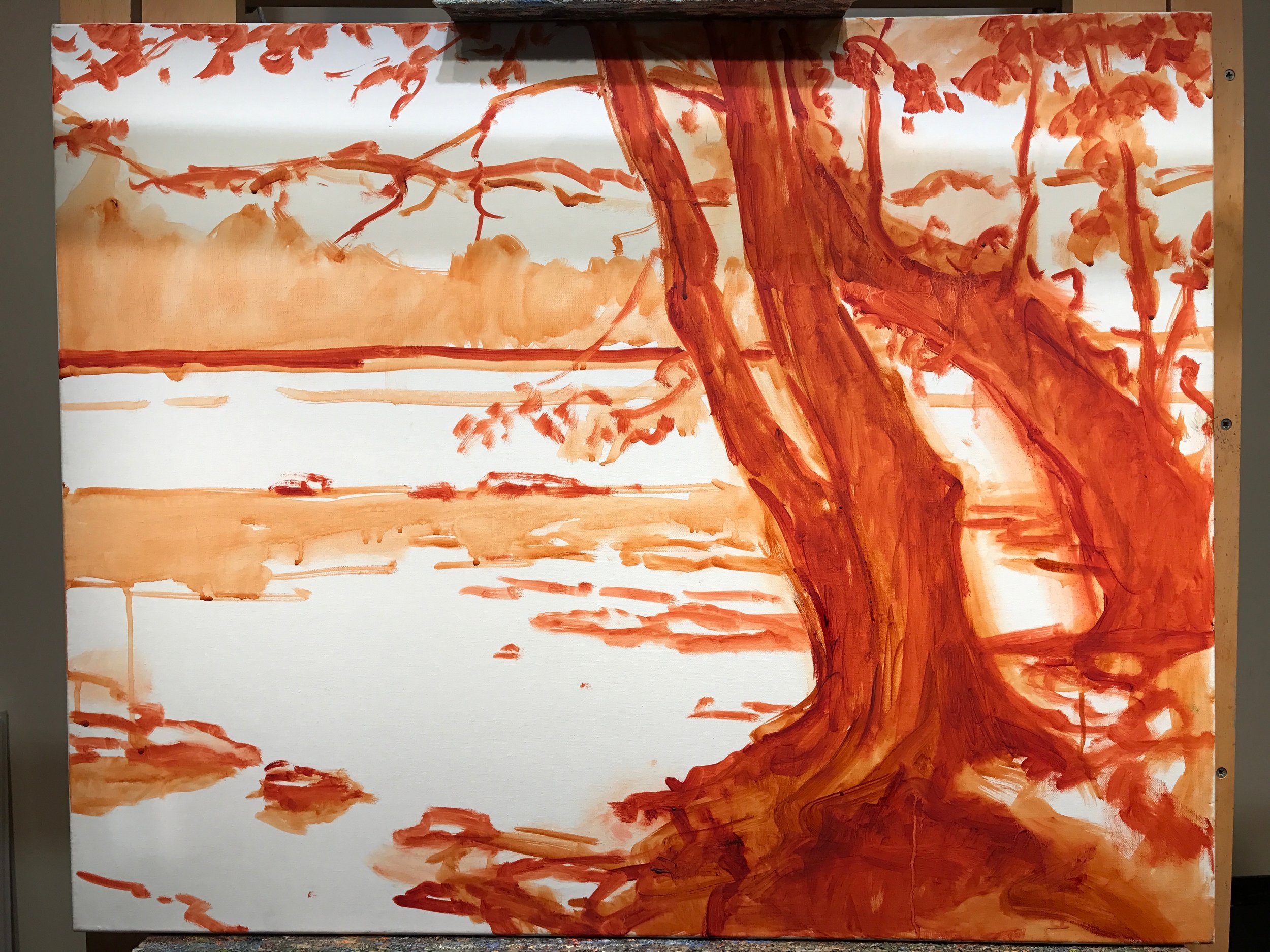
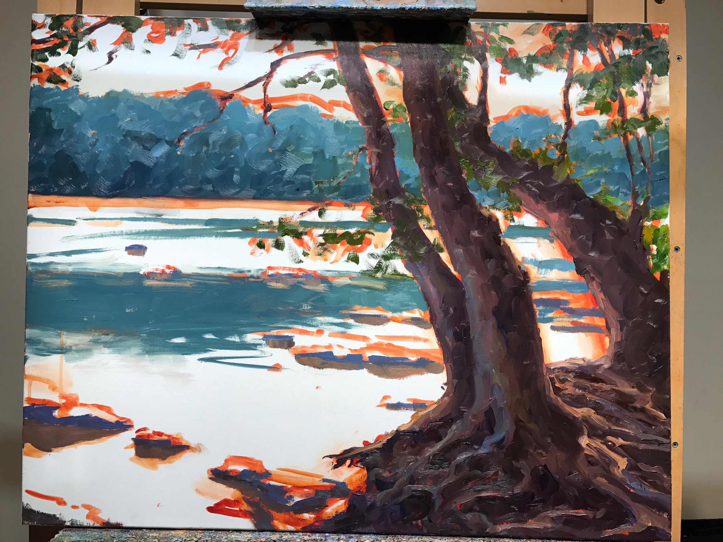
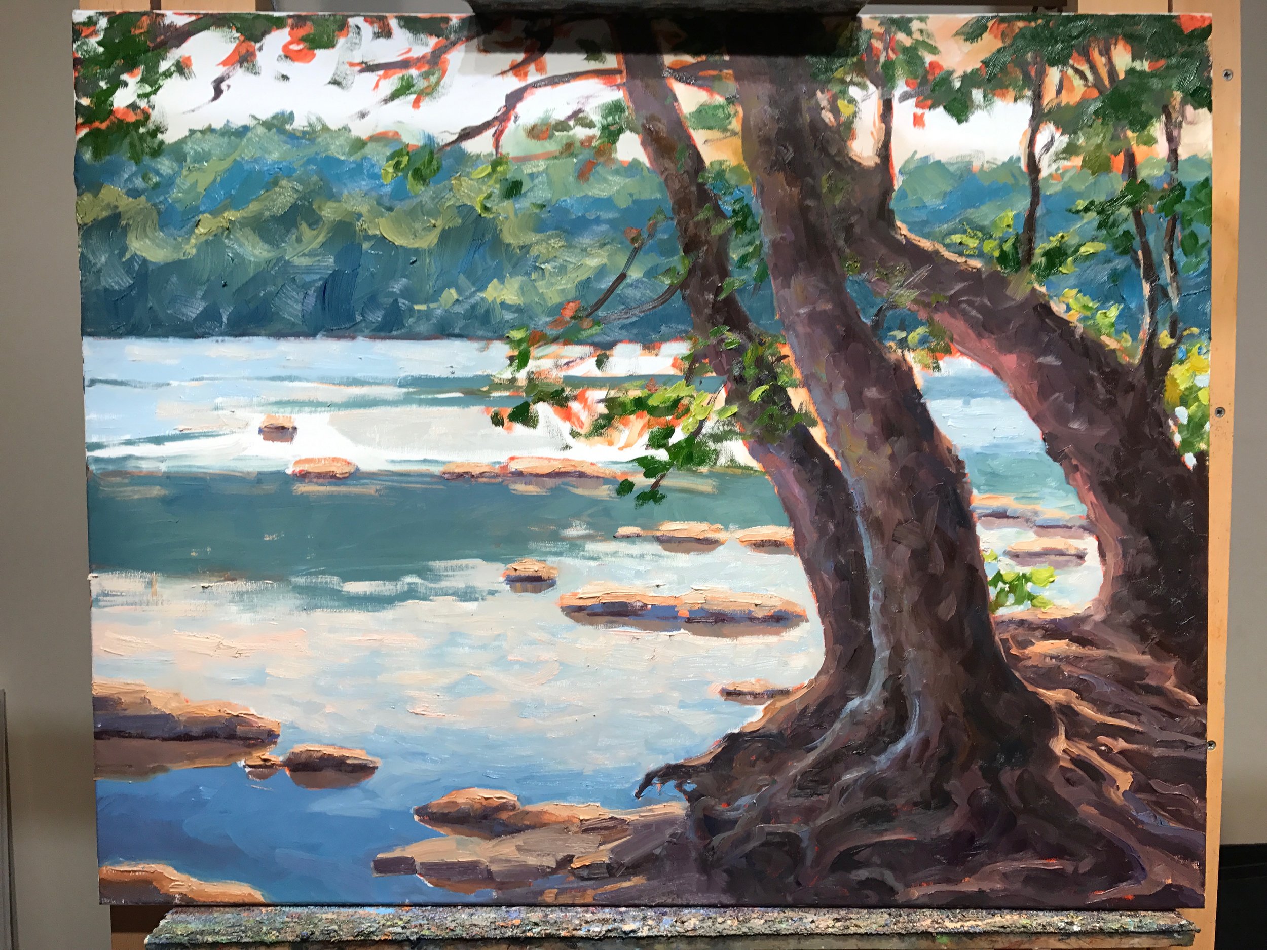
Okay, enough palette talk for now. Let’s recap;

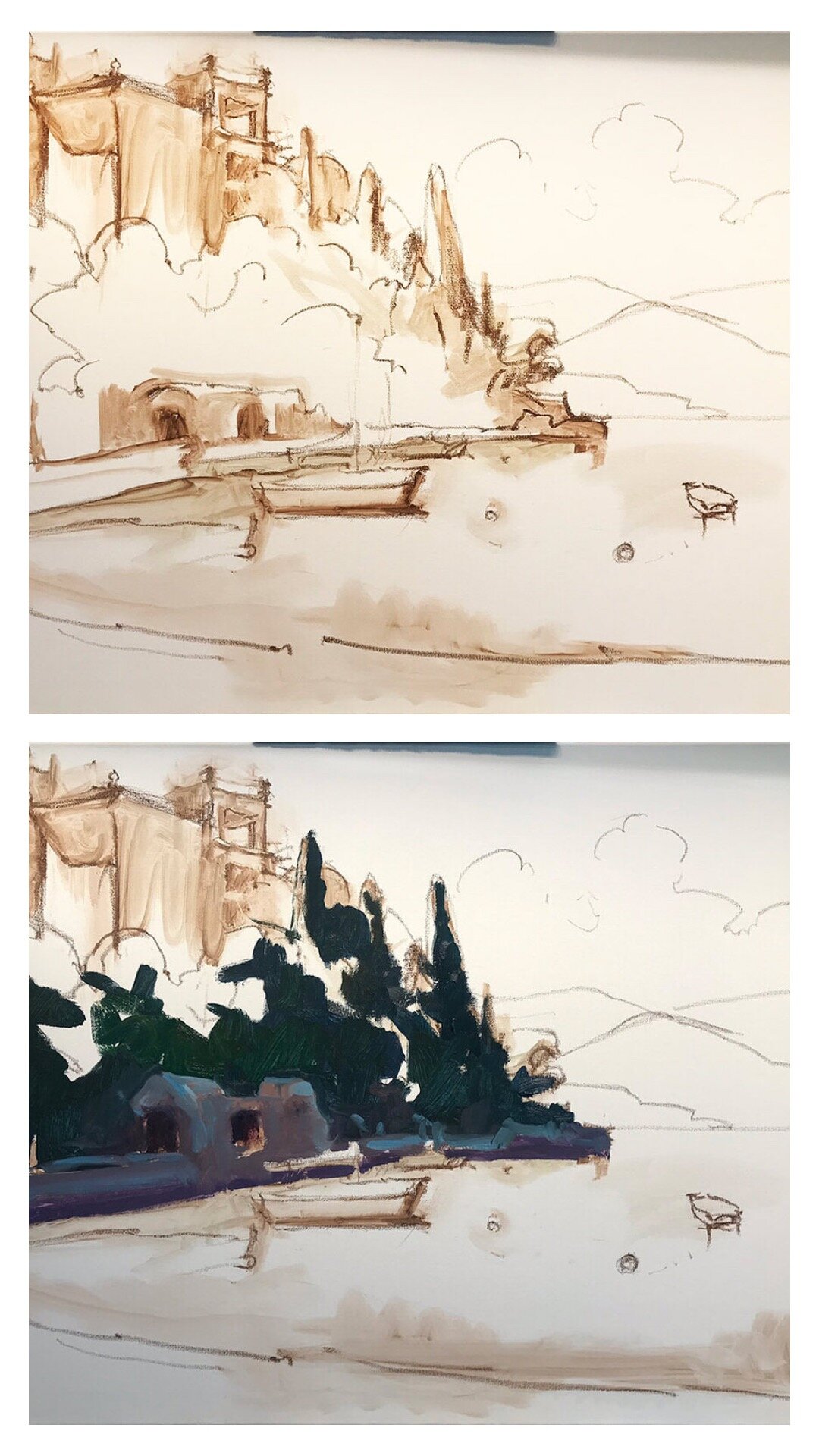
It’s time to address the rest of that white canvas by adding color to the lit side of the trees

varenna_demo_jenniferyoung

I also start addressing a few of the details of the foreground including boats and walkway to the town of Varenna.

varenna_demo_jenniferyoung

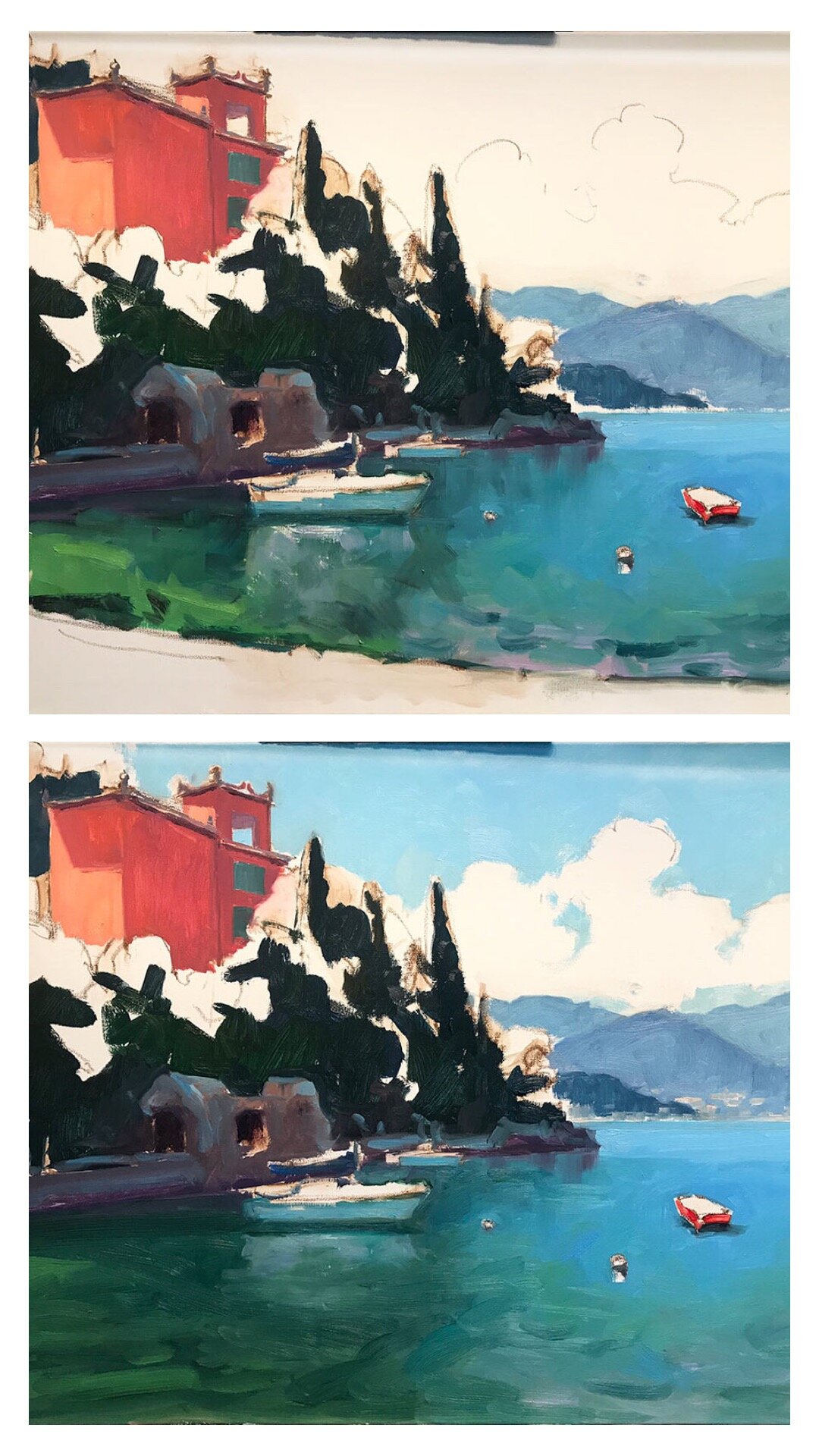
And finally (with a big caveat that this color is off because I was working on the painting at night and photographed it without the benefit of daylight) I start to address the masts, water, and clouds.

varenna8.jpg

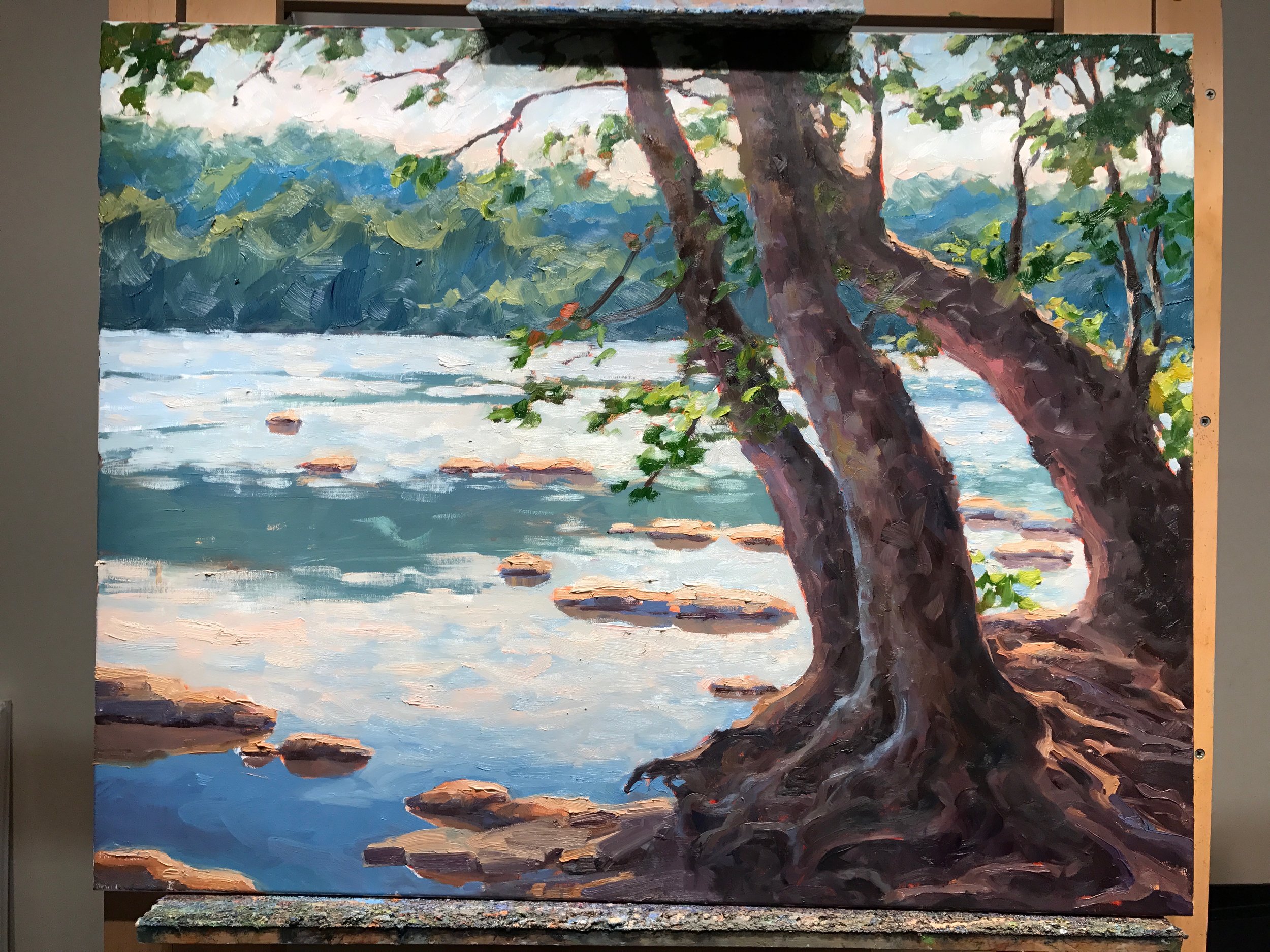
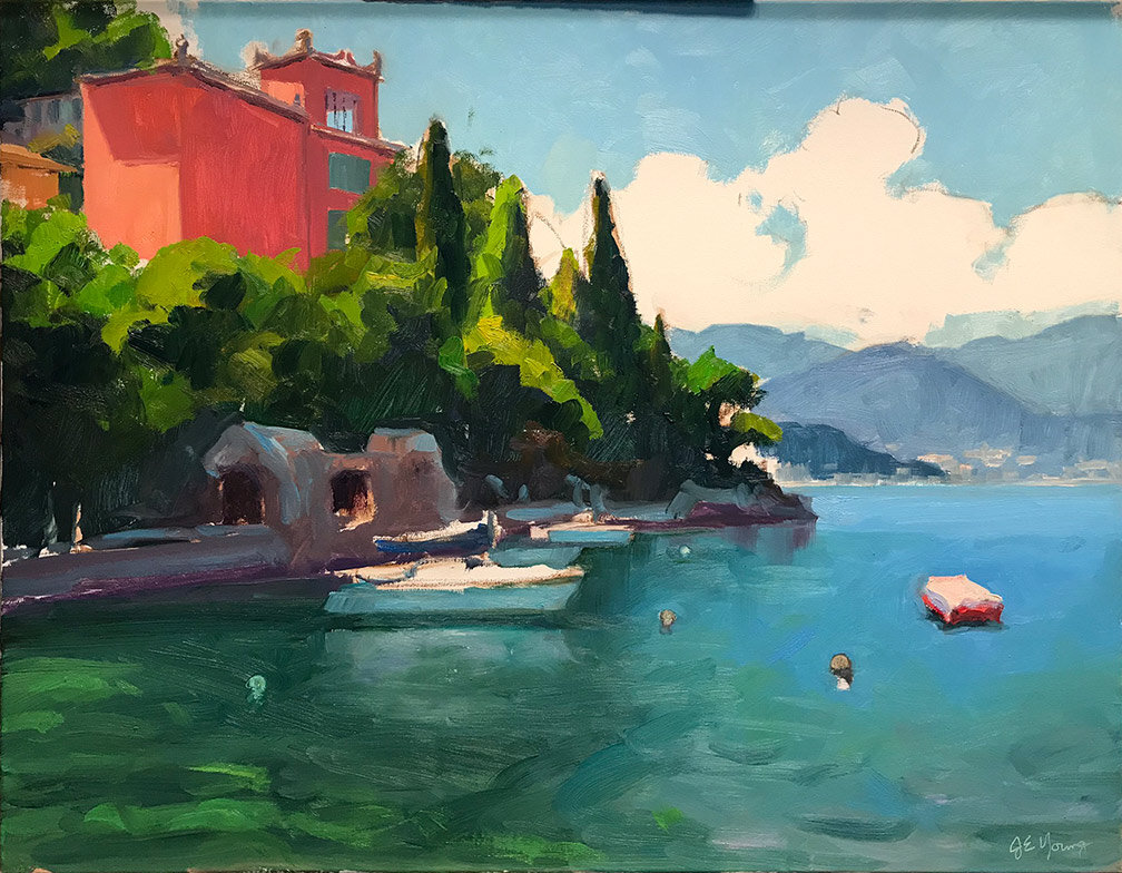
At this point I am going to sit with the painting for a day or two and may “tweak” it here and there, but I am close. I will post the finished piece, (photographed in better lighting) when I do. ***UPDATE*** See the final painting here.

Time struggles, plein air, and new calendar of events

This week has been a little crazy; two openings and a plein air event for me, theater rehearsals and school and sports for my daughter, and all of the regular stuff of life in between. But some version of crazy seems to be the norm for my schedule every week, and I am not alone.

While I was painting this week at Lewis Ginter Botanical Garden (more on that in a minute) I ran into an artist friend and we started talking about how disorganized we can sometimes feel and how guilty we feel about not being better at marketing to social media, to our newsletters, and yes, to our blogs. When time is crunched, the choice of whether to do any of the above or to paint always seems to result in painting as the clear winner.

It’s a frustration that I know a lot of other artists share, many of whom, like me, aren’t always masters of time management or organization. “I need a calendar of events on my website,” I said to my friend, “a quick and simple way for people to check in and see my upcoming shows and events. Maybe it would help me stay more organized too.” When I got home that afternoon, I checked out my site and lo and behold it does have that functionality. So viola! I now have a calendar!😃

If you check out the aforementioned calendar you can see that I have been spending the week painting at the botanical gardens as part of a promotion for National Public Gardens Week. Local artists who applied to paint during this week will submit their completed works for a chance to be juried in to an exhibit at Lewis Ginter that opens June 22nd.

Work in progress, 12x16”, painted during National Public Garden Week at Lewis Ginter Botanical Gardens

Work in progress, 12x16”, painted during National Public Garden Week at Lewis Ginter Botanical Gardens

I really like these kind of events because even though I regularly paint outside on my own, they get me out and focused and inspired. I enjoy seeing what other artists are doing and collecting new ideas on various artists setups and tools of the trade. It’s a very different vibe from the more formal events that are organized around competition. I have some friends who thrive on competition and use it as a means to drive themselves onward to bigger heights. For myself, it’s a little more stressful. I do the competitions from time to time and haven’t yet regretted it, but I am not that competitive by nature. So the more relaxed festivals that are really just a celebration of art and plein air painting are truly my jam.

Escape to Provence! A Step by Step Demo

Over Christmas break as everything was pretty brown and exceedingly soggy outside, I decided to mine my many photos of sunnier times from my trips abroad. I will never forget my trip to Lourmarin, painting and eating my way through this beautiful part of Provence. I still long to go back, and am determined to do so, hopefully this time sharing it’s magic with my daughter. In the meantime I can always revisit the experience through paintings. So let’s get started, shall we?

“Le Printemps, Temple de Lourmarin”, Oil on linen, 24x30” ©Jennifer E Young

“Le Printemps, Temple de Lourmarin”, Oil on linen, 24x30” ©Jennifer E Young

Above is the completed work, photographed outside for correct color and no glare! This Protestant Church, Le Temple de Lourmarin, is simple and austere on the inside but it has a wonderful exterior and adds a sense of history and tradition as it sits like a sentry at the edge of town. Click through on the final image to read more or purchase this piece.

Life in the Meadow; Start to Finish

Today I thought I'd share the  progressive steps for my newest painting of the beautiful Blue Ridge Mountains. (My usual disclaimers and apologies about the quality of these in-progress photos apply due to lighting conditions in my temporary work space.) This view is near the little B&B where we have stayed on a couple of occasions while visiting Bedford, Virginia.

I'm starting as usual with a sepia-toned sketch thinned with Gamsol to work out the main elements of my composition. This is very loose and general, but it helps me to determine placement. At this early stage I am not overly obsessed with exactness of the forms. Unlike with watercolor, in oil painting I like to carve and refine shapes as I go along. 

meadow1.jpg

In the next steps I concentrate on massing in areas in the shadow family. This doesn't take too long because in contrast to my prior painting of the Blue Ridge which was predominantly in shadow, this new painting is predominantly sunlit, with a light source that is nearly overhead.

work-in-progress-jenniferyoung

Next steps are massing in the meadow and the rest of the tree shapes, as well as the distant mountains

work-in-progress-Jenniferyoung

Followed by the sky

wip_jenniferyoung

With the canvas nearly covered I work out the finer details of my primary focal area (the horses). 

LifeintheMeadowDetail_jenniferyoung

At the final stages I add some suggestions of wildflowers to the field. I also add highlights and soften edges here and there, until I achieve the illusion of depth and light I'm after. 

Voila! The final: 

"Life in the Meadow", Oil on linen, 20x24" ©Jennifer Young

"Life in the Meadow", Oil on linen, 20x24" ©Jennifer Young

In Harmony

Last week as I was working on my latest James River painting, I ran into a little conudrum. So I decided to put the question out to my followers on my Facebook page to get some feedback. First, here's a few shots of the painting's progression.

The foreground was definitely what was holding most of my attention. Those roots and the light spilling over on the trees, was where it was at. That's fine, but my worry was that once the eye was finished there, it would exit the painting rather too quickly. So I experimented by adding a couple of birds in the middle distance, perhaps as a way to rest the eye before taking flight. I liked the idea, but I was a little worried that an additional element would split the focus or detract from the foreground too much. 

I knew which way I was leaning, but I thought it would be fun to put the question out there in Facebook land. The overwhelming feedback was YES to birds. So birds it is...simple ones, just shapes, really. It's been raining for days, so it's been really difficult to get a good shot of the completed painting, but finally, here it is!

"In Harmony" Oil on linen, 24x30" ©Jennifer E Young

"In Harmony" Oil on linen, 24x30" ©Jennifer E Young

This is another painting of the James River's Pony Pasture. I've done a couple of other small plein air studies of this exact view in the past, and have always wanted to do a larger one. I'm not sure why it took me so long to get around to it, but I'm glad I finally did. You can see more info, plus a couple of detail shots of the painting by clicking on the final image above.