Primrose and Irises

Here's a little celebration of the color violet :-) . I scaled up a bit for this still life. It's still not that big, but given I'm not yet painting these florals at a very fast clip, I felt the difference and it took me a little while to bring it to a conclusion.

"Primrose and Irises" Oil on Canvas, 20x16" © Jennifer E Young

"Primrose and Irises" Oil on Canvas, 20x16" © Jennifer E Young

I am learning to tackle the cut flowers first. Those babies shift and turn and then have the nerve to shrivel up on you long before you're ready to see them go! The irises are now things of the past, but the potted primrose is still going strong.

Still life shadow box

I mentioned in my last post that it's helpful to have some control over the lighting environment when painting the still life. A simple solution is to create a shadow box. This is not a new idea. If you google "still life shadow box", you can find lots of examples. I looked at a number of them, but given my tendency for being definitively un-handy when it comes to building things, I went for the low tech option as described by Lee A. Brown on his blog A Day Not Wasted. The only difference was that I didn't bother with the plastic corner moulding he mentions. Instead I found one of my favorite "building" supplies, some duct tape, (in black- SCORE!) when I was shopping for the foam core. Made this way, the box isn't indestructible, but it's sturdy enough since I don't really foresee needing to move it around all that much. The other difference in my box is that I made two windows for the light, one on top and one on the left side, which I can cover or uncover with the leftover scrap foam core, depending on which direction I want the light.  Here's what mine looks like:

Shadow box for still life painting

All of this is sitting on this Ikea kitchen cart on wheels, which I found on Craigslist for $10 (SCORE! again.) I'm only 5'4", so at my height, this cart brings my objects about as close to eye level as I can manage given the space I have to work with. I've gathered various boxes (gift boxes, jewelry boxes, etc. to help elevate my objects even further, and to provide some variety in the height I can achieve with various objects.  Here's a slightly different angle, with my last still life setup inside:

Still life setup

Still life setup

A simple large cardboard box, open on one end, and a shop light from Home Depot, is an even lower-tech version that would also work perfectly fine.

Still life...trying again

The last time I attempted a floral still life painting, it all went south. But, since I have been wanting to build a more regular practice of painting and drawing from life, and since it is nothing but brown and gray outside right now in Virginia (not to mention that I don't tolerate the cold too well) I decided not to let a little past  failure hold me back. And as they say, it's in the failures where we have great opportunity to learn and grow. It sounds a bit cliché but it's also actually true, especially if you don't let the failures wig you out. I have to admit, at first I did duke it out with the old psyche a bit, but upon reflection I realized that I really did learn a few lessons from my last effort. For one thing I learned that I didn't really set myself up for success to begin with. I basically walked in, put some flowers in a vase, set them on a table and went to it. How hard could it be? Wellll....

The first problem was that there is actually quite a lot that goes into setting up a nice still life. I figured since it had been a very long time I would keep it simple by focusing on just the flowers and a vase, and no other extraneous objects. Only extraneous objects were all around my prior "setup" (if you could call it that.) The utility sink was in the background, as well as pictures hanging on a wall, art supply bins nearby, etc.  It's not impossible to paint that stuff out, but it is pretty distracting.

Secondly, in my previous attempt, the lighting was completely flat and non directional. That's great for studio lighting in general, but it makes it harder to create form and good color without that definitive light and shadow. I felt like it was kind of akin to painting outside on a gray day.

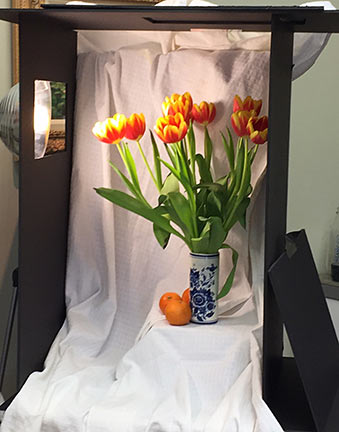
So the first order of business was to remedy these issues, and create an environment where I would be "set up" for success.  Once I found a solution to my setup issues (which I will share in my next post) I felt like I had more control.

Here's how it went down, in various stages:

Initial design in a wash of cobalt blue, burnt sienna, and chromatic black:

Still life floral painting demo by Jennifer E Young

Blocking in; shadows first, then midtones:

Still life floral painting demo by Jennifer E Young

Fleshing it out:

Still life floral painting demo by Jennifer E Young

And the final:

"Tulips and Mandarins" Oil on Linen, 14x11" ©Jennifer E Young

"Tulips and Mandarins" Oil on Linen, 14x11" ©Jennifer E Young

Illuminated

This was a bit of an experiment for me. I pushed the color and moved things about quite a bit, and worked in a much more impressionistic style. I played with layering color and working more with broken color to achieve the shimmering effect I was after. It's definitely more about expression than about straight on  realism.

"Illuminated" Oil on Linen, 24x30"  Jennifer Young

"Illuminated" Oil on Linen, 24x30"  Jennifer Young

This was in part because my photo reference was very washed out, yet I remember this time and place so much more vividly and with much more richness in color and brilliance.  I had painted a small study on site during a summer trip to Nelson County, Virginia, but couldn't finish it because the light of the setting sun changed so fast and quickly disappeared behind the trees and mountains.

I'm not sure if I will continue in this vein, but I feel as if I have learned something. Here it is in grayscale, which I actually might like a little better (LOL.)

It makes me want to experiment with it again, with a different color palette, to see what happens.

My studio featured on Houzz

A few weeks ago Houzz posted a discussion asking artists to share their hardworking studios. I participated in the forum with a few pics of my own studio space. A couple of weeks later an editor followed up with me directly and asked if I'd be interested in being included in another article. I was pretty flattered, and of course I said yes! If you are an artist looking for ideas for your own space, or even if you just enjoy looking at others' creative spaces, check out this article!

14 Home Studios That Nurture Creativity and Art