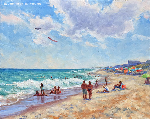
Summer by the Shore

As much as I love the dramatic light of a sunrise or sunset at the beach,  full-on sunshine makes me conjure up lazy days and summer vacations. So as I sent my wee-one off the kindergarten today I guess I can admit that I have been feeling a little nostalgic (already!) for those long duty-free days filled with sandcastle building,  sun and sand between my toes:

Outer banks beach landscape painting ©Jennifer E Young "Summer by the Shore" Water Miscible Oils on Linen, 16x20" To purchase, contact me!

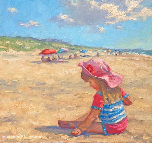
I had such a fun time with this one. It was almost a way of teleporting myself back to the beach. I especially enjoyed painting the figures. Here is a detail  of some of them:

summershore_detail

In fact, I had so much fun that I may even do another painting with just these two girls frolicking in the waves.

As I mentioned in my prior post, I am loving painting in the studio with water miscible oils. I will still work with traditional oils outdoors, mainly because I have quite a large supply of them in my stock. But gradually, in spite of some early struggles, I feel I am getting the hang of painting with the WS variety. I am loving that they are solvent and odor free, and have managed to work with them in a way that creates a lovely rich texture. This is helped greatly by my new Rosemary & Co. brushes, I might add. If you paint, do yourself a favor and check these out!

One of my struggles early on was that the water soluble oils weren't playing too well with my natural bristle brushes. Even after I realized that I shouldn't thin with water and wipe the water out of  my brushes thoroughly  between washing, my bristle brushes would get fairly flabby after a while. I really dislike synthetic brushes because they lack the spring and paint load abilities of a natural hair. Enter Ivory and Eclipse brushes by Rosemary & Co. These are synthetic brushes, but they behave much more like natural hair bristle brushes. Amazing! They really hold the paint and have just the right amount of spring in them. And the prices are quite reasonable as well. If I were to pick just one type ( though why would I want to do that?!) I'd go for the Ivory because they are more like the bristle brushes I normally paint with for my direct painting method. But the Eclipse, which are touted as a "synthetic mongoose" are really nice as well for finer details and soft edges. I really look forward to trying out some of the other styles as time and money allows. Meanwhile, I think I'll head back to the beach soon (by way of the easel!)

Sand Play

If you live in Richmond. Virginia and heard someone crying out in agonizing frustration this afternoon, it may have been me trying to bring this painting to a satisfactory conclusion.

painting of child at the beach by Jennifer E Young

"Sand Play" (NFS) Oil on Canvas, 12x12"

This was actually an experiment, and one of those "what would happen if..." paintings that I probably would have put unfinished in the "circular file". But my four year old daughter (who is the subject of this piece) saw it in progress.

"When I grow up to be a beautiful woman," she said, "I will give this painting to my little girl". (How cute is that?) Of course, after that, I had to finish it. I may add a little touch or two, but it is more or less done. When my daughter saw the final, she squealed with delight and said, "Thank you Mommy!" That made it all totally worth it! (And now the neighborhood can enjoy their Labor Day weekend in peace.)

Present day fun, plus a blast from the past

So this is a bit of a shameless plug for my husband Dave's band, "The Unknown Favorites", which was featured on "Virginia Currents" last week. The show is produced by our local Public Television station here in Richmond, WCVE. What my blog readers may not know is that I also appeared on Viginia Currents about 10 years ago, when I was still doing my large figurative paintings, and the producers included a clip of that show within the feature about the band. I had no idea they were going to air the clip of my segment when I tuned in to watch the band. It had been quite a while since I'd seen it, and it was fun to see it again, and to see my humble (and dark!) little backyard studio that I was working in at the time. One thing I remember is that I was very nervous, and had at times found myself struggling for the right words to express myself. So that's my disclaimer! I had only just started painting landscapes at that time, and while the focus was on my figurative paintings, they show a few of those early pieces on the segment as well. The landscapes definitely were not my forte back then. Just goes to show that if you apply yourself and work hard at your craft, you can improve (at least, I hope I think I've improved. I hope you think so too!)

Here's  the video. The band shows up about 13 1/2 minutes into the show (after the Economist).

Virginia Currents #2013 from Community Idea Stations on Vimeo.

Here's a direct link, in case you can't see the video above: http://ideastations.org/node/7526

Bathers on the James

I've taken two more two more plein air trips down to the James River of late, and this piece, done near Belle Isle is the result of the first. This is a study done alongside a painting buddy of mine, from the vantage point of the Civil War museum park, looking up at the CSX railway tracks.

plein air painting of the James River Richmond VA 

 "Bathers on the James" (study) Oil on Panel, 9x12"

With angle of the light and the architecture of the bridge, I didn't get much further than a study. But I feel that this scene is destined to become a larger, more developed piece at some point soon. Initially I was attracted to light of early evening as it slanted across the track footings and bounced in the water's reflections. But as we were setting up, groups of  bathers descended on the scene. What luck. I knew there were lots of swimmers in the evenings nearby on Belle Isle, but I didn't realize how many people have come to use this part of the park (right across from the Civil War Museum) after work. Even though in this painting I merely suggest just a few of the figures (and they are barely there- only about an inch and a half high) in life they had a much greater presence and gave a very dreamlike quality to the scene before me. Everything happened so fast, so I just did what I could to try and catch the light and overall structure of scene, not getting caught up in the details but committing them to my memory. It seemed like just as soon as the bathers appeared, they disappeared into the ethers (right along with the fading light.)  I've already returned to the same spot at the same time in order to take photos in hopes that I can do these bathers justice in a larger work.

French market painting #2

Here is something of a companion piece to the other Cahors market painting I posted a couple of days ago:

French market oil painting by Jennifer Young

"Legumes du Jour" Oil on Linen, 20x16"

sold!

For both this painting and the previous market painting I have again experimented with a single primary palette of just 3 colors (red, yellow, and blue) plus white. I don't normally use a huge palette any way, but sometimes I feel I can become over-reliant on certain colors. Using a very limited palette helps me to feel as if I am taking back in control of my color mixing and really forces me to think more about color relationships. It also pretty much ensures more unified color. My three primaries for these two paintings were cadmium yellow pale, cadmium red medium, and ultramarine blue, and the white was titanium.

Upcoming Events

Just a quick note to share a couple of upcoming art events. First, I am very excited to learn that I was one of 24 artists selected to participate in the The Paint Annapolis 2009 juried competition in September. Longtime blog readers may recall that I went up and participated in just the quick draw portion last year. But this year will be my first time as a juried participant in a week-long event of this size. The entry juror was the very talented painter Scott Burdick, whose work, his portraits particular, I've long admired. Second, I've been invited to be a featured artist with painter Hilarie Lambert in an upcoming show at City Art Gallery in Greenville, NC. The show will feature works from our European travels, and opens on August 6th. Here is one of my new paintings I've done for the show:

 french market painting by Jennifer Young

"Market Price" Oil on linen, 16x20" sold

One of my favorite parts of my trip last year (okay, I have a LOT of favorite parts!) was visiting the incredible market in Cahors. It was a true French market with all the goods--meat, veggies, cheeses, flowers, oils, soaps, and linens--and none of the tourist tchotchkes that you can see in some of the European markets of the well-traveled cities.

I painted a flower stand in this market en plein air, but this is an alternate view from the same day. The flower stand is in the distance, beyond what you see in the foreground- a stand of sausages (saucissons- pronounced somewhat like SO-SEE-SAW). I'm not a meat-eater now, but once upon a time I tasted some country French sausages like these. They were very rich, but pretty darn tasty at the time. I've lost my taste for it now, but it's still fun to say "saucissons"!

Sunset on the Sound

I did bring my watercolors with me on our recent anniversary trip to Cape Hatteras, but I really didn't do much in the way of painting, save for this quick and light-hearted attempt below (done when we were sitting on the beach).  It just wasn't that kind of trip.

 watercolor of the Outer Banks, North Carolina

In fact, I even forgot to bring my camera, which is a real rarity for me! In a way it was a shame, because the B& B where we stayed had a fantastic vantage point on the sound, and provided us with some of the most beautiful sunsets we'd seen in a while. In another way, taking a real vacation to just "be", without feeling the need to work, was quite nice and very relaxing (though, believe me, there were times when the views were so compelling that the pull was strong!)

Our room had a view, so we'd sit on our balcony each evening and watch the sun set. I never tire of doing this. You can watch the setting sun from the same spot each evening and yet each time the experience is unique. It's the best show in town, and the sky seems to delight itself in its endless variations.

In the end, it's just as well that I left the camera at home, because the large majority of my amateur snapshots fail to capture the depth of color and the subtler transitions from sky to water. If not painting on the spot, the next best thing is to just sit and observe and to try and commit what I see to memory as best I can. So that's what I did. Once we got home, I painted this little watercolor from memory:

Watercolor landscape painting of the Outer Banks at sunset

"Sunset on the Sound" Watercolor, 7x10"

sold

More alla prima portraits

Following up on my previous post about the Rob Liberace's portrait workshop, I thought I'd start this entry by posting my painting from day 2 of the class. This was a very different model from the one who sat for us on the first day:

alla prima portrait study by Jennifer Young

Portrait study- "The Captain", Oil, 20x16"

I heard quite a few people calling this gentleman the Captain, but I'm not sure if they were doing so because he actually was a captain, or just looked like one! In any event, he was a riot and really seemed to get a kick out of sitting for us. He was an excellent model, able to stay still for an extraordinary amount of time (which he attributed to the fact that he was a long-time turkey hunter.)

I got a little further along with this portrait than I had done on the first day, though I think I had a bit of a handicap to overcome. I had toned this canvas rather too dark. Prior to the class we were sent instructions to tone our canvases in acrylic to a middle value gray. I'm ususally pretty good with my value judgements, but I'd not used acrylics in a long time and they seemed to dry darker than I had expected them to.

This ground had me feeling like I had to do a good deal of extra work to get rid of it so that I could acheive the fair complexion and hair of this gentleman. Normally the middle value gray would be a nice gauge  for judging mid tones, but with this model's coloration especially, the darker than mid gray tone was just not helpful.

This next portrait below was actually not done in the workshop, but comes from a session last week after I returned back home. I met up with a local portrait group that meets weekly here in Richmond. I have actually wanted to meet up with this group for quite a while but for some reason the mid-week evening sessions have not jived with my schedule. Any way, this is Joey:

alla prima portrait study by Jennifer Young

"Joey" (portrait study), 16x12, oil on linen

Since I knew we'd only have this model for a 3 hour segment of time, I thought I'd make it a little easier on myself by choosing a smaller canvas (toned in a light wash of burnt umber, on the spot). As it turned out, I didn't get much farther with my level of finish; which is too bad because Joey had on a great oversized black leather jacket and was holding a guitar.

Nevertheless, I think this is my favorite alla prima portrait so far, as I was very happy with the likeness I was able to acheive. I went about it in the same manner as the two previous studies, using same palette as I'd used in the portrait workshop. But this one just seemed to "click" a little better. Even though that electric blue could use some toning down around his jawline, I like what's happening with the color sense and the brushwork.

I'm missing the portrait group's meeting this week because I'm going to the Shins concert (woo hoo!) but I intend to keep up with them on as regular a basis as I am able. Whether or not I ever "do anything" formally with portraiture, I've made it my goal because I'm convinced that the challenge of working from the live model will improve my abilities to render and to see light and color more accurately overall.

Alla prima portrait study

In my previous post I mentioned an out of town trip last weekend. I was over in Colonial Beach VA pursuing one of my main 2009 goals (exploring the figure) by taking another class with painter/portrait artist Robert Liberace. This class was a 2 day workshop on alla prima portrait painting. Since this is the way I am accustomed to painting with my landscapes (particularly smaller works and those done en plein air) I was really drawn to the class. Rob is as enthusiastic and energetic as I remember him to be from my first class with him in figure drawing last semester at the Art League School. I am continually enthralled by his masterful demos, and I found it interesting that the process he set forth for this style of portraiture was very similar to the method I use to paint my landscapes.

The palette we used, however, was quite a bit different and more expansive than what I typically use for my landscapes; burnt umber, cad yellow light, followed by several reds, several blues, two violets and a couple of greens. He also used two different kinds of white, Titanium (a very strong, bright white) and Lead White (the most opaque of the whites.)

Rob began with an imprimatura (toning) in burnt umber on Ampersand panel, and a very quick and sketchy (though amazingly accurate) grisaile. From there he then built his way to layers of color from shadow to midtone, halftone and finally highlights. Of course he made it look so easy, but I soon found out otherwise!

The model I painted on this first day was a very stunning young lady who looked to be about 15 or 16. Turns out she was actually only 12. I think for her age and energy level she did exceedly well sitting for us, and it was a real visual treat to paint her. By the luck of the draw, I found myself setting up in a spot that put the model in complete profile. I'm not normally overly excited with profile views. In fact I find them boring. But the model had a great hairdo and a nice twist to her torso that actually enlivened my view and made it fun to paint:

portrait study by Jennifer Young

She was wearing a great red satin dress in the Asian style, which went well with her beautiful golden skintone and almond shaped eyes. Unfortunately in the remaining time we had left to work (after Rob's excellent demo) I got none of the dress, save for a brief outline. I did take a photo of her though, in case I decide to work more on the painting. But most times I leave my workshop studies as is, to serve as a reminder of what I learned and in what areas I still need to grow.

In any case, I  learned a lot from this first sitting. First of all, just as in plein air painting, it's important to get your drawing down accurately and commit to your big idea as soon as possible. While the lighting in a portrait studio doesn't change the way the natural light does en plein air, what does change incrementally is the model. It's really hard for a model to get the exact same pose and facial expression after a break. And it's also really hard to hold a pose for any length of time (especially if you happen to be 12 years old!) So while it's tempting to jump right in to color, Rob wanted us to spend a good deal of time first developing a strong grisaille and really fleshing out the portrait in it's proper porportion, placement, light, shadow, and halftone-- BEFORE putting down the first dab of color.

Another very important thing I learned once I moved beyond the grisaille had to do with painting children. As in landscape painting, it is oh so very easy to overdo it by getting lost in details. It's an interesting dance; because while you want to accurately record what you see, too much unnecessary detail can detract from the character of the subject and weaken the overall painting. At about an hour into my painting I was well into color, painting in every shadow I could possibly see on the model's face. I knew the likeness in her profile was pretty accurate, but still  I wasn't getting her character--her "glow".

Then Rob came by and said, "You're aging her." Taking my brush, with literally two sweeping strokes he pulled some of the middle skintone I had put down on her upper cheek and quickly swept it downward, blending away almost all of the shadow work I'd done around her mouth and nose, leaving only part of the cheekbone shadow and the shadow work I'd done under her jaw. I just stood there and chuckled. It was like one of those "miracle line eraser" wrinkle ads you see on the Internet.

"You just took 10 years off of her, " I said. Ah, if only it were that easy in real life!

p.s. The above 20x16" study was after about 2 to 2 1/2 hrs. of work. The sketch in the upper right corner of the canvas was a hands-on instructive from Rob early on, because the initial lines of my grisaille around the eyes were too juicy and lacked definition.

Elka in charcoal and conte

Even though my drawing class is over, my work with the figure continues, as I can find the time and opportunity. Last week time and opportunity converged, and I met with some other artists locally for a portrait session. This is Elka:

portrait charcoal drawing

Elka sat for us for about 3 hours (with breaks in between.) This isn't the first attempt at drawing her. My previous session was a complete and utterly disasterous oil painting (a "wiper"). This time around, I decided to revert back to drawing, and work on perfecting those skills before taking on figure painting. This piece is about 11x14" on a tinted Canson pastel paper (charcoal with white conte highlights.)

For this second session, Elka dressed up in 20's garb. I must admit that when I got the word she'd be dressed this way I wasn't that excited (probably another reason I only brought my drawing materials instead of my paints.) I don't know why. I guess I imagined her showing up in some kind of goofy costume or something and I wasn't really in the mood for doing anything that felt too much like fantasy.

But as it turned out, she showed up very tastefully dressed, and the hat actually really made it for me. Her pearl necklace also gave her a nice prop to do something with her hand so that she wouldn't just be sitting there staring. I didn't get a chance to develop the pearls, (which was a real bummer because that would've been fun) but even so I feel that I got a good likeness, and I am pleasantly surprised and happy with this drawing.

Elka is a very pretty girl--prettier than I've been able to render her. A very strange thing I've noticed is that I am less interested in drawing the pretty models and more attracted to drawing people I'd normally not think of as "beautiful" (at first glance). I think the traditionally pretty people have less appeal to me sometimes because they have features that are too small and/or too symmetrical. It's surely my own predjudice, but it feels like a greater effort for me to find the "character" of the person, and for this reason, I tend to exaggerate the curve of the nose or the arch of the brow or what have you. And then I've had experiences with models who may not be pretty (to me) or "perfect" in the traditional sense, but by the end of the session I'm filled with awe at their beauty and the uniqueness of them.

Ideally I hope to have that kind of feeling about all of the models I draw, and for that matter, all of the subjects I choose, whether landscape, figure or still life, and to render them accurately but also with my own artistic style and vision. But I guess it is natural to approach some things with greater preference and enthusiasm than others, and in the end, I can usually get to that feeling place as long as I can approach the subject with an open mind. I think I eventually got there with Elka- in spite of her great fault--that she was just too darned pretty ;-)

Small figure studies

I haven't written in a while about my return back to the exploration of the figure, but it has been going relatively well. The weekly class I've taken with Robert Liberace has been wonderful, but I must say that the 1.5 + hour commute (each way) has been a little bit of a challenge, and unfortunately I had to miss a class or two in the semester because my car broke down. (That's one of the drawbacks of taking an out of town class--you can't exactly catch a ride if your transportation source goes south!) So while I've felt a little bit disjointed with my schedule glitch, what I've also discovered is that my time in class flies by very quickly, and that my execution with drawing the figure from life is still relatively slow.

figure study ink gesture

Rob did some amazing demonstrations during the course of each class, and I often felt torn about whether I should watch the demos for the duration or work on my own drawings. I tried to acheive a balance of the two as best I could, but since my time with Rob was rather limited (and I can hang out with myself most any time), watching Rob's demos often won out. As a result I've ended up with rather a lot of "beginnings," and nothing from this class really has the feeling of a finished work.

watercolor portrait study

But that is the nature of  learning, I think. And whenever  I teach my own workshops I always try to emphasize to students that in a learning environment, the goal of finishing or making a "framable product" should be subordinate to learning and experiementation.

I took a decent amount of figure drawing in college, so I don't consider myself to be a novice. But I'll say without equivocation that this class was definitely experimental for me. In fact, since it's been such a long time since I've done much if any life drawing, in hindsight I might have been slightly cavalier by signing up for this class. Rob has a lot of devoted followers and it became clear to me early on that many of his students (talented in their own right and some also teachers themselves) were quite familiar both with Rob's teachings and with life drawing in general.

I probably would have done well to have first gained a level of comfort by taking an entire semester of a more basic class in just one or two drawing mediums-- charcoal and chalk, for instance-- to really develop my drawing.  The class was called something like "exploring the figure," which is a hint that it was the next stage beyond just fundamentals. And while all along the way we learned about correct proportion and developing mass and form, there was a little more emphasis in this class on exploring different mediums from drawing to painting, which added a whole new level of learning to an already complicated subject.

figurative painting portrait study watercolor

But neither my car breakdowns nor my cavalier course selection was enough to detract from the class as a whole, thanks wholly to the instructor. I found Rob to be an incredibly energetic, enthusiastic, and helpful instructor. Most of all I found him to be so very inspirational. Beyond his masterful technical acuity, he displays an incredibly beautiful sensitivity and true artistry in his work. So in many ways,  I am glad to have taken this particular class; because not only did it enable me to see the range he is able to acheive in his own work, but I also could see hints and clues about what is possible for myself.

grisaille portrait study Jennifer Young

*Note, scattered throughout this post are a few of my studies from the class. All are pretty small--ranging from 4x6" to 8x10". The small gestural studies (short poses from 3 to 7 minutes) were done in sepia ink. The two subsequent pieces were watercolor, and the final piece was a grisaille on linen, done on the last day of class.

Too cold for plein air...? So I'll write about it instead!

Note: This post picks up on a conversation that started in the comments section of my post from a couple of days ago about painting outside in "the elements"....or not. My first plein air painting experience was a disaster. In fact, I don't think I was really won over with the whole idea of painting on location until about the 5th time out. It took many more outings than that, however, before I created anything I considered to be remotely approaching a "success".

There were definitely days when I found myself wondering why I bothered with it at all. Even now that I really love plein air painting, I still find I don't do it as often as I would like. It is certainly a lot easier to paint in a nice cozy studio at any time of day or night without having to haul a bunch of gear around. It's a hassle. You have to deal with bugs, sunburn, wind, rain, or the freezing cold. In some cases you also have to deal with constant interruptions from passers-by (from dogs to people to timed sprinklers coming on unexpectedly to boats parking right in front of your view!)

But even with all of that, there is something exhilarating about it. It can often be the best sweaty, bug-bitten, exhausting, driven, compelling, and highly focused couple of hours I've ever spent. And even in the "wipers" or those that end up in the "circular file" there was often enough of an element-- maybe just a square inch or two-- that hinted at some special understanding and called me forward. In short, there was something this experience was teaching me that I wasn't getting by working in the studio alone.

In order to really enjoy my plein air painting experiences I think I first had to finally let go of the need for a particular outcome. Of course ultimately I want to become a better painter! But just as I'm trying to do now with my life-drawing, I gained the greatest benefit from this practice when I finally started viewing it in terms of what I could learn rather than what I could produce. The shift in perspective helped, because what I found from nearly the beginning was that whatever the immediate outcome, these experiences helped to inform and improve my knowledge and understanding overall, including the work I did in the studio.

Since my work is based on the natural world, there is no better reference than nature herself; and one of the main benefits of plein air painting for me is that I am painting from life.  Plein air painting isn't the only way to achieve that of course. I can also set up a still life  or do some figure drawing and painting (which is one reason why I've gotten back into life drawing myself this winter when I can't seem to get myself outside in the cold for more than 5 minutes!)

But the difference with plein air is that not only are you dealing with painting your response to a "live" subject, you are also having to concern yourself with the changing light and many other things that move and change and can't be controlled the way you can do in the studio environment. It's limiting, but not in a bad way. It pushes you to think about simplifying and making the bold statement without having to articulate every little detail, and doing so with a great deal of accuracy at the same time.

That is not to say that by their nature all plein air paintings are "better" than studio paintings. I'm sure anyone who has spent time looking at landscape paintings has probably seen a good deal of strong AND weak paintings produced by both methods. Ultimately, a painting has to stand on its own.

Both methods have their advantages and their limitations, which is why I like to "mix it up". In some respects the two practices could be compared to short-pose gesture drawing vs. longer, more studied sittings done in life drawing. In either case, I'm sharpening my skills of sight and understanding, but using different muscle groups, so to speak. Hopefully with regular practice the dexterity and skill will grow. That's not all there is to art. To be sure, it's not art without individual creativity and expression. But skill and dexterity in the execution sure make it a lot easier for me to better articulate my creative vision.

p.s. I've just gotten word that I've been chosen to participate in the "Painting North Carolina!" plein air invitational sponsored by the Germanton Gallery. The event runs from March 29 through April 2nd, with a reception on April 3rd. Looks like I may have to get outside soon, cold weather or not, to get some practice in before the event!

Reclining nude II- WIP

I started this drawing on Friday in Robert Liberace's "Exploring the Figure" drawing class at the Art League School:

reclining nude figurative drawing by Jennifer Young

The upper portion is the least resolved so far, but the whole drawing is to be developed further by a kind of push/pull method of adding and subtracting layers of charcoal, followed by highlights in white conte chalk.

Rob started the class with a beautiful demonstration inspired by the techniques of a 19th century French academic artist named Pierre Paul Prud'hon. I had not heard much about this artist, but enjoyed seeing the exquisite reproductions that Rob shared by way of this book:

Rob made particular note of the way in which Prud'hon defined form, and his unique method of shading and highlighting. As this article by artist Rebecca Alzofon  explains very well, Prud'hon had a unique method of shading--in part by creating hatch lines that followed the direction of the form, then stumping and hatching again in a similar manner with highlighting chalks. So in our class, our challenge (should we choose to accept it) is to experiment with working in a similar manner from our model. From my understanding we will work on the same pose for another two or 3 sessions.

In Rob's demonstration he used a Canson gray tinted paper (at about a value #4) which worked well, as it created a light-mid value to contrast with highlighting with white Conte. I again found myself without the proper materials to perform the task. I must have gotten an incomplete or outdated supplies list or something, but all I had was an off-white Rives BFK paper, with which I just made-do by shading with vine charcoal to give me somewhat of a "tone".  I'm not sure at this point how far I can continue developing the current drawing or if it will produce the desired effect. At some point I may just start again with the proper paper, but I'd like to at least take this a little further to see what more I can do.

It has occurred to me that this method of very refined drawing is somewhat more polished than what I'm normally drawn to. Even in the Prud'hon reproductions in the book, I found myself lingering in the passages  of his drawings that were less "finished" and showed more gesture, more of the decision making process, and more of the hand of the artist.

In my own drawing, I notice myself secretly wanting to stop before I lose too much of the gesture. This is probably because in my landscape painting I've set a goal for myself to find ways of stating things more simply...to say "more with less", so to speak and to do it a bit more loosely. At the same time, the whole reason I signed up for this class is to experiment and maybe even learn something new in the process! You can't do that if you are too beholden to your own agenda.

I've been reading a great little book right now by George Leonard called Mastery: The Keys to Success and Long-Term Fulfillment. Leonard is an aikido master so a lot of his analogies in the book are drawn from the martial arts and Zen philosophy. According to the author, one of the keys of mastery is entitled "Surrender":

"The courage of a master is measured by his or her willingness to surrender. This means surrendering to your teacher and to the demands of your discipline. It also means surrendering your own hard-won proficiency from time to time in order to reach a higher or different level of proficiency."

Hmmm. I suspect it probably also means surrendering your own agenda from time to time as well.

Frayssinet Village painting- WIP resolved

I have been doing a TON of painting lately!! Unfortunately the painting I'm speaking of involves latex paint and a roller rather than the oil on canvas variety. The good news though is that I'm getting steps closer to finishing the new studio. (I'll post new pics of the paint colors I've chosen soon, once I've finished painting and had a chance to clean up the debris.) The other bit of good news (to me) is that I carved out a bit of time to steal away to my temporary studio space/closet to finish the French village painting I was working on a short while ago. This is yet another painting I will likely try and re-shoot when conditions are better (Note: Mission accomplished!). The color is definitely truer, but the details are lost. (I know I'm sounding like a broken record about my photography woes, but it's a significant frustration that I completely underestimated when I was planning my "interim" period between moves from old studio to new.  I like to get good photos, both high and low res.,  of whatever I paint. It's one reason why I'm not doing the weekly updates to my website that I'm normally accustomed to (in addition to the fact that I'm just not painting as much due to the current construction project.) But since we're dealing with a lot of ice/sleet/rain here in Virginia with  no chance of photographing this outside, I'll quit my whining and post what I have:

vibrant landscape painting French village by Jennifer Young

"Light and Shadow, Frayssinet, France" Oil on Canvas, 24x30" Sold!

As you can see if you compare this to my last version, the main edits were in the focal area concerning the figure. I also decided to shed a considerable number of years from my little lady (if only I could do that in real life.) Grandma looked so tired walking up that hill, so I let her granddaughter take the trek. LOL.

I now consider this painting pretty much resolved to my satisfaction. Thanks to those of you who chimed in on my soliciations for the last round of edits. Whether it's obvious or not, I feel that I took all of your thoughts into consideration, while still holding on to my original intent for the piece. 

By the way, this is the village where I stayed last year during my "artist's retreat" in France, and where I've planned to hold my own retreat/workshop for June. The gateway to the right leads to the courtyard of Le Vieux Couvent, and you can see part of a building on the left (behind the irises.) Sadly, I am now at a point where I'm considering cancelling this trip...or at least postponing until the economy improves. We'll see. More on that when I know more.

A beautiful day!

I don't much write about "politics" on this blog (if that's even what you'd call it?) but I couldn't let this momentous day pass without noting my own sense of joy and national pride as we prepare to inaugurate Barack Obama  to the presidency. A big part of me wishes that I could have been there in person on this historic day, in spite of the mobs of people, and in spite of the fact that I will likely see more of the actual inauguration on TV than I would do on the ground. As it is, I'll be celebrating by drawing (as one of my nephews would say) "nekked people" ;-) . I'm attempting to make good on one of my artistic goals this year by working more from life and tackling the challenge of the human form. To get started, I've enrolled in weekly class up in Alexandria, VA studying under the very fine classical figurative painter/portraitist Robert Liberace. Liberace is making a name for himself and he's  been featured a few times in American Artist magazine and other publications.

This class is a big one. Not surprisingly he's a popular teacher and in prior years students were lined up outside the Art League School for a chance to enroll in his drawing and painting classes. In light of that the school has expanded his class size to accomodate two classrooms full of students. So at this point I'm not too sure how much face time I'll really get with the instructor. Outside of the first demonstration, I didn't see him much in our room on the first day of class. But I'm hoping this will change as we all settle in to a routine, so that I'll at least be able get more of his input if even indirectly, by watching him interacting with other students my classroom.

Having said that, it was inspiring to watch our instructor's elegant handling of his drawing. I wish I had thought to get a picture of his demo with my camera phone, but I'll try for it next time. Meanwhile, here's one of my first efforts in life drawing in a verrrry long while. Boy did I feel rusty! I'm posting this drawing not because I think it's great, (actually, it looks pretty tentative, like a cave-man drawing compared to the masterful sketch of my teacher!) But I wanted to mark a starting point to track my progress (hopefully) as I go along.

  life drawing by Jennifer Young

How not to succeed at your goals while really trying ;-)

Happy New Year everyone! This past week, I've taken some time to reflect on the common practice of new year goal-setting, and I've enjoyed browsing around the blogosphere to see what others (and particularly other artists) are writing about the subject. Actually artist Katherine Tyrrell has made this task easy for me with the  great series of year end roundup posts she's provided on her blog Making a Mark--  the topics of which extend far beyond goal-setting (though there is a good deal of that too, including Katherine's own set of goals for the new year.) *Note of thanks to Katherine for foot-noting my blog posts on studio lighting in her "art studios in 2009" subsection of "Who's Made a Mark This Week". For myself, unlike previous years I am taking my time and being a bit more reflective about goal setting. Obviously there is value to goal-setting --otherwise there wouldn't be so many people finding satisfaction in doing it. But why is it that so often goal- setting fails to achieve the desired results? I think that in the past I've sometimes been guilty of goal-setting just for the sake of getting things accomplished, without really examining whether the goals are really worthy ones. Taking this approach  leaves me feeling either unfulfilled even if things get "done" or disappointed  because I didn't accomplish more. It also keeps me so in the mode of wanting to "get there already" that I don't enjoy the process nearly as well. 

So in thinking about how to set more meaningful goals for myself, I've also been thinking about why goal-setting so often doesn't satisfy. There are any number of reasons, of course, but here's a shortlist that I've come up against.

How not to succeed at your goals while really trying:

  • Don't ask "WHY?" Why do I want (or think I want) to do, be, have, or achieve this?  What do I hope to gain? How will this improve my life, my work, or the lives of others? These seem like  obvious questions, but without asking these essential questions first, it's easy to find yourself pursuing goals that aren't meaningful, and sometimes aren't even yours! (see bullet #2) In a nutshell, asking the essential "Why?" helps to get to the heart of what is driving you. 
  •  Set goals that deep down you don't really care about just because you think you should or because others think you should. For an artist, these might include things like setting a goal to get work into a gallery or earn a certain dollar amount from your art, for fear that failing to do so will mean you will be perceived as "unsuccessful". Or setting a goal to paint in a certain manner  or by a certain method because you feel others think it is a more legitimate form or method than some other one. Mind you, none of these are wrong choices as long as they support what you want deep down. But here's a tip; if there are a lot of "shoulds" in your goals, that's worth examining before you commit to them, to see if they really serve you. Otherwise, setting these kinds of goals can often set you up for feelings of "failure". If your heart isn't really in it all the way, you're likely to go for it halfway or not at all. 
  •  Be unrealistic- It's been my personal experience that my trouble has not been the size of the goal, but the timeline I set to achieve it. Setting far greater goals than you can possibly achieve in a given timeline creates more stress than inspiration.
  • Set goals that aren't challenging enough- Being realistic about time and/or resources doesn't mean  you should feel bored. If your goal leaves you feeling flat-lined, are you really going to be inspired to devote the time needed to go for it? In order to motivate myself, my goal has to be beyond my comfort zone. I want any goal I set this year to make my heart go pitter-patter. It should inspire, excite, ignite and sometimes maybe even feel a little scary.
  • Be over-expansive. It has taken me a number of years to get this, (41 to be exact) but I think (I hope) I am finally learning that setting too many goals in a given time-period is not only hard to manage in terms of time, but it also splits my focus too much. I'm finding it's better for me to limit myself to fewer more meaningful goals in order to really give them the proper attention required.   This doesn't mean that I won't break the big stuff down into smaller milestones, but the milestones and activities should support one of my main goals, not set me off in 100 different directions.
  • Set goals without making a plan to go about it.  It does me no good whatsoever to set even meaningful goals without breaking them down into plans of action. In order to track progress, a high level goal could then be broken down into:
    • milestones along the way (these should be measurable)
    • activities needed to reach those milestones
    • a schedule  to carry out those activities (monthly and weekly schedules are good, but for me it has to be daily).
  • Lack balance- This is a very personal matter. Some people do just fine with letting other matters drop for a while in order to hyper-focus on achieving one goal. Not so with me. I'm already an "uber-focuser" and unless I intentionally set goals that address all important aspects of my life, I miss out on fun stuff (like, oh,  sleep, proper diet and exercise, fulfilling relationships,  and time for fun, for instance!) And without those things in balance, soon there is no joy even in the things I dearly want to achieve artistically.

It's easy to jump into a litany of to-do's, but it may take a little longer to step back first and examine the big picture to see if your goals really speak to the greater vision you have for yourself. As I go through my own process I am finding I do have an overarching theme that I want to focus on this year in relationship to my art.

Back to school

Ideally this would include "real-time" instruction and mentoring, and I am hopeful I will be able to find the time and resources to pursue that. But after all, I have a ton of art books to keep me busy and they will help me to commit myself to a regular staple of study through experimentation, self-guided lessons, etc. *Note: For a fascinating and inspiring look at one artist's documented learning processes, check out Paul Foxton's wonderful info-packed site Learning to See.

Also, I love landscape painting and I will continue with this tract, but I'm feeling a great desire to become reacquainted with and develop a greater understanding of the human form. Along those lines, I will make a greater commitment to paint much more often from life--if not daily, nearly so.  Whether this means painting en plein air or still life or portraiture, (or even if it is a 5 minute sketch waiting for my haircut) I continue to see so much benefit to this practice and its time to commit to working from life as a regular discipline.

Obviously all of this will need to be worked out in greater detail into more specific goals and a measurable plan, but this is where I'm heading as for the year ahead. I guess if I had to boil everything down to one word I'd say that what it is I'm after is to achieve a greater level of mastery with my work.

Mastery

Now that's a big, expansive scary word if I ever saw one! And  while it's really too broad to write down as a year long goal,  it can be a guidepost by which my artistic goals can be set. It is said that it takes 10,000 hours to achieve mastery at something. Whether or not this is exact, what it tells me is that it's not something that's likely to be attained in a year!  It's not as if I'm starting from zero, but even so, in truth it may not even be attained in a lifetime, for that matter, even with a disciplined plan.

I do wonder though, as an artist, how do you really know you've arrived? Do you suddenly wake up one day and say, "I'm a master!" It seems a bit of a moving target. Each new level of understanding inevitably leads to new questions, new challenges, and raising the bar ever higher. To quote Gertrude Stein, "There is no there there."

To my mind, arriving really isn't the point. The way I see it, mastery has more to do with a state of being than a state of arriving. It's more about process than it is about product. It's a state of flow. Certainly there is tangible accomplishment produced as well, and I guess the accomplishment part is what we tend to focus on when we think of someone mastering something. But I really see those kinds of results as more of a by-product of something much greater. And yet, it is the by-products that are the most measurable so that's the starting point I'll use to make my plan.  Better get to it. 10000 hours is a long way off.

Summer Reading

My husband saw this little painting I did of our friends and said "Very Mary Cassat".  Sweet of him to say, and yes, I'd certainly aspire to paint like her! But I think the Cassat reference had more to do with my painting on the beach than anything else. I've often wanted to paint on the shore the way the Impressionists once did, but always felt somewhat restricted due to the total lack of shade and the sensitivity of my fair skin. This year, however, it has been possible because we've borrowed a large 12x12' canopy from our sister and brother-in-law. Otherwise I've had fried in my first 30 minutes on the beach!

The canopy allowed me to set up my easel and caputre this little vignette of our friends Esther and Carrie, engrossed in their summer reading:

figurative painting plein air coastal beach scene

"Summer Reading" Oil on Multimedia Artboard, 6x6" (NFS)

This painting was done on Multimedia Artboard. I painted straight on an unprimed surface, and I must say I prefer this surface primed with a layer of gesso for oils. While I was able to build the surface texture up after a bit, I found the board too absorbant without any gesso. Any way, after a bit, it was fun. I felt particularly good about the piece since Esther (the one with the dark hair) got up in the middle of the painting to go surfing.  She was a good sport, but still her vacation wouldn't suffer for my art.

New Richmond Gallery: Metrospace Gallery

Last Friday evening I had the opportunity to hang some of my figurative paintings at the soft-opening of a new gallery on Broad Street. My work hung on one wall and the other wall displayed the abstract paintings of Will Turner (alas, no link provided because his website isn't finished yet.) For those who are familiar with my landscape paintings, you will see that, aside from my love of vibrant color, my figurative paintings seem quite a departure. Below are the paintings included in this show. These are large works focusing on women, with strong psychological and narrative content. While I am steadily continuing to develop and grow as a landscape painter, I will also be developing some new works more closely aligned with these large figure paintings, perhaps moving away from the narrative and further into abstraction. We will see! For more information on these paintings please contact me.

Regarding Metro Space Gallery: This is a huge new gallery and event space located in the heart of the downtown First Fridays Art Walk. It isn't quite finished yet (they are finishing the floors today as I write this) but even in its austere state it is a beautiful new space. The gallery is located at 119 W. Broad Street, right next door to Metro Sound and Music (same owner). I am not a gallery spokesperson, but from what I could gather, I believe they are on target to open in September if not before.

Update 7/25/07: The paintings of mine that hung in this exhibition are now on display at Plant Zero in the exhibition hall near the event space. :-)

From figures to landscapes (and back again?)

From time to time I receive wonderful messages from students who have chosen my work as a focus for their school projects. Here is a recent message I received. My answer follows: I wanted to ask if you could tell me about yourself and your paintings. I am studying A-levels and I am doing a critical study on you. Could you please let me know how you got into drawing landscapes. I would appreciate it.

Thank you so much for your interest in my artwork! As to your question: In college and for some time thereafter I was developing a body of work that focused on the human figure. These paintings were heavily influenced by a number of sources in art history-- Frida Kahlo, Gustav Klimt, and the early renaissance paintings I had seen in Italy and the Netherlands:

figurative painting by jennifer young 
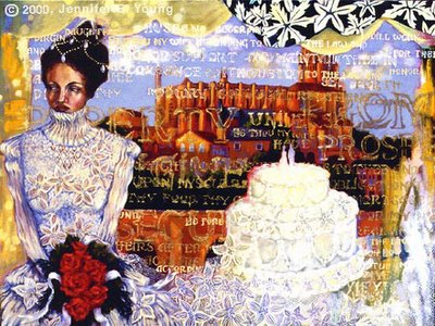
One of my favorites from this period "Faith", Oil on Canvas (sold)

So how did I go from that to landscape? Well, in college I held a double major of study in both painting and art history, so I was a lover of art of many different styles and from many different periods in history. I loved the impressionists and the post impressionists but impressionist landscape paintings were not much favored with my professors at the time. Professors at my school were much more attuned to paintings of either a nonobjective nature, or figurative paintings with deep psychological impact. So I developed the figurative paintings as my "serious body of work" and only dabbled in landscapes every now and then.   But eventually I found myself struggling more and more with the figure paintings. They were very large and some of them were filled with a lot of angst. One painting took weeks to complete. Emotionally they were often quite draining and my inspiration was slowing down. When my father died of pancreatic cancer all of the work I had been doing on those  paintings came to a complete halt. I began to question a lot of things, including whether I would ever do another painting. My heart just wasn't in it.   My husband naturally knew of my struggles and, knowing how much I had loved the landscapes of Monet, Sisley and many other impressionist painters, he bought me my very first outdoor easel. He also signed me up for a painting class so I could learn to paint on location outdoors. I loved it from the moment I tried it. I began painting again, and I finally allowed myself to follow my bliss and paint the landscape. After the death of my father I really wanted to do things that were more life affirming, that filled me with joy. I realized life is indeed so very short and I wanted to celebrate it in a way that had meaning for ME, without worrying about whether others found it artistically "important".   Painting the landscape was one of the ways I could honor that desire, and I have been painting them ever since. Nowadays I also enjoy experimenting with other kinds of painting, including abstraction, and sometimes even the human figure again. I believe that an artist has the right to explore it all, if that is her desire.   I hope this helps you with your project!

Older Work

I've been pretty busy getting ready for a show in Greenville, NC next week, so have not had much opportunity to upload new images to the website. I added a couple of new ones this morning though, and will add more as time and weather permits me to photograph them. Meanwhile, since I've mentioned my older work a couple of times, I thought I'd share a few of my older, very different paintings. I was heavily into symbolism and archetypes when I did these. Some of my influences were Chagall, Kahlo, the German expressionists, Klimt, Schiele, and others in the symbolist and figurative traditions. I also went bananas (and still do) over the early renaissance paintings I saw in Italy and Belgium. So, lots of imagery, and lots of "mood"! These pieces are all fairly large. I no longer display these on my official website, because they are so different from what I am doing now:

"Flora" (oil on gallery wrapped canvas, approx. 52" high x 36" wide). Those are bees flying out of her mouth. Represents spring renewal (possibly after a hard winter?)


"Abundance" (oil and gold metal leaf on gallery wrapped canvas, 36"h x 48"w). This is "Flora" after she gained some weight. Just kidding! Represents the abundance in life, fertility, nurturing, etc.


"The Fool" (oil on gallery wrapped canvas, 48"h x 36"w). This is based on the first card in the archetypical journey of the Tarot. Represents new beginnings, adventure, hopefulness, but tendencies toward being a bit fool hardy too (note, the parachute is not open!)


"The Night Sea Journey" (oil on gallery wrapped canvas, 48"h x 60"w). All about the dark night of the soul.


"The Marriage Contract" (oil on gallery wrapped canvas, 36"h x 48" w)


These kinds of paintings garnered some shows in places like Purdue University and the Hofstra museum. The photography isn't great so some are very dark (literally and figuratively, I guess!) There are a few more, but these give an idea of what I was doing before I started painting landscapes (you can see my current landscape work online at www.jenniferyoung.com).