A new thing-a-majig and a new painting

In the wake of the plein air weekend I wrote of in my last post, last week was mostly a recovery week for me. I did manage to get a new studio painting started, however. This is the initial tonal sketch on a 20x24" linen canvas.

Landscape painting tontal sketch by Jennifer E Young

This painting  may prove to be a challenge for me because much of this scene is in shadow. But there are a few pops of light that I am arranging in strategic places that I hope will carry the painting. Hey, you never know unless you try, right?

As with the other recent studio oils, I'm working with water miscible paints. One thing I'm noticing with these paints is that the paint blobs on my palette tend to gum up a little quicker once they are laid out, especially when I can't get back to the studio within a day. The manufacturer, Royal Talens recommends in their product info to mist the unused paints with a little water and cover  with foil to keep them moist and reduce the exposure to air. I have never liked putting plastic or foil directly on my paints though, because I feel that it wastes too much in the removal (yes I realize there is a bit of faulty logic in there but we all have our pet peeves).  So I'm experimenting with this:

What you are seeing is a basic 9x13" cake pan covered with a silicone doo-jobby that I found on Amazon. It is supposed to create an airtight seal, and the cake pan is deep enough that this cover-thing doesn't actually touch the paint. Whether it will be sufficient to keep the paint from oxidizing remains to be seen. I haven't been back at the easel since Saturday so I guess I will find out this morning when I go to work. I will report back with my findings, as well as an update on my progress with the painting, in an upcoming post.

Lessons from the workshop

I thought I'd share a few of the studies I worked on during the Matt Smith workshop I posted about earlier this week. I will first preface by saying that my haste in preparing for this class came back to haunt me, so while I was well prepared in terms of my art supplies, I misunderstood what I was supposed to bring in the way of reference materials. The support documentation said to bring plein air studies and/or photos, and for some reason I took that to mean that plein air studies were preferred (maybe I was just hooked on the idea of plein air!) I probably should have asked beforehand about this because I did feel a little puzzled when I was packing about referencing a small scale plein air to make another small scale painting. (I usually translate small plein airs to larger works in the studio, but the recommended canvas sizes were all under 12x16"). In any event, I packed a number of my plein air pieces for reference, and then as a total afterthought printed off a few of my photos "just in case."

After seeing one demo and hearing the discussion though, I realized the error of my ways. I talked to Matt about what I should work from and he said he would rather see what I could do with my photo references for this class. Matt did bring a number of his own photo references for people to use, but I really dislike using other people's references. Even though we are composing with light and form, I want references that reflect my real experience of having seen (and felt) a place.  So I did what I could with what I had, but I really wished I had brought a more extensive selection of my hundreds upon hundreds of photos I have in my personal archive.

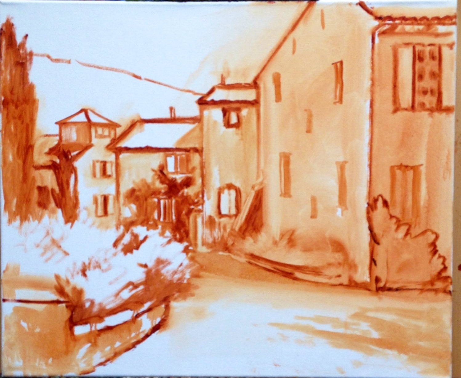
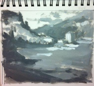
This  first painting is also the most incomplete:

poplars

In all of my paintings the common feedback from Matt was to take my brush and "knock back" some of my brushwork that competed with my statement or focal area. For instance, in this painting, our conversation went something like this:

MS:  "Is this painting about the light or shadows?" JY: "Well, I like the highlights on the edges of the poplar trees the best". And with that he took my brush and blended back the rather boisterous brushwork that was beginning to take shape in the shadow passages. MS: "You're giving equal weight to both." Next he mixed a bold tree highlight and swept it upwards on the edge of one of my poplar trees calligraphically, making the highlight really jump out. JY: "Ah, I see! But...I wouldn't just leave it like that...would I? It looks pretty unfinished." MS: "No, not necessarily. But you may restate and knock back several times before you get it right."

 I have such a love of brushwork, but it probably can work to my disadvantage sometimes. The hard part, I think, is figuring out what, exactly, is "right", and what is too little or too much. It's all about finding that balance, where active areas are juxtaposed with quiet passages. It's the quiet passages that play a supporting role and allow the more active ones to take center stage. To paraphrase something Matt said in one of his talks, it can't all be "important". Filter the noise and find the important elements.

I soon abandoned the first study, deciding to just keep that as an annotated lesson.  The second 8x10" painting below is more complete, and may look familiar to some long time blog readers. That is because I painted this scene before en plein air, and blogged about it here. The photo in the link is too dark overall but even so, I think this second study is much more infused with light. (So this exercise will be very helpful to me when I translate the concept to a larger painting, which I really am excited to do now! ) For the painting below, though,  I thought I'd try it again using just my photo reference and see what kind of feedback I could get, and whether it would look decidedly different as a result.

rooted2

I really loved the composition as it was, so it remains relatively the same in this second attempt. But in terms of paint application,  I got some helpful hands-on feedback from Matt again. Again he took my brush and knocked back the brushwork of the distant trees to make them sit back more and look less stylized.  Fair enough. He then demonstrated "opening up the shadows, using reflected light cast from nearby objects to cast color into the shadows. He put a touch of blue, for instance, on the shadow side of the tree trunks reflecting the water, and the warmer tones reflecting warmth from the stones or earth. That was awesome. After that he showed me how an assertive hand used to apply just a few intense highlights could suddenly make the painting pop. I reworked some of what he put in but played with those general ideas. But that rim light of his along the trunk and the 3 or 4 dabs of bright green paint on the tree leaves remain just as they were applied. (And don't they just sing?)

I felt I was finally getting somewhere on this final painting (below), though we had some helpful discussion early on about using perspective to direct the viewer to the focal point. He again knocked back the distant mountains with no paint, just several swift blending strokes (sigh.)  I don't consider this painting really finished either but I love the composition and I think I would like to try this again on a larger scale. It's the Dordogne as seen from the top of the Chateau de Beynac.

dordogne

I think overall his main critique of my work was that he wanted to see both more paint and a more deliberate, assertive handling of paint. And it's really hard to do the latter without the former. As he put it, you need to have enough paint there so that it expresses the character of the medium. Otherwise you need to ask yourself, "Why are you painting in oils?"

The class was listed as an intermediate-advanced class and I felt the instruction and the students lived up to that. I left the class pretty exhausted but with a lot to think about on my 6 hour drive back home. It will be interesting to see how I can apply Matt's feedback and insights to my work, while still making my paintings "mine". Once or twice the feedback was hard, but I soon realized, as with any class, it's important to leave your ego at the door and come with an open mind if you really want to learn.
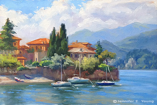
Studies

I'm baaaack. And I'm kicking off my return to blogging with a new Varenna study. I actually hesitate to call this a study, given the amount of time it took. I guess a month away from painting has left me feeling a litle rusty and slow! In any case, this painting will serve as a preliminary study for a larger piece.

Landscape painting of Lake Como Italy by Jennifer Young Varenna Study Oil on canvas, 6"x9" Contact me for more info.

We have had rounds of winter sickness followed by school closings due to snow, so with my foray back into painting being twarted quite a bit, I had the thought to develop a number of small scale studies of some larger painting ideas that  I've been wanting to tackle. I'll be painting some of these to scale up to my larger sizes. For example this 6x9" piece will scale up to 24x36".

I've painted various views of this harbor a few times now, which you can see herehere, and here. I guess you can tell I am enamored with this particular view of this  lovely Italian lake town! This composition emphasizes the strong horizontal of the walled town jutting out onto the lake, contrasted by the verticals of the buildings and tall cypresses.

While I almost always sketch out my composition on paper before I tackle a canvas, I usually leave the painted study for when I am out in the field painting from life. In fact, I have painted lots of studies and lots of larger scale studio pieces and quite a bit in between. Not all small paintings warrant a big statement, but I haven't been all that great about developing my viable studies into larger, more fleshed out studio concepts.  My schedule has been so sporadic for such a long time now, and with not much chance of an end in sight, I really feel like I need to have a more methodical  approach to my work habits. I am hoping that by tightening up my studio practices a bit, I might find more equilibrium when I do get a chance to enter the studio, and I will waste less time and feel less at a loss about what I am going to tackle next.

Well, nothing informs like experience, and since these small ones can presumably be completed in a fraction of the time, (ahem!) I thought it was worthwhile to have a go at a few of them, done, specifically with larger paintings in mind. I will also mine some of my other small works, in particular the plein air pieces I've done, as I think a number of them have potential for further development. I have worked from a number of them here and there, but I think there is more potential (especially in my James River series) and it could be something fun to do during these cold winter months when I'm not getting outside.

Ansouis/French village painting in the works

Note: I have gotten word that some users are having difficulties placing bids on my auctions. I believe I have fixed the issue now (the bid button was missing!) But if you have attempted to bid unsuccessfully, or if you are having any issues now, can you please contact me and let me know about your issue? Now, on to the new painting! Not a great photo here, but I'm doing a bit of mobile blogging and the image editing options on my phone aren't optimal. Nevertheless, I  thought I'd share the rough sketch I've started on a 20x24" canvas of a French provincial village street scene.  Even though I mapped out the composition more or less to scale in advance, it took a little more editing than usual  to get the layout the way I wanted it (the first pass had things too centered). France village painting sketch by Jennifer E Young

The plan for this painting is to portray a square in the center of the charming village of Ansouis. I have a busy next few days with family, but I hope to be able to get back to this soon. I'll post further developments as they unfold!

Pescallo Cafe (in progress)

Call us crazy, but we are seriously entertaining the idea of returning to Italy next year-- with a toddler along for the ride. I am not really certain where we will go or how this will work with me painting, us touring, and one of us being only 3 1/2, but the fact that we are seriously talking about it seems fairly miraculous in and of itself. Every time I go through my photos and sketches of past travels, I end up wanting to return to this region or that region, and I am no closer to settling on a destination than when we started talking about this trip last winter. And then there are the places we haven't even gotten to yet. Each part of Italy seems to have its own alluring qualities, unique to themselves but quintessentially Italian.

Lake Como remains near the top of my list (so far) in terms of sheer beauty and aesthetic pleasure. It's not heavily endowed with art history or artifacts, (compared to, say, Rome, Florence, or Venice) but what it lacks in museums it makes up for in natural beauty and storybook enchantment.

This is a quick sketch of a composition I have been playing around with for a little while. It is of a little cafe set upon a pier in Pescallo. Not a great photo, but hopefully you get the general idea.

This was drawn to scale on my sketchpad so that when I "scale up" that there will not be a great distortion when I put it to canvas. There will still be some adjustments along the way, but by remaining in the same format, there shouldn't be any major surprises.

Here is the line composition drawn out in oil (burnt sienna) on canvas. I do some toning here to work out a value pattern, but it's not a 100% tonal drawing-- just enough to cement my concept in my mind and get me excited about the piece.

tonal sketch Lake Como cafe by Jennifer E. Young

Stay tuned for more to come soon as the painting progresses.

A spring commission

With the spring shows hung and the winter commission complete, I was thinking I would be able to turn next to some plein air painting, or perhaps to develop a couple of my James River plein air paintings into larger studio works. But that will have to wait, as I have gotten another commission! :-) But first, a couple of shots of the garden, which, when last photographed was in a state of sad dishevelment! The gardens around the studio really come into greater color in the summer. But with the rubbish cleared and weeds pulled, things are coming alive in the side garden with Creeping Jenny on the path, flanked by Mountian Bluets (Bachelor's Buttons) and creeping phlox. A flowering Dogwood makes a nice canopy, and the lilac in the fore is just starting to put off its heady scent.

20130427-063451.jpg Here's another shot below of the garden opposite the studio. In summer there are lilies, cone flowers, tall phlox and a butterfly bush. But my big thing lately is succulents. I love that they are water-wise and so marvelously sculptural. In the center is a succulent topiary I made last year. I will need to replenish a few of the tender plants that didn't survive our winter, but it hasn't been quite warm enough here to see much variety in the garden centers yet.

20130427-063539.jpg

Now that my daughter is a toddler, I can usually patch together enough time to noodle in the garden while she plays nearby. Working in the studio is a different story. At just 2 1/2 years old, her attention span is still pretty limited. So while she loves being in the studio, (and I love having her there,) I do have to shoo her out when it comes time to work, amidst howls of protest (and a certain amount of Mommy guilt as well).

...Which leads me to the commission! If you have been a reader for some time, this image might be familiar to you. In fact, I have painted variations of this scene a few times, beginning with the small painting done en plein air in the Blue Ridge mountains, and following with two larger 30x40 versions.

The commission came about as the result of my April show currently taking place at Design Domaine Gallery in Bernardsville, New Jersey. The client loved the painting "Morning Meadow" (click here to read my blog about this painting in the making) but it was much too large for her space. So my task is to recreate this scene in a 16x20 format.

Since a 30x40" painting doesn't exactly scale down to 16x20", we thought it best to start with a sketch of the new painting so that the client could have a visual idea of how it would look compositionally.

20130427-063621.jpg

While on the one hand, it may seem easier to recreate something I have basically already done a number of times, it can sometimes be a challenge to meet client expectations. Sometimes, though not always, a client may, for instance, expect the new painting to be exactly like the first, only smaller. So an effort always has to be made to explain in advance that as an original work of art, a painting can't be recreated stroke-for-stroke like the last.

The client does understand this, though she would like the color of the new piece to be as close as possible to the last. It was, after all, the combination of colors in Morning Meadow that she fell in love with.

Luckily, my prior blog post listed the exact color palette I used to create the larger piece! :) (I can't tell you how often I have referenced my own blog to get this kind of historical information.) So while I won't be able to remember exactly the combinations of color mixtures, I will be able to take some of the guesswork out of the process and use the same palette for this piece.

20130427-063635.jpg

Above is the sketch, reinterpreted onto canvas. At this point in sketch stage, I want to make sure I get an accurate placement for the various elements in the composition, so I've marked off in pencil the horizontal and vertical mid-points in the pencil sketch as well as on the painting to guide me. More to come in an upcoming post, where I will get into some color!

Lake Como W.I.P. & Demo

I mentioned in my last post that I had a new painting in the works, and I thought I'd attempt a little demo with this one. I say "attempt" because my laptop finally gave up the ghost, and these days I tend to do a lot of my writing via my mobile. Not only am I "all thumbs" (literally) but I have to sneak it in before my phone gets snatched away by the chubby little hands of my daughter who wants to "see pictures" whenever she sees it emerge from my pocket. This will be a painting of the beautiful fishing village of Pescallo. Pescallo is a tiny, sleepy  little place that sits just down the slope from Bellagio (also very beautiful). In fact, I could see Pescallo from the balcony of my Bellagio hotel, and the drama of the light as it poured over the mountains and harbor beckoned me to take a stroll down there many mornings before we started the day's touring.

I begin by sketching out a compositional plan that is also a value plan for the painting. I do this using light, middle, and dark value gray oil paints in my sketchbook. I often do a similar thing with Tombo pens (the grayscale ones), but mostly when I am painting outdoors as a way to quickly hone in and get a handle on my composition (in an environment that is bombarded with stimuli). But it is a good practice with studio work too. The oils are mentioned in Kevin Macpherson's book, "Landscape Painting Inside and Out," and I have long wanted to buy these paints so I could give it a try. They are Portland Gray Light, Medium, and Deep, by Gamblin. Hey, if it's good enough for "KMac", (as my husband calls him) it's good enough for me!

notan sketch

The point of this is to see if your painting has a strong underlying structure with a unifying value plan without getting bogged down in details. This is really supposed to be more of a notan sketch at this stage, which is a very simplified thing and addresses more of the armature of the painting rather than the pinpoint accuracy of objects and shapes. It's been a while since I've done this kind of study, and I realized at some point that I had not allowed much for the fourth value I was working with, which was the white of the paper. Oops! So I had to amend my sketch a little and add in some white for the lightest areas.

Still, I feel that my plan is solid and I'm ready to move forward by sketching out a line drawing on my 24x30" canvas.

oil sketch lake como painting by Jennifer Young

For this I am using burnt sienna (Winsor Newton), thinned with Gamsol mineral spirits. I don't much use this earth color in the rest of my painting stages, and while I could mix up  a good earth for such a job using my standard red, yellow, and blue, it is more of a convenience for me to use a premixed paint at this preliminary stage. I also like it because it lends a nice warm undertone to the canvas as I go along, and it doesn't bleed into my other colors (especially the light ones like the sky) when I move beyond the sketching stage.

Now that I have a plan, I am ready to start painting with color! I'll get into that in the next post .

In the works- Rooftops, St. Cirq La Popie

Just thought I'd do a quick post of what is currently on my easel. It's a 24x30" painting of  a location I visited on my last trip to France; St. Cirq La Popie. St. Cirq La Popie is probably one of the most storybook-pretty villages in France that I have yet seen. I am actually hoping to do a little plein air painting today during baby E's naptimes, so this will be brief. Let's hope the nap gods are with me!

France landscape St. Cirq La Popie


France landscape St. Cirq La Popie

Pigeonniere W.I.P.

I am short on time today, so this post will be short on words (rare, I know!) I do have pictures to share, however, of my current 20x24" painting on the easel. The plan is for this to be a larger, more developed version of the plein air piece I did in France (shown here) with more of the sky featured. Compositional sketch:

France painting work-in-progress by Jennifer Young

Tonal sketch:

France landscape painting in progress by Jennifer Young

Sky lay-in (first go):

France landscape painting in progress by Jennifer Young

Ground and shrubs lay-in:

France landscape oil painting by Jennifer Young

France landscape painting in progress by Jennifer Young

Now the fun begins! :-)

A small commission, with just weeks away...

Given how long it has been since I've posted anything new here at all, I am almost embarrassed to write another "yes I'm still here" post. But here goes! The baby is now less than a month away from her due date and I am finally feeling as if I have gotten our household in some kind of order to prepare for her arrival. Unfortunately, now that I'm getting a little respite from the baby books, the shower, the classes, and prepping the nursery, I am, in this final trimester, also feeling my least energetic and creative. In truth, I don't think I was prepared for just how exhausted I'd feel throughout the pregnancy. But now that I'm getting really big, I can't really seem to do any one thing for very long before I start to feel quite uncomfortable. So needless to say, painting has pretty much taken a back seat during most of my pregnancy, and it's hard to say when that will change to any great extent after the baby comes. However, I do have one new little piece to share. It's a small watercolor/pen and ink painting  (8x10" on 11x14" paper) that a client commissioned to commemorate her daughter's upcoming wedding:

watercolor tuscany painting by Jennifer E. Young, all rights reserved.

"Flavor of Fagiolari" Watercolor and Pen & Ink on Paper sold

The scene is of a B&B in the Chianti region, not far from where I myself have traveled a number of times. It's a special place to the betrothed because they met in Italy and stayed at Fagiolari during their travels through Tuscany together.

When I paint from photos, I prefer to work from my own references. I just have a much better feeling for the place if I, myself, have traveled and painted there, and my photos serve as a trigger to call forth those experiences. I also take several different viewpoints of a given scene, plus a number of details, so that I can have as much information as possible when I get to work. So it's always with a bit of reservation when I consider working from a client's photo, which is normally more of a one-off tourist snapshot.

But this commission was actually quite a joy for me. Not only was it great to be doing something in the painting realm again, but the photos provided were excellent. Having also traveled the area fairly extensively myself helped a good deal as well.  Plus I was given much leeway as to how I wanted to interpret them (the photos) and what I wanted to include, rather than being tied to making an exact, literal interpretation  (a.k.a. an illustration) of a scene.

What was most important to the client was that I caputre the "flavor" of the place (hence the painting's title). Luckily, the client was delighted with the finished piece, and I had a good time getting my hands back in some art-making to boot. I tend to feel somewhat more intimidated by watercolors (as opposed to oils) but given its manageable size and the properties of the medium, I was able to stop and start more easily than I can with oils. It's not without reason to think that maybe I can even attempt a few more before "D-day" (or make that B-day) but we'll see. The one thing I can say about my life this past year is that it is anything but predictable!

Sunset on the Sound

I did bring my watercolors with me on our recent anniversary trip to Cape Hatteras, but I really didn't do much in the way of painting, save for this quick and light-hearted attempt below (done when we were sitting on the beach).  It just wasn't that kind of trip.

 watercolor of the Outer Banks, North Carolina

In fact, I even forgot to bring my camera, which is a real rarity for me! In a way it was a shame, because the B& B where we stayed had a fantastic vantage point on the sound, and provided us with some of the most beautiful sunsets we'd seen in a while. In another way, taking a real vacation to just "be", without feeling the need to work, was quite nice and very relaxing (though, believe me, there were times when the views were so compelling that the pull was strong!)

Our room had a view, so we'd sit on our balcony each evening and watch the sun set. I never tire of doing this. You can watch the setting sun from the same spot each evening and yet each time the experience is unique. It's the best show in town, and the sky seems to delight itself in its endless variations.

In the end, it's just as well that I left the camera at home, because the large majority of my amateur snapshots fail to capture the depth of color and the subtler transitions from sky to water. If not painting on the spot, the next best thing is to just sit and observe and to try and commit what I see to memory as best I can. So that's what I did. Once we got home, I painted this little watercolor from memory:

Watercolor landscape painting of the Outer Banks at sunset

"Sunset on the Sound" Watercolor, 7x10"

sold

More alla prima portraits

Following up on my previous post about the Rob Liberace's portrait workshop, I thought I'd start this entry by posting my painting from day 2 of the class. This was a very different model from the one who sat for us on the first day:

alla prima portrait study by Jennifer Young

Portrait study- "The Captain", Oil, 20x16"

I heard quite a few people calling this gentleman the Captain, but I'm not sure if they were doing so because he actually was a captain, or just looked like one! In any event, he was a riot and really seemed to get a kick out of sitting for us. He was an excellent model, able to stay still for an extraordinary amount of time (which he attributed to the fact that he was a long-time turkey hunter.)

I got a little further along with this portrait than I had done on the first day, though I think I had a bit of a handicap to overcome. I had toned this canvas rather too dark. Prior to the class we were sent instructions to tone our canvases in acrylic to a middle value gray. I'm ususally pretty good with my value judgements, but I'd not used acrylics in a long time and they seemed to dry darker than I had expected them to.

This ground had me feeling like I had to do a good deal of extra work to get rid of it so that I could acheive the fair complexion and hair of this gentleman. Normally the middle value gray would be a nice gauge  for judging mid tones, but with this model's coloration especially, the darker than mid gray tone was just not helpful.

This next portrait below was actually not done in the workshop, but comes from a session last week after I returned back home. I met up with a local portrait group that meets weekly here in Richmond. I have actually wanted to meet up with this group for quite a while but for some reason the mid-week evening sessions have not jived with my schedule. Any way, this is Joey:

alla prima portrait study by Jennifer Young

"Joey" (portrait study), 16x12, oil on linen

Since I knew we'd only have this model for a 3 hour segment of time, I thought I'd make it a little easier on myself by choosing a smaller canvas (toned in a light wash of burnt umber, on the spot). As it turned out, I didn't get much farther with my level of finish; which is too bad because Joey had on a great oversized black leather jacket and was holding a guitar.

Nevertheless, I think this is my favorite alla prima portrait so far, as I was very happy with the likeness I was able to acheive. I went about it in the same manner as the two previous studies, using same palette as I'd used in the portrait workshop. But this one just seemed to "click" a little better. Even though that electric blue could use some toning down around his jawline, I like what's happening with the color sense and the brushwork.

I'm missing the portrait group's meeting this week because I'm going to the Shins concert (woo hoo!) but I intend to keep up with them on as regular a basis as I am able. Whether or not I ever "do anything" formally with portraiture, I've made it my goal because I'm convinced that the challenge of working from the live model will improve my abilities to render and to see light and color more accurately overall.

Alla prima portrait study

In my previous post I mentioned an out of town trip last weekend. I was over in Colonial Beach VA pursuing one of my main 2009 goals (exploring the figure) by taking another class with painter/portrait artist Robert Liberace. This class was a 2 day workshop on alla prima portrait painting. Since this is the way I am accustomed to painting with my landscapes (particularly smaller works and those done en plein air) I was really drawn to the class. Rob is as enthusiastic and energetic as I remember him to be from my first class with him in figure drawing last semester at the Art League School. I am continually enthralled by his masterful demos, and I found it interesting that the process he set forth for this style of portraiture was very similar to the method I use to paint my landscapes.

The palette we used, however, was quite a bit different and more expansive than what I typically use for my landscapes; burnt umber, cad yellow light, followed by several reds, several blues, two violets and a couple of greens. He also used two different kinds of white, Titanium (a very strong, bright white) and Lead White (the most opaque of the whites.)

Rob began with an imprimatura (toning) in burnt umber on Ampersand panel, and a very quick and sketchy (though amazingly accurate) grisaile. From there he then built his way to layers of color from shadow to midtone, halftone and finally highlights. Of course he made it look so easy, but I soon found out otherwise!

The model I painted on this first day was a very stunning young lady who looked to be about 15 or 16. Turns out she was actually only 12. I think for her age and energy level she did exceedly well sitting for us, and it was a real visual treat to paint her. By the luck of the draw, I found myself setting up in a spot that put the model in complete profile. I'm not normally overly excited with profile views. In fact I find them boring. But the model had a great hairdo and a nice twist to her torso that actually enlivened my view and made it fun to paint:

portrait study by Jennifer Young

She was wearing a great red satin dress in the Asian style, which went well with her beautiful golden skintone and almond shaped eyes. Unfortunately in the remaining time we had left to work (after Rob's excellent demo) I got none of the dress, save for a brief outline. I did take a photo of her though, in case I decide to work more on the painting. But most times I leave my workshop studies as is, to serve as a reminder of what I learned and in what areas I still need to grow.

In any case, I  learned a lot from this first sitting. First of all, just as in plein air painting, it's important to get your drawing down accurately and commit to your big idea as soon as possible. While the lighting in a portrait studio doesn't change the way the natural light does en plein air, what does change incrementally is the model. It's really hard for a model to get the exact same pose and facial expression after a break. And it's also really hard to hold a pose for any length of time (especially if you happen to be 12 years old!) So while it's tempting to jump right in to color, Rob wanted us to spend a good deal of time first developing a strong grisaille and really fleshing out the portrait in it's proper porportion, placement, light, shadow, and halftone-- BEFORE putting down the first dab of color.

Another very important thing I learned once I moved beyond the grisaille had to do with painting children. As in landscape painting, it is oh so very easy to overdo it by getting lost in details. It's an interesting dance; because while you want to accurately record what you see, too much unnecessary detail can detract from the character of the subject and weaken the overall painting. At about an hour into my painting I was well into color, painting in every shadow I could possibly see on the model's face. I knew the likeness in her profile was pretty accurate, but still  I wasn't getting her character--her "glow".

Then Rob came by and said, "You're aging her." Taking my brush, with literally two sweeping strokes he pulled some of the middle skintone I had put down on her upper cheek and quickly swept it downward, blending away almost all of the shadow work I'd done around her mouth and nose, leaving only part of the cheekbone shadow and the shadow work I'd done under her jaw. I just stood there and chuckled. It was like one of those "miracle line eraser" wrinkle ads you see on the Internet.

"You just took 10 years off of her, " I said. Ah, if only it were that easy in real life!

p.s. The above 20x16" study was after about 2 to 2 1/2 hrs. of work. The sketch in the upper right corner of the canvas was a hands-on instructive from Rob early on, because the initial lines of my grisaille around the eyes were too juicy and lacked definition.

Elka in charcoal and conte

Even though my drawing class is over, my work with the figure continues, as I can find the time and opportunity. Last week time and opportunity converged, and I met with some other artists locally for a portrait session. This is Elka:

portrait charcoal drawing

Elka sat for us for about 3 hours (with breaks in between.) This isn't the first attempt at drawing her. My previous session was a complete and utterly disasterous oil painting (a "wiper"). This time around, I decided to revert back to drawing, and work on perfecting those skills before taking on figure painting. This piece is about 11x14" on a tinted Canson pastel paper (charcoal with white conte highlights.)

For this second session, Elka dressed up in 20's garb. I must admit that when I got the word she'd be dressed this way I wasn't that excited (probably another reason I only brought my drawing materials instead of my paints.) I don't know why. I guess I imagined her showing up in some kind of goofy costume or something and I wasn't really in the mood for doing anything that felt too much like fantasy.

But as it turned out, she showed up very tastefully dressed, and the hat actually really made it for me. Her pearl necklace also gave her a nice prop to do something with her hand so that she wouldn't just be sitting there staring. I didn't get a chance to develop the pearls, (which was a real bummer because that would've been fun) but even so I feel that I got a good likeness, and I am pleasantly surprised and happy with this drawing.

Elka is a very pretty girl--prettier than I've been able to render her. A very strange thing I've noticed is that I am less interested in drawing the pretty models and more attracted to drawing people I'd normally not think of as "beautiful" (at first glance). I think the traditionally pretty people have less appeal to me sometimes because they have features that are too small and/or too symmetrical. It's surely my own predjudice, but it feels like a greater effort for me to find the "character" of the person, and for this reason, I tend to exaggerate the curve of the nose or the arch of the brow or what have you. And then I've had experiences with models who may not be pretty (to me) or "perfect" in the traditional sense, but by the end of the session I'm filled with awe at their beauty and the uniqueness of them.

Ideally I hope to have that kind of feeling about all of the models I draw, and for that matter, all of the subjects I choose, whether landscape, figure or still life, and to render them accurately but also with my own artistic style and vision. But I guess it is natural to approach some things with greater preference and enthusiasm than others, and in the end, I can usually get to that feeling place as long as I can approach the subject with an open mind. I think I eventually got there with Elka- in spite of her great fault--that she was just too darned pretty ;-)

French country garden painting WIP, cont'd

Now that my gardens are right outside my studio doors, I'm finding it far too easy to get distracted with gardening instead of painting--especially now that spring is here. I did do some more work on the painting of the garden passage in St. Cirq Lapopie started earlier in the week though, so I thought I'd continue to post the progression. It's almost there, but I will probably do a bit more work on it before it's all said and done:

France garden landscape oil painting

I've learned something from the last few oils I've done and I'll share it in case it may be of help to other painters. As odd as it seems, I am finding it is actually easier to manipulate the paint and have better effects with my edges if I use a lot more of it. I've never considered myself to be terribly stingy with paint to begin with, (and it may not be all that obvious in this picture,) but lately I've been laying it on pretty thickly and it's like, "Wow, that makes things so much easier!"

When I've taught workshops, I've definitely noticed a certain "stinginess" in beginning painters, both in terms of the amount of the paint colors they'll mix up on their palette, and in the application of the paint onto the canvas. This usually stems from just being uncertain, tentative, and maybe even a little intimidated. But what I try to get across is that in alla prima painting, they are actually creating a lot more work for themselves by mixing up flat little puddles of paint and using skinny, dabby little strokes.

There is a caveat, though (isn't there always when it comes to any kind of painting "rules"?) It helps to have a certain amount of confidence in your drawing and compositional skills if you're going to lay it on thickly (and in fact, this may be part of what's going on with beginners who are feeling tentative and intimidated). Otherwise when painting thickly, you may find yourself needing to do more scraping to make significant changes.

But over all for the kind of direct painting I'm doing, using a lot more paint is helping me to actually have better control AND keep it looser at the same time (if that makes any sense.) Manipulating thicker paint to soften edges and refine shapes does require a light touch though. You aren't moving it around to such an extent that you're smearing it or picking up too much of the underneath and surrounding paint layers. If you do that, there's a danger of having a mud-fest on your hands.

Garden painting, St. Cirq La Popie- WIP

For the last week I've been pretty much bowled over by the flu, so I haven't found my way back to blogging before now. Bronchitis still has its hold, so I'm confining my work to the studio for the time being and holding off on plein air painting until I don't tire quite so easily. Meanwhile, I took a quick snap of the start of my latest piece from French series on the Lot Valley:

 landscape painting wip france by Jennifer Young

I did a small watercolor study of this scene a while back during my studio construction, which made my compositional decisions a little easier with the oil. This is just the initial block in of a much larger piece (24x30"--about 3 hrs. work.) Today I'm working on adding more color and more finesse (though not too much or I'll lose the freshness.) More pics to follow.

Small figure studies

I haven't written in a while about my return back to the exploration of the figure, but it has been going relatively well. The weekly class I've taken with Robert Liberace has been wonderful, but I must say that the 1.5 + hour commute (each way) has been a little bit of a challenge, and unfortunately I had to miss a class or two in the semester because my car broke down. (That's one of the drawbacks of taking an out of town class--you can't exactly catch a ride if your transportation source goes south!) So while I've felt a little bit disjointed with my schedule glitch, what I've also discovered is that my time in class flies by very quickly, and that my execution with drawing the figure from life is still relatively slow.

figure study ink gesture

Rob did some amazing demonstrations during the course of each class, and I often felt torn about whether I should watch the demos for the duration or work on my own drawings. I tried to acheive a balance of the two as best I could, but since my time with Rob was rather limited (and I can hang out with myself most any time), watching Rob's demos often won out. As a result I've ended up with rather a lot of "beginnings," and nothing from this class really has the feeling of a finished work.

watercolor portrait study

But that is the nature of  learning, I think. And whenever  I teach my own workshops I always try to emphasize to students that in a learning environment, the goal of finishing or making a "framable product" should be subordinate to learning and experiementation.

I took a decent amount of figure drawing in college, so I don't consider myself to be a novice. But I'll say without equivocation that this class was definitely experimental for me. In fact, since it's been such a long time since I've done much if any life drawing, in hindsight I might have been slightly cavalier by signing up for this class. Rob has a lot of devoted followers and it became clear to me early on that many of his students (talented in their own right and some also teachers themselves) were quite familiar both with Rob's teachings and with life drawing in general.

I probably would have done well to have first gained a level of comfort by taking an entire semester of a more basic class in just one or two drawing mediums-- charcoal and chalk, for instance-- to really develop my drawing.  The class was called something like "exploring the figure," which is a hint that it was the next stage beyond just fundamentals. And while all along the way we learned about correct proportion and developing mass and form, there was a little more emphasis in this class on exploring different mediums from drawing to painting, which added a whole new level of learning to an already complicated subject.

figurative painting portrait study watercolor

But neither my car breakdowns nor my cavalier course selection was enough to detract from the class as a whole, thanks wholly to the instructor. I found Rob to be an incredibly energetic, enthusiastic, and helpful instructor. Most of all I found him to be so very inspirational. Beyond his masterful technical acuity, he displays an incredibly beautiful sensitivity and true artistry in his work. So in many ways,  I am glad to have taken this particular class; because not only did it enable me to see the range he is able to acheive in his own work, but I also could see hints and clues about what is possible for myself.

grisaille portrait study Jennifer Young

*Note, scattered throughout this post are a few of my studies from the class. All are pretty small--ranging from 4x6" to 8x10". The small gestural studies (short poses from 3 to 7 minutes) were done in sepia ink. The two subsequent pieces were watercolor, and the final piece was a grisaille on linen, done on the last day of class.

Creek study

After the blizzard we had last week, it was really nice (albeit a little bizarre) to have a day of sunshine and temperatures in the upper 70's on Monday. So I took advantage of it and went over to to our local Bryan Park to do a little painting. I had some other work to do in the morning, so by the time I got there I only had about an hour and a half to paint on site:

plein air landscape painting by Jennifer Young

This is a 12x9 oil on linen panel. The rocks were more of a challenge than I expected but it was a good exercise, and I plan to return to have another go at this scene to rework the composition and do a better job with some of the values. I also saw a few other spots in the park that interested me, and with it being so near my house, I will definitely return at different times of the day.

I'm still using a pretty limited palette both in the studio and en plein air. I have been experimenting lately with my red; trying to find ONE tube that can act as a substitute for the two or three tubes of red that I commonly use (alizarin crimson, permanent rose, and sometimes cadmium red light.) What I'd like to do is try and limit the number of tubes I bring outside to lighten my load and get better/faster at mixing my colors.

Alizarin crimson works pretty well to this end, but sometimes the color doesn't have the "punch" I'd like, expecially if I'm painting sunsets or flowers. On the other hand, it works well to mix deep purples, browns, and darker values in general. Permanent rose is great for that brighter punch, but then I'm challenged to use it for deeper values and still keep the color looking "red". I find cad. red light the most limiting of the bunch, though it works great for some things also.

To confuse matters even more, paint colors that go by the same name vary widely between manufacturers. Windsor & Newton's alizarin crimson is a bright, and relatively clean and versatile color, but it's permanance rating is listed as "B", moderately durable. Gamblin offers a "permanent alizarin", which has been my fall back, but it is a good deal duller and darker than W&N's, and tends to create a muddier color when tinted. So right now I am experimenting with a quinacridone red by Williamsburg Oil Paint company. This is a definte contender, though it is such a clean pure and strong color that it may require a little TOO much work to tone the mixtures down, which isn't exactly desirable in the field when the light changes so quickly. Quinacridones are also modern pigments and tend to be a lot more expensive than some of the other reds.

Any way, I'm still experimenting, but if you're an oil painter and have a solution or suggestion, I'd love to hear it. What red would you choose if you had to pick just one? I may stick with my old tried and true (permanent alizarin) and finish the color charts I started a long while ago to see if I can get a better handle on mixing it. But I'm open to other ideas. Artists, if you work with oils and have a suggestion, let me know, and be sure to identify the manufacturer you use as well as the color name.

French pastoral WIP and new studio sneak peek

Like everything else these last several months, it has taken longer than I expected to get myself set up in the new studio space. But I love how it has come along; and I'm happy to say that I am at least set up enough where I am working again. I must admit I feel a bit rusty with my painting. At least I've done a little bit of drawing during the chaos, so in that way I have been able to keep my hand in it, so to speak.  But for me, the discipline of painting is a bit like the discipline of physical exercise. It seems to take a while to get "in the flow", but it's oh so easy to get out of shape. (What's up with that?!) The only thing I know to do is just get started and work through the awkwardness.

I thought I'd start up again where I left off--by working on another studio painting based on a plein air study from my trip to the Dordogne. Here is the study:

french countryside plein air painting Jennifer Young

When I originally posted about this piece I called it a "Work-in-Progress", as it was my intention to finish it. But ultimately I would reap greater benefit from it by keeping it as a study. In misty, foggy scenes, the values are so close together and it can be a real challenge to achieve this effect. So even though this is not a "complete" piece, it had a lot of information for me to reference in terms of accurate values and edges captured on site.

Here is the larger piece (24x30") currently under way:

landscape painting of southern France by Jennifer Young

At this point I've kept everything pretty much as flat shapes and used very limited color, as I work out a general pattern and design. I'll need to keep adjusting the values as I know they are stronger than the study overall, but particularly in the middle distance. I also plan to use a lot more paint and more color variations, all the while keeping color subtle and the edges very soft. That's my aim, any way. It was challenging on a small scale and even more-so on a larger one! But I'm game. (I think!)

As for my other "WIP" (my new studio), I do have some more pics to share, as I've begun moving in setting up workstations. But I'll give my readers a break from "construction-speak" and save that for another post. Meanwhile, just a sneak peek at my painting area:

artist's studio setupÂ

Too cold for plein air...? So I'll write about it instead!

Note: This post picks up on a conversation that started in the comments section of my post from a couple of days ago about painting outside in "the elements"....or not. My first plein air painting experience was a disaster. In fact, I don't think I was really won over with the whole idea of painting on location until about the 5th time out. It took many more outings than that, however, before I created anything I considered to be remotely approaching a "success".

There were definitely days when I found myself wondering why I bothered with it at all. Even now that I really love plein air painting, I still find I don't do it as often as I would like. It is certainly a lot easier to paint in a nice cozy studio at any time of day or night without having to haul a bunch of gear around. It's a hassle. You have to deal with bugs, sunburn, wind, rain, or the freezing cold. In some cases you also have to deal with constant interruptions from passers-by (from dogs to people to timed sprinklers coming on unexpectedly to boats parking right in front of your view!)

But even with all of that, there is something exhilarating about it. It can often be the best sweaty, bug-bitten, exhausting, driven, compelling, and highly focused couple of hours I've ever spent. And even in the "wipers" or those that end up in the "circular file" there was often enough of an element-- maybe just a square inch or two-- that hinted at some special understanding and called me forward. In short, there was something this experience was teaching me that I wasn't getting by working in the studio alone.

In order to really enjoy my plein air painting experiences I think I first had to finally let go of the need for a particular outcome. Of course ultimately I want to become a better painter! But just as I'm trying to do now with my life-drawing, I gained the greatest benefit from this practice when I finally started viewing it in terms of what I could learn rather than what I could produce. The shift in perspective helped, because what I found from nearly the beginning was that whatever the immediate outcome, these experiences helped to inform and improve my knowledge and understanding overall, including the work I did in the studio.

Since my work is based on the natural world, there is no better reference than nature herself; and one of the main benefits of plein air painting for me is that I am painting from life.  Plein air painting isn't the only way to achieve that of course. I can also set up a still life  or do some figure drawing and painting (which is one reason why I've gotten back into life drawing myself this winter when I can't seem to get myself outside in the cold for more than 5 minutes!)

But the difference with plein air is that not only are you dealing with painting your response to a "live" subject, you are also having to concern yourself with the changing light and many other things that move and change and can't be controlled the way you can do in the studio environment. It's limiting, but not in a bad way. It pushes you to think about simplifying and making the bold statement without having to articulate every little detail, and doing so with a great deal of accuracy at the same time.

That is not to say that by their nature all plein air paintings are "better" than studio paintings. I'm sure anyone who has spent time looking at landscape paintings has probably seen a good deal of strong AND weak paintings produced by both methods. Ultimately, a painting has to stand on its own.

Both methods have their advantages and their limitations, which is why I like to "mix it up". In some respects the two practices could be compared to short-pose gesture drawing vs. longer, more studied sittings done in life drawing. In either case, I'm sharpening my skills of sight and understanding, but using different muscle groups, so to speak. Hopefully with regular practice the dexterity and skill will grow. That's not all there is to art. To be sure, it's not art without individual creativity and expression. But skill and dexterity in the execution sure make it a lot easier for me to better articulate my creative vision.

p.s. I've just gotten word that I've been chosen to participate in the "Painting North Carolina!" plein air invitational sponsored by the Germanton Gallery. The event runs from March 29 through April 2nd, with a reception on April 3rd. Looks like I may have to get outside soon, cold weather or not, to get some practice in before the event!