Plein Air Crush

This week I am coming down off of an exciting weekend in Floyd County, Virginia, where I participated in the inaugural plein air event called Plein Air Crush. In total there were about 19 artists participating over the course of the weekend, with judging and awards taking place on Sunday. This year the event centered around Chateau Morrisette Winery, which has some interesting architectural features, lovely gardens and vineyards, not to mention a fine restaurant and some pretty tasty wine. It sounds luxurious doesn't it? But keep in mind I was not doing much sipping. Instead I was schlepping; schlepping a bunch of art gear and standing for hours, out in the elements. It was hard on the body but rewarding for the spirit, and I had a good time painting the new-to-me scenery and meeting other artists.

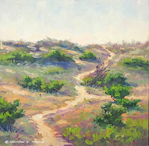
We converged on Friday evening for a little meet and greet, but the painting portion of the event kicked off on Saturday, where we faced the threat of rain and some pretty dark skies. Painting in these conditions is really challenging because the value range is very limited and the light fairly flat. So I decided to set up in the vineyard where I found opportunities for some strong linear elements and soft edges that provided interesting compositional options:

 Plein air vineyard landscape painting by Jennifer E Young 
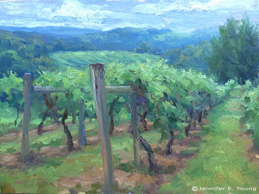
"Vineyard in Gray Light", oil on panel, 9x12"

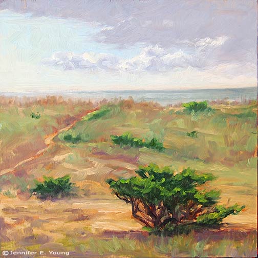
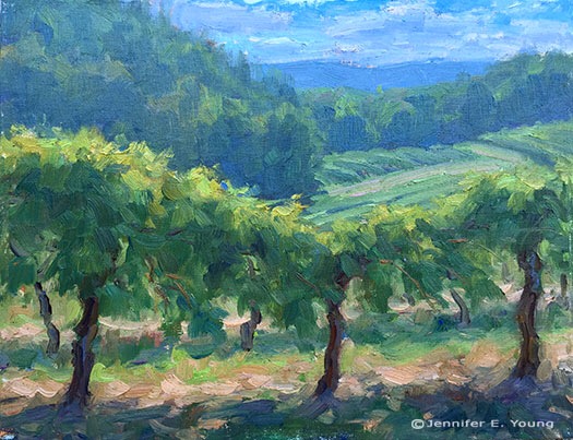
In the afternoon I decided to venture a little further afield to paint a view of Buffalo Mountain: Buffalo Mountain plein air landscape painting by Jennifer E Young "Buffalo Mountain View", oil on linen, 8x8"

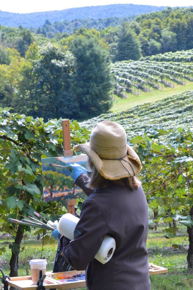
Sunday was the quick draw. It was incredibly windy. Worse than clouds and rain, wind conditions are a nearly impossible situation for the plein air painter because of the danger of having your entire setup topple and/or take flight.  The wind at the winery required that most painters seek a shelterd place unless they had a good way of weighting their setup (which I didn't).

Down at the vineyard though it was much warmer and virtually windless. I hadn't really planned on doing another vineyard piece but I figured it was my best option for success when we had a time limit.

Plein Air landscape painting of Chateau Morrisette vineyard by Jennifer E Young "Sunlit Vines", oil on linen, 9x12"

Plein air painter Jennifer E Young

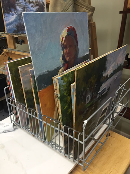
We had three hours for the quick draw (which is actually pretty generous). At the alotted time we had to deliver our quick draw painting and the other works we had completed during the event and set up for judging. Steve Doherty, artist and editor of Plein Air Magazine was the judge. I didn't win any awards but it was cool to meet him and I learned a lot about my painting, and even a bit about myself as well.

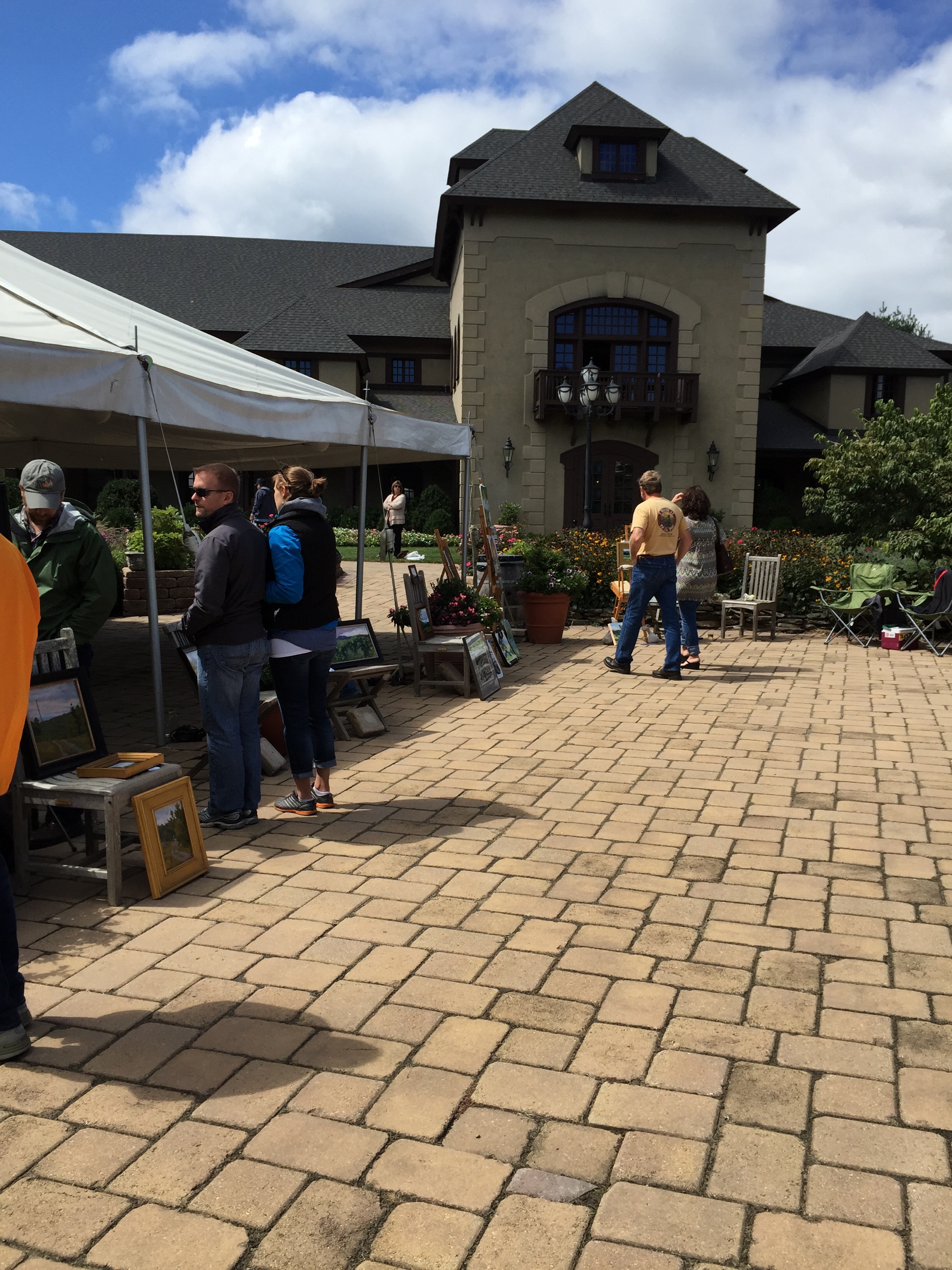
Setting up for the judgement back up at the winery

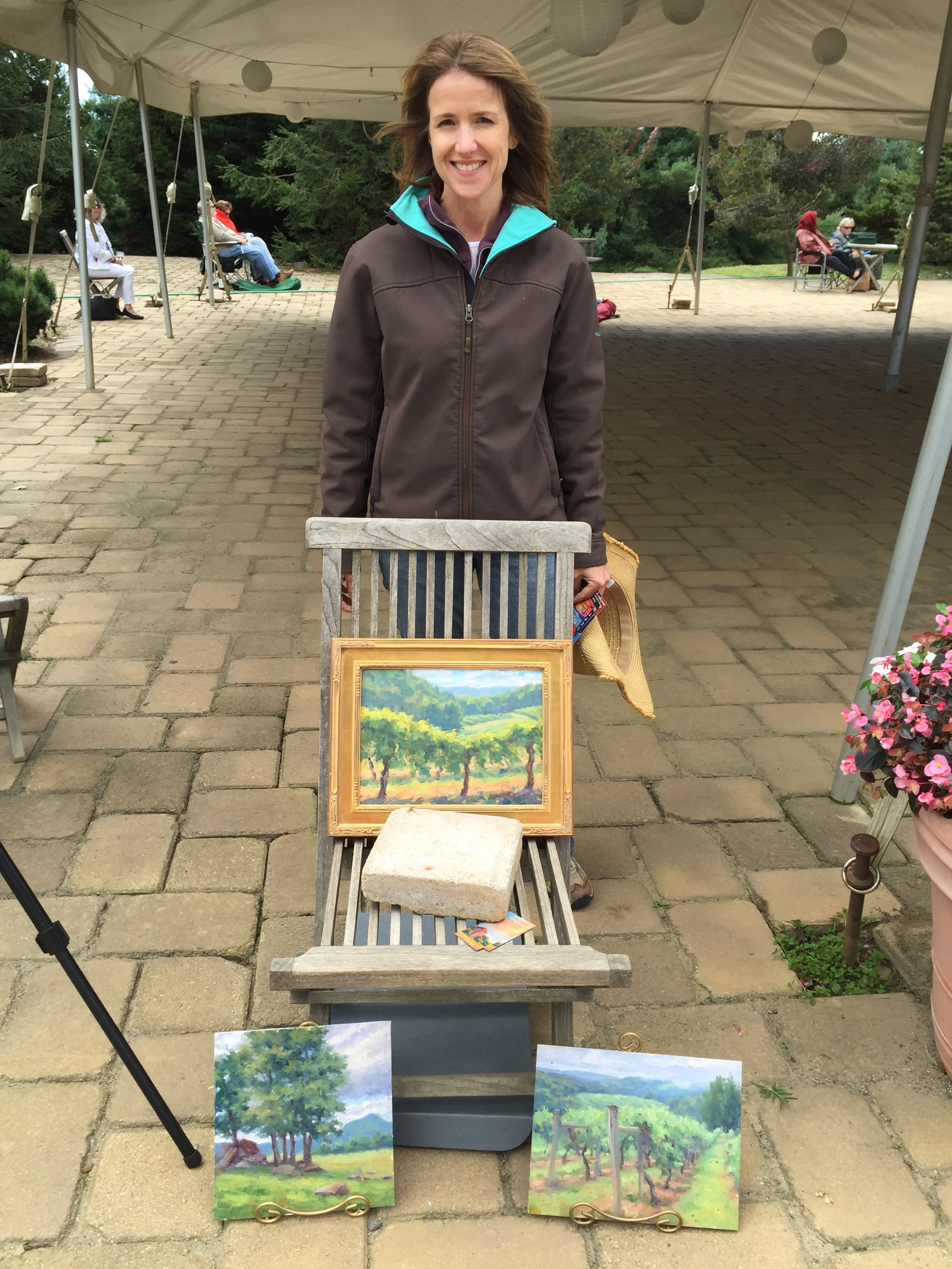
Here I am happy and tired. The wind blew up a bunch of dirt on my paintings. I have managed to get most of it off of the two vineyard pieces, but the Buffalo Mountain one was painted really thickly and I don't think that stuff is going to budge. Oh well...that's plein air for you! It was good winery soil at least.

I came home to a messy house and a bunch of dirty laundry, but it was a fair trade for having had time off from mommy duties to do my thing for a whole weekend. (Thanks honey!) :-)

Watching the Waves

Here is the last plein air painting I did at the beach last week. It was a quickie, started around 4:30 or so and wrapping up around 6PM. Watching the waves is one of my favorite things to do when I'm at the beach.

Outer Banks plein air painting ©Jennifer E Young, All rights reserved "Watching the Waves" Water miscible oils on linen, 8x8" To purchase, please contact me!

What is it about the ocean that calls us so? I guess it is the mystery of it. Or maybe it's the rhythm of the tides? Or maybe it's just that it is the place where we all originated, and it's depths are still unknown. My daughter once asked me, "When does the ocean stop waving?" Exactly! It never does, though it never ceases in changing either.

Incidentally, as I was painting this little vignette of our neighbor with her blue striped umbrella, I was photographed by Hidden Outer Banks!

Jennifer Young plein air painting by Hidden Outer Banks

Check them out. It was perhaps the one time when I actually didn't mind having a picture taken in my bathing suit. ;-)

Morning Surf

Immediately after I wrapped up painting my sunrise painting, I turned to look up the beach toward the pier and noticed how lovely the waves looked lapping up on the curving shoreline. So since I finally felt like I was getting somewhere with these paints, I decided that this would be a back-to-back session, one piece after another. Here' s the beach in early morning, post sunrise, around 8:30 a.m. or so:

Plein air coastal beach landscape painting of the Outer Banks, NC ©Jennifer E. Young, All rights reserved"Morning Surf" Oil on Canvas, 9x12" Contact me to purchase!

For this painting and the prior sunrise one I had to lay the paint on pretty thickly to manipulate the edges the way I wanted. Also I found the titanium white and cadmium yellow light were much less intense than what I was used to with my traditional oils, so the highlights were painted very thickly indeed. I hadn't noticed this in my first venture with the Water Soluble oils, but it became much more apparent with these beach paintings because they are pretty high key.  Overall the effect seems to me to be closer to a palette knife painting than one done with a brush, though hog bristle brushes were all that I used.

I really enjoy painting the surf. While I have done it before a number of times  in the studio, these pieces were  my first effort done completely from life. What a rush! I feel like I could spend a lifetime studying just this one subject...I should be so lucky.

Back from the beach

Last week my family made our annual trek to the Outer Banks of North Carolina. It is a trip I look forward to all year, and it always seems to be over all too soon. For this trip, I brought along my water soluble oils.  Given all of the moving and excitement we had this spring and summer, I thought I would simplify things a bit with the painting gear I chose to bring with me, and eliminate the need for carrying turpentine. The only problem with my little plan was that, unlike my first foray into this medium, I found myself struggling. A lot. I don't know if it was the humidity, the painting surfaces, my overall fatigue or what. But every painting I did all week was a complete wiper, in spite of my  most valiant efforts.  The paint seemed to completely lack body and intensity. It also seemed to do nothing but smear all over my surfaces when I applied them.

Finally on the night before the last full day, it dawned on me that I should try a more absorbent surface. When I paint with traditional oils my preferred surface is one that is quite smooth --a fine weave linen or a shellacked birch panel. It was my understanding that shellac wasn't going to fly with water soluble oils, and my linen wasn't doing the job at all. So I dug around in my supply of panels and came up with a couple of gessoed birch panels and a Pintura gessoed canvas panel and decided to throw the old Hail Mary on the final day.

Here is the  first piece I did that last day, at sunrise:

Plein Air painting of the Outer Banks, NC ©Jennifer E Young, All rights reserved

"Sunrise at Nags Head" Water miscible oils on panel, 9x12" Contact me to purchase.

Finally I painted 3 pieces that I actually felt happy with! The paint was still harder to control than my beloved traditional oils, and I had a harder time mixing the colors I was aiming for, but at least the paintings actually looked like something I could show and/or use for reference when painting larger pieces. I will post the other paintings from that day in the coming days. Stay tuned!

Super cheap wet panel holder

This week as I am plodding through the daunting task of packing up my studio, I have storage on my mind (as in, where the heck am I going to put all of this stuff?!) Granted, a number of these boxes are my office supplies and files, but let's face it; artists have a lot of stuff.

art studio storage tips

And so we painters are always trying to come up with nifty and cheap storage ideas that will protect our paintings when they are wet and keep them organized when they are dry. With that introduction, meet my cd storage racks turned painting panel holders:

studiorack1

This is about as low tech as you can get. Two CD holders are tied together with twist-ties on either side.

art storage ideas

These are also great to have in the car for plein air paitning trips. I put the whole setup inside of a box lid sized to hold them for added stability and reduced mess. It will hold painting panels up to 12" and keep them neatly separated from each other so that they don't touch.

Granted, CD holders are becoming a little harder to find as we move further into the digital age, but they are still around. If push comes to shove, a letter sorter from an office supply store will do.

art storage tips


Happy New Year!

Happy New Year (almost)! I hope everyone had a wonderful holiday season and looks forward to a great 2015. I took a little time off over the holidays to be with my family. Now that my daughter is 4 1/2 years old, Christmas time is really so much fun and I wanted to enjoy and cherish every minute of it. Even so, I did manage to "sneak in" one more painting before ringing in a brand new year.

French landscape pastoral painting by Jennifer E Young

"Mist in the Valley" Oil on Canvas, 12x16" Click here for more info, or  contact me to purchase!

This painting is based on a combination of photos and a plein air study I did while I was in the Lot Valley a few years ago. If you have been reading my blog a while, you may recall that I tackled similar subject matter before, and will likely explore compositional variations again. I have a lot of reference photos from that morning and it was probably one of the most memorable plein air sessions from the trip. It's also both fun and challenging painting such a close range of values and all of those soft edges.

P.S. Did you know 2015 is the year of the sheep in the Chinese astrology? I'm not really superstitious or into astrology and didn't realize it when I started working on this piece. But it's pretty coincidental, don't you think?

Week-long study with Kevin Macpherson

Last week I did something I haven't done in a very long time...devote myself to the art mistress from morning to night for an entire week. And it was a week studying with the talented Kevin Macpherson at that! As you may have read from my previous blog posts,  I am a big fan of his paintings and his books. He is truly one of the best teachers I have encountered so far. Not only is he a highly skilled painter, but he has a way of honing in on and distilling essential information that actually penetrates my rock-hard noggin. JYandKMAC2

The workshop took place in a beautiful new space called Chesapeake Fine Art Studio, run by artist Hai-Ou Hou in Stevensville, MD (great location- about 20 mins. away from Annapolis). If you are an artist on the east coast,  it would behoove you to check out her site. Hai-Ou is quite the painter herself, and also appears to be drawing some of the best and brightest painter/instructors in the plein air and traditional/representational painting movements.

I really wish I had time to delve into all I learned during my workshop experience, but life is slamming me pretty hard right now. This week marked a return to the "real world" (insert the sound of  needle scraping across a record here) with kitchen renovation, school activities, and doctor's appointments commanding most of my time and energy.

But my biggest take aways from Kevin's instruction had to do with value and composition. He spoke a lot about light and shadow, and how one can create much stronger paintings by clearly indicating which elements belong in the light family and which belong in the shadow family. (This sounds simple in theory but it isn't always so easy in practice.) He stressed seeing and painting "shapes, not things", with the idea that if we are too wrapped up in painting a "thing" we lose the ability to really see it accurately and how it relates to the rest of the painting as a whole. We spent a good deal of time really learning how to see the true value of things (er, shapes, that is!) He stressed using a color isolator in the field to identify true value and color, determining and laying down your darkest note of color first, followed by the rest of the shadow family, and finally the values in the light family, keying everything up from that very darkest note, so that you really can get a handle on color and value relationships.

In essence, how dark you key your darks will determine how light you key your lights. I use the analogy of playing "Chopsticks" on the piano. You can play low on the scale or high on the scale, but the arrangement of notes and their relationship to each other are the same no matter how high or low you move along the keyboard.

Kevin Macpherson's workshop

His demos didn't disappoint. In addition to demos in the field, mid-week during his opening he did a remarkable demonstration in the studio (from a photo) on a canvas sized at about 20x24" . During that opening he also presented an inspiring and highly entertaining lecture. This lecture, I understand, was very similar to the one he presented at the Plein Air Convention. Not being able to travel as much as I used to, I really appreciated having the opportunity to see this presentation, in a much more intimate setting.

Though we were meant to work largely out of doors, we had our share of rain and wind. When the weather didn't cooperate, it gave us the opportunity to study (in the gorgeous and spacious studio) some of the more pertinent points Kevin was trying to drive home. We spent a good deal of time studying value relationships among the "light family and shadow family". On another occasion we delved into "The Golden Mean" or "Golden Section" (the informal subdivision of space) and he presented a fascinating slide lecture with many, many inspiring examples of  how it has been used by painters throughout history.

Kevin Macpherson's painting demo

Here are a couple of my plein air paintings done during the workshop that actually reached a level of finish:siloshadows_w

plein air landscape paintings by Jennifer E. Young

At the week's end, I left feeling completely exhausted and totally exhilarated at the same time. I didn't leave with many "finished" pieces, but that wasn't my goal at all any how. What I did leave with was a wealth of knowledge and insight, as well as a good deal of creative spark. Whether that spark ignites a fire, is now totally up to me.

Morning Wash, Venice

We have been prepping for a kitchen remodel these last few weeks, so this little studio piece of Venice has been patiently waiting on the "back burner" (pun intended.) Today I got so tired of seeing its mournful state of incompleteness on my easel that I attacked it with the brush. Here is the result:

Italian street scene painting by Jennifer E Young 
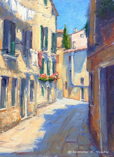
"Morning Wash", Venice Oil on Linen, 16x12"    I remember the day I and my traveling companion were taking photos of this little neighborhood. It was our first morning in Venice and we had spent it pretty much as nearly every American tourist does, snapping away with our cameras and ooh-ing and ahh-ing over every nook and cranny of the place. Then we turned the corner and, almost against my will, I blurted out, "Oooh, laundry!" My friend laughed, and of course, I realized immediately how silly that sounded. But to an artist, it has the potential to add both visual interest and an element of the human presence, even on an otherwise empty street. It's a mystery to me how the Italians can make even clothes hanging on a line an intrigue. But I guess it doesn't hurt that those clotheslines are surrounded by beautiful ochre stone, magnificent architecture and, I suspect, a little bit of magic too.

P.S. If you're wondering what happened to the still life I had started  in my last post, I gave it the 86. I will try again at some point, but I think I was  little overly ambitious with the size given my limited time. The flowers croaked before I could get them down, so I had to just chalk it up to one of the ones that got away.

Large Hatteras Island Painting -complete!

Here is the final version of the painting I have been working on for the past week or so:

coastal andscape painting of the NC Outer Banks by Jennifer E. Young

"To the Sea" Oil on Gallery Wrapped Canvas, 30x40" Click here for more info, or contact me to purchase!

I had such a good time painting this piece I didn't want it to end. The  several prior studies I did of this subject (most of them on location) really helped to inform me about color choices and brushwork, and also, more importantly, they brought back the strong emotional connection I have with the subject. I felt like I was on vacation all over again. Don't get me wrong, this was work, too, but it is this kind of view that I see on summer vacations to the Outer Banks  when I step out on the deck in the morning to sip my first cup of coffee. For me it recalls a time to let  all the cares go and just relax!

Hatteras Island W.I.P.

I'm starting something new (and big) today of the Hatteras Island dunes. It's a motif I have been exploring for a while now, though mostly in my field studies.

Outer Banks coastal landscape painting Jennifer Young

I'm painting this on a 30x40" gallery wrapped canvas, which is a little more absorbent and has a bit more tooth than my usual stretched linen. Hopefully this won't fight against me too much. I need bigger brushes! I want to keep this loose and fresh, like the plein airs, with not too much detail (but just enough.)

Right now I am referencing an image of my inspiration plein air (now sold) on my monitor,  and a second study painted to scale up to 30x40" that I worked up in the studio. The colors are really off in this snapshot, but you get the idea:

©Jennifer E Young, All rights reserved

In the second study I tried to recreate the feeling of the original plein air, but  with a few compositional adjustments to the horizon, sky, and beach path.

It feels good to be working on something large. I have avoided it lately because of my sporadic schedule, but things don't seem to be changing much in that area of my life any time soon, so what the heck.

Back at the beach

First I forgot the white paint. Then, there were the fire ants. Next came the wind. "Why exactly do I do this?" I'm thinking to myself. But then I saw the Jolly Roger flapping in the breeze, and I was hooked. So I held on to my hat (and easel) and set to work.

20140725-075935.jpg

This little 8x8" oil was done from our gazebo on the Outer Banks Dunes, looking out at the neighboring gazebos. The clouds were what attracted me but the Jolly Roger flag was a fun little detail that sealed the deal.

Featured in Plein Air Magazine's OutdoorPainter.com!

I'm on the road and struggling with mobile blogging right now, so I will keep this post brief. But I'm excited to announce that Plein Air Magazine has featured me and my work in their EZine article about "My Favorite Place to Paint".  The location may surprise you. Check it out! http://www.outdoorpainter.com/news/my-favorite-place-to-paint-jennifer-young.html

My lunchtime view

A major goal of mine this year has been to return to a regular practice of plein air painting. I've made kind of a slow start of it, but with a young child and a constantly changing schedule, finding the time to do this has been a major challenge to me. Before I had my daughter, I became accustomed to traveling around in search for the perfect painting site. Now, that's not really practical, (or most times, even possible). This is actually most peoples' reality and it's only in hindsight that I realize just how spoiled I was to ever have been able to do this in the first place! But these kinds of constraints shouldn't prevent me from plein air painting. After all, an exotic location does not (necessarily) a good painting make. And in fact, painting my world around me, just as it is, provides a pretty good challenge and a good discipline.

This is the view I behold every time I eat outside on my patio (which I do quite often in the temperate months). You may recall the distant flower bed from another recent plein air I did in the spring. This is a different view, from beneath the shade of our Crepe Myrtle:

Plein air garden painting by Jennifer Young 
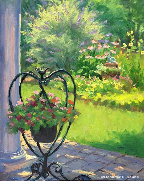
"Patio View, Midday" 10x8", Oil on panel To purchase, please contact me!

Of course, painting my current reality doesn't mean I have to include everything. Here's what you don't see on the other side of that column:

My Facebook page, plus two plein airs from the OBX

It's been such a while since I've provided some blog love, but there's been so much going on this summer that it's been hard to keep up. However I do  have two little plein air pieces I'd like to share, having just returned from a fabulous week on Hatteras Island in North Carolina's Outer Banks:

Plein air painting of OBX Dunes by Jennifer E Young

Plein air painting Hatteras Island NC by Jennifer E Young

These are both 8x8 studies done on birch panels, painted from the lower and upper decks of the beach house we rented in Salvo. I only painted on a couple of mornings (it was the hubby's vacation too, after all) but I so love painting there that I look forward to doing more and more of these in time. Here you can see me through the picture window, painting on the deck, while the kiddos finished up their breakfast. You might just be able to make out a cup of coffee on the railing. I had my breakfast delivered easel-side, too! Not a bad way to spend the morning. :-)

Jennifer Young painting plein air

I didn't get to paint out on the shore due to either the timing or the wind, but hope to do so when we return to the Outer Banks in about a month. Though the legs are starting to go, I'm still lugging my big old Soltek easel around. However I'm finding it more and more cumbersome for travel. I may have to dust off my little Prochade kit for my next trip, though I will need to get used to the much smaller palette size again, and the fact that it does not stand up well at all to any kind of wind.

This is the first time I have painted on shellacked birch panel, but I really like it. I prepared my own panels with Zinsser Bullseye Shellac, two coats per side, and sanding in between. I have heard about this kind of panel before, but it was most recently recommended by Matt Smith in his workshop that I attended in the Spring, so I was eager to try it after that. I was a little afraid that the shellac would make for too slick a surface, but it was the just right amount of smoothness and tooth. It did take a little preparation, but once the panels were sealed, the wood provided a lovely blonde tone on which to paint...no extra toning needed.

One final note, I have finally created a Fan page on Facebook, on which I plan to update with announcements and goings on. You'll find a link to it in this post and also in the right sidebar. I guess I'm not exactly on the bleeding edge, but at least now I can finally say, "Like us on Facebook"!

Lessons from the workshop

I thought I'd share a few of the studies I worked on during the Matt Smith workshop I posted about earlier this week. I will first preface by saying that my haste in preparing for this class came back to haunt me, so while I was well prepared in terms of my art supplies, I misunderstood what I was supposed to bring in the way of reference materials. The support documentation said to bring plein air studies and/or photos, and for some reason I took that to mean that plein air studies were preferred (maybe I was just hooked on the idea of plein air!) I probably should have asked beforehand about this because I did feel a little puzzled when I was packing about referencing a small scale plein air to make another small scale painting. (I usually translate small plein airs to larger works in the studio, but the recommended canvas sizes were all under 12x16"). In any event, I packed a number of my plein air pieces for reference, and then as a total afterthought printed off a few of my photos "just in case."

After seeing one demo and hearing the discussion though, I realized the error of my ways. I talked to Matt about what I should work from and he said he would rather see what I could do with my photo references for this class. Matt did bring a number of his own photo references for people to use, but I really dislike using other people's references. Even though we are composing with light and form, I want references that reflect my real experience of having seen (and felt) a place.  So I did what I could with what I had, but I really wished I had brought a more extensive selection of my hundreds upon hundreds of photos I have in my personal archive.

This  first painting is also the most incomplete:

poplars

In all of my paintings the common feedback from Matt was to take my brush and "knock back" some of my brushwork that competed with my statement or focal area. For instance, in this painting, our conversation went something like this:

MS:  "Is this painting about the light or shadows?" JY: "Well, I like the highlights on the edges of the poplar trees the best". And with that he took my brush and blended back the rather boisterous brushwork that was beginning to take shape in the shadow passages. MS: "You're giving equal weight to both." Next he mixed a bold tree highlight and swept it upwards on the edge of one of my poplar trees calligraphically, making the highlight really jump out. JY: "Ah, I see! But...I wouldn't just leave it like that...would I? It looks pretty unfinished." MS: "No, not necessarily. But you may restate and knock back several times before you get it right."

 I have such a love of brushwork, but it probably can work to my disadvantage sometimes. The hard part, I think, is figuring out what, exactly, is "right", and what is too little or too much. It's all about finding that balance, where active areas are juxtaposed with quiet passages. It's the quiet passages that play a supporting role and allow the more active ones to take center stage. To paraphrase something Matt said in one of his talks, it can't all be "important". Filter the noise and find the important elements.

I soon abandoned the first study, deciding to just keep that as an annotated lesson.  The second 8x10" painting below is more complete, and may look familiar to some long time blog readers. That is because I painted this scene before en plein air, and blogged about it here. The photo in the link is too dark overall but even so, I think this second study is much more infused with light. (So this exercise will be very helpful to me when I translate the concept to a larger painting, which I really am excited to do now! ) For the painting below, though,  I thought I'd try it again using just my photo reference and see what kind of feedback I could get, and whether it would look decidedly different as a result.

rooted2

I really loved the composition as it was, so it remains relatively the same in this second attempt. But in terms of paint application,  I got some helpful hands-on feedback from Matt again. Again he took my brush and knocked back the brushwork of the distant trees to make them sit back more and look less stylized.  Fair enough. He then demonstrated "opening up the shadows, using reflected light cast from nearby objects to cast color into the shadows. He put a touch of blue, for instance, on the shadow side of the tree trunks reflecting the water, and the warmer tones reflecting warmth from the stones or earth. That was awesome. After that he showed me how an assertive hand used to apply just a few intense highlights could suddenly make the painting pop. I reworked some of what he put in but played with those general ideas. But that rim light of his along the trunk and the 3 or 4 dabs of bright green paint on the tree leaves remain just as they were applied. (And don't they just sing?)

I felt I was finally getting somewhere on this final painting (below), though we had some helpful discussion early on about using perspective to direct the viewer to the focal point. He again knocked back the distant mountains with no paint, just several swift blending strokes (sigh.)  I don't consider this painting really finished either but I love the composition and I think I would like to try this again on a larger scale. It's the Dordogne as seen from the top of the Chateau de Beynac.

dordogne

I think overall his main critique of my work was that he wanted to see both more paint and a more deliberate, assertive handling of paint. And it's really hard to do the latter without the former. As he put it, you need to have enough paint there so that it expresses the character of the medium. Otherwise you need to ask yourself, "Why are you painting in oils?"

The class was listed as an intermediate-advanced class and I felt the instruction and the students lived up to that. I left the class pretty exhausted but with a lot to think about on my 6 hour drive back home. It will be interesting to see how I can apply Matt's feedback and insights to my work, while still making my paintings "mine". Once or twice the feedback was hard, but I soon realized, as with any class, it's important to leave your ego at the door and come with an open mind if you really want to learn.

Matt Smith workshop

Oh yeah, I have a blog! ;-) Actually, I didn't forget; I've been doing a little traveling up north to the New Hope School of Art to take a workshop from the very talented painter Matt Smith. The trip was noteworthy for a number of reasons. First, it was the first time I have been away from my daughter for more than a night. (That part was hard.) But second, it was also the first time I've had in 4 years to do nothing but paint and immerse myself in "art stuff" for four days straight. (And that part, my friends, was luxurious!) I haven't taken a workshop in a very long time. But now that my daughter is getting a little older, I really feel like it's time to amp up my art life in some significant way and infuse my work with new insights. So when I heard Matt was coming east to teach (he's based out West, so that's something I'd not caught wind of before around here) I knew it would be an excellent opportunity to do just that.

Please excuse the poor photo quality but this was shot with my iPhone in low light. Here you can see the very light way Matt holds his brush to apply paint and manipulate edges.

Matt hails from Arizona, and is best known as a painter of the Sonoran desert near his home, as well as the snow capped Canadian Rockies and other places out west that epitomize the classic western landscape. What initially attracted  me to his work though was not his subject matter, but the sensitivity in the handling of  his brushwork and edges. They are both bold and delicate at the same time.  But after seeing him demo and talk about his approach, I was equally impressed by the purposeful way he composed his paintings and orchestrated his compositions to create  powerful statements. I won't get into a blow by blow description of day 1-4 of class, but I will share some of the significant things I took away from it personally, most likely in more than one post.

The interesting thing about this workshop was that even though Matt is best known among artists as a plein air painter, the class was held entirely inside, in the studio. I'll be perfectly honest here and say that when I signed up for the class I was mildly disappointed that the format would not include at least part plein air painting, especially since Matt himself is a seasoned field painter and the area where the workshop was located was very scenic. (It was the birthplace, in fact, for an entire movement of landscape painters, known as The New Hope School and Pennsylvania Impressionism.) Largely though, that disappointment was entirely personal. My studio is my workhorse, but plein air painting is more exciting to me. Also with my life situation at present, I just don't get the longer stretches of time needed to trek out in the field as often to paint.

When I asked about the reason for the indoor class, Matt's response was that in his years of teaching, he has seen the same problems pop up again and again, whether in the field or in the studio. Maybe he felt it's better to address these fundamental issues in a controlled environment rather than adding another layer of difficulty with the environmental factors that plein air adds. In any event, the format turned out to be fine. In fact, there was plenty I needed to work on just with my studio work,  the studio environment definitely allowed Matt to get to each student several times a day with valuable feedback. As it turned out, the weather was not great any way, and we probably would have needed to seek shelter for at least two of the four days due to rain and wind.

Matt did several very good demos (using his photo references). He used a Strada easel, which I think was a rather new purchase for him. He talked a lot about equipment and painting gear, which, as any regular reader of my blog may have surmised, is a topic of great interest to me. The Strada is made of metal and looked like a neat little box (I think his was the mini, which is presently sold out.)

The Strada Mini Easel

But even without the two winged accessory attachments added to provide more workspace, it was a very heavy box for its size. Matt said he liked it because of its compact size (it easily fits into a backpack) and durability for travel, but personally I could not deal with the heft. A Gitzo travel tripod was also part of his setup, which looked great for its ease of use and small size when folded (also easily fitting into a backpack), but a quick Google search soon told me this item was way out of my price range. (Wowsa!)

Matt, by self-definition is not a colorist. In fact, of the fundamentals he sites as essential to a good painting (Drawing, Value, Design, and Color) the most expendable he says, is color. Even so,  I found his palette fairly wide, with four blues, two earths, two yellows, an orange, one red, a violet, and a couple of greens (plus, of course, white.) He used no medium other than his oil paint and a very tiny amount of Gamsol to thin his paints.

His start consists of a very light sketch, soon followed by masses of color, working broadly to get his main elements and shadows down. He then builds from there, thin to thick, dark to light, broad to more detailed. One thing I found interesting is that he almost always left his sky a white canvas until close to the very end of the process. Obviously this is working to his great advantage, but try as I might, I couldn't resist my normal method of putting the sky in early on. This was especially the case if there was any water in the landscape, as I find  I need that sky information to know what's being reflected.

I've a lot more to say on the subject but I should probably try and paint something now! In my next post I'll share of few of my studies done in the workshop, as well as some valuable take-aways that I received from Matt's feedback.

Varenna's dramatic skies (W.I.P. continued)

When I traveled to Bellagio and Varenna, one of the things that struck me about the landscape was the dramatic cloud formations that settled over these little lake towns. Possibly this is due to the altitude, or the difference in altitude between the lake and the surrounding mountains. OR, it could have just been my timing. In any event, while they were very beautiful and created spectacular displays, they also made  it pretty tricky to sketch/paint en plein air because the daggone light kept changing from minute to minute. In the studio, of course all of that is much easier to control, and I get to celebrate the beauty of the clouds without at the same time cursing the inconvenience of them ;-). After I sketch in my composition, my most common approach to landscape painting is to lay in the sky and the far distance. Since the sky contains my light source, the highlighted sides of the clouds will hold some of the lightest values in the painting. Probably the only other things that approach this high value is the light bouncing off of the white painted boats.

Landscape painting of Varenna Italy in progress by Jennifer E Young

I am not sure if it's evident in this photo, but I have used an array of colors(cad orange, cad red light, alizarin permanent, ultramarine and sevres blue) to tint the clouds. The blue sky is a combo of ultramarine, sevres blue, and white.

landscape painting clouds detail by Jennifer Young

Next distant mountains progressively deepen in value, but they are still very cool in temperature, so that they will sit back behind what's to come in the foreground. After evaluating my composition further, I decided to raise the distant horizon line, so as to push those cliffs back a bit more, in relation to the foreground town.

Lake Como landscape painting in progress by Jennifer E. Young

 After I get the painting a little further on, I may come back and tweak what I've done here. But for now  it's time to address  the water and the heart of the matter; the town of Varenna.


New Key West auction posted!

Congratulations to Barbara T. for winning this auction!

Key West painting by Jennifer E. Young opening bid $100!

"The Shady Side" Oil on Canvas Panel, 6x8" 20120826-120134.jpg

When things heat up from the tropical sun, a shady verandah is just the thing--especially if that verandah is in Key West, and you can imagine yourself there sipping a nice cool beverage! This little painting of Key West conch houses may help you to do just that.  This painting would retail for $375 (unframed).  Now is your chance to win a slice of sunshine for yourself, at a great price! This original oil painting on canvas panel by Jennifer E. Young measures 6×8" (a perfect size to fit under the Christmas tree!) Unframed, it is signed by the artist, lower right. To begin bidding, enter your bid in the auction module in the sidebar of this blog. Here’s how it works:

  • All auctioned items are offered unframed.
  • The opening bid for this painting is just $100 (a fraction of my retail price).
  • Bids increment by $25
  • Highest bidder at the auction’s end wins the painting.
  • When the auction has ended, I will send the winning bidder a Paypal invoice.
  • I ship via U.S. mail within 3 days or less of receiving cleared payment.
  • Free shipping in the continental USA!
  • Visit my auctions page for more details

New Key West painting auction starts today!

On the auction block today Congratulations to Barbara T. for winning  this little bit of Key West Sunshine!

toweringbg.jpg "Towering Bougainvillea" Oil on canvas panel, 6x8"

20120826-120134.jpg

Nothing says warmth and sunshine to me as much as the cheerful pastel "conch" houses and tropical flora of Key West. I have traveled there  many times to "chase the sun" when it's cold and rainy back home. This painting would retail for $375 (unframed)  in a gallery.  Now is your chance to win a slice of sunshine for yourself, at a great price!

This original oil painting on canvas panel by Jennifer E. Young measures 6×8? (a perfect size to fit under the Christmas tree!) Unframed, it is signed by the artist, lower right. To begin bidding, enter your bid in the auction module in the sidebar of this blog.

Here’s how it works:

  • All auctioned items are offered unframed.
  • The opening bid for this painting is just $100 (a fraction of my retail price).
  • Bids increment by $25
  • Highest bidder at the auction’s end wins the painting.
  • When the auction has ended, I will send the winning bidder a Paypal invoice.
  • I ship via U.S. mail within 3 days or less of receiving cleared payment.
  • Free shipping in the continental USA!
  • Visit my auctions page for more details.

Mountain Shadows

Continuing with my exploration of the southern landscape, I started a new 24x30" painting today based on my recent trip to the mountains. Here is the initial tonal drawing to determine the composition and basic shapes. This is an early morning scene so the shadows are nice and long:

Blue ridge mountain landscape painting in progress by Jennifer E. Young

Next I start the block in, very broadly, laying in the darkest patterns first, followed by the lights. Aside from the usual burnt sienna I use for the tonal sketch, I have limited my palette to three primaries plus white (cadmium yellow light, alizarin permanent, and ultramarine blue).

Blue Ridge Mountains landscape painting in progress by Jennifer E. Young

The sky will be my lightest light, but I've put off laying that in until I have something of the mountain laid down.

Here's where I am after a few hours' work:

Blue Ridge Mountain landscape painting in progress by Jennifer E. Young

Next I will start laying in the sky and blocking in the haybales before going back in to refine overall. I think I've gotten some good information down so far. Now I just need to keep building on it and solidify my plan. More to come soon!