Lake Como W.I.P. & Demo

I mentioned in my last post that I had a new painting in the works, and I thought I'd attempt a little demo with this one. I say "attempt" because my laptop finally gave up the ghost, and these days I tend to do a lot of my writing via my mobile. Not only am I "all thumbs" (literally) but I have to sneak it in before my phone gets snatched away by the chubby little hands of my daughter who wants to "see pictures" whenever she sees it emerge from my pocket. This will be a painting of the beautiful fishing village of Pescallo. Pescallo is a tiny, sleepylittle place that sits just down the slope from Bellagio (also very beautiful). In fact, I could see Pescallo from the balcony of my Bellagio hotel, and the drama of the light as it poured over the mountains and harbor beckoned me to take a stroll down there many mornings before we started the day's touring.

I begin by sketching out a compositional plan that is also a value plan for the painting. I do this using light, middle, and dark value gray oil paints in my sketchbook. I often do a similar thing with Tombo pens (the grayscale ones), but mostly when I am painting outdoors as a way to quickly hone in and get a handle on my composition (in an environment that is bombarded with stimuli). But it is a good practice with studio work too. The oils are mentioned in Kevin Macpherson's book, "Landscape Painting Inside and Out," and I have long wanted to buy these paints so I could give it a try. They are Portland Gray Light, Medium, and Deep, by Gamblin. Hey, if it's good enough for "KMac", (as my husband calls him) it's good enough for me!

notan sketch
notan sketch

The point of this is to see if your painting has a strong underlying structure with a unifying value plan without getting bogged down in details. This is really supposed to be more of a notan sketch at this stage, which is a very simplified thing and addresses more of the armature of the painting rather than the pinpoint accuracy of objects and shapes. It's been a while since I've done this kind of study, and I realized at some point that I had not allowed much for the fourth value I was working with, which was the white of the paper. Oops! So I had to amend my sketch a little and add in some white for the lightest areas.

Still, I feel that my plan is solid and I'm ready to move forward by sketching out a line drawing on my 24x30" canvas.

oil sketch lake como painting by Jennifer Young

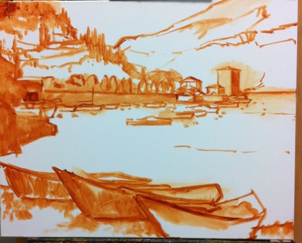
For this I am using burnt sienna (Winsor Newton), thinned with Gamsol mineral spirits. I don't much use this earth color in the rest of my painting stages, and while I could mix up  a good earth for such a job using my standard red, yellow, and blue, it is more of a convenience for me to use a premixed paint at this preliminary stage. I also like it because it lends a nice warm undertone to the canvas as I go along, and it doesn't bleed into my other colors (especially the light ones like the sky) when I move beyond the sketching stage.

Now that I have a plan, I am ready to start painting with color! I'll get into that in the next post .

French country garden painting complete

Whew! I had a lot of starts and stops with this painting, but it's finished.There were times when I really needed to scrape whole portions of it down because there was too much buildup to make adjustments. It brought to mind a quote attributed to Everett Raymond Kinstler that I read recently in a very good article by Bill Davidson posted on the Oil Painters of America blog,

“I start out in this way thinking, ‘this will be the greatest painting of this subject matter ever painted.’ Later in the process I think, ‘this will be the greatest painting of this subject matter I ever painted,’ and finally I think, ‘Hell! I hope I can save this painting!’ [paraphrased]”

Now I can't say that I've so far stated anything close to the first sentence of that quote, but the progression of feeling from confidence to doubt certainly rings true, especially when there is a lot of time invested in a piece.

"Quiet Reflection, Southern France", Oil on linen, 20x24" © Jennifer Young

"Quiet Reflection, Southern France", Oil on linen, 20x24" © Jennifer Young

The subject matter is the dappled morning light as it plays across a part of an old convent building and surrounding water garden. This place is now converted to a B&B and venue for painting holidays  (aptly named Le Vieux Couvent) in the town of Frayssinet, France. I blogged about my visit there numerous times. It is a lovely place that I remember with great fondness.

...And now,I'm going to get  a bit off topic by asking a favor of my readers. I seem to be having some trouble having my posts delivered to subscribers by email. So if you actually do happen to receive this post via your email subscription, could you please let me know?

From study to studio (work in progress)

I feel like it has been ages since I have painted en plein air. Perhaps I feel this way because it is true! But while time, obligation, and health have kept my plein air painting at bay lately, I still think about it very much (not without a lot of longing) and I find myself digging out what plein air pieces I still have and meditating on them. It seems to me that even the weakest studies contain valuable information. Studio works have their place and purpose, and (the good ones) posess a grandeur that is harder to acheive en plein air. But there is a quality about the plein air paintings that continues to distinguish them in my heart and mind as something very special. As incomplete and insufficient as some of them are, they are infused with life and an immediacy that I still find hard to match in the studio. Still, given my life situation at the moment, I shall have to try.

One day recently when I was feeling particularly "homesick" for plein air painting, I came across this little piece that I painted during my trip to the Dordogne. It was tucked away in a stack of unfinished studies that I have not looked at in a long time:

I put it away mainly because I ran out of time to finish it on site, and I really haven't thought much about it since. It doesn't have the wildflowers that were in the field, the middle distance is unresolved, and it is lacking contrast in the row of nearby trees, as well as some other detail. But what it does have is some really good information about the light, as well as a nice loose, light touch that reflects the breeziness of that morning in early summer. And as I looked at it with new eyes, I started to think about new possibilities, and how I might translate the information in this scene to a larger studio canvas.

The location was near a public park just on the outskirts of a little village in France called St. Germain de Bel Air. There were these enormously tall trees that I believe were poplars. They always remind me of Monet because he painted a series of these trees in the countryside near Giverny. I was attracted to the scene not only because of the trees, but because of the way they lined the simple country path that led to the village, and the shadows they cast in great diagonals across the picture plane.

We will see how it goes, but here is my (very) preliminary layout on a 24x30" canvas.

Provence lavender lay-in (W.I.P.)

This has been my first real opportunity to paint in over a week. It has been really hot, muggy weather lately, so I've decided to stay close to the studio and scour some of my old photo archives for landscape subject matter. In doing so, I came upon some of my images of an area of Provence that I visited in lavender season almost 10 years ago (!) called La Drome Provencal. Here's a 16x20" composition I've mapped out:

Provence lavender landscape painting by Jennifer Young

I have more to flesh out in terms of both shadow/highlight and detail, but I've started with a basic block-in to nail down my composition. Up to now, I've used the same color palette as the previous painting I posted of Lake Como. But when I started to lay in the lavender I had the overwhelming temptation to reach for a cooler, more transparent red (like alizarin crimson) to add some brilliance. I have held off up to now.

What I aim to see is if I can achieve the proper color relationships in the painting without having to resort to any other colors than the three primaries I've chosen. Alizarin Crimson (permanent) has long been my default red when I paint in a single primary palette. While it is a beautiful transparent color, I sometimes feel it is almost too garish in my mixtures.

So I feel it is worthwhile to try and achieve a luminous, vibrant quality to my paintings without having to resort to over-the-top color. Being somewhat of a color slut, this is not an easy challenge for me! We'll see if I can hold out to the bitter (better?) end!

Varenna painting complete

Just a quick post to share the final version of the Lake Como painting I wrote about in my last post:

"La Passarella, Varenna" Oil on Linen, 24"x 20" (SOLD) ©Jennifer Young

"La Passarella, Varenna" Oil on Linen, 24"x 20" (SOLD) ©Jennifer Young

This view shows small fishing and leisure boats in front of the arched foot path called "La Passarella"  that winds its way around Varenna.Known  as "the pearl of the lake", Varenna is one of the most beautiful towns on Lake Como. A great place to leisurely wander and get lost!

I also really enjoyed this version of the limited palette I wrote about in my last post. I can see myself using this one again (as soon as I buy more Cad. Red Medium!)