Moving forward (Lake Como W.I.P., continued)
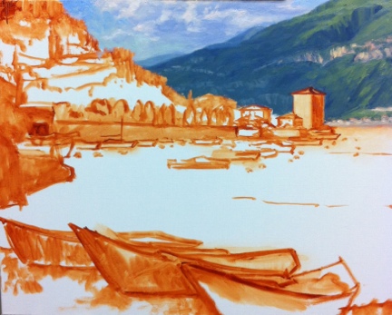
At this point in the process I feel that I have sufficiently addressed the nearest hillside to the point that I can now move forward and focus on the middle distance boats and water.

lake como painting in progress by Jennifer Young

I also realise that there is still a lot of white canvas around this painting and I really want to at least block the rest of it in so that I can better gauge my color and value relationships. Ideally I probably should have done this earlier, but as you might have noticed I have been short on easel time in the last week, and I want to address the water in as close to an alla prima fashion as I can, because otherwise I end up having to scrape off a lot of dried paint from my palette and remix everything to try and get back to where I had previously left off.

Pescallo painting Italian landscape

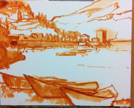
Ah, that's better!  I've painted in the little stone wall/pier to the left, and have at least suggested that there is a lake here somewhere! The paint layer on the water is still a very thin block-in here, but at least I have some color down and have indicated approximately where the boats are going and where the water highlights will be. This last picture shows where I had to leave off this morning. No matter how early I try to get out to the studio, I seem to always feel that I have one hour too little. But that's the way it goes, right now. Depending on how much painting time I will get this weekend, I hope to finish this piece up in another session or two.

painting-in-progress of Pescallo Italy

Lake Como W.I.P./Demo (continued)

Well I promised color in my last post, so let's get started! I don't know if I mentioned it lately, but I have been experimenting with expanded palettes for my latest paintings, and that exploration continues with this one. Regular readers may remember that I have for a long while used a limited palette of red, yellow, and blue, plus white (like this one). For this painting, my palette is (as I lay it out from left to right) Titanium White, Cadmium Yellow Light, Golden Ochre (Rembrandt), Cadmium Orange, Cadmium Red, Alizarin Permanent (Gamblin), Cobalt Blue, and Ultramarine Blue. (I've specified brands where color names are specific to a particular brand.)   I haven't used any pre-mixed greens, as you can really mix a zillion different greens with this palette. I have used most of these colors off and on, with the exception of Cobalt Blue. To be honest, I was really hoping that I wouldn't like it, because it is a terribly expensive tube of paint. Of course, I love it!  It is a cooler blue than Ultramarine, which has more red in it. I still love Ultramarine, but Cobalt has some really wonderful possibilities. Any way, back to the painting...I start by painting in the sky, which contains the light source and is also the farthest in distance. The sky is Cobalt blue plus white, with cad yellow lt. added as it nears the horizon. For the clouds I've mixed a combination of blues and cads red and orange + white for the shadows, and Cad orange and red + white for the highlights.

20120921-150523.jpg
20120921-150523.jpg

Working from back to front, I next paint in the distant cliffs, which have a beautiful shadow casting down over them from low-lying clouds. The photo is a bit dark here (apologies) but I will try to get some more accurate photos in subsequent blog posts so you can get a better idea of the colors.

The distant mountains complete, I block in the buildings that jut out into the harbor, as they will serve as my area of interest in the painting, and everything will kind of flow to lead the eye towards them. I also decide to lay down my pattern of darks, to restate the plan I made in my notan sketch. Again, this photo just blackens everything out, but I had to make a choice between using my time blogging or photo editing, and at this point, I've chosen blogging.

20120921-150612.jpg
20120921-150612.jpg

Next, I work on the terraced hillside in the middle distance. What a joy it is to paint...all of those shadows and varied greens! A nice round bristle brush is great for painting in those cypress trees, which have always struck me as distinctive punctuation marks in the Italian landscape. .

20120921-150639.jpg
20120921-150639.jpg

 A mahl stick (shown in the next photo  on my easel below the painting) is a handy tool to have to steady the hand without smudging the painting, when painting details like architecture and tall skinny cypress trees.

20120921-150656.jpg
20120921-150656.jpg

I have yet to paint in the highlights on the cypresses, but once I've done that I will be ready to move on to the middle distant water and boats, and finally the boats in the foreground. All that will be left after that point will be fine tuning  wherever's needed.

Lake Como W.I.P. & Demo

I mentioned in my last post that I had a new painting in the works, and I thought I'd attempt a little demo with this one. I say "attempt" because my laptop finally gave up the ghost, and these days I tend to do a lot of my writing via my mobile. Not only am I "all thumbs" (literally) but I have to sneak it in before my phone gets snatched away by the chubby little hands of my daughter who wants to "see pictures" whenever she sees it emerge from my pocket. This will be a painting of the beautiful fishing village of Pescallo. Pescallo is a tiny, sleepylittle place that sits just down the slope from Bellagio (also very beautiful). In fact, I could see Pescallo from the balcony of my Bellagio hotel, and the drama of the light as it poured over the mountains and harbor beckoned me to take a stroll down there many mornings before we started the day's touring.

I begin by sketching out a compositional plan that is also a value plan for the painting. I do this using light, middle, and dark value gray oil paints in my sketchbook. I often do a similar thing with Tombo pens (the grayscale ones), but mostly when I am painting outdoors as a way to quickly hone in and get a handle on my composition (in an environment that is bombarded with stimuli). But it is a good practice with studio work too. The oils are mentioned in Kevin Macpherson's book, "Landscape Painting Inside and Out," and I have long wanted to buy these paints so I could give it a try. They are Portland Gray Light, Medium, and Deep, by Gamblin. Hey, if it's good enough for "KMac", (as my husband calls him) it's good enough for me!

notan sketch
notan sketch

The point of this is to see if your painting has a strong underlying structure with a unifying value plan without getting bogged down in details. This is really supposed to be more of a notan sketch at this stage, which is a very simplified thing and addresses more of the armature of the painting rather than the pinpoint accuracy of objects and shapes. It's been a while since I've done this kind of study, and I realized at some point that I had not allowed much for the fourth value I was working with, which was the white of the paper. Oops! So I had to amend my sketch a little and add in some white for the lightest areas.

Still, I feel that my plan is solid and I'm ready to move forward by sketching out a line drawing on my 24x30" canvas.

oil sketch lake como painting by Jennifer Young

For this I am using burnt sienna (Winsor Newton), thinned with Gamsol mineral spirits. I don't much use this earth color in the rest of my painting stages, and while I could mix up  a good earth for such a job using my standard red, yellow, and blue, it is more of a convenience for me to use a premixed paint at this preliminary stage. I also like it because it lends a nice warm undertone to the canvas as I go along, and it doesn't bleed into my other colors (especially the light ones like the sky) when I move beyond the sketching stage.

Now that I have a plan, I am ready to start painting with color! I'll get into that in the next post .

This week on the easel: Val d'Orcia W.I.P.

Just a quick post to share what is in progress on the easel this week: My studio time (which includes painting, but also varnishing and framing, website updates, emails, blogging, photography, sales/marketing, office work, etc.) is now limited to a few hours every other weekday. Painting takes precidence, but every now and then I really must play catch-up with "everything else". So it was with Monday, and I only had time to do the layout in sepia:

Tuscany landscape painting in progress by Jennifer Young

Upon my return to the easel, I tackeled the block-in (first pass) which is still mainly shadows and midtones:

tuscany landscape painting in progress by jennifer young

Time ran out before I was able to get to the hilltop buildings, but I was happy to have covered the rest of this 24x30" canvas in about 3 1/2 hours. Because I can't always get back to an "open" painting, I at least want to return to a canvas that is brought to the same level of completion in all areas.

This is a view I have painted before (a number of years ago) and I am returning to it now to see if I can use a looser approach. There is quite a bit of information in this scene, and my aim is to relay a feeling of the variety in the landscape of Tuscany, but in a more unified, simplified manner, without articulating everything in minute detail.

Season of Plenty (Provence painting complete)

Just a quick post to follow up on the W.I.P. I shared on Wednesday...Here is the painting, now complete (more or less).

"Season of Plenty" Oil on linen, 16x20" ©Jennifer Young

"Season of Plenty" Oil on linen, 16x20" ©Jennifer Young

There is some glare in the photo so I may need to attempt a re-shoot this weekend. Nevertheless I think it gives a pretty good indication of the final. I managed to maintain my single primary palette to completion, just to prove I could do it. But I am not sure if this color- limiting exercise was to the benefit of the painting, so I will set it aside for a few days and think it over before making any adjustments.