Back from the beach
/Last week my family made our annual trek to the Outer Banks of North Carolina. It is a trip I look forward to all year, and it always seems to be over all too soon. For this trip, I brought along my water soluble oils. Given all of the moving and excitement we had this spring and summer, I thought I would simplify things a bit with the painting gear I chose to bring with me, and eliminate the need for carrying turpentine. The only problem with my little plan was that, unlike my first foray into this medium, I found myself struggling. A lot. I don't know if it was the humidity, the painting surfaces, my overall fatigue or what. But every painting I did all week was a complete wiper, in spite of my most valiant efforts. The paint seemed to completely lack body and intensity. It also seemed to do nothing but smear all over my surfaces when I applied them.
Finally on the night before the last full day, it dawned on me that I should try a more absorbent surface. When I paint with traditional oils my preferred surface is one that is quite smooth --a fine weave linen or a shellacked birch panel. It was my understanding that shellac wasn't going to fly with water soluble oils, and my linen wasn't doing the job at all. So I dug around in my supply of panels and came up with a couple of gessoed birch panels and a Pintura gessoed canvas panel and decided to throw the old Hail Mary on the final day.
Here is the first piece I did that last day, at sunrise:
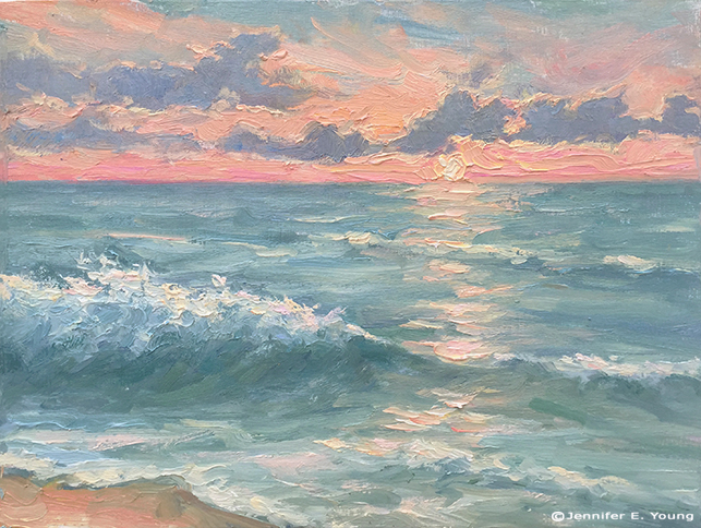
"Sunrise at Nags Head" Water miscible oils on panel, 9x12" ©Jennifer E Young
Finally I painted 3 pieces that I actually felt happy with! The paint was still harder to control than my beloved traditional oils, and I had a harder time mixing the colors I was aiming for, but at least the paintings actually looked like something I could show and/or use for reference when painting larger pieces. I will post the other paintings from that day in the coming days. Stay tuned!