In Autumn Light
/'Tis the season for small paintings! This time of year, galleries promote their artists with small works shows for the holidays. There is a good reason for this. Small paintings are a nice way to start an original art collection or offer a unique and thoughtful gift without breaking the bank. With that in mind, here is a little 6x6" painting in water miscible oils of a quaint little street in my home town.

"In Autumn Light", Oil on Board, 6x6" ©Jennifer Young
This is a well known Episcopal church on Virginia Street in Ashland. I experimented with a lot of different angles, but they all seemed a little too much like "look at this church!" and not enough like "look at this sweet painting". Finally I found a composition I really loved. I wanted this to have both a sense of place and a sense of the lovely light of autumn. The leaves have been falling off in droves from all of the rain we've had. But at its peak, this humble little street displayed its foliage like a proud peacock, and I am really glad to have captured it.
I took a couple of progress shots to record the architecture (har har) of the painting. They were a very few, both because this is such a tiny piece, and because I forgot to photograph the first step, which was the monotone value sketch (done in my usual manner). While it lacks the nuance of a larger, more developed painting, the process below shows my general approach to building a painting regardless of the size. In some ways, the simplicity of the piece helps to demonstrate the importance of creating a strong structure right from the start.

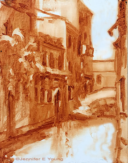
Post- tonal sketch, I begin mapping out my shadow patterns. The darks act as the "bones" that hold the painting together. Even at this stage you can get a very good idea of the strength or the weakness of your painting. Are those values spotty? Disconnected? Or do they lead the eye in and around the painting to the focal point?

What is it about the light family that makes us want to jump right in and start painting it? What representational artist has not said, "It's all about the light"? But here's the kicker. The light doesn't hold up unless you have the shadow to support it. Shadows first give the painting its form, then that gorgeous light can follow.
At one time I painted a lot of "minis" (6x8" and under) both en plein air and in the studio. They sold well, but I got really burnt out after a while and longed for more opportunity to massage my ideas into something more fully developed, more refined. But now, upon request, I am revisiting the concept of the "small stuff" for its own sake. I have to say, there is something to be said for the simple statement. It lends itself so well to the direct approach, and there is a freshness to it that says, while perhaps not everything, sometimes just enough.