Painting in the mountains- day two

The following morning is bright and beautiful. I decided to start out after breakfast by painting a little vignette right on the grounds where I was staying. I noticed a little whitewashed garden shed, (which I am told used to be a chicken coop) because it had some nice light and cast shadows from a neighboring tree. The light is soft and dewy and so this is the feeling I'd be going for. One thing I've learned from trial and error is to try and think in big shapes first. It is a good idea to lay in your darkest darks and lightest lights first, to help key the rest of the painting. With this subject and the small size of my canvas, that is a relatively easy task. Here is my little canvas, measuring 10"x8".

*Tip: I pretty much never use white paint directly out of the tube. It is too stark and too cool, even if the local color actually is white. The temperature of the light and the reflected light from other elements in the picture will effect the local color. Here I mix a tiny, tiny dab of cad. yellow and cad. red in with the white ( a little goes a long way) to warm it up a bit. 

*Tip: There were other buildings behind this little "chicken coop" that I could see in the background, but the only thing that really interested me was the clothesline, so that's all I included. I don't put in everything I see, just because it's there! My highest priority is to make an interesting painting, and the other buildings in the distance on such a small canvas would have just distracted from my center of interest.

Tags: art painting landscape painting artist plein air

Painting in the mountains- first evening

I got spring fever last week, and while I think the area where I live in Richmond is beautiful, I go the hankering for some wide open spaces and mountainous vistas. I took a chance that the break in the weather would hold by planning a little trip to the mountains for a few nights. The cabin where I stayed is located near Charlottesville, VA, so it is only a little over an hour from my home. I arrive in the afternoon to find the cabin situated in the countryside with redbuds, dogwoods, azaleas, wisteria, and lilac still blooming. Needless to say, it is a beautiful area! The property sits among rolling hills, and is bordered by a pasture full of grazing cattle. Upon my arrival at the cabin, I see one of the proprietors busy mowing the grass. Judging by the size of the property, this appears to be at least a half-day affair, so I decide to take the car and explore the area a bit more.

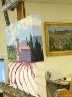
Hooray! I have found a great spot to paint! It is a nearby park with a beautiful apple orchard next to it. There are still blossoms on the trees, and I'm excited because I can set up directly across from the orchard on park property. By this time it is about 4:30 p.m. and my thought is that there should still be plenty of light for a couple of hours, so I took out a 12x16" panel and set to work. I guess I was a bit too ambitious for the first go. 12x16" is admittedly a small painting if you are working under consistent lighting conditions. But it suddenly seemed huge to me, especially in the rapidly changing light.

The light changed sooo fast. I have been used to the morning light, which also, in fact, changes pretty quickly, but this was super quick because the sun was steadily going down behind the mountains even before sunset. I barely got my canvas covered before the dramatic light and shadows on the mountains went completely flat and dull. I did take photos, and thought, well, I can finish it in the studio or perhaps on the field on the following day. Here is a picture of the painting in its incomplete form:

*Tip: I highly recommend sticking to a smaller canvas to start (no larger than 11x14) if you are just getting started painting en plein air, or if you are painting in rapidly changing light conditions. Pochades are excellent sizes to capture scenes quickly and loosely. The aim for me is to capture the light conditions of that particular moment in time, as a scene can look very different at different times of day and under different weather conditions. 

You can always work on a larger painting in the studio using your plein air reference if you want to make it bigger later. Of course if you really feel like you want to do a big painting, have at it, especially if you know you can return again and again at the same time of day until you complete it. As it is for me when traveling, I usually get just one shot to get it down. It is far better to have small victories that accurately capture the light, than larger canvases that are incomplete and leave me wanting.

I will post some additional pictures from my plein air painting mountain trip in future entries, so stay tuned!

Tags: art painting landscape painting artist plein air

Pochade box

Clouds and rain have been rolling in, so no plein air these last couple of mornings. I have plenty to do in my studio as I'm getting some new work together for a show, so it works out fine. In the meantime I thought I'd focus this morning's post on my one of my plein air setups. There are TON of options out there for plein air painters--everything from pochade boxes to classic French easels and beyond. Early on I had a full size French easel, but I found it to be too heavy for me, and I hated all of the wingnuts. Inevitably one would end up falling off during transport and without that wingnut to secure the easel leg, you're pretty much out of luck. If I ever did get another French easel, I would probably go for something like the Julian half box which is much lighter weight and not so cumbersome, in my opinion.

I currently work with two plein air setups for oils. One of them, my pochade box, I use quite often. Here is a picture of my pochade box:

I hang a roll of paper towels from a bungee cord on the front handle, and a grocery bag also to hold my spent paper towels. My paints, thinner, and medium store below the sliding palette, and my canvas stores in the lid.

A pochade is a French term meaning "quick sketch" and refers to the color studies that artists would create in the open air often for later reference in the studio. Original pochades were popular with 18th and 19th century landscape painters. They were small "cigar boxes" with hinged lids. Like my pochade box pictured above, the lid served as an area to hold the canvas or panel, and the bottom part of the box was used to store paints and a palette. It was a very simple affair and small enough to hold in your hand, sometimes with the use of a little thumb hole cut into the bottom of the box.

Currently pochade boxes range in sizes from 6x8" to 12x16". Prices for pochade boxes range widely, but if you are handy it is possible to make your own, as the design is really very simple. As for me, I am NOT handy like that!

I bought this little 9x12" pochade box online and I like it quite a lot. It weighs about 5 1/2 pounds, and with optional accessories can hold canvas panels from 6x8" on up to about 16x20". It has a tripod mounting plate on the bottom side to mount onto a camera tripod. My brand is a Bogen Jr. Manfrotto tripod, which is lightweight but sturdy.

I am constantly trying to find ways to compact and lighten my setup, but right now I carry all of my supplies in a large tote bag that I purchased from LL Bean (shown just behind my tripod). It works okay for short distances and for flat areas where you can just strap it onto a rolling luggage cart, but if I'm hiking in the mountains, probably not. In that case, I'd probably benefit from paring things down a bit.

Tags: art painting landscape painting artist plein air

Plein air outing (04/11/06)

I woke up this morning to a perfect, cool spring day so I set out early to do a little plein air painting. I experimented with a very limited palette, which was definitely challenging for me, especially when painting outdoors. My colors were three versions of the primary colors, (yellow red and blue, appearing as cadmium yellow pale, alizarin crimson, and ultramarine blue on my palette) plus white. I also added a fourth paint color, pthalo green, which is a highly tinted transparent warm green that can be used to mix a variety of colors beyond just green. My aim is to do some smaller paintings (pochades) as often as I can this spring and summer. On a sunny day, I find that I can only work on one scene for about two hours a session because beyond that the light has changed too drastically. By staying small I can do studies and cover the canvas within a limited amount of time. Small paintings also require you to paint loosely, as they cannot take a lot of detail unless you use a tiny brush. The whole idea for me though is to paint loosely and sharpen my ability to capture accurate color notes and the light effects in nature, not to render everything in a precise manner.

Here is the resulting 8x10" painting I did:

This is a redbud tree sitting along the banks of a little pond at a park near my house. It is definitely loose, but I will need to practice more with the limited palette as I did not get the contrast in the values, nor the colors quite as vibrant as I would have liked. Even so I think it is worthwhile to experiment with the limited palette as a way of really learning more about color mixing. 

I think this is probably about 1 1/2 hrs. worth of work. It may have taken a little less time if some of the park attendants had not come by wanting to chat. It was probably around 10 a.m. by the time I really got into it, and the light moved very quickly. I started out with my easel in full shade and ended with up with my canvas sitting entirely in the glaring sun, which made it hard to see anything. For this reason I decided it was time to pack up. Many people erect an umbrella over their work space to deal with this problem of moving light and shadow. With both the canvas and the palette in the shade, it is easier to see your colors. Dappled light or direct sunlight on the canvas and/or palette makes it very difficult to see and mix anything. I do have an umbrella but I was too lazy to bother with it today. That'll teach me!

I haven't decided if I will do any more with this painting, or if I will just keep it as a reference and as a learning exercise. I don't want to do too much, but I may see if I can push the values (the lights and darks) a little more. In any event, even if some of my plein air paintings never reach the "finished" stage, they are worthwhile for the experience of honing my observation skills.

Tags: art painting landscape painting artist plein air

Planning a painting

One might assume that if an artist already has a photo of the scene, no further planning is needed. However, I always find it helpful to plan out my composition a little bit in advance before I dive right into painting. This saves consistent editing to the composition on my canvas, though editing and refining are still a part of the painting process. A sketch need not be overly detailed, but it is still helpful in order to figure out the placement of things. Where is my horizon line? Where is my center of interest? Where is the sun in relation to my subject, and where will the shadows fall? What from the scene do I feel is important, and what may I want to edit out completely?

A sketch is also helpful because my canvas proportions may be different from the proportions in my photo. Therefore, I have to think about how to crop a scene to make it most interesting. Here is a photo of a scene in the Luberon valley of Provence that I took when I was there painting on location. A lovely little church served as a backdrop for a beautiful cherry orchard strewn with pink and white wildflowers. The photo does not do justice to the gorgeous wildflowers that were in this scene, but since I was there and painted and sketched in this area, memory can serve me well here:

Here is my very quick sketch. I plan to eliminate one of the middle ground trees, and use the two foreground trees to frame the scene. I establish where my horizon line will fall. At this point I am thinking it will be more interesting to have the horizon line a little higher up in my scene, rather than right smack in the middle of my canvas. Having my center of interest (the church) just off to the left of center creates a more dynamic composition as well. I also establish my light source and determine shadows.

Here is the painting, pretty well laid out. It is 12x16". It's been snowing here so the lighting coming in my studio windows has not been great for photography and this photograph has dulled my colors somewhat. I'm still working out the distant trees and the grasses and wildflowers in the foreground. I will post the completed painting on my website in the Provence Paintings section when it is complete.

Studio Work

Even though yesterday was the first day of spring, it is still pretty cold here. The days are actually varying wildly in temperature, which is typical for March in Richmond. Today temperatures will top out in the mid 30's, but by the weekend it is supposed to be in the upper 60's. Anemones, daffodils, cherry blossoms and forsythia are everywhere, and yet weather reports are actually calling for snow.

So, for a while longer I rely on my sketches and photos to inform my work. I work in the summer months in the studio too, but in warmer weather I can also break out for mornings painting and sketching in the open air. There is nothing quite like working from life. But when conditions are not ideal (or when you have long departed from your subject matter), I have devised (with my husband Dave's computer help and expertise) a way of working in the studio that exceeds working from printed photos.

When I travel to my painting destinations, I take literally thousands of digital pictures. I take shots both up close and far away, and I also shoot the same scene from several different angles if possible. The benefit of shooting digital is that I don't need to buy loads of film, and then worry about whether it will survive going through the x-ray machines at the airports. I can also see my images immediately and delete the ones that are clearly deficient.

When I get home I save my images onto a CD and work directly from a computer monitor that sits next to my easel. As it is, even digital photography is still one generation removed from nature. When an image is then printed off onto photo paper, the scene is even further removed. Printed photos tend to further wash out light areas and blacken out the darkest shadows, so a lot of detail is lost.

Viewing the images directly in digital form on my monitor allows me to see them in a truer light than if I had to print them off. Another advantage is that I can zoom in on a segment of the photo to see more detail--something not possible with printed photos. Of course you have to have taken the picture at a high enough image resolution in the first place, so I have a number of flash cards that hold a lot of large pictures. If traveling for extended periods it is even a good idea to download images along the way to CD or laptop, if possible, so that you have more room on your flash card (or memory stick) to take more pictures!

Here is my monitor/easel setup:


Back from the Workshop

The Friday workshop was a lot of fun. I was impressed by the talent and friendliness of the entire group, and it sure made my experience a real joy. I look forward to giving more workshops in the future! I will post more pictures of the class on in my "photo journal" on my website when I have time, but here are a few images in the meantime. The class began with a little talk and a demonstration. Here is a shot of the classroom. I'm standing in the front of the room (wearing a black shirt and green apron).

Giving the demo... 

An action shot of the painting process; I'm laying in my lightest and darkest areas first to establish my values. 

I got about half way done with this little painting before the participants broke out and started working on their own projects. I should have the finished painting up on my website soon.

Read about Jennifer's current and upcoming workshops here!

Fun with Gouache

I spent some time yesterday playing with gouache paints so that I could see how I liked working with them as a possible candidate for my portable studio. Gouache is a water based medium; basically it is an opaque watercolor. While as an oil painter I wouldn't exactly call it opaque, it is more so than traditional watercolor. I've worked with many different water media before, including gouache, but it has been some time. Here's what I discovered:

My "oops" moments:

  • Some of the colors don't behave at all like either watercolor or oils. In general the gouache colors were somewhat darker and took some experimenting to get the mix I wanted.
  • The paint dries very quickly! In the future I may rethink squeezing out big blobs on my palette all at once (an overzealous oil painter's habit.) If I painted with these outdoors, I'd definitely need a spray bottle or drying retardant to keep my paints moist and fluid while working in the open air.

My "hey, cool!" moments:

  • A very forgiving medium that is easy to work with. Most mistakes can be "lifted off" with water and brush. The opaqueness allows you to paint over certain passages and change the composition (something not so easily done with watercolor.)
  • Versatile- can be mixed with watercolor and pen and ink. Acts as a watercolor for washes, but can also be laid down more opaquely and mixed with white.
  • Easy cleanup. Like watercolor, just a little soap and water does the trick.

Gouache paintings are treated the same as watercolors in terms of care and framing. They should be displayed under glass and kept out of direct sunlight for best longevity. Gouaches tend to like a rigid surface, so a heavy paper or mat board is a good substrate for this medium. Here is a little painting I did of the Provincial countryside:


Jennifer Young; Vibrant Landscapes www.jenniferyoung.com Contact

Starting and finishing

Nowadays, the beginning stage is definitely one of my favorite parts of the painting process. I used to hate starting something new. Well, not hate, but I did feel a certain sense of intimidation staring at a big white, blank canvas. This was probably due to the fact that some years ago when I painted in my figurative/abstract style, I was creating work without reference to much of anything, other than my own thoughts and ideas. I also used to stretch my own canvases, which were pretty darn large!! It took me so much energy and effort to build the stretchers, stretch the canvas, and then apply at least two layers of gesso, that by the time I was ready to paint, well, I'd better not mess up! Intimidating. Now, with my landscapes, I always start with a beautiful, archival ready made canvas, and an idea or inspiration that is based on the natural world (photo or actual). With so much around me to observe, my ideas seem endless. The beginning stages are fun because, while I have a fairly well established starting point, I am constantly designing, tweaking, abstracting, and then bringing my design back into focus. I can imagine what it will look like, but not exactly, so there is a bit of surprise and excitement as I make the painting unfold.

I paint with large brushes for as long as possible and really get things going. As the painting advances, I continue to flesh out the values and colors, leaving the finer details until the very end. The details are necessary of course, but the challenge is to make them just enough so that they enhance the piece (a line here, a stroke of highlight there) but not enough so that it looks over-worked.

Often with smaller paintings, I can paint wet into wet, "alla prima" (all at once,) so finishing is really just the final note in a natural progression of observations and decisions. But when I have a large canvas, I can sometimes paint on it over a series of days. I may take it off of the easel for a while and just stare at it. Start another painting and then stare at the nearly-completed canvas again, throughout the day. What needs to be addressed? When is it finished? Often I can answer these questions pretty quickly, but not always.

So, any way, this week I have been so into starting paintings and I haven't done much finishing. I keep starting and starting. (I guess whatever keeps you motivated and working.) I think I have 4 or so going right now. Well, the time has come to start finishing some of the darned things. That's what I'll be doing today. Hopefully at the day's end I can emerge with the accomplishment of completion.

Travel Plans

Travel is one of the most joyful parts of my life as an artist. I love traveling to new and beautiful places to paint and gather inspiration, and I feel so fortunate that my business is able to support my adventures. This February we will be taking a much welcomed trip down to sunny Key West. We were supposed to go last Spring, but bad weather caused us to cancel those plans. Here's a scene I painted from photos I took on our last trip to Key West. It's called "Sunset Celebration". It measures 11x14", oil on canvas. For more details about the painting, check out my scenes of the American South section on my website:

I've also started planning for a June trip to Lake Como, Italy! I think the scenic views of the lake regions in Northern Italy are some of the most striking and beautiful in the country. The uniqueness of Lake Como is that it is distinctively Mediterranean, with lush flora, palm trees and cypresses, but set against a stunning backdrop of the Alpine mountains. I am so excited to be returning to this area, since the last time I went was many years ago and my camera broke on day two!

I will be painting on location both in Key West and in Como. I am primarily an oil painter but I'm considering bringing watercolors instead, since they allow for easier cleanup and are more portable. Plus, with the new airline regulations I have heard many instances where other artists have had their oil paints confiscated by the airlines. That's quite a setback to experience, considering the painter has to buy a whole new set of expensive paints at the destination site. Supposedly you can bring a letter from the paint manufacturer insisting that the oil paints are made with vegetable oils and do not contain but a trace of ingredients that would be considered "flammable".

But in past trips since 9/11 I have not wanted to take the chance. If I wanted to paint in oils overseas I ended up just shopping for small tubes of paint in the destination country. This can actually be a really fun experience, because there are so many fine products in the art stores of France and Italy. But it does take a bit of extra planning and time if one is going to be staying primarily out in the country.

Gallery Wrap

This week I'm working on some landscapes done with gallery wrapped canvas. It is a more time consuming because I am extending the painting to the edges, but I am really liking the effect. Here is a a small 12x12" work in progress. I'll be posting more work to my website this weekend.


Okay, so the fast has been a little harder than I thought- energy wise. May have been a better choice to start this after my next art opening, but oh well. I think I can still get the work done in plenty of time. I'll just need to manage my time wisely. 

In some instances the fast is easier than I would have imagined, but it is still not for the faint of heart. I am doing the "Master Cleanse," a modified juice fast and am on day 7. Haven't blogged before now because I am at the studio during the day and like milktoast by 8 p.m. every evening. Supposedly it gets better in respect to energy level and other things too. We will see. It might help if I stopped fantasizing about Pad Thai and garlicky spaghettini! I've not been all that hungry, but am having outrageous cravings. Still, I've gotten this far (with no coffee!) and am aiming for 10 days or more.

Painting Demo Part III

Things are really starting to take shape now. I've started to add more of the "local" color greens to the highlight side of my distant trees, allowing the deep blues and blue grays to act as the shadowed underside. I also begin to indicate the lines of the vineyards and the silvery olive trees that dot the distant countryside.  


The painting is looking close to being finished (at least in my mind). Just a few details to address now. I've given more dimension to the olive trees in front and have begun to restate the trunks, adding some of the bluish highlights just in places where the sun hits the gnarled forms. I keep my distant buildings soft and sketchy because they are farther away. Highlights on the distant trees are duller than the richer green colors that I put on the highlights in the foreground. I also add detail strokes to my cypresses. Now I take a nice long look at the painting to see what adjustments need to be made before I start finishing. Placing a mirror on the wall just opposite of your painting is an excellent tool for this purpose. It reflects the painting back in reverse, giving you a fresh viewpoint from which to see the painting anew. Sometimes when you've been staring at a painting for hours it's hard to see what needs to be changed.


Viola! Here is the painting in its finished (or nearly so) form. I've touched in the slight suggestion of windows on some of the buildings, taking care not to do too much of that in the distant ones. I've also developed my vineyards a little more and restated my tree branches. One adjustment I made with my reverse viewing/mirror technique was in the foreground trees. I didn't like how the tree line stopped just short of the edge of the picture plane. It made the composition feel too boxed in. So I extended the tree line out to the edge, which I think gives it a nicer sense of fluidity.


"Gli Olivi della Crete," Oil on Canvas, 30 x 40"

As you may have surmised that "Gli Olivi" means olive trees, and La Crete is the region in Tuscany that is depicted. Over the next week as I work on other paintings, I will prop this painting up in a visible spot in my studio and just keep looking at it. I may make minor adjustments to it if something really jumps out at me after a while, or I may deem it "finished" and put a coat of retouch varnish on it when it dries to the touch for protection.

Thanks for tuning in! If you'd like to see the entire demo again, please view the following links:

Painting Demo Part I Painting Demo Part II

To see more of my Italian Landscape paintings, click here.

Painting Demo Part II

I begin to block in some of the color here, laying in the foreground so that I can gauge the values and temperature of the rest of the color. I want to emphasize these wonderful olive trees and the sloping hill. The olive trees are so distinctive in the Tuscan countryside. At different distances and in different light they take on shades of green, silver, and even blue/violet. But back to the painting; the ground is too dark. The light from the sky is shining directly on the places that are not in shadow from the trees, so I will try to bring out some more highlights as I progress with the painting.

Here I am giving a little more form to the foreground trees, and I lay down the color for where I will show some of the bare land. All of the ground is still too dark in my opinion, but I begin to lighten it up a little.   


Blocking in more of the painting, the distance is starting to take shape. I lay in very cool colors in the far distance, using blues and cool greens. In general warm colors come forward and cool colors recede, so I will start with relatively cooler, lighter colors in the distance and stronger, warmer colors as the eye moves forward in the painting. I still use slightly darker blues, (ultramarine, plus a dab of cad red light and white/ or ultramarine plus a dab each of cad. orange and alizarin crimson and white) even in the middle ground, as I can always add more local color later. I've also lightened up the ochre ground colors throughout the painting, which I think looks better and more convincing.

I start to feel more comfortable once the canvas is covered with paint and there aren't any unaddressed areas. Even if the value or color isn't quite right, it helps me to "see" the painting better if I can have everything more or less laid out. I have now indicated the buildings, more of the distant trees, and have added detail to the olive trees in the foreground, including giving them some more shadow areas. As I have worked in more color, you can see I've painted out some of the tree trunks and branches that were indicated before, so I will have to restate them again at some point.

As you can see, this is very much a push and pull exercise for me. Some artists start with the distance and work forward, and I used to try and do that too, but I always tend to want to lay in some of the foreground so that I can better determine what the distance will need.

Painting Demonstration: Part I

I thought I'd share some information here about my painting process in the studio. It has been raining and snowing for what has seemed like weeks here, so the photography may not be the best. The colors may not appear exact but hopefully these pictures will be sufficient to give you some idea of how the image looks.

Here is my inspiration photo. This is a picture I took with my digital camera when I was in Tuscany in the springtime. We stayed in Montalcino, in the southern part of Tuscany, and we drove all over this and neighboring areas. I think I must have taken about 1000 photos in all. I like using digital pictures because you can delete on site and don't need to worry about film. Plus, back home I can zoom in on details and see them directly in my computer monitor without having to go through the expense of printing the images unless I really want to. My photos are pretty amateurish, but I use them more as digital records to jog my memory of what I saw and sketched while I was there. The actual digital file for this photo is much larger, allowing me much more detail in the studio:

What I like about this scene: I love the lines and the layers of textures. What I want to emphasize. The buildings on the right and the olive trees in the foreground. What I will want to change: I'll reverse the direction of the lines in the front vineyard so that they don't lead your eye straight out of the painting. I will also simplify the buildings, both in the foreground and in the distance; leaving in what I feel to be important and taking out what I feel is distracting.

Here is a quick sketch of the scene that I will use to work out what I'm thinking about:

Okay, before you say anything, I can draw better than this! This is just a quickie sketch - a throw away drawing to cement in my mind what I want to focus on in the painting. It would be better if I had drawn a more rectangular shape, as this is the format I will use for my painting, but I just grabbed what was on hand at the moment of inspiration. As you can see from this drawing, I am still working out the composition. That grouping of cypress trees is right in the middle of the photo, but I will experiment with some other placements. My objective is to make an interesting painting that expresses my impressions and feelings about this beautiful land that I visited, not to make an exact copy of a photograph. While I want to be true to the subject, my first commitment is to paint a dynamic and harmonious landscape.

Starting: Nowadays I mostly paint on white canvases, though some times I still tone them with a quick wash of raw sienna or alizarin crimson. I mix alizarin crimson and ultramarine blue, and with this I draw with a round bristle brush just a quick layout of my composition.


I'll lay in the sky because this is usually the lightest/brightest part of the picture. I don't get into a lot of detail here because I want to keep it loose and things are still subject to change. However, I do want to have a road map in place, so to speak. My next step will be to start blocking in the painting and laying out my color. In the coming days I will post my progress on this painting...stay tuned!

Oil painting substrates

I thought I'd write a little here about some of the oil painting substrates I use on a regular basis.Canvas: The canvas I use most often for anything over 16x20 inches in size is one that has staples only on the back side of the stretcher bars. Small metal tacks are nailed into the sides of the stretcher to hold the canvas secure. This is a very sturdy, fine canvas with an old world look to it, primed with acrylic gesso. The surface is smooth enough so that it is not absorbent, but not so smooth that there is no canvas "tooth".

The stretched canvases I have been using for my landscapes are standard-depth canvas (around 3/4" deep), so generally the finished paintings are finished off with a frame for display. The great benefit to these canvases is that their depth allows them to easily fit into any variety of frame styles and mouldings, from the very traditional to the very contemporary.

I have lately been considering trying some gallery wrapped canvases for my landscapes. I used to use them in my older work, like the painting shown here. The gallery wrapped canvases are deeper than the standard canvas and have no staples around the perimeter, allowing the canvas edges to be painted as well. They offer a clean contemporary look, and have the benefit of being lightweight and versatile. While these canvases can be framed, one needs to find frames that have very deep rabbet depths so that the canvas edge (which is around 1 1/2" deep) does not extend beyond the frame when you look at it in profile. In general these canvases are meant to have painted edges and are displayed unframed.Panels: Often times for smaller works I will use birchboard panels or gessoed canvas that is mounted on a hardboard or wood panel. (I never use the canvases that are mounted on cardboard. They are too cheap and flimsy and don't hold up for professional use. In any event they are not archival and I use archival materials for my work.)The panels are great for painting out of doors (painting "en plein air") because they are flat and can be packed and carried more easily than stretched canvas. Sometimes I will prime these panels with a neutral base coat of gray or raw sienna. I use these when I travel and for smaller works no larger than 16x20":


 After a while they do get heavy, however, so I am always in search of the most lightweight option available! The lightest I've found is the birchboard panels, but these are not commercially available. The birchboard (shown here, bottom gray panel) can be purchased at the hardware store in larger sheets that I have cut down to size. They have a smooth side (for painting) and a rough side. However, I prime them on both sides to seal them and prevent warping.