Change is Good (Part II)

In my last post I explained how I go about making changes to a previously completed painting that may need some minor tweaking to improve it. Today’s post deals with more drastic measures. This still life isn’t really that old, but almost since its completion I felt I wanted to do something different to the background. Both the shawl on the left and the angles on the right bothered me, as did the color combinations as they related to the foreground. All of these elements served to distract more than enhance the still life arrangement. 

Still life, version I

Still life, version I

So, after sanding, scraping and oiling out (as described in my previous post) my first thought was to create a very simple dark background, which is a classical approach to still life painting employed by a lot of painters through the ages. I also got rid of the awkward angle in the lower right portion of the table cloth, and carried the horizon line straight across.

Still life, version II

Still life, version II

I actually liked these changes, though without the background distractions it really brought out how evenly divided the painting was by the bottle of forsythias, making for not-so-interesting negative space on either side, only accentuated by the plain dark ground. The dark color also really brought out the remaining texture underneath, even when the paint layer was built up. So, I decided to play with it a bit, knowing I could always come back to the simple dark background if I really wanted to.

“Forsythia and Delft Blue”, Oil on linen, 20x24" ©Jennifer E Young (click the image for details)

“Forsythia and Delft Blue”, Oil on linen, 20x24" ©Jennifer E Young (click the image for details)

What I arrived upon felt to me to be both whimsical and old world at once. It almost reminds me of an antique screen or stage set of a decorative painted sky. The “clouds” served to break up the background space, and the softer, happier palette made me feel happier too. It can be a little scary to make these kind of changes but I’ve come around to the idea that  if the painting is nagging on me, the benefit of change can outweigh the risk. Have I ever “ruined” a painting doing this? Yes indeed. Occasionally my over-zealous scraping can poke a hole straight through the painting. Other times my changes may fail to satisfy me and I end up scrapping the whole thing entirely. But if I’m not satisfied with the painting as it is, it’s probably worth risking it. In any case, if I’m lucky, I have miles of canvas to go before I’m done. 

Week-long study with Kevin Macpherson

Jennifer with Kevin Macpherson

Jennifer with Kevin Macpherson

Last week I did something I haven't done in a very long time...devote myself to the art mistress from morning to night for an entire week. And it was a week studying with the talented Kevin Macpherson at that! As you may have read from my previous blog posts,  I am a big fan of his paintings and his books. He is truly one of the best teachers I have encountered so far. Not only is he a highly skilled painter, but he has a way of honing in on and distilling essential information that actually penetrates my rock-hard noggin.

The workshop took place in a beautiful new space called Chesapeake Fine Art Studio, run by artist Hai-Ou Hou in Stevensville, MD (great location- about 20 mins. away from Annapolis). If you are an artist on the east coast,  it would behoove you to check out her site. Hai-Ou is quite the painter herself, and also appears to be drawing some of the best and brightest painter/instructors in the plein air and traditional/representational painting movements.

I really wish I had time to delve into all I learned during my workshop experience, but life is slamming me pretty hard right now. This week marked a return to the "real world" (insert the sound of needle scraping across a record here) with kitchen renovation, school activities, and doctor's appointments commanding most of my time and energy.

But my biggest takeaways from Kevin's instruction had to do with value and composition. He spoke a lot about light and shadow, and how one can create much stronger paintings by clearly indicating which elements belong in the light family and which belong in the shadow family. (This sounds simple in theory but it isn't always so easy in practice.) He stressed seeing and painting "shapes, not things", with the idea that if we are too wrapped up in painting a "thing" we lose the ability to really see it accurately and how it relates to the rest of the painting as a whole. We spent a good deal of time really learning how to see the true value of things (er, shapes, that is!) He stressed using a color isolator in the field to identify true value and color, determining and laying down your darkest note of color first, followed by the rest of the shadow family, and finally the values in the light family, keying everything up from that very darkest note, so that you really can get a handle on color and value relationships.

In essence, how dark you key your darks will determine how light you key your lights. I use the analogy of playing "Chopsticks" on the piano. You can play low on the scale or high on the scale, but the arrangement of notes and their relationship to each other are the same no matter how high or low you move along the keyboard.

Kevin Macpherson's workshop

His demos didn't disappoint. In addition to demos in the field, mid-week during his opening he did a remarkable demonstration in the studio (from a photo) on a canvas sized at about 20x24" . During that opening he also presented an inspiring and highly entertaining lecture. This lecture, I understand, was very similar to the one he presented at the Plein Air Convention. Not being able to travel as much as I used to, I really appreciated having the opportunity to see this presentation, in a much more intimate setting.

Though we were meant to work largely out of doors, we had our share of rain and wind. When the weather didn't cooperate, it gave us the opportunity to study (in the gorgeous and spacious studio) some of the more pertinent points Kevin was trying to drive home. We spent a good deal of time studying value relationships among the "light family and shadow family". On another occasion we delved into "The Golden Mean" or "Golden Section" (the informal subdivision of space) and he presented a fascinating slide lecture with many, many inspiring examples of  how it has been used by painters throughout history.

Kevin Macpherson's painting demo

Here are a couple of my plein air paintings done during the workshop that actually reached a level of finish:

"Silo Shadows" Oil on panel, 10x8" ©Jennifer Young

"Silo Shadows" Oil on panel, 10x8" ©Jennifer Young

"Docked on a Gray Day", Oil on canvas, 10x12" © Jennifer E. Young

"Docked on a Gray Day", Oil on canvas, 10x12" © Jennifer E. Young

At the week's end, I left feeling completely exhausted and totally exhilarated at the same time. I didn't leave with many "finished" pieces, but that wasn't my goal at all any how. What I did leave with was a wealth of knowledge and insight, as well as a good deal of creative spark. Whether that spark ignites a fire, is now totally up to me.

Painting water

A reader recently asked me in my comments section about painting water, and as I am in the middle of painting Venice scenes I thought it might be good to "reflect" a bit on it here (pun intended). As we all know, pure water is transparent and has no color. It's power, pictorially speaking, lies in the colors and shapes it reflects. It's always a bit dangerous to apply too many formulas to painting, but some general guidelines are useful (just be sure to verify these with your observing eyes!)

Obviously, if you are painting a still body of water like a pond or lake that reflects the surrounding landscape, the reflected elements are upside down and reversed in the water. Reflected shapes are sometimes foreshortened, and water's movement also distorts the shapes reflected, depending on how much of a breeze or current is at play.

A common error is to paint reflected items tone for tone exactly as they appear in their solid counterparts. But unless they are in deep shadow (which does sometimes happen in the narrow canals of Venice) dark elements usually appear lighter in their reflections, and light tones appear darker. For me, painting the reflections (and especially the dark values) fairly thinly works best, as standing water has a glass-like appearance.

A common error of beginners is to paint everything reflected in horizontal strokes, and in doing so, overwork and over-blend these areas until everything is kind of a muddy mess.

I like to paint the basic value-shapes of the reflections in downward or vertical strokes first to follow the forms above, and then add strokes of movement horizontally. For detail and highlights, it's easy to "overdo" them in reflections, so take a subtle approach to start. Sometimes that is the most effective. You can always add more touches later, but it's harder to take away unless you just scrape down or wipe the whole thing clean!

Moving water like rivers, rapids and ocean waves are another thing altogether. They have their own unique properties, and probably could benefit from their own (future) post!

Some of my favorite reference sources for painting techniques regarding water (and everything else!) are the books by Emile Gruppe. Gruppe was a wonderful impressionist painter and teacher who was a part of the Cape Ann School of artists. He worked in and around Gloucester and Rockport Massachusetts. He wrote a triad of books on painting and they are all invaluable to the landscape painter.

Annapolis Day 2- A fine morning with guidance from Gruppe

Had a few technical difficulties to overcome before I could post again, but I'm picking up where I last left off writing about the Annapolis paint out. Day two of the paint-out started off great, mainly because I had been able to do a little planning the day before. Painting in an unfamiliar place can always be a little overwhelming. It takes a little bit of time to get your bearings and find locations that appeal to you. This task can also be a little more daunting if you are also painting unfamiliar subject matter. (In my case, not living near a harbor or having much boating experience,  that subject matter would be the preponderance of boats.) To tackle the first obstacle, I spent some time on the first day (in between my morning and afternoon paintings) just wandering around scouting out possible painting locations along the many small harbors. One thing to consider is the path the sun will take across the sky throughout the day from sunrise to sunset. Having already done one morning painting the first day, I began to get a feel for which locations would make good morning setups and which would work better for me in the evenings. (I will also sometimes carry a compass with me to accomplish this task.)  As a result, I found a location in Eastport that I knew would be perfect for an early morning sunrise scene. And in contrast to the first morning when I got started late, I was able to arrive early on day 2 and start painting between 7 and 7:30 a.m.

As for the second obstacle.... the first thing I had to do was to recognize that no matter what I am painting, all I really need to do is paint shapes and the play of light on forms. If you can accurately see what is in front of you as abstract shapes and light patterns (and get a good grasp especially on painting the shapes of the negative space between the forms as well,) form naturally happens. Having said that, the mind plays tricks on the untrained eye--even sometimes on the eye that has had a bit of training. Boats (like trees and the human face) are some of the things that the mind has long tended to see as symbols. They're some of the things that so many of us drew when we were kids --a sort of half-circle topped with two triangles. So one can easily fall into the trap of painting a symbol of a boat (or a tree or a face) instead of painting the actual shape.

While intellectually I know that all of the above is true, for my own peace of mind, I found it also helpful to consult one of my favorite art books of all time by Emile A. Gruppe. Gruppe was a fine New England painter of landscapes, townscapes and most notably to me, marinescapes . He was active in the 30's on up until the 70's and received training at the Art Students League in New York, and from famed American landscape painters Charles Hawthorne and John F. Carlson. Gruppe was also a wonderful teacher in his own right, both through the school that he established, and through his series of books on painting ("Brushwork," "Gruppe on Color" and "Gruppe on Painting; Direct Techniques in Oil" ). 

All three of these books are fabulous. They are also out of print, making the ones that are still available quite pricey and difficult to acquire. I haven't written much about these books before because there is just sooo much I would want to to say. I can't give proper honor to each of them now without making this post even longer than it already is, but suffice it to say that despite the cost and the regardless of sad quality of the painting reproductions within, they are three incredibly worthwhile and inspiring (if not essential) additions to any landscape painter's library.

For my money, Gruppe was a master of brushwork and composition. Living in New England, he was also a frequent painter of harbors and coastal scenes, which made his book, "Gruppe on Painting; Direct Techniques in Oil," a perfect traveling companion on my trip to Annapolis. I'm glad I grabbed it as I was walking out the door, especially since this particular book has a whole section on painting harbor scenes.  This is not a book of formulas, but rather a thoughtful book with a wealth of things to consider. For instance, here is an excerpt on drawing boats:

"...students havepreconceptions about what a boat should look like. They think of boats they drew as children, boats that were shaped like wooden shoes or bananas, curling up at the bow and stern. And that's how they draw them. But probably no shape could be less like that of a real ocean-going dragger; all those concave lines suggest weakness while the character of the dragger is strong and tough......Remember that the gunwhale of the boat is straight as it nears the bow--it doesn't sweep up like a gondola! And the bow goes into the water in a fairly straight line--it doesn't cut under sharply. Use strong lines to suggest a strong subject."

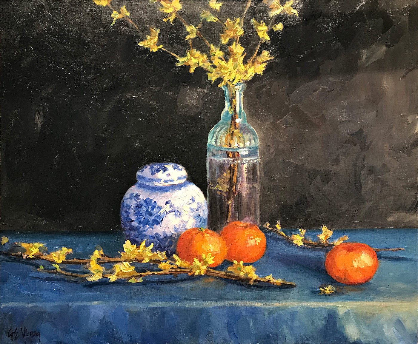
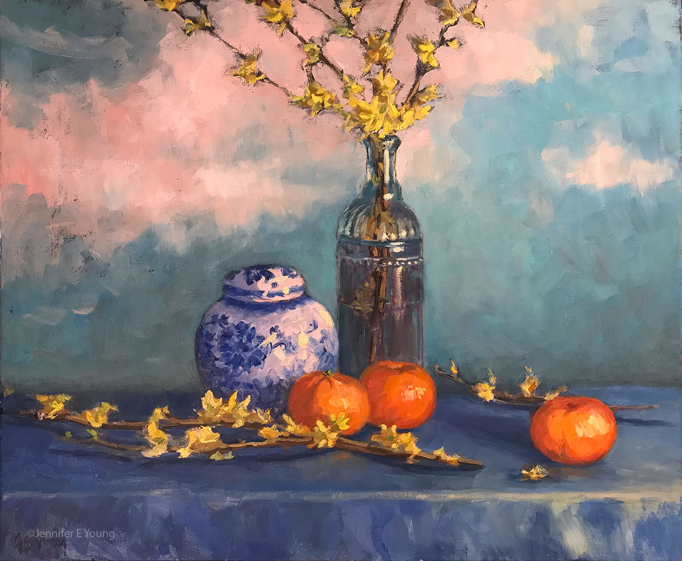
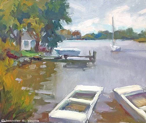
Just that one snippet helped me immensely, and yet there is so much more in this section alone; on cast shadows, masts, rigging, refraction, smaller boats, and docks and wharves. The conversational tone and the passion in Gruppe's writing helped me to internalize his teachings and carry them with me as I addressed the subjects and painted them from life. Here, finally, is the painting that resulted. I may need to touch it up when I return to the studio, but I was pretty happy about it overall:

coastal marine plein air painting annapolis

"Daybreak in Annapolis Oil on Multimedia Artboard, 11x14" (SOLD) ©Jennifer Young

On this second day of painting, I was happy to meet more of the artist members of the MAPAPA, so I felt a little more connected and a little less lost. In fact, as I was finishing up the above piece, an artist came up to me with a rather dazed and confused look. She said it was her first day at the paint-out, and she'd been driving around for an hour trying to decide what to paint. I had to chuckle (not at her, but with her.) Been there, done that!

Last chance to see JMW Turner show in D.C.

Turner, Grand Canal Venice

Over the holidays I finally seized the opportunity to head up to the National Gallery in Washington D.C. for the Turner show.  This traveling exhibition is a rare opportunity to see some 140 works by a true master of landscape painting (and, I might add, great-grandfather of abstraction). The show was wonderfully comprehensive, and featured so many of his larger scaled oil paintings as well as his intimate watercolors. It's probably an understatement to say that Turner seemed an interesting guy. His work showed a passionate interest in depicting disasters (caused both by nature and by man) in powerful compositions of dramatic color and light.  In painting after painting, one sees snow storms, shipwrecks, thunder, and fire swirling with emotion. The man must have been exhausted! I am not overly fond of the strong narrative element in many of his paintings, but even so, there is much to see and appreciate in these works. Turner was an artist concerned with social and political injustices both past and present and used narrative elements (both visually and in some of his ridiculously long painting titles) to make his points. He had some statements to make, that's for sure.

Turner started out as an architectural draftsman, and mastered drawing at an early age. This was quite evident in his beautiful paintings of Rome and Venice (pictured above). And while paintings of pure landscape were minimal, there were more sublime pieces as well, where the narrative was limited and light was the subject. Some of my favorites of the larger oils were labeled as "studies" or"unfinished". I loved the way these were so fresh and stripped down to their simplified essence of light and color. He was a precursor to the Impressionists and truly ahead of his time. As explained in NGA exhibition supporting materials, these "incomplete" works were just that, and probably not meant for exhibition, but as preparations for "finished" paintings to present to collectors and the Academy. But we can appreciate them with our modern sensibility as works of art in their own right, as well as for their wonderful documentation of this artist's processes.

While the oils were undeniably impressive and painted with skill and bravura, I personally found greatest delight in his watercolors. These just blew me away. Works ranged from highly finished watercolors with a lot of detailand drawing, to quick expressive sketches (near abstractions) from his sketchbooks.

If you're anywhere near D.C., you can catch this extraordinary show at the National Gallery's West building through January 6th, 2008 . Check out this cool online exhibition preview at the NGA's website! Next stops for the exhibition are Dallas and New York.