Reworking and "oiling out"

Each year my family looks forward to our annual beach week on the Outer Banks of North Carolina. I have written a lot about how much I love painting down there. A week never feels like enough time, but this year it feels like a lost luxury because the family made the tough decision to cancel our rental due to the risks of traveling during COVID19.

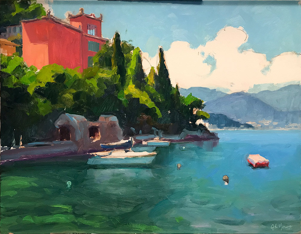
Needless to say I am feeling very nostalgic for the beach, and have spent a lot of time looking the painting, “Radiant Dawn,” which I painted a couple of years ago during another pivotal time of my life. This was the view from the bedroom balcony of our beach rental, and I hung it up in our living room to transport me back there in spirit. It was an emotional time for me but the awesome beauty of this sunrise lifted me up and gave me a deep sense of connection, hope, and gratitude.

sunrisenagshead.jpg

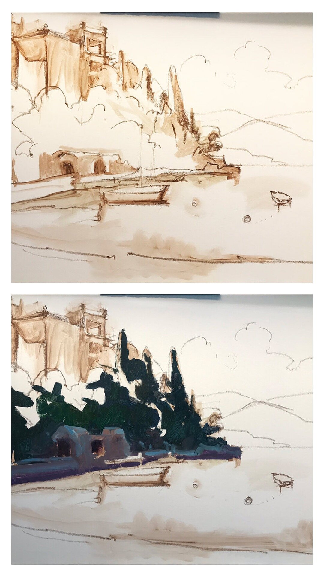
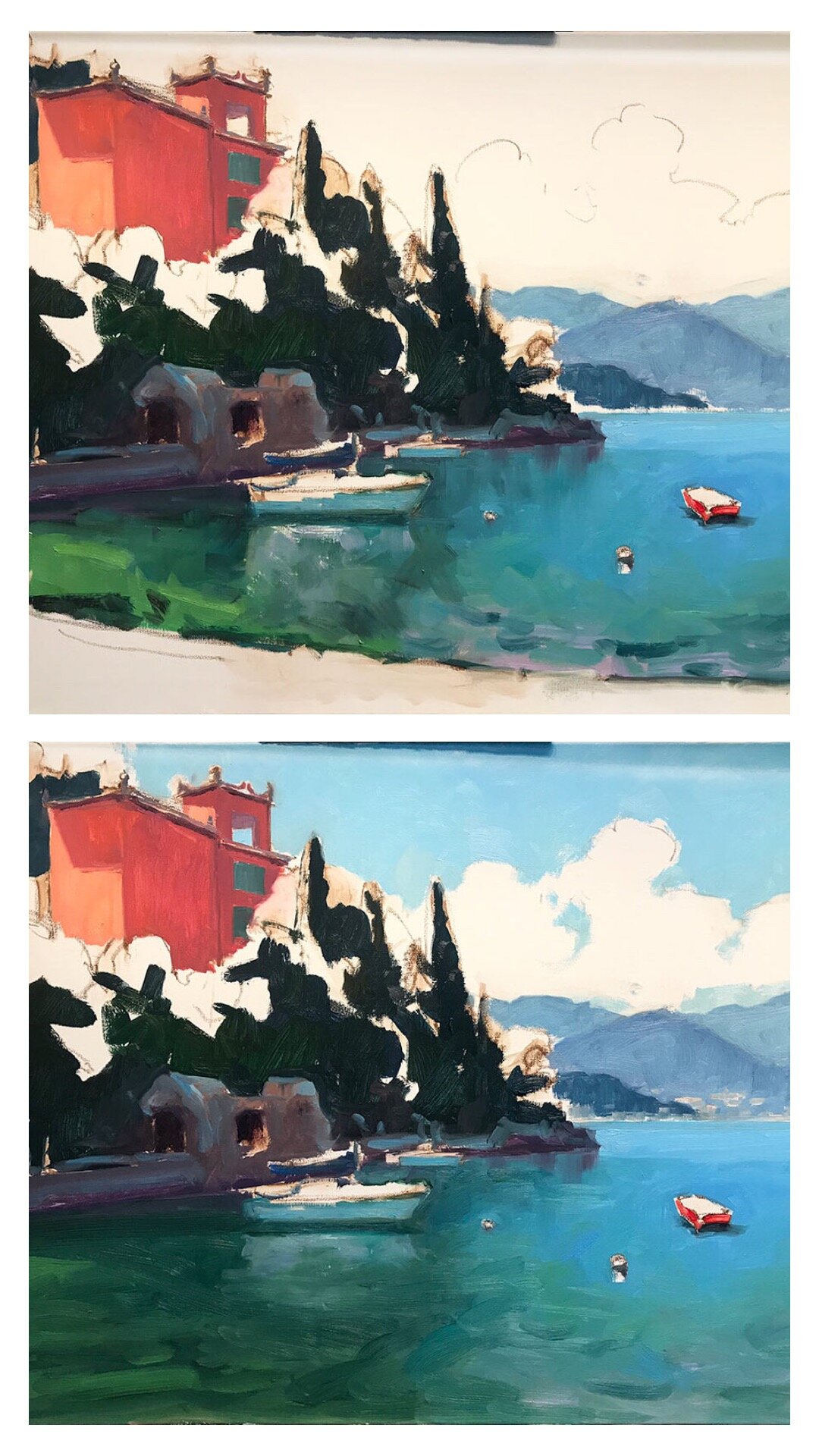
But of course the artist in me started to analyze the painting each morning as I “enjoyed” it from our breakfast nook. While I love the sky, I found myself really wanting to rework the lower portion of the piece. I found it altogether too green and too dark, and it did not evoke the feeling of “dunes” to me. I remember WHY I painted it this way, (I didn’t want to make the painting too busy and detract from the sky) but it just wasn’t working for me.

Sometimes when I rework a painting I have to sand the area down or even first scrape down some of the built up paint texture ever so gently with a razor blade. Otherwise the previous brushwork underneath is too distracting. In this case the surface was relatively uniform. It was, however, a bit slick and required some “oiling out” to assist in the adhesion of the new paint layers. To rework a dry painting I may use a bit of my painting medium mixed with Gamsol, or even a light spray of retouch-varnish applied to the area. For this piece, just oiling out with Gamsol seemed to be enough.

“Radiant Dawn,” Oil on linen, 24x30” ©Jennifer E Young

“Radiant Dawn,” Oil on linen, 24x30” ©Jennifer E Young

I basically reworked the lower third of this painting, leaving the sky completely alone. (It may look like I did more to the sky, but that’s because I think I did a better job of color correction on my digital image this time around.) Painting everything in a close value range can be a challenge, but an important one to keep the sense of unity I was after from the start. Here is the newly adjusted piece, with changes that my family didn’t even notice 😂. Oh well! I feel happier about it, so I guess that’s what’s important.

P.S. “Oiling out” and reworking are generally not advisable to do over a final varnish unless you can completely remove the varnish layer due to possible problems with cracking that can ensue. I always use retouch varnish though, both for this reason and because personally I don’t find final varnish necessary.

Lake Como Painting Progression (continued)

Well the time has really gotten away from me this week, as we are in the home stretch of my daughter’s “learn from home” work for her last weeks of fourth grade. But I HAVE been making progress on my painting of Varenna, the start of which I shared in my prior post.

First things first… I thought before going any further I would share a little about the colors currently on my palette, and what I’ve been using to work on this piece.

palette2.jpg

I will start by saying that this is a pretty big palette of colors for me, and definitely larger than what I use for my field work. But because I have such limited studio time, it helps to have a few more “convenience colors” to work with so I don’t spend so much time mixing. Plus look at those yummy colors. Sometimes it is just plain fun to indulge in them, as long as I don’t have to carry them around in my backpack! The paints listed with an asterisk* by their name are the kinds of colors I nearly always use. This is basically a double primary palette with the addition of an earth (brown pink) and a “black” (Payne’s Gray, which is really almost a dark blue).

I pretty much always lay my basic palette out the same way in a clockwise fashion. So for instance, starting with my earth colors in the lower left, I move up to white, which is always in my upper left, followed by colors from warm to cool, generally speaking. This palette has varied over time with a few colors added, or removed, or others substituted from time to time when I want to experiment. For instance, my two reds used to be Cadmium Red Light and Alizarin Crimson, but I switched to a cooler Napthol Red for my “warm” because when tinted it makes a cleaner, less orangey pink. I will use Quniacridone Violet in a similar manner to my former Alizarin Crimson for nice dark purples or browns, to modify other colors.

If you are new to painting I would recommend starting out with a double primary palette (a warm and cool of each primary color, yellow, red, and blue) plus white, and then slowly adding new colors over time as you get a good handle of what your primaries can mix. You might be surprised at what even a single primary palette can do.

Okay, enough palette talk for now. Let’s recap;

It’s time to address the rest of that white canvas by adding color to the lit side of the trees

varenna_demo_jenniferyoung

I also start addressing a few of the details of the foreground including boats and walkway to the town of Varenna.

varenna_demo_jenniferyoung

And finally (with a big caveat that this color is off because I was working on the painting at night and photographed it without the benefit of daylight) I start to address the masts, water, and clouds.

varenna8.jpg

At this point I am going to sit with the painting for a day or two and may “tweak” it here and there, but I am close. I will post the finished piece, (photographed in better lighting) when I do. ***UPDATE*** See the final painting here.

Lake Como painting progression

I am working on putting together a video post, but I have to get my 9 year old to help me with some of the technical side first.😅 So today I am relying on the good old fashioned blog post, sharing a step-by-step painting in progress.

I had such a good time with my last Lake Como Painting that thought I’d “laissez les bons temps roule,” (as the Cajun in me likes to say.) I chose a scene in Varenna from my photo archives, one of my favorite memories that now feels like both yesterday and a long time ago. I chose one of my favorite canvas sizes, a 24x30”, and a color scheme of jewel tones that always cheers me up.

My starting approach for the last year or so is to just very casually sketch out my composition lightly in sienna oil pastel. The Sennlier oil pastel is so soft and lovely that it erases my change of mind with a very low stain, and yet allows me to indicate some shading at the same time.

varennasketch_jenniferyoung

Once I am more or less satisfied with my composition, I begin laying in some of the shadow areas of my painting, to get a feeling for the overall value pattern of my painting.

varenna_WIP_Jenniferyoung

I am generally trying to keep things very broad as I lay down the initial color. While not all of the water is “in shadow”, I decided to lay in the general color because I felt it would help me make a decision about the composition ( as you will see in the next photo.)

Varenna_Painting_Demo_JenniferYoung

My initial idea was to include the foreground shoreline with a couple of rowboats, but at the same time I wanted to keep the distant horizon below the middle point, which pushed the shoreline down. After laying in the water I decided the shoreline wasn’t really doing much for me or the composition.

Varenna_Painting_Demo_JenniferYoung

This is better, I think. Even working from photos in the studio, there is still a lot of decision making that goes into the process. You don’t have to be a slave to a photo and paint something in, just because it’s there in the reference. This is my painting, after all, and sometimes the best thing I can do for my work is to simplify. There may be a future painting with the shoreline boats as the feature, you never know, but sometimes it’s better to say one thing with clarity than several things with confusion.

At this point it was time to step away and make dinner, but I felt like I was at a good stopping point so this is where I left off last evening. I will still need to address the rest of that white canvas and make additional adjustments to the water and boats , but now I have a pretty solid idea of where I’m going next.

From Study to Studio: Rose Regalia

There is little more satisfying than capturing a moment in time through painting. And there is no better method to achieve that end than painting from life. The beauty of plein air painting lies in its freshness and immediacy. At its best, pure notes of color painted with confidence are juxtaposed with passages of broken color as the painter makes new discoveries along the way. Light and shadow fit together like pieces of a puzzle until a unified statement coalesces into art.

Where plein air painting is very spontaneous, my approach in the studio, while similar, is more deliberate. Here I can adjust my proportions and play with the composition without the rush against time. I knew in the moment as I was painting this scene at Lewis Ginter Botanical Gardens that I would want to do a variation of it in a larger format. The colors were so spectacular and the garden designers did a good deal of the design work for my painting with the well- planned pathways and layers of flowers in all shades framed by trees and gazebos in the background.

“Rose Regalia”, Oil on linen, 12x16” ©Jennifer E Young

“Rose Regalia”, Oil on linen, 12x16” ©Jennifer E Young

I chose a favorite canvas size, 24 x 30”, for my larger studio piece. It is a slightly different aspect ratio than my 12x16” plein air, so I made some slight adjustments to the proportions and placement of the gazebos to create a less centered composition.

“Rose Regalia II”, Oil on linen, 24x30” ©Jennifer E Young

“Rose Regalia II”, Oil on linen, 24x30” ©Jennifer E Young

I wanted to stay true to the spirit of the smaller painting and the lighting effect coming from behind, but I lengthened the path to create a little more distance between the foreground roses and the background gazebos so as to slow the eye as it traveled through the painting. I really liked the looseness and freshness in the handling of the roses in my plein air piece, but I added more tonal variation and detail in the peachy roses in the foreground, since these shrubs were close to the viewer and the larger canvas seemed to call for something more.

Overall I am enjoying both the large and small versions of this composition, each in their own ways, and I think they each possess their own qualities unique to their chosen approach. The smaller plein air piece is currently one of 3 paintings I have displayed in a group show called “En Plein Air” at the Lora Robbins Library at Lewis Ginter, and the larger painting will be a part of a new exhibit this Friday at Crossroads Art Center’s Summer Open House. If you are in the Richmond area and you’d like to see these shows in person, check out my calendar for the details .

Sharpening the Saw: The value of a quick study

Last month I completed a weekly class with David Tanner, a painter well-known locally for his portraiture. I believe the best artists, and especially the best teachers, are also lifelong students. Thus I am a true believer in the periodic practice of focused study to “sharpen the saw” and to discover new ways of seeing and working.

My current obligations and time constraints make it difficult to invest in a week-long workshop out of town. So I was really interested when a fellow painter-friend recommended David’s class down at the Visual Art Center in Richmond. I have known and enjoyed David’s paintings for his sensitive portraits, his impressionist style and beautiful color sense, so I was delighted when his class, “Increase Your Speed & Capture the Color in Oil” jived with my daughter’s school and after-school schedule.

I loved the concept of this class, which was to distill the subjects, whether still life or the live model, to essential planes, light and shadow, and color, in quick small oil studies. Each class was roughly divided into two 1 1/2 hour sessions, beginning with one or two objects (a vase, a watering can, a piece of fruit) and various combinations of colorful backdrops. Gradually through each class the level of difficulty increased, until switching at last to the live model.

Quick studies done in class, 8x10” and 6x8”

Quick studies done in class, 8x10” and 6x8”

My biggest takeaway from this class was the importance of regular practice, with quick studies as a sort of artistic calisthenics. These little paintings, no matter how mundane the subject, were created with the INTENTION of allowing them to just be studies and nothing more. So often with my time constraints I feel a great pressure to create finished pieces— something I can sign and put a frame on. This class was not about that—at all—and I loved it! Frankly, I needed it.

Putting a time limit on the sessions helped me avoid jumping into the fussy details too soon. This occurs also with plein air painting practice, though I tend to spend more time on those, establishing correct proportion and a pleasing composition. I can really see using this approach as a compliment to my plein air painting practice, on rainy days when I can’t get outside. It’s also just a good a regular practice to work into my studio time, to improve and sharpen the saw.