Alla prima portrait study

In my previous post I mentioned an out of town trip last weekend. I was over in Colonial Beach VA pursuing one of my main 2009 goals (exploring the figure) by taking another class with painter/portrait artist Robert Liberace. This class was a 2 day workshop on alla prima portrait painting. Since this is the way I am accustomed to painting with my landscapes (particularly smaller works and those done en plein air) I was really drawn to the class. Rob is as enthusiastic and energetic as I remember him to be from my first class with him in figure drawing last semester at the Art League School. I am continually enthralled by his masterful demos, and I found it interesting that the process he set forth for this style of portraiture was very similar to the method I use to paint my landscapes.

The palette we used, however, was quite a bit different and more expansive than what I typically use for my landscapes; burnt umber, cad yellow light, followed by several reds, several blues, two violets and a couple of greens. He also used two different kinds of white, Titanium (a very strong, bright white) and Lead White (the most opaque of the whites.)

Rob began with an imprimatura (toning) in burnt umber on Ampersand panel, and a very quick and sketchy (though amazingly accurate) grisaile. From there he then built his way to layers of color from shadow to mid-tone, halftone and finally highlights. Of course he made it look so easy, but I soon found out otherwise!

The model I painted on this first day was a very stunning young lady who looked to be about 15 or 16. Turns out she was actually only 12. I think for her age and energy level she did exceedingly well sitting for us, and it was a real visual treat to paint her. By the luck of the draw, I found myself setting up in a spot that put the model in complete profile. I'm not normally overly excited with profile views. In fact I find them boring. But the model had a great hairdo and a nice twist to her torso that actually enlivened my view and made it fun to paint:

girlportraitstudy_jenniferyoung

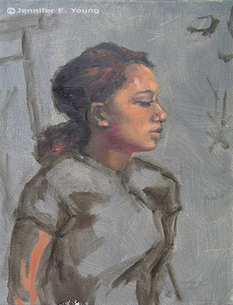
She was wearing a great red satin dress in the Asian style, which went well with her beautiful golden skintone and almond shaped eyes. Unfortunately in the remaining time we had left to work (after Rob's excellent demo) I got none of the dress, save for a brief outline. I did take a photo of her though, in case I decide to work more on the painting. But most times I leave my workshop studies as is, to serve as a reminder of what I learned and in what areas I still need to grow.

In any case, I  learned a lot from this first sitting. First of all, just as in plein air painting, it's important to get your drawing down accurately and commit to your big idea as soon as possible. While the lighting in a portrait studio doesn't change the way the natural light does en plein air, what does change incrementally is the model. It's really hard for a model to get the exact same pose and facial expression after a break. And it's also really hard to hold a pose for any length of time (especially if you happen to be 12 years old!) So while it's tempting to jump right in to color, Rob wanted us to spend a good deal of time first developing a strong grisaille and really fleshing out the portrait in it's proper porportion, placement, light, shadow, and halftone-- BEFORE putting down the first dab of color.

Another very important thing I learned once I moved beyond the grisaille had to do with painting children. As in landscape painting, it is oh so very easy to overdo it by getting lost in details. It's an interesting dance; because while you want to accurately record what you see, too much unnecessary detail can detract from the character of the subject and weaken the overall painting. At about an hour into my painting I was well into color, painting in every shadow I could possibly see on the model's face. I knew the likeness in her profile was pretty accurate, but still  I wasn't getting her character--her "glow".

Then Rob came by and said, "You're aging her." Taking my brush, with literally two sweeping strokes he pulled some of the middle skintone I had put down on her upper cheek and quickly swept it downward, blending away almost all of the shadow work I'd done around her mouth and nose, leaving only part of the cheekbone shadow and the shadow work I'd done under her jaw. I just stood there and chuckled. It was like one of those "miracle line eraser" wrinkle ads you see on the Internet.

"You just took 10 years off of her, " I said. Ah, if only it were that easy in real life!

p.s. The above 20x16" study was after about 2 to 2 1/2 hrs. of work. The sketch in the upper right corner of the canvas was a hands-on instructive from Rob early on, because the initial lines of my grisaille around the eyes were too juicy and lacked definition.

Elka in charcoal and conte

Even though my drawing class is over, my work with the figure continues, as I can find the time and opportunity. Last week time and opportunity converged, and I met with some other artists locally for a portrait session. This is Elka:

portrait charcoal drawing

Elka sat for us for about 3 hours (with breaks in between.) This isn't the first attempt at drawing her. My previous session was a complete and utterly disasterous oil painting (a "wiper"). This time around, I decided to revert back to drawing, and work on perfecting those skills before taking on figure painting. This piece is about 11x14" on a tinted Canson pastel paper (charcoal with white conte highlights.)

For this second session, Elka dressed up in 20's garb. I must admit that when I got the word she'd be dressed this way I wasn't that excited (probably another reason I only brought my drawing materials instead of my paints.) I don't know why. I guess I imagined her showing up in some kind of goofy costume or something and I wasn't really in the mood for doing anything that felt too much like fantasy.

But as it turned out, she showed up very tastefully dressed, and the hat actually really made it for me. Her pearl necklace also gave her a nice prop to do something with her hand so that she wouldn't just be sitting there staring. I didn't get a chance to develop the pearls, (which was a real bummer because that would've been fun) but even so I feel that I got a good likeness, and I am pleasantly surprised and happy with this drawing.

Elka is a very pretty girl--prettier than I've been able to render her. A very strange thing I've noticed is that I am less interested in drawing the pretty models and more attracted to drawing people I'd normally not think of as "beautiful" (at first glance). I think the traditionally pretty people have less appeal to me sometimes because they have features that are too small and/or too symmetrical. It's surely my own predjudice, but it feels like a greater effort for me to find the "character" of the person, and for this reason, I tend to exaggerate the curve of the nose or the arch of the brow or what have you. And then I've had experiences with models who may not be pretty (to me) or "perfect" in the traditional sense, but by the end of the session I'm filled with awe at their beauty and the uniqueness of them.

Ideally I hope to have that kind of feeling about all of the models I draw, and for that matter, all of the subjects I choose, whether landscape, figure or still life, and to render them accurately but also with my own artistic style and vision. But I guess it is natural to approach some things with greater preference and enthusiasm than others, and in the end, I can usually get to that feeling place as long as I can approach the subject with an open mind. I think I eventually got there with Elka- in spite of her great fault--that she was just too darned pretty ;-)

Small figure studies

I haven't written in a while about my return back to the exploration of the figure, but it has been going relatively well. The weekly class I've taken with Robert Liberace has been wonderful, but I must say that the 1.5 + hour commute (each way) has been a little bit of a challenge, and unfortunately I had to miss a class or two in the semester because my car broke down. (That's one of the drawbacks of taking an out of town class--you can't exactly catch a ride if your transportation source goes south!) So while I've felt a little bit disjointed with my schedule glitch, what I've also discovered is that my time in class flies by very quickly, and that my execution with drawing the figure from life is still relatively slow.

figure study ink gesture

Rob did some amazing demonstrations during the course of each class, and I often felt torn about whether I should watch the demos for the duration or work on my own drawings. I tried to acheive a balance of the two as best I could, but since my time with Rob was rather limited (and I can hang out with myself most any time), watching Rob's demos often won out. As a result I've ended up with rather a lot of "beginnings," and nothing from this class really has the feeling of a finished work.

watercolor portrait study

But that is the nature of  learning, I think. And whenever  I teach my own workshops I always try to emphasize to students that in a learning environment, the goal of finishing or making a "framable product" should be subordinate to learning and experiementation.

I took a decent amount of figure drawing in college, so I don't consider myself to be a novice. But I'll say without equivocation that this class was definitely experimental for me. In fact, since it's been such a long time since I've done much if any life drawing, in hindsight I might have been slightly cavalier by signing up for this class. Rob has a lot of devoted followers and it became clear to me early on that many of his students (talented in their own right and some also teachers themselves) were quite familiar both with Rob's teachings and with life drawing in general.

I probably would have done well to have first gained a level of comfort by taking an entire semester of a more basic class in just one or two drawing mediums-- charcoal and chalk, for instance-- to really develop my drawing.  The class was called something like "exploring the figure," which is a hint that it was the next stage beyond just fundamentals. And while all along the way we learned about correct proportion and developing mass and form, there was a little more emphasis in this class on exploring different mediums from drawing to painting, which added a whole new level of learning to an already complicated subject.

figurative painting portrait study watercolor

But neither my car breakdowns nor my cavalier course selection was enough to detract from the class as a whole, thanks wholly to the instructor. I found Rob to be an incredibly energetic, enthusiastic, and helpful instructor. Most of all I found him to be so very inspirational. Beyond his masterful technical acuity, he displays an incredibly beautiful sensitivity and true artistry in his work. So in many ways,  I am glad to have taken this particular class; because not only did it enable me to see the range he is able to acheive in his own work, but I also could see hints and clues about what is possible for myself.

grisaille portrait study Jennifer Young

*Note, scattered throughout this post are a few of my studies from the class. All are pretty small--ranging from 4x6" to 8x10". The small gestural studies (short poses from 3 to 7 minutes) were done in sepia ink. The two subsequent pieces were watercolor, and the final piece was a grisaille on linen, done on the last day of class.

Reclining nude II- WIP

I started this drawing on Friday in Robert Liberace's "Exploring the Figure" drawing class at the Art League School:

reclining nude figurative drawing by Jennifer Young

The upper portion is the least resolved so far, but the whole drawing is to be developed further by a kind of push/pull method of adding and subtracting layers of charcoal, followed by highlights in white conte chalk.

Rob started the class with a beautiful demonstration inspired by the techniques of a 19th century French academic artist named Pierre Paul Prud'hon. I had not heard much about this artist, but enjoyed seeing the exquisite  reproductions that Rob shared by way of this book.

Rob made particular note of the way in which Prud'hon defined form, and his unique method of shading and highlighting. As this article by artist Rebecca Alzofon explains very well, Prud'hon had a unique method of shading--in part by creating hatch lines that followed the direction of the form, then stumping and hatching again in a similar manner with highlighting chalks. So in our class, our challenge (should we choose to accept it) is to experiment with working in a similar manner from our model. From my understanding we will work on the same pose for another two or 3 sessions.

In Rob's demonstration he used a Canson gray tinted paper (at about a value #4) which worked well, as it created a light-mid value to contrast with highlighting with white Conte. I again found myself without the proper materials to perform the task. I must have gotten an incomplete or outdated supplies list or something, but all I had was an off-white Rives BFK paper, with which I just made-do by shading with vine charcoal to give me somewhat of a "tone".  I'm not sure at this point how far I can continue developing the current drawing or if it will produce the desired effect. At some point I may just start again with the proper paper, but I'd like to at least take this a little further to see what more I can do.

It has occurred to me that this method of very refined drawing is somewhat more polished than what I'm normally drawn to. Even in the Prud'hon reproductions in the book, I found myself lingering in the passagesof his drawings that were less "finished" and showed more gesture, more of the decision making process, and more of the hand of the artist.

In my own drawing, I notice myself secretly wanting to stop before I lose too much of the gesture. This is probably because in my landscape painting I've set a goal for myself to find ways of stating things more simply...to say "more with less", so to speak and to do it a bit more loosely. At the same time, the whole reason I signed up for this class is to experiment and maybe even learn something new in the process! You can't do that if you are too beholden to your own agenda.

I've been reading a great little book right now by George Leonard called Mastery: The Keys to Success and Long-Term Fulfillment. Leonard is an aikido master so a lot of his analogies in the book are drawn from the martial arts and Zen philosophy. According to the author, one of the keys of mastery is entitled "Surrender":

"The courage of a master is measured by his or her willingness to surrender. This means surrendering to your teacher and to the demands of your discipline. It also means surrendering your own hard-won proficiency from time to time in order to reach a higher or different level of proficiency."

Hmmm. I suspect it probably also means surrendering your own agenda from time to time as well.

Reclining nude sketch

Last night I joined a local figure drawing group. This group met for two hours-- slightly shorter than the usual 2 1/2 to 3 hour sessions I've been to before. The time flew, but I was still there long enough to be reminded again of how out of practice I am! This was my best attempt --a 25 minute pose (one of the longest of the evening).

figurative life drawing reclining nude

I really liked the model...she was very dramatic, which made drawing her lots of fun. She was also quite the trooper, lying on what looked to be a very uncomfortable low bench, with her head supported by a wedge-pillow thingy. I felt happy that I at least started to get some of the weight of her pose. But not much else in the way of detail. I think I'll be sticking to charcoal on newsprint paper until I can get myself to a point of more speed and accuracy, which is only going to come with practice and understanding.

 To that end, I'm studying proportion and human anatomy as best I can on my own for now, through books. I picked up a book by Andrew Loomis at the library called "Figure Drawing for All It's Worth". The book was originally published in 1943, and is one of a series of books by the author on similar topics. Loomis was a well known illustrator back in the day and is still referenced by a lot of figurative artists today as a good source for basic and accessible information on human proportion and figure drawing in general. Sadly, his books are now out of print, but you can still find some of them online  and possibly at your local library.

Loomis makes some interesting opening comments in the book about "Beginner's Work". There are several telltale signs he lists, but I took note of this one, as I definitely see this occurring in my own figure drawing:

"An overabundance of small fuzzy line:  Do not "pet" in your line, draw it clearly with a long sweep. Do not shade with a multitude of little "pecky" strokes. "

Ya. So in addition to all of the other stuff on anatomy and proportion, one of the things I want to work on is quality of the contour and line. I think the sketchiness comes in part from a lack of confidence/familiarity with the subject. It's much easier to make sketchy marks as you try to find the right placement and proportion. It's something else altogether to put meaningful, lyrical marks in just the right place!