Sharpening the Saw: The value of a quick study
/Last month I completed a weekly class with David Tanner, a painter well-known locally for his portraiture. I believe the best artists, and especially the best teachers, are also lifelong students. Thus I am a true believer in the periodic practice of focused study to “sharpen the saw” and to discover new ways of seeing and working.
My current obligations and time constraints make it difficult to invest in a week-long workshop out of town. So I was really interested when a fellow painter-friend recommended David’s class down at the Visual Art Center in Richmond. I have known and enjoyed David’s paintings for his sensitive portraits, his impressionist style and beautiful color sense, so I was delighted when his class, “Increase Your Speed & Capture the Color in Oil” jived with my daughter’s school and after-school schedule.
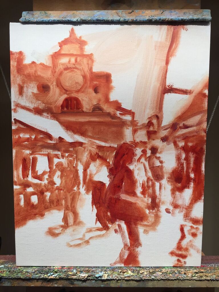
I loved the concept of this class, which was to distill the subjects, whether still life or the live model, to essential planes, light and shadow, and color, in quick small oil studies. Each class was roughly divided into two 1 1/2 hour sessions, beginning with one or two objects (a vase, a watering can, a piece of fruit) and various combinations of colorful backdrops. Gradually through each class the level of difficulty increased, until switching at last to the live model.

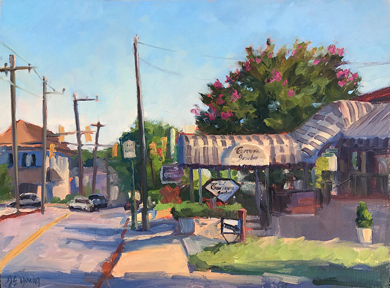
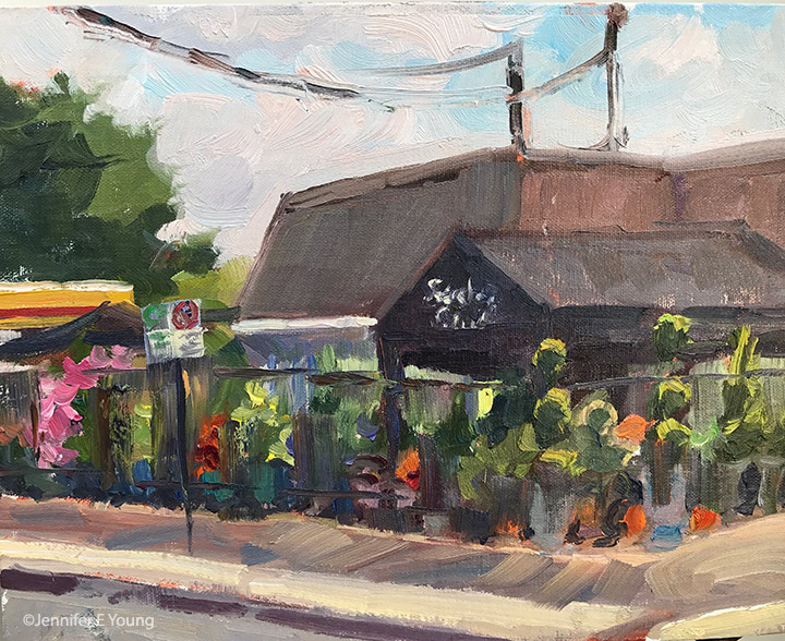
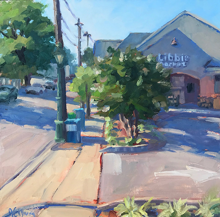
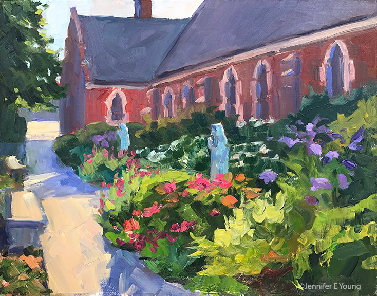
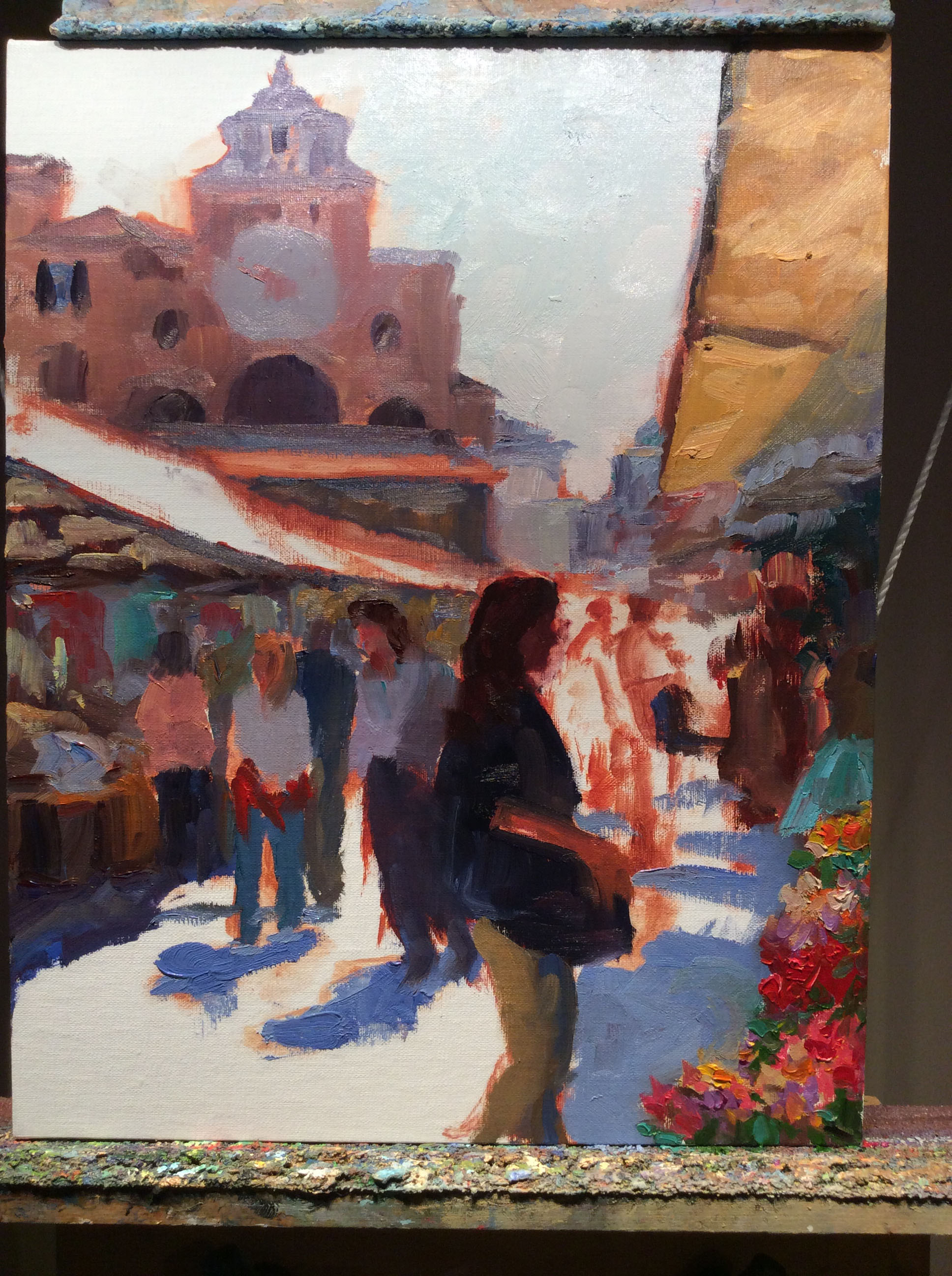
Quick studies done in class, 8x10” and 6x8”
My biggest takeaway from this class was the importance of regular practice, with quick studies as a sort of artistic calisthenics. These little paintings, no matter how mundane the subject, were created with the INTENTION of allowing them to just be studies and nothing more. So often with my time constraints I feel a great pressure to create finished pieces— something I can sign and put a frame on. This class was not about that—at all—and I loved it! Frankly, I needed it.
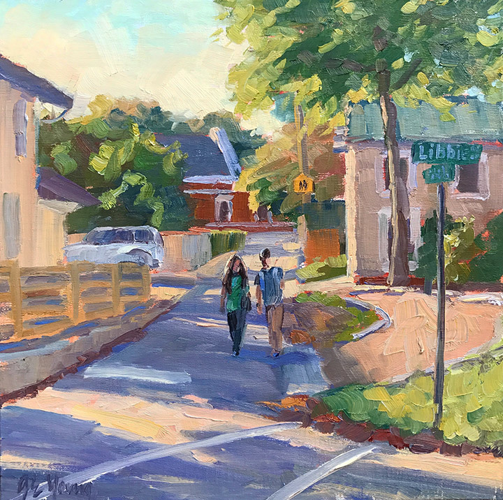
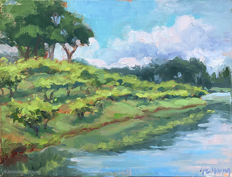
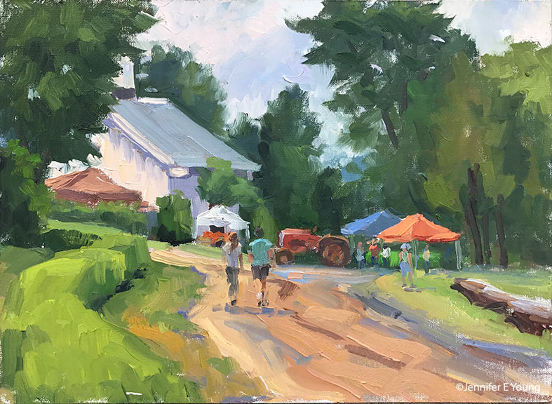
Putting a time limit on the sessions helped me avoid jumping into the fussy details too soon. This occurs also with plein air painting practice, though I tend to spend more time on those, establishing correct proportion and a pleasing composition. I can really see using this approach as a compliment to my plein air painting practice, on rainy days when I can’t get outside. It’s also just a good a regular practice to work into my studio time, to improve and sharpen the saw.