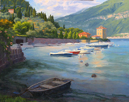
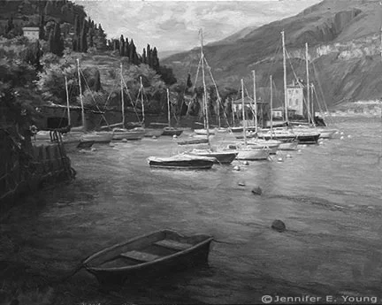
Painting water

A reader recently asked me in my comments section about painting water, and as I am in the middle of painting Venice scenes I thought it might be good to "reflect" a bit on it here (pun intended). As we all know, pure water is transparent and has no color. It's power, pictorially speaking, lies in the colors and shapes it reflects. It's always a bit dangerous to apply too many formulas to painting, but some general guidelines are useful (just be sure to verify these with your observing eyes!)

Obviously, if you are painting a still body of water like a pond or lake that reflects the surrounding landscape, the reflected elements are upside down and reversed in the water. Reflected shapes are sometimes foreshortened, and water's movement also distorts the shapes reflected, depending on how much of a breeze or current is at play.

A common error is to paint reflected items tone for tone exactly as they appear in their solid counterparts. But unless they are in deep shadow (which does sometimes happen in the narrow canals of Venice) dark elements usually appear lighter in their reflections, and light tones appear darker. For me, painting the reflections (and especially the dark values) fairly thinly works best, as standing water has a glass-like appearance.

A common error of beginners is to paint everything reflected in horizontal strokes, and in doing so, overwork and over-blend these areas until everything is kind of a muddy mess.

I like to paint the basic value-shapes of the reflections in downward or vertical strokes first to follow the forms above, and then add strokes of movement horizontally. For detail and highlights, it's easy to "overdo" them in reflections, so take a subtle approach to start. Sometimes that is the most effective. You can always add more touches later, but it's harder to take away unless you just scrape down or wipe the whole thing clean!

Moving water like rivers, rapids and ocean waves are another thing altogether. They have their own unique properties, and probably could benefit from their own (future) post!

Some of my favorite reference sources for painting techniques regarding water (and everything else!) are the books by Emile Gruppe. Gruppe was a wonderful impressionist painter and teacher who was a part of the Cape Ann School of artists. He worked in and around Gloucester and Rockport Massachusetts. He wrote a triad of books on painting and they are all invaluable to the landscape painter.

Blue Ridge Mountains Commission- WIP, cont'd

This week I continued work on the mountain meadow commission painting I began blogging about in my last post. My approach for this piece seems to be that I am working more or less from back to front, as edges are softer farther away and come into greater focus in the foreground. The sky is painted together with the distant mountains, since there is such an interplay of clouds and mist back there. The distant trees are addressed rather uniformly at this point, as I tweak their values and placement in the composition.

Blue Ridge Mountain Meadow Commission- WIP

Next I decide to address the darkest value in the painting, which is the focal tree, so that I can better assess the value relationships as a whole. I am not getting into the tree edges yet, as I need some of the meadow colors laid down first in order to create the soft edges of a misty morning.

Jennifer Young Morning Meadow commissioned painting in progress

Next I mass in very generally the flowers in the field. There will be a lot more color variation but I just want to get the generalized color and pattern down on the canvas first.

Jennifer Young Morning Meadow painting commission- WIP

Soft greens of the grasses follow the blue, and merge to soften the edges further.

Jennifer Young painting commission

With the field of the meadow laid in, I can now start to give the focal tree a nicer shape, with soft lacy edges and a few subtle tree holes. I may need to tease out those holes a little further, perhaps darken them a bit, so that they aren't so "holey", but now I can see the  painting really start to take shape.

Jennifer Young mountain landscape painting in progress

The sky has gotten washed out in the photo above, but I will try to get a better shot with different lighting conditions. It's been raining and cloudy a lot lately, so I am relying on indoor lighting (which isn't all that reliable!) What comes next will be more work on that field. Both grasses and flowers are cooler and softer as they recede, and show more detail, warmth,  color intensity and contrast as they come forward.

A spring commission

With the spring shows hung and the winter commission complete, I was thinking I would be able to turn next to some plein air painting, or perhaps to develop a couple of my James River plein air paintings into larger studio works. But that will have to wait, as I have gotten another commission! :-) But first, a couple of shots of the garden, which, when last photographed was in a state of sad dishevelment! The gardens around the studio really come into greater color in the summer. But with the rubbish cleared and weeds pulled, things are coming alive in the side garden with Creeping Jenny on the path, flanked by Mountian Bluets (Bachelor's Buttons) and creeping phlox. A flowering Dogwood makes a nice canopy, and the lilac in the fore is just starting to put off its heady scent.

20130427-063451.jpg

Here's another shot below of the garden opposite the studio. In summer there are lilies, cone flowers, tall phlox and a butterfly bush. But my big thing lately is succulents. I love that they are water-wise and so marvelously sculptural. In the center is a succulent topiary I made last year. I will need to replenish a few of the tender plants that didn't survive our winter, but it hasn't been quite warm enough here to see much variety in the garden centers yet.

20130427-063539.jpg

Now that my daughter is a toddler, I can usually patch together enough time to noodle in the garden while she plays nearby. Working in the studio is a different story. At just 2 1/2 years old, her attention span is still pretty limited. So while she loves being in the studio, (and I love having her there,) I do have to shoo her out when it comes time to work, amidst howls of protest (and a certain amount of Mommy guilt as well).

...Which leads me to the commission! If you have been a reader for some time, this image might be familiar to you. In fact, I have painted variations of this scene a few times, beginning with the small painting done en plein air in the Blue Ridge mountains, and following with two larger 30x40 versions.

The commission came about as the result of my April show currently taking placein New Jersey. The client loved the painting "Morning Meadow" (click here to read my blog about this painting in the making) but it was much too large for her space. So my task is to recreate this scene in a 16x20 format.

Since a 30x40" painting doesn't exactly scale down to 16x20", we thought it best to start with a sketch of the new painting so that the client could have a visual idea of how it would look compositionally.

20130427-063621.jpg

While on the one hand, it may seem easier to recreate something I have basically already done a number of times, it can sometimes be a challenge to meet client expectations. Sometimes, though not always, a client may, for instance, expect the new painting to be exactly like the first, only smaller. So an effort always has to be made to explain in advance that as an original work of art, a painting can't be recreated stroke-for-stroke like the last.

The client does understand this, though she would like the color of the new piece to be as close as possible to the last. It was, after all, the combination of colors in Morning Meadow that she fell in love with.

Luckily, my prior blog post listed the exact color palette I used to create the larger piece! :) (I can't tell you how often I have referenced my own blog to get this kind of historical information.) So while I won't be able to remember exactly the combinations of color mixtures, I will be able to take some of the guesswork out of the process and use the same palette for this piece.

20130427-063635.jpg

Above is the sketch, reinterpreted onto canvas. At this point in sketch stage, I want to make sure I get an accurate placement for the various elements in the composition, so I've marked off in pencil the horizontal and vertical mid-points in the pencil sketch as well as on the painting to guide me. More to come in an upcoming post, where I will get into some color!

Sogno Rosso

We have been back from Thanksgiving travels for a week now, and we all received an awesome airline door prize in the form of the virus-of-the-day.  It's on the way out now, but I guess I should not be surprised to have contracted something, travelling with a toddler (who, especially since she has been in preschool has become the human petri dish!) Well, I guess as they say, what doesn't kill you makes you stronger. Any way, I am back to painting now, and I have really missed my studio time.  As I mentioned before, I am sticking to some smaller paintings for a while. The holiday schedule seems to just get fuller and crazier with each passing year. So, for sanity's sake, I think I am finally learning to just be kind to myself at the outset and not even attempt anything overly ambitious during this time.

So December is officially small painting month for me! And here, to prove my point, is a 12x16" painting of the Val d'Orcia, in Tuscany:

The compositional sketch:

20121202-185123.jpg
20121130-170359.jpg
"Sogno Rosso" Oil on Canvas, 12"x16" (SOLD) ©Jennifer Young

"Sogno Rosso" Oil on Canvas, 12"x16" (SOLD) ©Jennifer Young

The Tuscan landscape just seems to roll on forever. It is a painter's dream. That idea is the inspiration for the title. "Sogno" (= dream), and "Rosso" (= the red field of poppies). I am painting from photos, memory, and imagination. The photos are the touchstone, but through memory I hope to convey my feelings for this place, which, from the very first time I laid eyes on it, has pulled at my heartstrings.

I rarely paint anything exactly as it is, (whether painting from photographs or life) so that's where the "imagination" comes in. I compose, rearrange, and edit until I acheive a composition and a statement that is pleasing to me. I want to stay true to the place, but really, it's just a moment in time, and an impression of the natural world that I'm after.

Though I am temporarily committed to keeping my painting sizes small, I think this composition cries out to be reincarnated as a larger piece at some future point. What do you think?

Revisions, revisions...and finally the final!

Well is this the slowest moving demo ever, or what?  Sorry about that, and thanks for sticking with me! I  haveenjoyed this painting, but  I struggled with the foreground boats I had planned to include.  I took them out and put them back in several times. I felt like I wanted something there to lead the eye into the picture, but the boats as I had them seemed to block my entrance  rather than aid it. So I finally settled on a single rowboat to lead the eye in while still allowing some breathing room.

After that was all hashed out (whew! ) I set about laying in the background boats against the retaining wall, half of which are in shadow, and half in light.

Next came the masts, sails, and water. The reflections in this scene were very soft and shimmery. Light reflections tend to cast a wee bit darker than what is being reflected, and dark ones are a tad lighter. I tried to keep the whites on the warm side, as they take on a lovely golden glow as they glimmer in the low angle of the sun.

"Pescallo Glow" Oil on Linen, 24x30" (SOLD) ©Jennifer Young

"Pescallo Glow" Oil on Linen, 24x30" (SOLD) ©Jennifer Young

So, did I keep with my grayscale plan I mapped out at the beginning of this demo?  You tell me:

pescalloglowbw_jenniferyoung
notan sketch
grayscale sketch by Jennifer Young

I must say that I liked having the grayscale notan and I actually did reference it often during the entire process of my painting. While I think it is a valuable tool, I think I would still have benefitted from doing a compositional line drawing in addition, especially with such a complicated scene. I probably reference the notan sketch more throughout the painting, but a strong compositional line plan may very well have eliminated the foreground boat dilemma I struggled with midway through the painting.  Live and learn!