Large Hatteras Island Painting -complete!

Here is the final version of the painting I have been working on for the past week or so:

coastal andscape painting of the NC Outer Banks by Jennifer E. Young

"To the Sea" Oil on Gallery Wrapped Canvas, 30x40" Click here for more info, or contact me to purchase!

I had such a good time painting this piece I didn't want it to end. The  several prior studies I did of this subject (most of them on location) really helped to inform me about color choices and brushwork, and also, more importantly, they brought back the strong emotional connection I have with the subject. I felt like I was on vacation all over again. Don't get me wrong, this was work, too, but it is this kind of view that I see on summer vacations to the Outer Banks  when I step out on the deck in the morning to sip my first cup of coffee. For me it recalls a time to let  all the cares go and just relax!

Progress on the large Hatteras painting

Here are a few progress shots on the Hatteras Island Dunes painting I last blogged about:

Work in progress landscape painting by Jennifer E. YoungWork in progress landscape painting by Jennifer E. YoungWork in progress landscape painting by Jennifer E. Young

Though I am trying hard to address the picture as a whole, it is some kind of work just getting the canvas covered. I have been painting pretty small lately so I am kind of shocked at the amount of paint I'm mixing and using. I think this is especially true because I'm not used to using such an absorbent surface.

In the process of working solely from my painted studies, I've noticed that one of the main reasons I love the smaller alla prima pieces is the amount of broken color in the painting. Color is laid next to color, sometimes within the same stroke, and brush strokes aren't overly licked or blended. The result is that you can achieve a really fresh look with the little ones. It's not impossible to do this with the larger paintings, but you do have to really work wet-into-wet the whole time, and start loading on the paint to get that kind of effect. To have that kind of expectation with a painting of this size may very well be an exercise in futility, especially since I am not able to paint on it every day. On the other hand it is really impossible to replicate stroke-for-stroke what I have done in the smaller studies, as the brush size-to-canvas ratio would mean I'd likely have to turn to using house paint brushes!

So with these "reality checks" in mind, I am still striving to capture that fresh, breezy, beachy essence, even if the nature of this beast is very different from the original. I find myself working more background to foreground on the bigger paintings (rather than strictly dark to light) in order to keep the paint surface workable. Nevertheless, I am saving most of the lightest highlights toward the end because they are the most opaque and have the thickest application.

Of Paint and Palette Knives

Here is a recent message I received from a reader that I thought I other blog readers might find of interest: Q: Can you tell me if you use painting knives or if it is all done with brushes? And do you have a favorite brand of paint? -N.M

A: Hi N.M-I paint primarily with a brush, but here and there I have been using the palette knife as a painting tool (rather than just a tool for mixing). If you can get your hands on Richard Schmid's video on painting the landscape (June in particular), he has an excellent demonstration of how he uses the palette knife in his paintings. I am experimenting with his technique (as I understand it) but, not for every painting. So I wouldn't call myself a palette knife painter by any means.

As for paint brands, I'm looking at my paint bins now, and I see Winsor Newton, Gamblin, Holbein, Daniel Smith, M. Graham, Rembrandt, and Old Holland! I probably use Winsor Newton and Gamblin most often, but I have had good experiences with all of the above. I often base my decision on which brand to buy by the pigment I am after. Some pigments seem to be pretty particular to one brand. But even paints that go by the same name can vary quite a lot in hue, value, or color temperature. For instance, Winsor & Newton's Cadmium Yellow Light is warmer and I believe, a bit darker than Gamblin's, which is more lemony. That's not necessarily better or worse-- it all depends on what you're after.In any case, I make sure that I buy professional grade paints, rather than student grade. They are more expensive, but there is a big difference in quality.

I hope this helps, and happy painting!

"All Things French" opens tonight

Off to Greenville for the show opening. Y'all come! For those who can't make it, here's a slideshow recap of work I've delivered for the show:

Where: City Art Gallery, 511 Red Banks Rd., Greenville, NC 27858 When: Opening August 6, 6-8 PM. Show continues throught the month of August. What: All Things French! Paintings from France travels by Jennifer Young and Hilarie Lambert

Le Bateau Rouge

Well the week has flown by and I'm still working away constantly getting ready for the show at City Art Gallery (final touches, varnishing, framing, etc.) Meanwhile I have developed some kind of tendonitis in BOTH of my arms, starting from my shoulders and running all the way down to my wrists and hands. This has been coming on for a while but now it's raging. Fabulous. It also hurts to do any kind of computer work, so since I haven't trained any other appendages to hold a paintbrush, right now if I have to limit one activity it's going to be the computer. Needless to say, blogging may be spotty at best over the next week or two, but I will try to keep posting here and there if I can. Today's painting is again of a scene in the Dordogne. I worked from sketches and a photo. The tree in my photo was very much like a reverse version (in type and lighting) to the plein air painting I did not too long ago of the backlit willow, so I for that part of the painting, I found my plein air work to be a better reference. A little bit of Virginia in France? Hey, if it makes a better painting, I'm all for it.

French landscape painting by Jennifer Young

"Le Bateau Rouge" Oil on Linen, 24x30" sold

Shifting Light on the Dordogne

New painting:

landscape painting dordogne france

"Shifiting Light on the Dordogne" Oil on Linen, 30x40" Contact me for purchasing info.

One of the remarkable features about the landscape in this corner of France was the dramatic way the light would shift. You could be driving in a valley covered by enormous, low-lying clouds, and drive over a hill to the next valley filled with brilliant sunshine. If I had to describe in one word the weather of this region (at least in the spring when I was there) it would be "changeable." You basically had to dress in layers ("Wear fleece" was the prudent advice), and be prepared for fog, chill, rain and blazing sun, often throughout the course of one morning.

It could be quite a challenge for the plein air painter, but it did make for some amazing skies and cloud shadows--kind of like the things you see in a nature film that uses time-lapse photography. This is what I was trying to capture in this birds-eye view painting looking down on the Dordogne river and valley. It is one of several stunning vistas I saw from the top of the Chateau de Beynac.

French pastoral WIP now complete

I spent the good part of last week working on the 3x4' work-in-progress that I'd posted earlier. Usually I consider a 30x40" canvas to be a large painting for me. So moving up to 36x48" does slow me down a bit. I worked at it pretty consistently and really enjoyed myself, though I found myself constantly repeating a few mantras: "I need to mix even more paint," "I need bigger brushes", and "My shoulder aches." I may have to see if I can train myself to paint left-handed if I'm going to continue to do these big paintings!

French countryside landscape painting by Jennifer Young

"Solitaire" Oil on Canvas, 36x48" Contact me for more info!

This painting is a scene from my trip to the Lot and Dordogne last year. We spent one lovely morning painting alongside a pond in the village of St. Germain du Bel Air. This village is only a few kilos from where I was staying in Frayssinet, and it has a great park where the locals will go to picnic and do a little fishing. I remember when our group arrived on the scene and disembarked from the bus. All the chatter stopped and everybody drew in a soft gasp as we took in the dreamy surroundings. I especially loved how the light sparkled on the water and through those backlit tall trees. Here's a bit of zoom on the fishing dude:

detail oil painting of France

Another big one

I thought I'd continue my studio work in larger format with another three by four-footer from my trip last year to France. Still at the block-in stage, but things are starting to take shape. I think the little fishing dude at the tip of the "peninsula" will help to give a sense of scale to the line of towering poplars. :

French landscape painting of water by Jennifer Young

Hopefully this WIP will progress a little more quickly than the last one I posted of Beynac. I am finding that the breaks in continuity of my time in the studio also breaks the continuity of the painting for me. I'm not using any medium, but still the paint sets up pretty quickly. Once that happens, it is a lot more work to open things back up again. I haven't been able to manage an alla prima application for larger works like this, and sometimes an interruption in studio time can't really be avoided. But as long as I can work at it on consecutive days, I can work more wet-into-wet; which makes it easier for me to keep it "fresh". So that's my goal for this one--maintaining a continuous flow from start to finish.

Beynac- final (or close to it)

Back from our mini-vacation in Hatteras now, and I've finally taken the Beynac painting off of the easel to work on other things.

France landscape painting village painting

"Beynac", Oil on Canvas, 36x48" Contact me for more info!

This painting shows my view prior to hiking up to the top of the village to tour the chateau at the summit. The village of Beynac would be worth a visit just because it is so storybook pretty. But it is also the home of a magnificently preserved 13th century castle where Richard the Lionheart met his death! From the top of the Chateau de Beynac one can see out over the beautiful Dordogne valley in all directions. The day I paid a visit to Beynac is definitely one of my favorite and memories of my visit to this most beautiful part of France.

Beynac WIP, continued

The Beynac painting is coming along. I did snap a couple of stages during the process, though things have advanced since these pics. It was raining when I shot these, and the photos aren't color-corrected, but at least it gives an idea: Clouds and cliffs....

 france landscape painting work in progress

(this is where white paint in caluking tubes comes in really handy!)

 white paint

The village and cliffs coming more into view....This one is taking me a while, but I should have the finished piece ready to post (with a better quality photo) in a day or two.

 beynac painting work in progress

Meanwhile, last week Paul Hammond paid a visit to my studio. Paul runs a couple of interesting Richmond-centric blogs, including the All Things Richmond blog, where I've been invited to be a periodic guest on his site and occaisionally feature some of my paintings. He's kicked things off with an introductory blurb and a few photos of the studio and the surrounding gardens. Thanks Paul!

WIP, Beynac, France

I'd hoped to be posting a new plein air painting today, but the plein air gods weren't with me. In spite of my best intentions, it was a Murphy's law morning, and I came back home with nothing but a wiper. Back in the studio, I took solace in a new 3x4' canvas. Here's the start:

France painting work in progress Jennifer Young

Right now this probably looks a little like one of those red cliffs out in the Southwest, but it's actually a block-in for the riverside village of Beynac in Southwestern France. I'm experimenting with a little different approach here, blocking in the entire cliff and village as one mass first, rather than sketching out each little building individually.

This is more like the way my plein air starts are beginning to evolve now, with the idea that grouping related items into larger masses (in the beginning)  will provide me with a little more unity in color and composition early on. Here's hoping...this is the largest canvas I've worked on in a long while. More stages as they evolve, and as time permits.

Southern France painting demo continues

This post continues a demo I started last week. To start from the beginning, click here!

Before going too much further I like to get a good feel for my area of interest, so I lay in the general colors and highlights of the wall of the Abbey ruins. I've worked wet into wet to blend the purple shadow colors with the warm local colors of the Abbey wall, which gives me a nice mixture of golds, browns and muted violets.

Landscape painting demo by Jennifer Young

At this point I am ready to dig in to the rest of the landscape and get that canvas covered. To keep the flow going, I try not to be "stingy with my paint". For this painting I'm using a somewhat more expanded palette than I do when I paint on location.

oil painting demo by Jennifer Young

I  want to have large enough puddles of the colors I see so that I don't have stop every five seconds to mix up more paint. This process is pretty organic so it's difficult to give a step by step process of mixing colors. In addition to blending paint wet-into-wet on the canvas, I also tend to dip into various larger puddles to make new blends as I go along. The most important thing during this process is just to compare one color, one value to the others, constantly asking myself, "Darker or lighter? Warmer or Cooler?"

french landscape painting demonstration by Jennifer Young

I also decide to indicate the basic iris colors so that I know where I'm at. I have to be careful here--even the middle value of the purple/blue flowers has a lot of white in it, so I really don't want to paint these too thickly or it will be hard to control the darks, making them muddy and less pure. A lot of these preliminary iris lay-ins will need to be restated, and, of course defined, but I felt like I wanted some indication of them in there at this point so I wouldn't get lost (if that makes any sense!)

painting demonstration by Jennifer Young

Here you can see that I've continued on working my way down the canvas so that eventually everything is pretty well laid in. I've held off putting down much of my strongest highlights. That will be among my next steps, along with further refining, defining, tweaking, and adjusting.

paintings of France by Jennifer Young

Up to this point I have used just a few brushes. Aside from the one round I used for the linear drawing of my composition in the earliest stages, I've used my larger flats and filberts. Being the very messy painter that I am, I can't tell you the size numbers of any of these, as there is old smeared paint on all of my handles, completely obscuring any info that once was printed on them! I think probably the smallest in use is around an 8 or 10(flat) but the ones I used the most were the largest filberts I have, with widths ranging from 1 and 1/4" to 1 and 3/4". I love these large filberts, as you get a nice thin edge at the tip and a broad flat side too, making them very versatile for my purposes. I could even stand to go to a larger size brush for this size painting, but I need to conserve my expenses so I'm trying to use what I have on hand right now. Even so, if I use the broad side of the brushes I can get a pretty broad and loose stroke and avoid getting too fussy with too many details too early!

landscape oil painting demonstration by Jennifer Young

To be continued...

Back from the ethers with a new WIP/painting demo

My lapse in posting has probably made it seem like I fell off the face of the Earth or something. In fact, I was in Texas last week (which actually did feel a bit like another world to me --just kidding Texans!) I had to slip away unexpectedly to assist my mom, who was just released from the hospital after major surgery. The good news is that she's been doing great, and I'm back home now and back to painting. It's been far too windy and rainy this week to do any plein air work, so I've decided to continue my French landscape series with nice big 40x30" linen canvas in the studio--a vertical painting of an ancient church in ruins among a field of irises.

I started with a monochromatic tonal wash in transparent red oxide:

France painting demo work in progress

While this is a representational painting, my approach to the work is in the abstract. My aim at this stage is to express the pattern of lights and darks in a fluid and interesting manner. If you've been reading my blog for a while, you might remember a plein air painting I did of this same site last summer. Even though this larger painting will be of a different view from that location, I will use my plein air painting and my experience from that work to inform this piece.

The finished painting will have a lot of irises in the foreground, but I don't bother drawing them in at this point. My main concern early on is to connect my darks in such a way as to create an interesting underlying armature that will provide a structure for any detail, and also hopefully provide enough interest so as to lead the eye around the canvas.

Painting in this monochromatic, thin wash helps me to develop my overall composition without great commitment. Transparent red oxide is not a highly staining color, so if corrections or changes are desired, any marks I make at this stage can easily be wiped away with a paper towel dipped in solvent (I use Gamsol).

Incidental staining is not really a concern any way, since I usually like a toned canvas. It's sort of like I'm making a grisaille painting and toning my canvas at once. In this instance, I decide to leave the lightest lights (in the sky) mostly completely white, as I will next use the white of the canvas to develop the shape of my clouds:

landscape painting demo of the french countryside

Basically I'm painting the negative space of the sky with the blue paint mixture. Working on linen is a real pleasure. It makes it really easy to use my paper towels to smudge and wipe away paint so as to refine shapes and create those soft, wispy edges.

southern france landscape painting work in progress by jennifer young

After I established the basic cloud pattern, I start to add paint, color and shadow to the white of the clouds. I also begin to develop my darks, and give some definition to my area of interest; the ruins of the old abbey.

Further developments are under way and forthcoming soon....Stay tuned!

Garden painting, St. Cirq La Popie- WIP

For the last week I've been pretty much bowled over by the flu, so I haven't found my way back to blogging before now. Bronchitis still has its hold, so I'm confining my work to the studio for the time being and holding off on plein air painting until I don't tire quite so easily. Meanwhile, I took a quick snap of the start of my latest piece from French series on the Lot Valley:

 landscape painting wip france by Jennifer Young

I did a small watercolor study of this scene a while back during my studio construction, which made my compositional decisions a little easier with the oil. This is just the initial block in of a much larger piece (24x30"--about 3 hrs. work.) Today I'm working on adding more color and more finesse (though not too much or I'll lose the freshness.) More pics to follow.

"Early Risers, Southern France" (WIP painting complete)

Another milestone... I'm christening this painting as the first studio piece in my new art studio! Since I've made a commitment to myself become an earlier riser lately, I thought this title was appropriate:

southern france landscape painting pastoral by Jennifer Young

"Early Risers, Southern France" Oil on Linen, 24x30

SOLD I shooed away the pig that had wandered in on the left hand side of the painting in the last version and finally got the hang of painting sheep.

french landscape painting by Jennifer Young

I think I'm getting the hang of painting these misty, foggy scenes. They're a lot of fun, as they really challenge you to pay attention to your edges. I've kept almost all of my edges soft and values fairly close together.

landscape painting by Jennifer Young

I also feel that it helped immensely having painting a study of this scene on site. I remember this morning so well. This scene was just a walk up the country road from the old convent where I was staying last year in the Lot Valley. It was very early and mist was rising off of everything. The sun was just trying to poke through and gave everything a lovely cool rose glow. It really was a magical moment!

 I'm off to drawing class this morning but I should have the painting uploaded to my website by this weekend. Note: website has been updated. Click on the image or links above to purchase or for additional information.

French pastoral WIP and art studio WIP, cont'd

The misty painting of the Lot Valley continues....

Lot valley france landscape painting

Still trying to keep things soft, but articulate them at the same time. Today I'm working on the sheep. Meanwhile, I've been told that it's okay to continue my obsessive postings about the new studio ;-) . So here's a little mini tour:

First of all, so much of the furniture in this space came from IKEA that you'd think I had an interest in the company or something (none exists--other than a serious interest in shopping there. ) In fact, we put so many of my "IKEA finds" together that Dave started calling it "I killya" because of how much this stuff weighs. Still, there's no denying that they have some intelligent designs to outfit an office and art studio (and the price is right too!)

Here's a view of my painting area and the sink. At first I was going to go with a regular utility sink and cabinet, until I found the "Udden" sink at IKEA.

artist's studio jennifer young

That sink nearly DID kill us, actually--trying to lift the coordinating cabinet up to screw it into position in it's nifty little slot. For a while after that little ordeal I seriously thought I had nerve damage in my hand (my "painting hand, too!)

Below is a view from my little sitting/library area looking toward the art bins that Dave built for me. There are some more bins on top temporarily, but they will go up in the loft area when we're finished with them. At this writing, we're still working on studio storage, so I'll write more on that in a future post. A bookcase blocks the view, but the sink sits across from the bins, and my main easel stands across from the full-length mirror pictured, so I can check my work in reverese.

artist's studio jennifer young

And now flipping my position, here is a view of my sitting/reading area from beside my art bins (still populating the shelves with my many art books!)

artist's studio jennifer young

I have divided my sitting and office area from the painting/sink area with a large 6 foot room divider with storage cubbies from IKEA's Expedit storage series. I like that it divides the space while still giving me a feeling of openness. What is hard to see is that I've bolted this unit at a right angle to a white bookcase that faces the French doors for added function and stability.

The ladder is actually an old telephone ladder like this one that I bought cheap on Craigslist. We're still working to make it a moving ladder on a track...almost there.

Now we're on the other side of the room divider looking at my table where I do my framing, plein air panel prep, and flat art-mounting. All those little drawers are great for my framing tools and fasteners.

artist's studio jennifer young

In this same "room" sits my office. Can you tell how much I like paperwork? I've rather been avoiding going through my files, but since it's tax season, it's the task before me:

art studio jennifer young

Note those big squares of light from the windows and how far they come into the room. This is why I opted not to have east-facing windows also on my painting side. I will likely put up some kind of sheer window treatment soon to diffuse this light so it won't be so harsh.

Conspicuously absent from these pictures are my paintings that will in future be on the walls and in the bins. We have yet to get them out of my temporary storage space until we have finalized our art storage solutions....but more on that in a future post.

French pastoral WIP and new studio sneak peek

Like everything else these last several months, it has taken longer than I expected to get myself set up in the new studio space. But I love how it has come along; and I'm happy to say that I am at least set up enough where I am working again. I must admit I feel a bit rusty with my painting. At least I've done a little bit of drawing during the chaos, so in that way I have been able to keep my hand in it, so to speak.  But for me, the discipline of painting is a bit like the discipline of physical exercise. It seems to take a while to get "in the flow", but it's oh so easy to get out of shape. (What's up with that?!) The only thing I know to do is just get started and work through the awkwardness.

I thought I'd start up again where I left off--by working on another studio painting based on a plein air study from my trip to the Dordogne. Here is the study:

french countryside plein air painting Jennifer Young

When I originally posted about this piece I called it a "Work-in-Progress", as it was my intention to finish it. But ultimately I would reap greater benefit from it by keeping it as a study. In misty, foggy scenes, the values are so close together and it can be a real challenge to achieve this effect. So even though this is not a "complete" piece, it had a lot of information for me to reference in terms of accurate values and edges captured on site.

Here is the larger piece (24x30") currently under way:

landscape painting of southern France by Jennifer Young

At this point I've kept everything pretty much as flat shapes and used very limited color, as I work out a general pattern and design. I'll need to keep adjusting the values as I know they are stronger than the study overall, but particularly in the middle distance. I also plan to use a lot more paint and more color variations, all the while keeping color subtle and the edges very soft. That's my aim, any way. It was challenging on a small scale and even more-so on a larger one! But I'm game. (I think!)

As for my other "WIP" (my new studio), I do have some more pics to share, as I've begun moving in setting up workstations. But I'll give my readers a break from "construction-speak" and save that for another post. Meanwhile, just a sneak peek at my painting area:

artist's studio setupÂ

From plein air study to studio painting

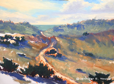
This new painting  just flowed. I finished it last weekend but couldn't photograph it until the sun came back.  This painting is actually a larger, more developed piece derived from a plein air study I did last spring in France:

france landscape painting poppies

"The Gift of Spring" Oil on Linen, 24x36"
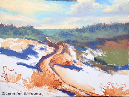
 SOLD

Here is the study:

poppies french landscape plein air painting

"Dusk in the Lot Valley" Oil on Multimedia ArtBoard, 6x12" SOLD

Even though I took tons of photographs of this beautiful spot when I was there in France, I must say, having already done a memorable study of this scene helped me tremendously. The photos, even when edited to reveal more of the depths of the shadows, could not compare with the information I got from my little study.Â

I was inspired to work this painting out into a larger format after watching a really excellent DVD by Kevin Macpherson called "Winter Escape". This is a longish, 2 part DVD that is probably only fascinating to artists. To everyone else it might be a bit like "watching paint dry", so to speak. But art videos are a great for me especially on a cold winter Sunday during football season! I have only had a chance to see part 1 of the DVD so far...Kevin really takes his time in this one. But to me, it was great to see a fairly large painting develop stroke by stroke, with good explanations of his thought processes along the way. Throughout the process, he gives good explanations of how he uses his plein air studies to capture his in-the-moment responses, notes of color and light effects on site.

 Now, there are lots of plein air painters who will pooh-pooh studio work (for landscapes). And while I do think that the best thing I've ever done for my landscapes is to take my easel outside for the direct experience, it just isn't always practical in terms of weather issues and size restrictions. An art studio is essential to me as it allows me to develop larger works and to experiment and expand on my ideas.

Macpherson seems to agree. Although he is known as a plein air painter (and rightfully so--he probably has thousands under his belt by now) he uses his studio in just this way, taking his studies and experiences he's gained on site and using them as jumping off points for his larger more fully developed work.

It was interesting though, to see how, because he has traveled and painted this landscape so often, he has so integrated his outdoor experiences to the point that he hardly referenced the photo he took. He mostly used his plein air studies (neither of which, by the way, exactly represented the larger painting he was creating on his easel.) The easel painting, was a compilation of elements from two or more plein air pieces, so I liked seeing that in no way did he feel the need to be literal. Rather than feeling bound and limited by one photographic viewpoint, he used his experience, memory, his studies, his beautiful brushwork and gorgeous color to conjure up his emotional response to the place.  Ah, now that is painting!

As for me, my painting developed pretty quickly with the use of the study. I knew I wanted more sky in the larger painting, so I used a combination of a couple of different plein air paintings, plus my photos from the site in France to determine my layout. Where the photos are useful to me is that they can help to work out composition and form. But information about the color notes and the light were gained from my plein air experience. The other added bonus was that I nearly felt transported back to my original experience, (which was a real joy) much more so than painting from photos alone. That is no small feat too, considering  I'm painting in what amounts to a glorified closet right now and outside temperatures are in the 30's - 40's.

If I were not such a cold weather wimp, I would be painting outside even now. I can usually deal with the cold okay excepting my hands. Yes, I've tried fingerless gloves (useless) and hand warmers, but the minute my hands are out of my pockets, any amount of cold is actually pretty painful, and I can't paint in big puffy gloves! But, barring travel to some warm tropical location (not a possibility this winter, I'm afraid) painting from my plein air studies is the next best thing.

Frayssinet Village painting- final edits?

I started this painting some time ago and it's taken me longer than I'd like to bring it to a satisfactory end. I generally dislike having long periods of stops and starts between painting sessions because I end up "oiling out" the painting and I run the danger of losing that freshness that comes with alla prima painting. But we're in the final stages of finishing the new studio so I just have to deal with the back and forth for a little while longer. (BTW, "oiling out" is when you wipe on a thin layer of diluted medium to help a partially dry oil surface better adhere to subsequent layers.)

village painting of southern France by Jennifer Young

This is a 24 x 30" painting of the village of Frayssinet, my "home base" for my plein air painting trip last summer. Photography issues continue, so at least on my monitor the color is a little dark and contrasty and the sky is too yellow and has lost the gradations of pale blue. 

Photography issues aside, the photos do give me a chance to again take a "step back" (something I mentioned before I can't manage to do in my temporary painting space.) With a new perspective, I am considering changing the figure. Right now the proportion makes her a little lost in the painting.

One option is to make her bigger. A quick edit in Photoshop makes this happen. (If only it was that quick and easy in actuality!)

French village painting Jennifer Young

The other option is to take the figure out altogether:

Jennifer Young landscape paintings of France

Of course, the second edit above would be the simplest option and it's not a bad solution. I'm leaning towards changing the figure, however, as she does add a bit more interest and  focal point.  Yeah or nay? No edits? Or edit #1 or #2?

French village painting back in progress; plus a blog award!

I managed to slip away for a few short hours yesterday to work on the oil painting I'd sketched out before Christmas. I have some real challenges with photography at my temporary painting site, so the photo is not great. But hopefully it can give an idea and I can figure out a better way to photograph as I move further along. Here I'm just trying to establish a good sense of notan in my design (AKA: my pattern of light and shadow):

French village landscape painting WIP

In looking at the digital image of this painting, I am seeing too much busy-ness in the shadow pattern on the ground, so I should probably benefit from simplifying this somewhat. This is where positioning a large mirror across from your painting station really comes in handy. The reverse image in the mirror really helps to provide an alternate view so that you can see errors and make adjustments. I'm lacking a mirror right now in my temporary studio setup. In addition, I have very little room to step back. So it's often not until I get home and download my digital shots that I am able to see the "fresh view" .

In addition to finally getting back to work on this painting, at long last I'd like to thank lovely artist Amy Sullivan for her kind recognition of my blog some time ago with an Art y Pico Award. I am just embarrassed it has taken me so long to respond to this, but I guess it speaks to the sense of overwhelm I've been experiencing during these last couple of months. In any event, I hope it's not too late to pick up the torch.

The Rules:

1. You have to pick 5 blogs that you consider deserve this award through creativity, design, interesting material, and also contributes to the blogger community, no matter of language.

2. Each award should have the name of the author with a link to their blog.

3. Award winners have to post the award with the name and link to the blog of the person who gave them the award.

4. Post a comment on each recipient's blog so they know they've been picked.

5. Show these rules and this paragraph explaining the awards origination. "The Arte y Pico Award" has arisen from the daily visits that I make to many blogs which nourish and enrich me with creativity. In them, I see dedication, creativity, care, comradeship, but mainly, ART, much art. I want to share this prize with all those bloggers that entertain and enrich me day to day. Doubtlessly, there are many and it will be hard to pick just a few." ~Without further ado, please check out these wonderful artists~

~1~ Marilyn King, a wonderful artist whose work and blog has grown by leaps and bounds ~ check her out~

~2~ Rick Nilson, who makes truly unique and imaginative paintings, mostly of the Outer Banks of North Carolina, with cryptic quirky comments to go along with them. I always enjoy my visits to his blog, and I'm sure you will too.

~3~ Dianne Mize, for her wonderful work on her Bagatelles and Meanderings blog. From what I've read on her blog she's run out of "Tag Steam". I can actually understand. This tagging stuff takes time, so in a way I hate to harrass her ;-)  But even if she can't participate I couldn't help but mention her blog any way--I really love her paintings and drawings and the thoughts she shares about her processes are wonderfully interesting.

~4~Keith Wilkinson~I first learned of his blog, The Filbert and Rigger from Marilyn King and I've really enjoyed following his work and seeing his newest, mostly e plein air paintings. Very inspiring!

~5~ Molly Young~my niece. Her blog is relatively new, but every time I visit I am impressed by her growth and her willingness to try new things. Go Molly!