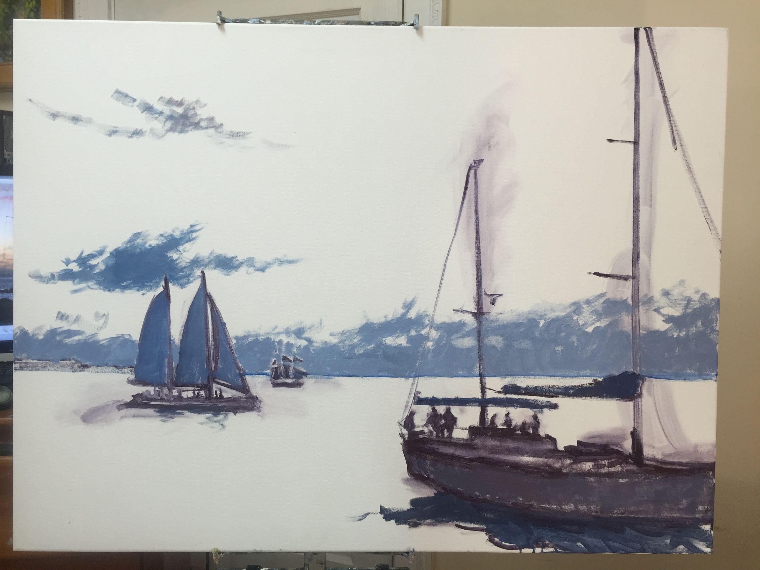
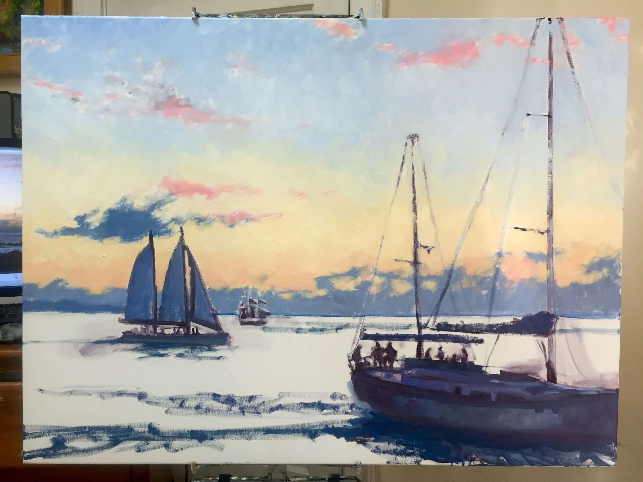
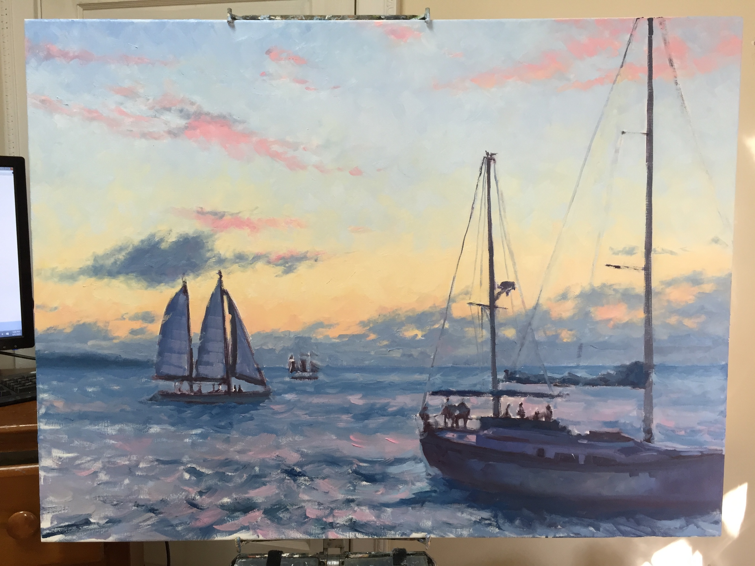
In Harmony

Last week as I was working on my latest James River painting, I ran into a little conudrum. So I decided to put the question out to my followers on my Facebook page to get some feedback. First, here's a few shots of the painting's progression.

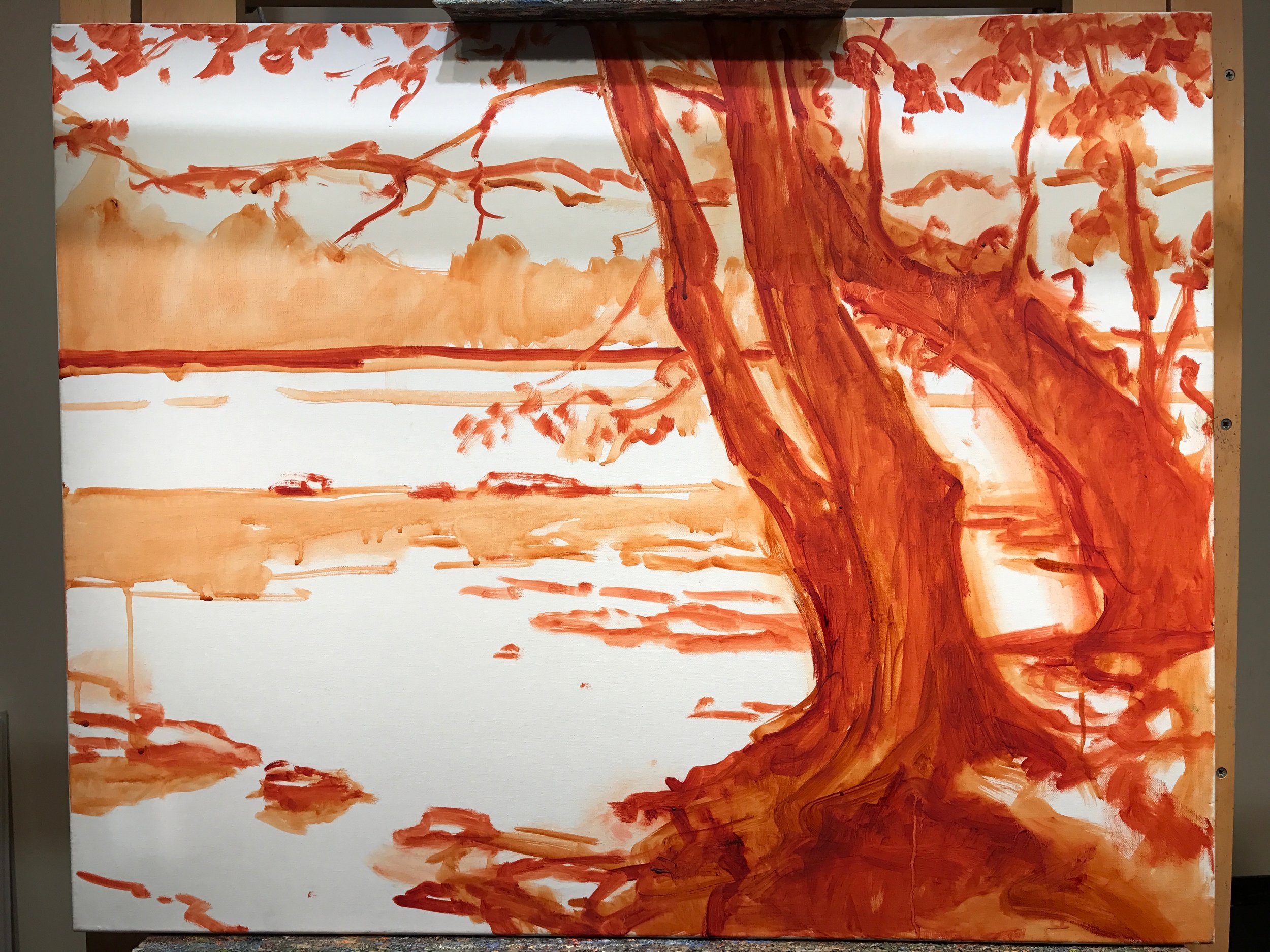
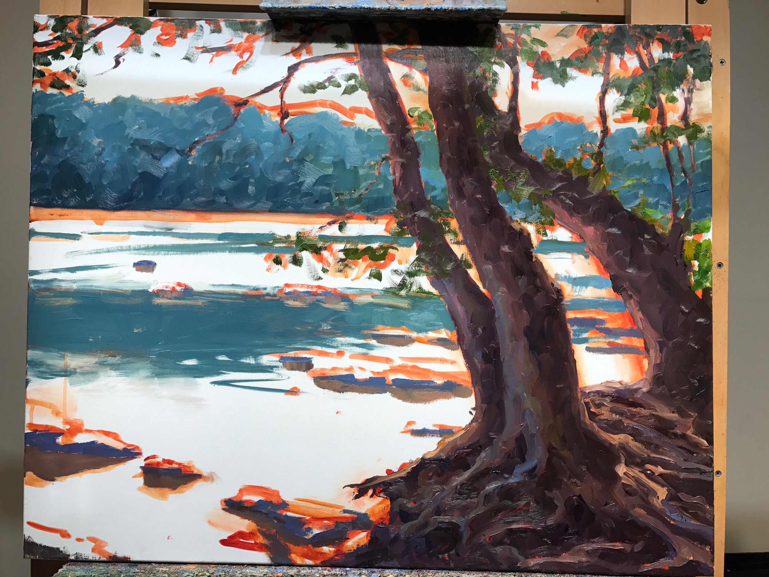
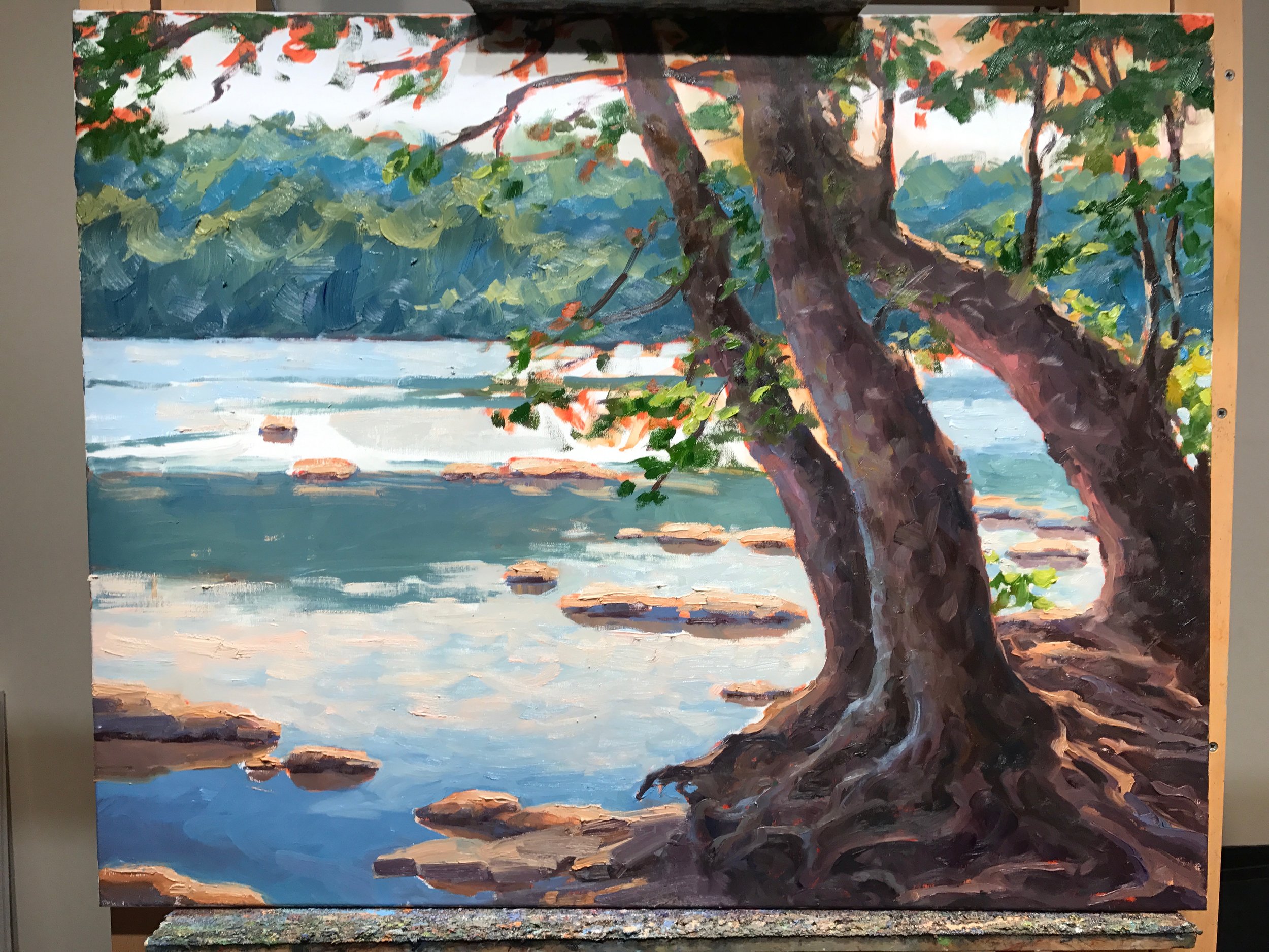
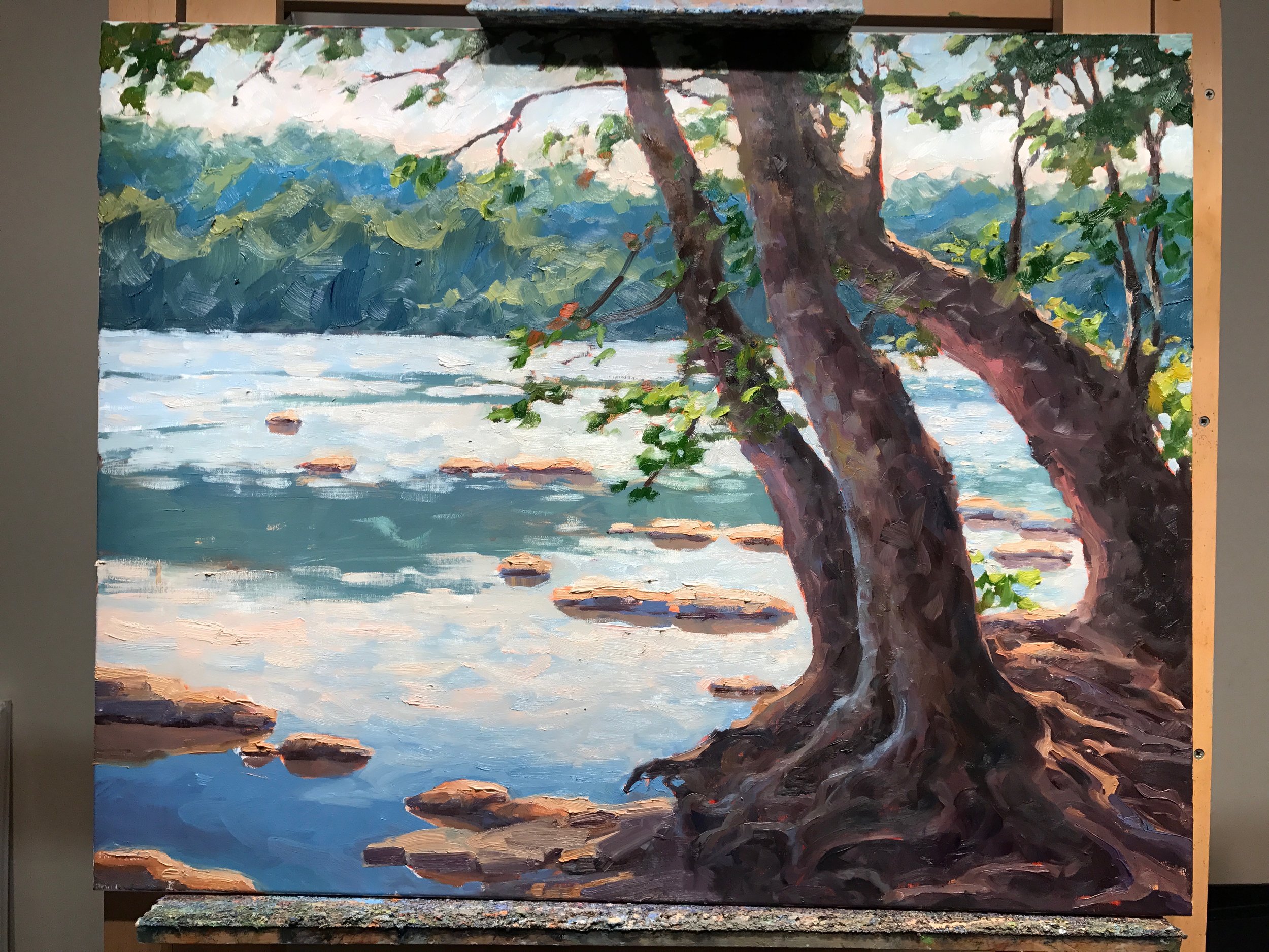
The foreground was definitely what was holding most of my attention. Those roots and the light spilling over on the trees, was where it was at. That's fine, but my worry was that once the eye was finished there, it would exit the painting rather too quickly. So I experimented by adding a couple of birds in the middle distance, perhaps as a way to rest the eye before taking flight. I liked the idea, but I was a little worried that an additional element would split the focus or detract from the foreground too much. 

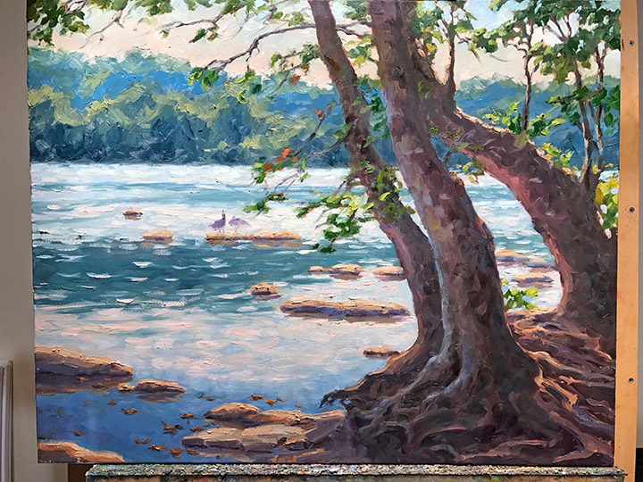
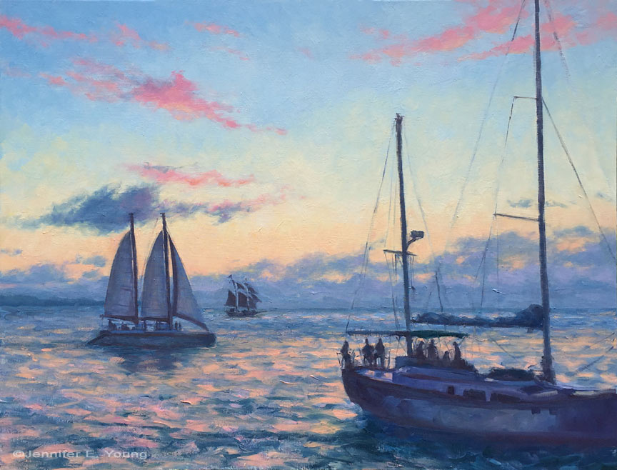
I knew which way I was leaning, but I thought it would be fun to put the question out there in Facebook land. The overwhelming feedback was YES to birds. So birds it is...simple ones, just shapes, really. It's been raining for days, so it's been really difficult to get a good shot of the completed painting, but finally, here it is!

"In Harmony" Oil on linen, 24x30" ©Jennifer E Young

"In Harmony" Oil on linen, 24x30" ©Jennifer E Young

This is another painting of the James River's Pony Pasture. I've done a couple of other small plein air studies of this exact view in the past, and have always wanted to do a larger one. I'm not sure why it took me so long to get around to it, but I'm glad I finally did. You can see more info, plus a couple of detail shots of the painting by clicking on the final image above.

Venetian market demo, continued

Today before I continue with my painting demo, I thought I would mention the colors I'm using on my palette. For many years I stuck with a fairly limited palette of about 5 or six colors (cad. yellow light, cadmium red, alizarin, ultramarine blue, pthalo green and white.) This was great for me as it really pushed me to learn how to mix color and not become reliant on pre-mixed colors from the tube. It also really helps lighten the load when I am packing my gear to take my studio outside and paint en plein air.

But these days in the studio, my time is more limited. I have a finite amount of hours each week to paint, blog, frame, ship, not to mention cook, eat, sleep, and care for my family. So I have allowed myself the luxury of an expanded palette to speed things along in certain areas. For instance, while I know how to mix secondary colors and some decent earth tones with a limited palette, things can move a bit faster if I have some premixed secondary colors (a.k.a. "convenience colors")  in my toolkit. So, for instance, red+yellow= orange., but cadmium orange is still a nice color to have both for it's purity and intensity and its convenience. In any case, whether I am using primaries or secondaries or pre-mixed earth colors, there is still plenty of color-mixing along the way, and  I don't ever use any color straight from the tube on my canvas.

Aside from the convenience, I am just enjoying playing with new colors. I've had less time to get out to doplein air painting, and I have missed it. So adding something new to experiment with in the studio keeps things fresh for me. On the palette I'm using right now I've introduced a few earth colors, plus some colors from Gamblin's radiant line. Aside from the colors listed with the asterisk *, I may not keep all of these colors out on my palette every time. But they have made an appearance in the studio often enough over the last few months that they are worth mentioning. All of these colors are Gamblin unless otherwise noted:

  • *Titanium white (Gamblin or Winsor Newton)
  • *Cadmium Yellow Light
  • Cadmium Yellow Deep
  • Indian Yellow (Winsor Newton)
  • *Cadmium Orange Deep
  • *Napthol Red
  • Radiant Red
  • *Quinacridone Violet
  • *Ultramarine Blue
  • Severes Blue-sometimes (Rembrandt)
  • *Radiant Turquoise
  • *Pthalo Green
  • Permanent Green Light
  • *Payne's Gray
  • *Brown Pink
  • Gold Ochre (Rembrandt)

 Now that I've gotten that bit of housekeeping out of the way, let's get back to painting! I spent my last post addressing the "shadow family" in this scene. In this picture you can see that much of the busy market scene is now at least suggested. But light is needed to delineate the forms and bring the scene alive.

venetianmarket_wip4_jenniferyoung

These images are a bit dark as I did not take the time to color correct the in-progress shots. But hopefully you can see that my approach has been to just focus on the general shapes of things without getting too bogged down in details. There are basically three large shapes of light spilling over this painting: the sky, the pavers, and the white awning, with lesser highlights on the figures.

Here is the final stage. I have kept things fairly loose because I wanted to keep the focus on the foreground figure, while still maintaining unity throughout the painting. Notice the difference in the color of the final piece below, taken under better lighting conditions to show the true nature of the colors in the painting.

"Il Mercato Veneziano", Oil on linen, 14x11" ©Jennifer E Young

"Il Mercato Veneziano", Oil on linen, 14x11" ©Jennifer E Young

Thanks for following along on my little painting journey to Venice! This piece is heading to City Art Gallery in Greenville, NC for their 30th Anniversary Celebration September 22nd. 30 years! Wow! Come join us for the party and see this painting (and yours truly)  in person! :-) 

Venetian market painting- a progression

It's taken me a while to get to blogging about this painting because after a disastrous automatic update to Windows 10 my computer died. It has actually been grinding to a halt for a while but it finally kicked the bucket for good last week and I have spent the past however many days trying to relocate my data and reinstall my applications. I am still operating on the bare minimum but at least I can blog again! I won't go on about it but just imagine to appropriate amount of ranting and hair-pulling and insert it here. Aaany-hoo, back to art!

I thought I'd post a little step-by-step demo of this piece because I actually had the forethought to take some progressive shots along the way. This one had a lot of figures and architecture in it, both of which might seem a bit overwhelming at first. But my reference photo also had a really nice value pattern, so by focusing on that first it made my job a lot easier. Here is the composition under way, put to canvas in monochrome with a brush and Gamsol:

mercatovenezianosketch_jenniferyoung

Next, I want to think in terms of light and shadow by separating out which parts of the painting are in the light (the light family) from which parts are in shadow ( the shadow family). I will start with the shadow family first. I learned this terminology from Kevin Macpherson, one of my teachers and a phenomenal painter. Phrasing it this way helps me to organize my thoughts and approach, beyond just saying "lights and darks". It's so helpful to see it this way because in actuality some things in shadow are quite light, though they are never lighter than what's in the light family.

mercato_veneziano_wip_jenniferyoung

I spend a lot of time working in the shadow family because so much of the strength of the painting is here. Only then do I start working in the light.

More stages next time. I hope you'll tune in as I work on lighting this bad boy up!

French village work in progress

The weather's been great here lately, but I haven't had much of a chance to do any plein air painting because I've been working on a large commission. I'm not sharing that today because I want to "unveil" it to the client first, but I'm doing a happy dance that it has reached a state of completion that I am satisfied enough with to present it. 

All clients are special, but this particular client commissioned me to create a commemorative piece in memory of a beloved family member. This client is a lovely lady and so very sweet and kind, and the sense of pressure I felt for "getting it right" has been all mine. 

Often times  when I have labored over a large or involved project, there is no better palette cleanser than painting a new small canvas, fast and fresh, of a completely unrelated subject. 

beynacvillagewip_jenniferyoung

I almost always seem to forget to photograph the painting after I paint the shadow patterns, but before adding the sunlit areas. Oh well, this is close. I didn't have time to finish yesterday because it was getting late when I started it and I had to pick up my daughter. I like this stage though, because if you get the majority of the shadow areas down in the beginning, you really see the potential and the armature it provides to the design.

Sunset Sail

Ever since my last blog posting, we have had rain, rain, rain. Needless to say, it thwarted many of my open days where I would have otherwise painted outside. The up side is that I finished the large 30x40" sunset painting I had started a while back, the progress of which I present to you now: