Bellagio From Above--Redux

The painting below was completed a while ago and has been sitting in my office since the move to our new home. So  I have had a lot of  opportunity to look at it lately with new eyes:

arielbellagio

 While I liked the painting before, I felt it could be improved and opened up a bit more to give this view a little more breathing room. So I looked back through my image archives from my trip to the Italian lakes and found several different views from this approximate vantage point. I then followed my own guidance and decided to play around with the composition in Photoshop to see "what would happen if..." I really wanted to capture more of the beauty of the lush blues in the lake and the mountains beyond:

bellagiofromabove "Bellagio From Above" Oil on Linen, 20x16" Click here for more info!

Of course, one change lead to another and my minor edits became quite a re-working. I oiled out the areas I wanted to repaint, and then set to task. This doesn't always work for me, as sometimes the paint layers have too much " skin' or texture, but this time around I guess the paint was more evenly applied.  I really like the way this turned out! It is much more aligned with the concept I had from the start- only now a little better executed.

Bellagio Promenade

As I mentioned in my last post, I've been working on a large(ish) painting of the Bellagio promenade that leads to the Villa Melzi. It took me a little longer to bring this painting to a conclusion and, because I painted at night, my progress shots were too bad to post. So what I am sharing today is the final piece:

Lake Como Italy landscape painting by Jennifer E Young"Bellagio Promenade" Oil on Linen, 24x30" For more info, click here. To purchase, please contact me!

 Because I had to work on this over a succession of days, I worked pretty lean until the last couple of sessions. In the end though, this bad boy has a lot of paint! Of all of the places I have visited so far in Italy, Lake Como in general, and Bellagio in particular, hovers near the top of my list for achieving that dazzling combination of natural and manmade beauty. The trifecta of pre-Alpine mountains, deep blue waters and classic Italian architecture dripping with flowers is pretty hard to beat.

New Lake Como painting in progress

School's out this week due to snow, so my painting time is catch as catch can. Nevertheless, we have been conspiring with other desperate parents to arrange play dates here and there, which allows a little painting and blogging time. So I thought I'd share the Bellagio painting I have my easel this week. This is a promenade on the outskirts of bella Bellagio, leading to the stunning grounds of the Villa Melzi.  This view however, looks back towards the town. Apologies in advance for the poor quality photos and the cast shadow of part of my easel on the painting. I don't have a lot of time to photo edit anything but the final these days, so I hope you will bear with me. I start in the usual fashion, with a loose sketch of my composition in Burnt Sienna:

Lake Como painting demo by Jennifer Young

Next I lay in the shadow family and darkest notes.

Lake Como painting demo by Jennifer Young

At this point I'm laying in some general blocks of color. Still no highlights yet...

Lake Como painting demo by Jennifer Young

And here's my starting point this morning:

Lake Como painting demo by Jennifer Young

Next I will continue blocking in, including the water and distant village. I'm still working up the nerve to paint outside while there's snow on the ground, but we will see. Not much of a fan of the cold, but that snow sure is pretty.

Pescallo cafe complete

We have had a bout of sickness at our house (first me, then my daughter) but I finally had a chance to get back to my Pescallo painting over the holiday weekend. Let's wrap this up! Picking up from my last installment, I am ready to paint in the flowers. Bougainvillea spills over the arbor with mixtures of alizarin crimson, permanent rose and a touch of cadmium red to warm things up. Normally I would block those colors in sooner but I was still trying to decide about the placement of that arbor structure and reds are such high staining colors that I didn't want to put them in until I had the composition pretty well established. Now I guess I am committed! ;)

Pescallo Italy landscape painting in progress by Jennifer E. Young

Geraniums in shades of red fill out the planters using the same colors as the bougainvillea (but in much different ratios).  I also flesh out the columns on the terrace and I am nearly done with the pier.

Now it's time to move down to finish the foreground water and reflections. There is a lot of movement in this water, and with much of this water in semi-shadow, reflections are subtle and broken by waves rather than the strong, mirror-like reflections seen in still water. For the darkest shades I mix Ultramarine and Gold Ochre, warmed or cooled by touches of Cadmium Orange or Sevres blue as the situation allows. Water highlights are deeper shades of the sky color.

Lake Como Italy paitning in progress by Jennifer E. Young

My finale is to include the rest of my vertical lines- the mast on the boat and the railing along the pier. These verticals act as a strong counter-balance to the horizontals of the mountains, boat and pier. I think the railing also serves to further push the background more firmly in the distance.

Lake Como landscape painting by Jennifer E. Young

"Alfresco in Pescallo" Oil on Linen, 24x30" Click here for more info!

This piece was a challenge to me, largely because of all of the interruptions I had, which caused the painting to set up quite a bit more in between sessions. I much prefer painting wet-into-wet, to avoid the extra work of opening the painting back up and scraping the dry paint down off of my palette. But sometimes it just can't be helped. In any event, I hope you like the final piece!

No babysitting this week, so there will be lots of trips to playgrounds and possibly the zoo, and I likely won't have much in the way of new work to post until after my daughter is back in preschool on the 9th.

Moving forward

Before I could really tackle the foreground on my Pescallo painting-in-progress, I needed to establish the background water. It shimmers with a pale sparkling light in the distance, the color becoming deeper and more varied in contrast as it moves in waves toward the viewer.

Lake Como painting in progress by Jennifer E. Young

Lest I got too caught up in the romance of Italy or the gentle waves of Lake Como, my husband brings me back to reality with a screeching halt and a critique of my painting. His opinion is to flip the direction of the boat so that it leads into the painting rather than out. I have to agree with him here, so being the always obedient wife (ha ha) I do as I'm told.

Next, I really need to address what is happening on the pier so that I can paint the reflections in the foreground water. I paint the tires that hang along the pier and serve as a rustic contrast to the elegant beauty of the backdrop. This epitomizes Pescallo to me; it is rustic but beautiful, quaint but elegant, sleepy but exciting, all at the same time. The tires are in higher contrast on the sunny side and in low contrast in the shadows.

Lake Como Italian landscape painting in progress by Jennifer E. Young

Black is not black and white is never white. By this I mean that I don't use a tube black to paint black-colored objects, or a straight out of the tube white for most white-colored objects. This would create very flat, dead color. Instead, I mix my "blacks" with my darkest translucent colors on my palette, ultramarine blue and alizarin crimson, and just the tiniest bit of cad. orange or yellow to neutralize some of that purple undertone.

Lake Como Italy painting in progress by Jennifer E.Young

Flowers and flowering vines grow out of every crack and cranny around these parts, and I paint those in delicately so as not to overpower. The showy flowers will be the geraniums and bougainvillea to come.

School is back in session, which means that our babysitter has become a lot less available now that she's returned to college classes. It also means I will have less time to paint over the next two weeks until my daughter returns to preschool. I didn't get the time to paint outside last week, but my goal is to finish this studio piece with one more session tomorrow, so that I can still fit in a plein air session by week's end. I'm close...wish me luck!

Pescallo cafe painting demo (cont'd)

Here's a little more progress on the Pescallo painting I started in my last post.  I'm trying to write this as a demo of sorts, which means that with my  time constraints it is taking longer for me to post than I'd like. But noting ventured nothing gained, and I'm now ready to talk about some color! My palette for this painting is as follows: titanium white cadmium yellow light cadmium orange cadmium red alizarin crimson ultramarine blue sevres blue (Rembrandt- it's like a cerulean but more intense) burnt sienna gold ochre

This is a bit more expanded than the single primary I have experimented with a lot in the past, but with limited time in the studio now, it is helpful to have a few more "convenience" colors in my arsenal. With the tonal drawing laid to canvas as my guide, I begin by blocking in my color, starting with the sky and mountains. I start with very general shapes at first and then work to refine them as I move along. For the sky I am using combinations of sevres and ultramarine and white, and for the clouds, touches of cadmium orange and red, plus white. The mountains are basically varying degrees of cadmium orange and ultramarine blue.

lake como Italy painting in progress by Jennifer Young

Since so much of the background peeks through what I will have going on in the fore, I decide to work out the background first, fleshing out the highlights of the mountains. The greens of the mountains are very grayed down- just the slightest amount of cad yellow light is used, in combination with the blues. I also add a little alizarin crimson to neutralize it further.

Italian landscape painting in progress by Jennifer Young

I decide to soften the sky a bit to make the background stay back and be less busy. Then I start to lay in a first pass at the water. I use a slightly darker variation of the blues from the sky for the distant water, using less white as I move forward. I also add in some cadmium orange to the blues as the water edges closer to the pier and foreground. This won't be the final word on the water, but I have gotten rid of that white canvas and have enough of the background tones to start laying in the foreground. Next I will begin work on establishing the shadows and highlights of the pier.

lake como Italy painting in progress by Jennifer Young

Quite a lot still to go, but things are starting to take shape. But as they say, the devil's in the details.

Bellagio from above; more oil painting w/out solvents

Following up from my prior WIP, here is the final painting. This is a view of Bellagio from a hike we took up to Villa Serbelloni. The villa is now maintained by the Rockefeller Foundation, who uses it as a retreat for  the Bellagio Study and Conference Center for artists and writers (wouldn't that be nice?) For this reason, we couldn't go inside the villa when we visited, but we could tour the grounds, which offers gorgeous views over Bellagio.

Oil painting of Bellagio, Italy

"Bellagio From Above" Oil on Linen, 20x16"

SOLD!

Both this piece and my previous Lake Como painting, were done without the use of solvents or any other medium other than small amounts of walnut oil to clean brushes and thin paint when necessary. But even when used judiciously, the walnut oil served to slow drying considerably. At present this is not a huge problem, as I am spending most of my time painting/renovating/preparing home and life for the new baby! But it does change the nature of things and the overall result became more impressionistic due both to the behavior of the paint, and probably also the gaps in my working sessions.

I know that an oil painting requires a certain length of time for all of the layers to fully dry (sometimes as much as 6 months or a year.) But normally the top layers will dry to the touch in about a week's time.  Not so with the walnut oil method, which seems to require at least an additional week to my usual handling time.

Maybe it's just that my painting habits are not particularly suited for this method, or maybe I just need to get used to new ways of doing things. Overall, except at the very beginning stage, I don't paint in thin layers. In fact, while I don't lay it on with a palette knife, I do paint passages that are relatively thick and juicy. But oddly, I experience the most difficulty in the lay-in, (early stage) which I am used to having set up rather quickly.

First of all, in order to follow the "fat over lean" rule, I have been trying not to make the paint too "fat", too soon. So I keep the walnut oil I use in my initial lay-in stage very spare. The result is that instead of a thinly painted initial sketch and color block-in, I find myself with trying to move paint around that has a definite drag and is less fluid. The lay-in becomes more often a "rub-in" with a rag or a "scrub-in" with an old brush, and the edits and corrections are very hard to lift off the canvas.

On the other hand, if I use more walnut oil at this stage, the paint can get too smeary and unmanageable for successive layers, not to mention less stable (with any medium you use, you should only use no more than 20% total volume when mixed directly into the paint, and I usually err on the side of caution and use rather less than that.)

One solution may be to use a runnier paint in the lay-in stage. M. Graham walnut oil paints are such a paint. I do have a few tubes on hand, as I've tried them in the past. As much as I wanted to like them, I normally prefer more body to my paints. But they might just work for my purposes now--but still probably just in the initial stage only. (Incidentally, it's perfectly okay to mix walnut oil with linseed oil based paint, so even if you want to paint solvent-free, you do not need to buy their paints exclusively.)

Aside from walnut oil to thin,  there are other oils to try. Linseed oil is commonly used by artists, both in mixtures of ground paint and in various mediums. And while both linseed and walnut oils are considered to be "drying oils", linseed tends to be the faster-drying of the two.  However, I seem to read a lot about how linseed oil tends to yellow over time. Maybe this is an exaggerated worry, but a quick look at experiments like this one swayed me to first try the walnut oil over linseed.

So, to sum up from this layperson's perspective, some of the pros of using walnut oil to thin/clean are:

  • Non-yellowing
  • Non-toxic/ solvent-free painting (though other oils can also serve to achieve the same thing.)
  • Odorless
  • Does not evaporate like solvents, so it seems fairly long-lasting
  • Conditions brushes nicely

Cons:

  • Walnut oil is expensive! (If you are only using oil to clean your brushes, you could probably get by with a less expensive oil.)
  • Slows drying considerably (this could actually be a "pro", depending on your painting technique.)
  • Compared to solvent, it requires using more brushes and/or more wiping of brushes between colors in order to keep the color clean.
  • Walnut oil is expensive!

A WIP and oil painting without solvents

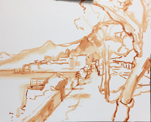
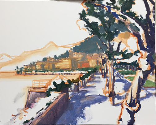
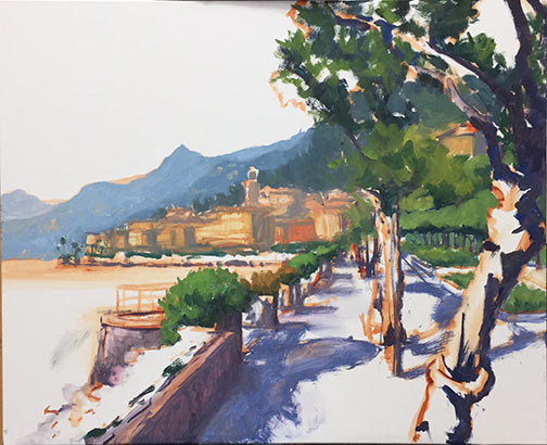
After a couple of wipers, I finally have at least a work-in-progress to post. I've continued with the Bellagio theme, this time with an ariel view. I guess I'd call this a color block-in:

bellagio painting work in progress

Why the wipers? Well, I've been oil painting without solvents, and it's taking some practice to get the hang of things. Now as a fairly long-time an oil painter, I'm quite used to being around solvents. I do try to be conscientious of the risks and precautions, so I minimize odor (through ventilation and the use of a high quality OMS) and contact (wearing nitrile gloves) when handling my paints. But otherwise I admit I haven't thought too much about what potential hazards might be involved.

I guess I've been fortunate, in that I haven't experienced some of the allergies that other artists have suffered. But allergies or not, now that I am in the midst of  pregnancy, taking the utmost care in the studio has taken on a new significance. So I decided to do a little investigating....

* Warning, this post is rather long...it's the first in a series of postings about what I've learned on alternatives to my usual oil painting method, presented in my usual rather rambling way. It's certainly not the definitive source on the topic, but may hopefully provide some insight or a jumping off point for other painters who may be wondering about some of this stuff.

Pigments

When considering alternatives to my usual method of painting, I first took a look at the  pigments I was using, simply because they are essentially the same substance found in oils, watercolors, acrylics, casein, etc.  Pigments are the ground powder, either natural or synthetic, that comprises the "colored part" of the paint.

From what I can gather, due to the risk of inhalation, pigments seem to be most hazardous when in their ground, dry form. Some folks using manufactured paints from the tube are rather indifferent in their attitude about pigments in paints, saying, "Well, as long as you don't snort or eat your paints you'll be fine."  Nevertheless, some pigments do contain toxins and heavy metals, which could potentially be ingested or absorbed through the skin on surface contact. So for this reason it's always a good idea to wear gloves when handling them, and avoid eating, smoking, etc., around them, at least not without thoroughly scrubbing with soap before hand.

I put the question of hazards in manufactured artist oils to the maker of the oil paints I use most frequently- Winsor Newton. The technician, Amy Faris, was extremely helpful and very quickly responsive to my queries. Here's an excerpt of some of what she wrote about pigments:

"Depending on the color, our oil paints contain either linseed oil or safflower oil, with the possible addition of a drier, again depending on the color.  Other than than, I am unable to give you any specific recipes regarding the oils, because that information falls under the category of proprietary, and they won't even share it with me." (*Jen's note: this last sentence is one I heard over and over from the manufacturers of artist's materials that I queried directly.)"

"What I can tell you is that all of our products are tested and labeled for health and safety by an independent toxicologist at the Art and Creative Materials Institute (ACMI).  An AP label - or a non-toxic label signifies that the toxicologist has not found anything in the product that can cause you harm, as long as you are using the product in the manner for which it was created - in other words, you are not eating it, applying it to your friend's body, etc.  A CL warning label signifies that the toxicologist has found something in the product that can potentially cause harm.  This CL label is usually followed by a statement on how to use the product safely."

"All health labeling can be found right on the back of every tube of paint we manufacture and on every container of medium, solvent etc.  If you would like more information on the toxicologist or on health and safety in general, please visit the ACMI website at:  http://www.acminet.org/"

"In terms of pigments:  some mineral or metallic based pigments can be hazardous to your health if they build up in your system over time. Lead, cadmium,cobalt  and chromium are some problematic pigments that spring to mind. Generally, the biggest hazard comes in to play if you are working with these pigments in their dry, powder form and are breathing the pigment dust into your lungs.  In terms of the pigment while it is contained in a vehicle (contained in the paint form we are all used to working with) as long as you are not spraying the paint (cadmiums breathed into the lungs prove to be cancer-causing), or ingesting it in large quantities over time ( I sometimes joke about eating it, but if you point your brush in your mouth or eat or drink in the studio with paint covered hands you run the risk of ingesting the paint)  you should be okay.  Paint that contains lead (usually whites such as flake or cremnitz white)  needs to be handled with great care - the lead can be carried through your skin layer if the paint has been diluted with a thinner - you never want to clean your brushes by rubbing them in the palm of your hand - doing so can drive pigments directly into your skin.  Cobalt can be a skin irritant to some people."

...And the vehicles?

So basically, since I don't grind my own paints, I can take care in handling and just make note of the labels (and manufacturers that use such labeling) to make my choice of paint. But what about the vehicles used to suspend the pigment in the paints and give them their characteristics? In many cases it is nothing more than a seed or nut oil (linseed oil, walnut, poppy, etc.) But in other cases, there are other additives, and they seem to be both more mysterious and potentially more hazardous to me (and my unborn baby) since they can be inhaled as they float about in the air. Paint manufacturers are, as I said, pretty hush-hush about the specific additives used in their formulas.  As artists, even with the labeling, it's often difficult to impossible to derive specific information on which elements beyond the pigments in the paint are potentially toxic. But through a very cursory look around the web, I learned that  some of the potential additives to common artist paints (oils, acrylics, etc.) could be various solvents and resins that are volatile organic compounds (toxic inhalants), formaldehyde, preservatives, and mercury. Yikes!

And contrary to popular belief, in terms of tubes of paint, it doesn't seem to me that oil paints are necessarily any more toxic than say, acrylics. In fact, while acrylics clean up with water, many acrylics use vehicles that contain ammonia and formaldehyde that off-gas as they dry.

So, being at best a dabbler in watercolors, not having enjoyed my past experience with water soluble oils, and seeing no compelling reason to jump over to acrylics, it looked like oil painting without solvents was still worth pursuing for me. It would require some changes in my work habits, but if I could use precautions and avoid both the use of solvents to clean my brushes, as well as solvents, driers, and other potentially noxious fumes that come from various painting mediums , it could be done.

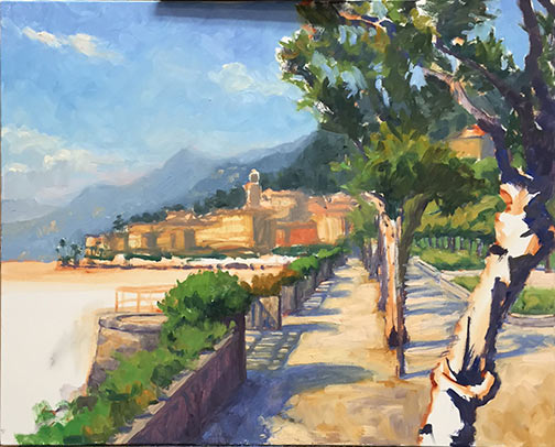
And that has been my aim. The W.I.P. pictured above, as well as and the one from my prior post were both done without the use of solvents. I'm using my usual paint brands--just using walnut oil instead of OMS to clean my brushes and a very tiny bit to thin my paint if needed. But it's slow going. This old dog is still having some trouble with her new tricks, and it's taking some getting used to. I'll write more about those challenges in a future post.
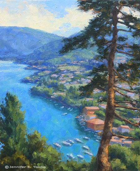
A two-fer; Lake Como Paintings

My schedule has been NUTS lately so unfortunately my blog has suffered a bit of benign neglect. Still alive and kicking and painting, however. Here's something I thought I'd try to see if I might be able to save a little money on paint. A lot of times when I paint I can mix too much color, (which I still think is far better than mixing too little). These mixtures can be reused of course, especially if the subsequent painting needs similar hues. But I'm not always good about consciously planning my subjects like that. So here's a conscious effort to get two paintings going at the same time with color mixtures that relate to each other:

lake como paintings by Jennifer Young

 The key will be not to just lazily use what's already mixed if it doesn't really suit what I'm painting. In hindsight it might have been better to start one large painting and one small painting instead of two rather ambitiously sized pieces, (they are both 30x40".) But I guess I was feeling cocky when I started these! 

While I did the transparent color block-ins  one after the other, what is happening  as I proceed is that I am still focusing on one individually, with an occasional switch-off when I need a change.  I don't really know if I'm conserving much paint, but it does keep things interesting. ;-) In case you can't tell what these are, the subject matter for both pieces is Lake Como, Italy. The painting on the left will be a more fleshed out version of the little watercolor painting I did for my last charity auction.

Speaking of which, a new Art for Food Auction will be posted by tomorrow morning!

A few gallery snaps from the "Small Stuff" show

Don't let anyone tell you that hanging a show for a bunch of small works is an easy task. But after it was all in place, we were very happy with the results, and I'm glad to report that my husband and I are still married. ;-) Here are a few shots from the show, on view now through Jan. 30th: When we were looking at this space for the gallery, one of the first things I noticed was this cute built-in. It's a perfect display for my minis and my new line of watercolor/pen and inks. Here I've decorated it with some lights and mistle toe:

miniature landscape paintings

A close-up that shows some of the ornaments--I like the little silver and gold Christmas balls along the bottom shelf:

miniature landscape paintings in a group

On the opposite wall are the landscape paintings of Venice and Lake Como:

landscape paintings of Venice and Lake Como

Close-up shot of the mantlepiece decorated with paintings. To the left of the large Venetian landscape are a series of little square 6x6" Lake Como paintings. Anyone who has read my blog for a while, or my squidoo lens on hanging art must know I'm a fan of grouping big and small paintings together like this. I'd love to do something similar over my fireplace mantle at home.

paintings of Lake Como and Venice

A small grouping from the next room of some of my more local autumn scenes:

paintings of autumn landscapes by Jennifer Young

I  guess that's really all I had time for, photography-wise. I may share a few more snaps and I will definitely share more info on some of the individual pieces in the show very soon.

Landscape painting of Lake Como, Italy

 landscape painting lake como italy

"Morning Quiet in Pescallo" Oil on Canvas, 20" x 24"

Fresh off the easel is the painting I blogged about a bit earlier. It shows a view from Bellagio looking down on the tiny fishing village of Pescallo.  This was our morning view from our hotel room balcony. What a way to wake up!

For more information, please click on the image or contact me.

On the Easel- Lake Como Painting

 I thought I'd share a new painting I have up on the easel:

 Painting of water Lake Como Italy

 Not sure how much more I'll get done today because I'm getting the studio ready for the First Fridays art walk tonight. If you come out to the gallery on the art walk tonight you'll probably see it on the easel in all it's unfinished glory (along with a number of other paintings that are actually finished and framed :-) .)

 This scene is an aerial view of the little fishing village Pescallo in Lake Como, Italy. It was my view every morning from the balcony of our hotel room in Bellagio (*sigh*). What I'm painting is the village rooftops and  the placid lake with docked boats in early morning. I hope it turns out, because I really loved that scene.

All of this work I've done for the "Luminosity" show, has really helped to get me into painting water scenes. For the longest time I had a fear of water-- not "real" water, just water as subject for my paintings. I don't know why. I guess it was just a mental block or something. So this past summer, I made a point to "just do it" and I really tried to focus on water scenes, especially when I went out painting en plein air.

On another note, I'd like to send a shout of thanks out to artist Boyd Greene for giving me a nod of recognition yesterday on his own fine art blog. I just discovered that I was among the artists he honored with a "Shibumi" award. According to Boyd;

 The ’shibumi’ award was originally created by Hawk and has a deep and profound meaning: ‘Shibumi is a Japanese term which used in the following context is a noun. Its meaning refers to a ‘particular aesthetic of simple, subtle, and unobtrusive beauty� which can be applied to almost anything.’

Thank you Boyd! I truly feel grateful and honored by my fellow artist bloggers this week. :-)

Villa Balbianello

It's been about a week since I've been back from Key West and I've not had time to unpack and photograph my third painting from that trip, which I shipped back home before I left. Right now, I'm getting ready for a show at the gallery this Friday called "Italian Waterways". This show focuses on recent paintings of Lake Como and Venice. Here is a new painting I did for this series of the Villa Balbianello:

Villa Balbianello, lake Como painting Italy

sold

Dave and I took a private boat ride and tour out to the villa in Lenno while we were staying in Bellagio. The villa has had an interesting history. It was built for a cardinal in the 1700's on the grounds of an old monestery. It passed through the hands of several owners since that time; the last of whom was Guido Monzino. Monzino was an explorer and led the first Italian exedition to Mount Everest. Upon his death he bequeathed the villa (and apparently a lot of booty from his explorations) to the National Trust of Italy, which is why people can visit it today.

While the story of the villa is interesting, what fascinates me most are the beautiful grounds and gardens, and it's excellent position on the tip of a peninsula. Apparently it has captivated the imagination of many artists and filmmakers as well. It was the setting for several films, including Star Wars Episode II.

Any way, back to the painting! It measures 24x36" and is oil on canvas. For more information about this painting, please click on the painting or contact me.

Bellagio Vignette

With this cold February weather, I naturally long for warm, sundrenched places. So lately I've found myself pouring through sketches and photos from our last trip to beautiful Lake Como. This is a little watercolor/pen and ink sketch I did from the balcony of our hotel in the lovely lake town of Bellagio:

painting of Lake Como Italy

We had great mountain views on three sides. This brings back some warm, sunny memories for me, painting and listening to the water lapping on the lake shores below. The image size is about 6x8", done on 7x9" paper. For more information about this painting, please contact me.

New Gallery Photos

I thought I'd post some photos of the new gallery space, which officialy opened last Friday night. We were swamped the entire night so I did not get ONE picture of the actual event! It turned out well--hectic but fun. We're both still recovering from total exhaustion, but at least we made it through "phase one". Phase two is still to come--moving my art studio part into the building. We hope to have that accomplished by mid January at the latest. Front room:

This is the wall to the right as you walk in the front door. The flowers on the table are from our new landlord!

Jennifer Young Studio & Gallery

This is the left wall of the same room--A great spot for the paintings in my mini collection:

Jennifer Young artist studio & gallery

This is a view of the right hand wall as you continue on into the middle room.

Jennifer Young artist studio & gallery

Here's a shot of the same wall looking back into the front room:

Paintings by Jennifer Young

Here is the opposite wall in the second room. The picture to the far left is an original oil painting of Tuscany. The pictures to the right are canvas prints on the walls, and paper prints in the rack. People were amazed at the quality of the canvas prints, which looked so much like paintings that I had to tell them they were prints and not originals.


Art prints by Jennifer Young

Heading out from the 2nd room and into the third room. This is where the band played opening night:


Jennifer Young paintings

Rounding the corner into this third room, here is my wall of Key West paintings:


Key West paintings by Jennifer Young

   Key West painting by Jennifer Young
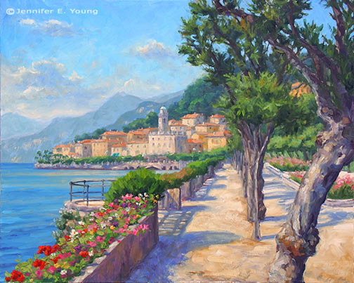
I had these paintings framed differently from the usual gold because I felt like the solid gold was too formal for this subject matter. I like the linen liner and the platinum colored frame with the bamboo motif for these sunny Key West pieces.

   This last room will undergo some changes. The front two rooms with the hardwood floors will remain gallery space, but we'll use this area more for work space (to be determined), though we'll still hang some art here. Down that hallway is a fourth small room and a bathroom with a utility sink.

   Jennifer Young Studio & Gallery is located at 16 E. Main Street, Richmond, VA, 23219. Currently we are open from 6 to 9 p.m. during the First Fridays Art walks, and other times by appointment. Please call 804-254-1008 (1-877-DIAL-ART toll free) to visit the gallery or to inquire about the paintings you see on the website.