Sunrise Stroll

Back in spring as I was packing up and/or discarding my earthly belongings, I had imagined that by fall we would have begun working on a new studio at the new house. "Oh, I'll be up and running by winter," I thought. Well, I may have been a "tad" optimistic as we haven't come close to deciding how or even where we will fashion one.  In light of the constant waffling, we finally decided to rent a little temporary workspace for me, to take the pressure off a bit.

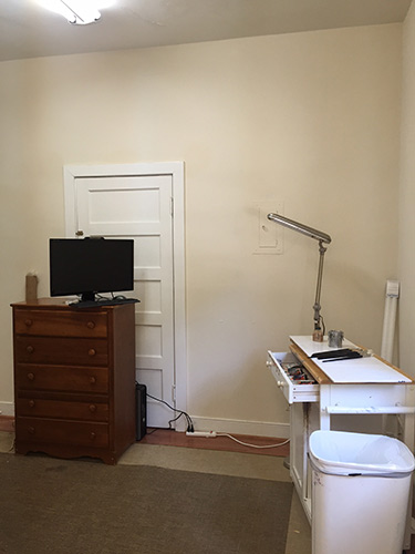
Viola! My little space. It's certainly a far cry from my former studio. It's tiny, it's dark, it's plain...but it's mine (at least temporarily). And I couldn't be happier to be back at work. :-)

space

What's missing in this picture is, of course, the easel. I will keep things simple (and light) by using my Soltek in here. I have also added a few additional lights to brighten things up a bit and make things a bit easier on the eyes.

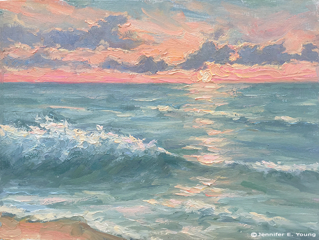
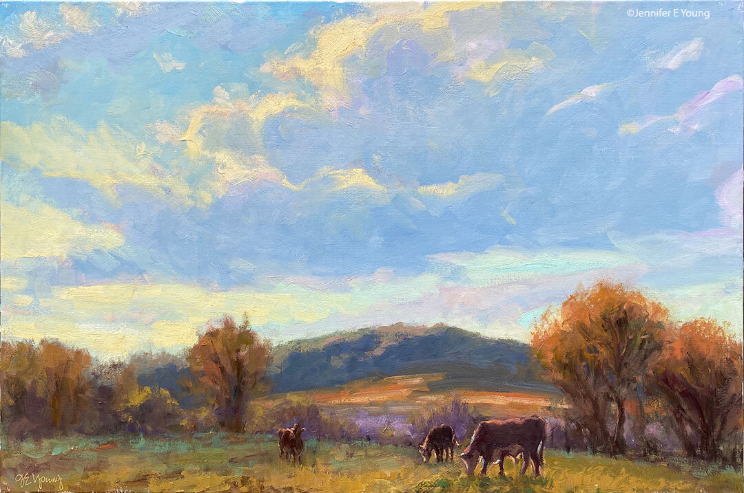
To kick off the occasion, I dove into a subject I have been dying to develop since I painted it on location this summer- The Outer Banks of North Carolina. I was especially keen to dive into the concept of the sunrise, having tackled in en plein air in July:

Outer Banks landscape painting ©Jennifer E Young "Sunrise Stroll" Oil on Linen, 20x24" Contact me to purchase!

 Because I am renting this space and the ventilation is poor, I will only use water miscible oils here. So this, friends, marks another inaugural moment, of sorts--my first studio painting with Royal Talens Cobra water miscible paints.  I have to say, I am loving these paints in the studio. They stay open longer than my traditional oils, which makes it easier to manipulate edges  and build up to lovely, lush texture without having to do it all alla prima.  The only criticism I have at the moment is that the Titanium White in this brand is rather weak. Maybe I just need to get used to the tinting properties of the other paint colors,  but I used  almost half of a 150 ML tube of paint on this one 20x24" painting. (And that's not *much* of an exaggeration.)  Otherwise, though, I am having a great time and am so happy to have a room to call my own to create and leave all of my toys lying about.

Morning Surf

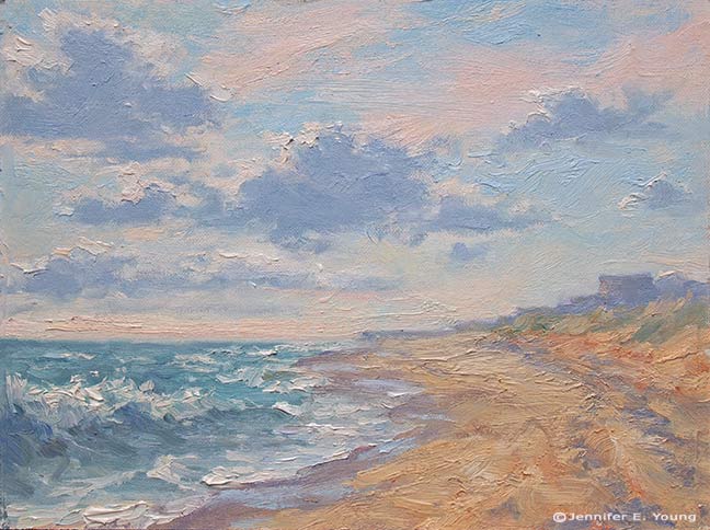
Immediately after I wrapped up painting my sunrise painting, I turned to look up the beach toward the pier and noticed how lovely the waves looked lapping up on the curving shoreline. So since I finally felt like I was getting somewhere with these paints, I decided that this would be a back-to-back session, one piece after another. Here' s the beach in early morning, post sunrise, around 8:30 a.m. or so:

Plein air coastal beach landscape painting of the Outer Banks, NC ©Jennifer E. Young, All rights reserved"Morning Surf" Oil on Canvas, 9x12" Contact me to purchase!

For this painting and the prior sunrise one I had to lay the paint on pretty thickly to manipulate the edges the way I wanted. Also I found the titanium white and cadmium yellow light were much less intense than what I was used to with my traditional oils, so the highlights were painted very thickly indeed. I hadn't noticed this in my first venture with the Water Soluble oils, but it became much more apparent with these beach paintings because they are pretty high key.  Overall the effect seems to me to be closer to a palette knife painting than one done with a brush, though hog bristle brushes were all that I used.

I really enjoy painting the surf. While I have done it before a number of times  in the studio, these pieces were  my first effort done completely from life. What a rush! I feel like I could spend a lifetime studying just this one subject...I should be so lucky.

Back from the beach

Last week my family made our annual trek to the Outer Banks of North Carolina. It is a trip I look forward to all year, and it always seems to be over all too soon. For this trip, I brought along my water soluble oils.  Given all of the moving and excitement we had this spring and summer, I thought I would simplify things a bit with the painting gear I chose to bring with me, and eliminate the need for carrying turpentine. The only problem with my little plan was that, unlike my first foray into this medium, I found myself struggling. A lot. I don't know if it was the humidity, the painting surfaces, my overall fatigue or what. But every painting I did all week was a complete wiper, in spite of my  most valiant efforts.  The paint seemed to completely lack body and intensity. It also seemed to do nothing but smear all over my surfaces when I applied them.

Finally on the night before the last full day, it dawned on me that I should try a more absorbent surface. When I paint with traditional oils my preferred surface is one that is quite smooth --a fine weave linen or a shellacked birch panel. It was my understanding that shellac wasn't going to fly with water soluble oils, and my linen wasn't doing the job at all. So I dug around in my supply of panels and came up with a couple of gessoed birch panels and a Pintura gessoed canvas panel and decided to throw the old Hail Mary on the final day.

Here is the  first piece I did that last day, at sunrise:

Plein Air painting of the Outer Banks, NC ©Jennifer E Young, All rights reserved

"Sunrise at Nags Head" Water miscible oils on panel, 9x12" Contact me to purchase.

Finally I painted 3 pieces that I actually felt happy with! The paint was still harder to control than my beloved traditional oils, and I had a harder time mixing the colors I was aiming for, but at least the paintings actually looked like something I could show and/or use for reference when painting larger pieces. I will post the other paintings from that day in the coming days. Stay tuned!

Color isolator

My 5 year old and I have started playing a little color game called, "What color is that exactly?"  I'm trying to show her that colors are not always what they seem. The ocean may seem "blue", but which blue, exactly? And is it all blue? Or is it the same blue, from horizon to shoreline? One way to hone your color discerning skills is by using a color isolator. A color isolator is nothing high tech. It's basically a small hole that one can peer through to "isolate" a particular color from all others in a scene, in order to achieve better color accuracy.

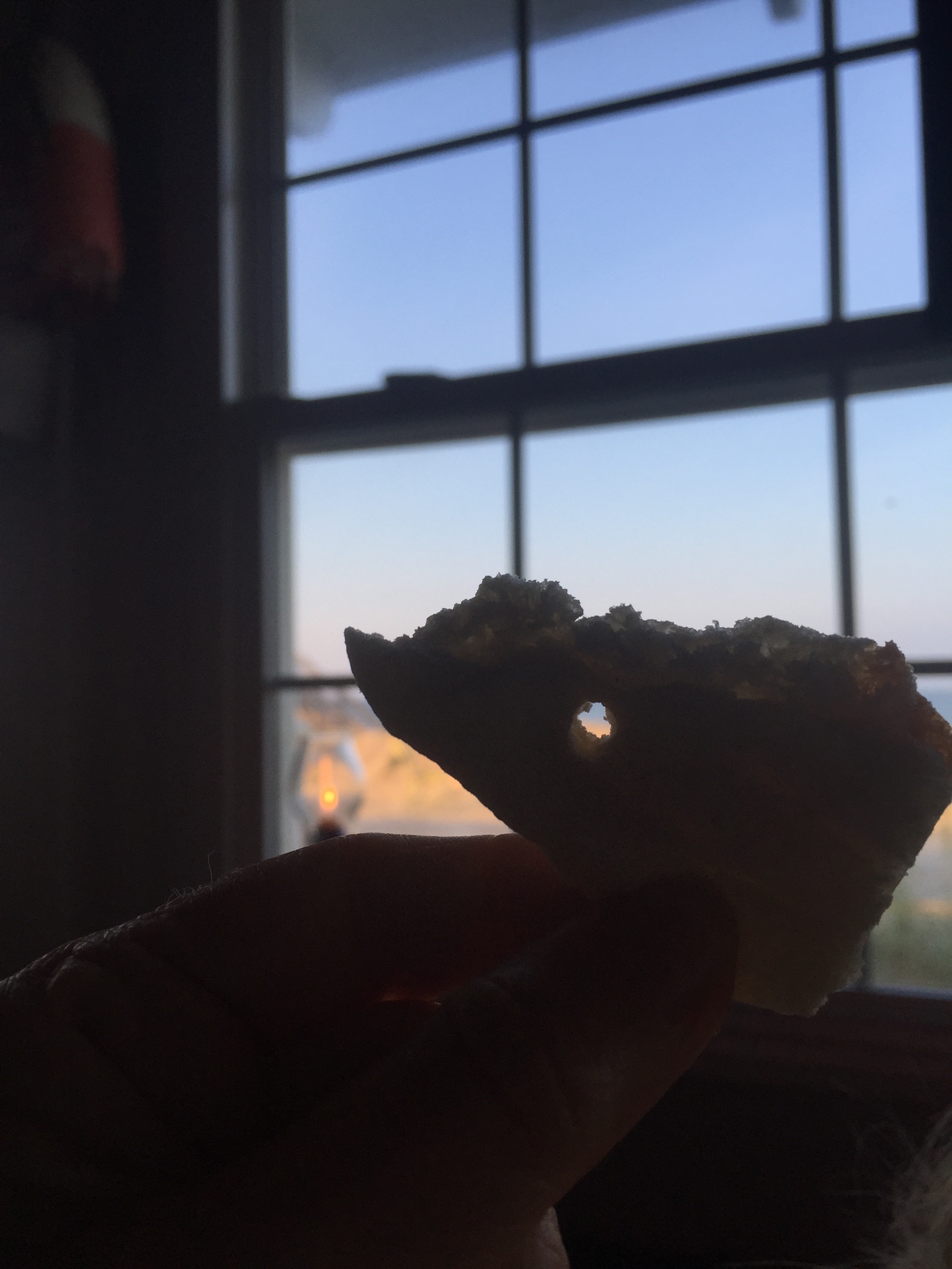
There are little art tools sold to achieve this purpose, or you can peer through the small hole at the end of your palette knife. In a pinch you can concoct a small hole by peering through your curled up fingers. Last night at the restaurant my daughter and I were peering through straws. We even made a hole in a piece of my daughter's pita bread.

  This worked really well, actually, though by this time my husband started trying to disassociate himself from the crazy people peeking at things through their appetizers.

The point is, by isolating a tiny portion of an object you eliminate the information overload that can often happen when painting outdoors, and it is easier to see the color and value more accurately.

First painting since the move!

After re-reading my post from yesterday I started to feel like a wimp, complaining about the heat and all. Then I tried it and realized that heat stroke does not improve your art one iota! All kidding aside, it was boiling lava hot outside on my patio. I only lasted about an hour before I decided I'd have to leave it until the next day, and pick up where I left off. And so I painted this piece over two sessions, noting the time of day and returning to wrap up at the same time this morning.

plein air garden painting by Jennifer E Young, All rights reserved "A Taste of Summer" Water soluble oils on Linen, 12x12" To purchase, contact me!

This little outdoor still-life setup includes the herbs and flowers I brought from my old place, as well as a big beautiful housewarming gift from our new neighbors (the pink and orange spray behind the basil). A  marriage of old and new,  I felt it was the perfect subject to kick off this new beginning.

I experimented with this painting using Cobra water-soluble oil paints by Royal Talens . I was inspired to try them when I started following the very talented painter Mark Hanson's discussions about them on Facebook and on his blog. I have friends who use water miscible oils, too, but having tried them before without success I haven't been compelled to try them again. But when Mark suggested that his migraine headaches may have gone away after switching to these oils, I took notice and decided to try this new (to me)  line of paints myself.

I have suffered from insomnia for years, and yet ever since we moved to the new house, I have only had two bad nights. That's pretty incredible! Coincidentally, with the exception of yesterday and today,  I have not painted since we've been here. Is it possible there is some other reason for my newfound improved sleep? Absolutely. But it's also possible the fumes were getting to me and I didn't even realize it. It has also bothered me for a while that I am eating as much organic and natural food as I can afford, I'm also inhaling volatile organic compounds on a daily basis in my work. And if we ultimately decide to set up my studio in our current attached garage, water soaked paper towels are  going to be a lot safer than ones soaked with mineral spirits, odorless or not!

I first tried water-soluble oils several years ago. I believe they were Winsor & Newton's Artisan series. At the time I found the handling too gummy and tacky and not to my liking at all. I may not have given them a fair shake though, because in recent weeks I have read that you really should not thin your paints with water or it will produce that tacky, gummy effect and make the paints rather dull and cloudy looking. Instead, Mark advised not to rinse off your brushes too much with water, but to just wipe off the brushes as much as possible in between color mixtures  instead, and save the water for the final cleanup. If needed, use a water miscible oil painting medium created specifically for these paints rather than water to increase viscosity.

That advice made a world of difference and I found myself painting without fighting with my materials. There was a slight difference in the handling and a few old habits to overcome, but nothing so difficult as to put me off. I would say they did not flow as easily for me as my traditional oils, and the color intensity was a tad weaker, but not by a tremendous amount. On the other hand, they have absolutely no odor and seem like they would be great for travel.

From what I have read so far, the drying time may be a bit longer than what I'm used to. But that should not be an issue for ole' Pokey, here. I do hope they dry well and evenly, without any dull passages or great shifts in color or value. I will report back on this if I notice anything remarkable. I look forward to experimenting more with these paints. I really hope these will be my new go-to paints, and that I can ditch the OMS once and for all!

Dordogne Breeze

Here is the final version of the painting I posted in progress yesterday:

French landscape <!-painting by Jennifer E Young "Dordogne Breeze" Oil on Linen, 20x16" Click here for more info. Contact me to purchase!

The fun thing about this painting is that I used a lot of paint, which made working the edges really easy and enjoyable to manipulate. Truth be told, I had originally planned to have more elements  in the painting, (sheep, additional buildings in the distance) but in the process of painting it I decided I liked the simplicity of it with just a very few dominant shapes. Those other elements can wait for another composition, another day. This has been a good reminder to myself that I do not need to say everything in one painting, and to just let the brushwork speak for itself.

Week-long study with Kevin Macpherson

Last week I did something I haven't done in a very long time...devote myself to the art mistress from morning to night for an entire week. And it was a week studying with the talented Kevin Macpherson at that! As you may have read from my previous blog posts,  I am a big fan of his paintings and his books. He is truly one of the best teachers I have encountered so far. Not only is he a highly skilled painter, but he has a way of honing in on and distilling essential information that actually penetrates my rock-hard noggin. JYandKMAC2

The workshop took place in a beautiful new space called Chesapeake Fine Art Studio, run by artist Hai-Ou Hou in Stevensville, MD (great location- about 20 mins. away from Annapolis). If you are an artist on the east coast,  it would behoove you to check out her site. Hai-Ou is quite the painter herself, and also appears to be drawing some of the best and brightest painter/instructors in the plein air and traditional/representational painting movements.

I really wish I had time to delve into all I learned during my workshop experience, but life is slamming me pretty hard right now. This week marked a return to the "real world" (insert the sound of  needle scraping across a record here) with kitchen renovation, school activities, and doctor's appointments commanding most of my time and energy.

But my biggest take aways from Kevin's instruction had to do with value and composition. He spoke a lot about light and shadow, and how one can create much stronger paintings by clearly indicating which elements belong in the light family and which belong in the shadow family. (This sounds simple in theory but it isn't always so easy in practice.) He stressed seeing and painting "shapes, not things", with the idea that if we are too wrapped up in painting a "thing" we lose the ability to really see it accurately and how it relates to the rest of the painting as a whole. We spent a good deal of time really learning how to see the true value of things (er, shapes, that is!) He stressed using a color isolator in the field to identify true value and color, determining and laying down your darkest note of color first, followed by the rest of the shadow family, and finally the values in the light family, keying everything up from that very darkest note, so that you really can get a handle on color and value relationships.

In essence, how dark you key your darks will determine how light you key your lights. I use the analogy of playing "Chopsticks" on the piano. You can play low on the scale or high on the scale, but the arrangement of notes and their relationship to each other are the same no matter how high or low you move along the keyboard.

Kevin Macpherson's workshop

His demos didn't disappoint. In addition to demos in the field, mid-week during his opening he did a remarkable demonstration in the studio (from a photo) on a canvas sized at about 20x24" . During that opening he also presented an inspiring and highly entertaining lecture. This lecture, I understand, was very similar to the one he presented at the Plein Air Convention. Not being able to travel as much as I used to, I really appreciated having the opportunity to see this presentation, in a much more intimate setting.

Though we were meant to work largely out of doors, we had our share of rain and wind. When the weather didn't cooperate, it gave us the opportunity to study (in the gorgeous and spacious studio) some of the more pertinent points Kevin was trying to drive home. We spent a good deal of time studying value relationships among the "light family and shadow family". On another occasion we delved into "The Golden Mean" or "Golden Section" (the informal subdivision of space) and he presented a fascinating slide lecture with many, many inspiring examples of  how it has been used by painters throughout history.

Kevin Macpherson's painting demo

Here are a couple of my plein air paintings done during the workshop that actually reached a level of finish:siloshadows_w

plein air landscape paintings by Jennifer E. Young

At the week's end, I left feeling completely exhausted and totally exhilarated at the same time. I didn't leave with many "finished" pieces, but that wasn't my goal at all any how. What I did leave with was a wealth of knowledge and insight, as well as a good deal of creative spark. Whether that spark ignites a fire, is now totally up to me.

Matt Smith workshop

Oh yeah, I have a blog! ;-) Actually, I didn't forget; I've been doing a little traveling up north to the New Hope School of Art to take a workshop from the very talented painter Matt Smith. The trip was noteworthy for a number of reasons. First, it was the first time I have been away from my daughter for more than a night. (That part was hard.) But second, it was also the first time I've had in 4 years to do nothing but paint and immerse myself in "art stuff" for four days straight. (And that part, my friends, was luxurious!) I haven't taken a workshop in a very long time. But now that my daughter is getting a little older, I really feel like it's time to amp up my art life in some significant way and infuse my work with new insights. So when I heard Matt was coming east to teach (he's based out West, so that's something I'd not caught wind of before around here) I knew it would be an excellent opportunity to do just that.

Please excuse the poor photo quality but this was shot with my iPhone in low light. Here you can see the very light way Matt holds his brush to apply paint and manipulate edges.

Matt hails from Arizona, and is best known as a painter of the Sonoran desert near his home, as well as the snow capped Canadian Rockies and other places out west that epitomize the classic western landscape. What initially attracted  me to his work though was not his subject matter, but the sensitivity in the handling of  his brushwork and edges. They are both bold and delicate at the same time.  But after seeing him demo and talk about his approach, I was equally impressed by the purposeful way he composed his paintings and orchestrated his compositions to create  powerful statements. I won't get into a blow by blow description of day 1-4 of class, but I will share some of the significant things I took away from it personally, most likely in more than one post.

The interesting thing about this workshop was that even though Matt is best known among artists as a plein air painter, the class was held entirely inside, in the studio. I'll be perfectly honest here and say that when I signed up for the class I was mildly disappointed that the format would not include at least part plein air painting, especially since Matt himself is a seasoned field painter and the area where the workshop was located was very scenic. (It was the birthplace, in fact, for an entire movement of landscape painters, known as The New Hope School and Pennsylvania Impressionism.) Largely though, that disappointment was entirely personal. My studio is my workhorse, but plein air painting is more exciting to me. Also with my life situation at present, I just don't get the longer stretches of time needed to trek out in the field as often to paint.

When I asked about the reason for the indoor class, Matt's response was that in his years of teaching, he has seen the same problems pop up again and again, whether in the field or in the studio. Maybe he felt it's better to address these fundamental issues in a controlled environment rather than adding another layer of difficulty with the environmental factors that plein air adds. In any event, the format turned out to be fine. In fact, there was plenty I needed to work on just with my studio work,  the studio environment definitely allowed Matt to get to each student several times a day with valuable feedback. As it turned out, the weather was not great any way, and we probably would have needed to seek shelter for at least two of the four days due to rain and wind.

Matt did several very good demos (using his photo references). He used a Strada easel, which I think was a rather new purchase for him. He talked a lot about equipment and painting gear, which, as any regular reader of my blog may have surmised, is a topic of great interest to me. The Strada is made of metal and looked like a neat little box (I think his was the mini, which is presently sold out.)

The Strada Mini Easel

But even without the two winged accessory attachments added to provide more workspace, it was a very heavy box for its size. Matt said he liked it because of its compact size (it easily fits into a backpack) and durability for travel, but personally I could not deal with the heft. A Gitzo travel tripod was also part of his setup, which looked great for its ease of use and small size when folded (also easily fitting into a backpack), but a quick Google search soon told me this item was way out of my price range. (Wowsa!)

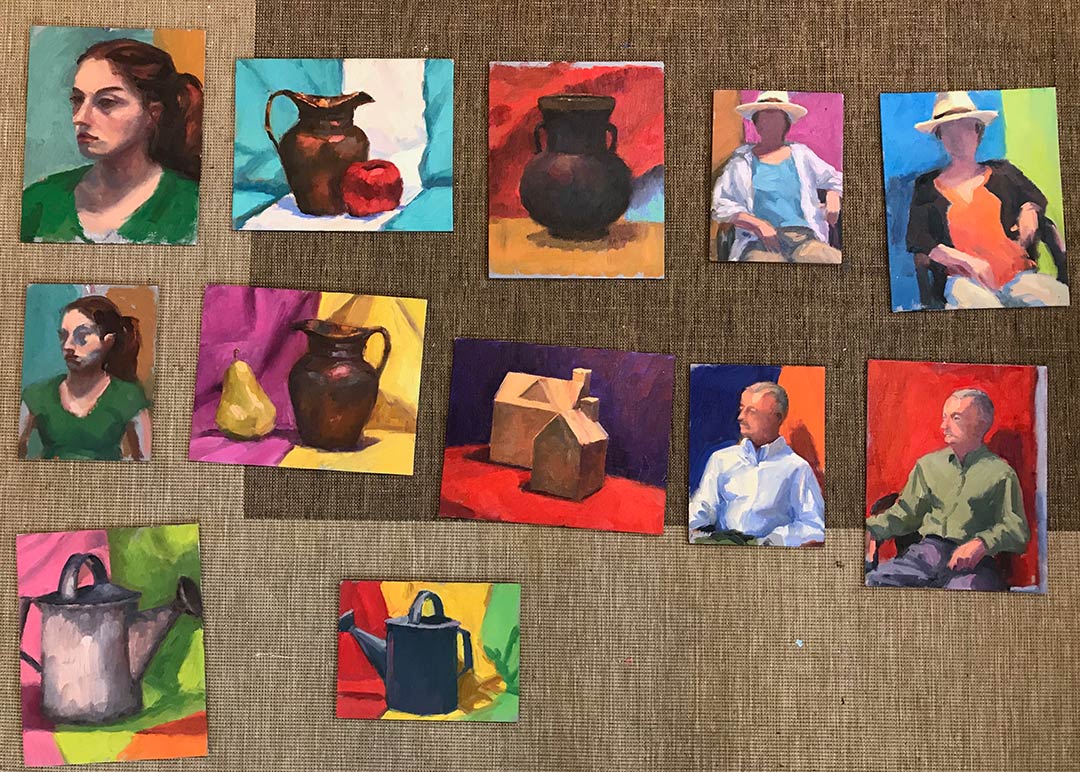
Matt, by self-definition is not a colorist. In fact, of the fundamentals he sites as essential to a good painting (Drawing, Value, Design, and Color) the most expendable he says, is color. Even so,  I found his palette fairly wide, with four blues, two earths, two yellows, an orange, one red, a violet, and a couple of greens (plus, of course, white.) He used no medium other than his oil paint and a very tiny amount of Gamsol to thin his paints.

His start consists of a very light sketch, soon followed by masses of color, working broadly to get his main elements and shadows down. He then builds from there, thin to thick, dark to light, broad to more detailed. One thing I found interesting is that he almost always left his sky a white canvas until close to the very end of the process. Obviously this is working to his great advantage, but try as I might, I couldn't resist my normal method of putting the sky in early on. This was especially the case if there was any water in the landscape, as I find  I need that sky information to know what's being reflected.

I've a lot more to say on the subject but I should probably try and paint something now! In my next post I'll share of few of my studies done in the workshop, as well as some valuable take-aways that I received from Matt's feedback.

A good value

If you have been reading my blog long enough, you may find that I obsess a little over art supplies and gear. A few months back a fellow artist mentioned that a great tool for judging values was a Kodak Wratten 90 filter. So for a few months I was on a mission to find one that was A) big enough to comfortably look through (ideally 4x4) and B) low enough in price so as not to break the bank. After searching online and watching the bidding wars on eBay, I found the combination of the two criteria impossible to meet. Then one day it dawned on me that I used to have a little red value viewer tool that I'd picked up in a sewing store. I don't know what happened to it, but I thought I'd poke around on Amazon to see if I could fine something similar. Lo and behold, I stumbled upon this little number:

Like the Wratten filter, this value finder helps neutralize color so that you can more accurately discern the values in your reference. Not only that but it has 3 view finders of different aspect ratios that will work with a range of canvas sizes. It also has optional guidelines that you can overlay to check composition, AND a couple of value scales to check your paint mixtures.

The drawback is that the filters are red rather than the nice grayish neutral of the Wratten filters. This may not appeal to everyone. But with a $14.95 price tag it is a good option and specifically geared toward the painter. I have been using it with studio work and it does a good job at neutralizing color so that I can judge values with more accuracy.  I haven't used it outdoors yet but I think there it would be even more useful when making on the spot judgements, and I look forward to taking it along with me (hopefully this week) now that the weather is warming.

Varenna's dramatic skies (W.I.P. continued)

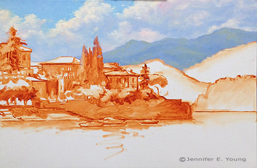
When I traveled to Bellagio and Varenna, one of the things that struck me about the landscape was the dramatic cloud formations that settled over these little lake towns. Possibly this is due to the altitude, or the difference in altitude between the lake and the surrounding mountains. OR, it could have just been my timing. In any event, while they were very beautiful and created spectacular displays, they also made  it pretty tricky to sketch/paint en plein air because the daggone light kept changing from minute to minute. In the studio, of course all of that is much easier to control, and I get to celebrate the beauty of the clouds without at the same time cursing the inconvenience of them ;-). After I sketch in my composition, my most common approach to landscape painting is to lay in the sky and the far distance. Since the sky contains my light source, the highlighted sides of the clouds will hold some of the lightest values in the painting. Probably the only other things that approach this high value is the light bouncing off of the white painted boats.

Landscape painting of Varenna Italy in progress by Jennifer E Young

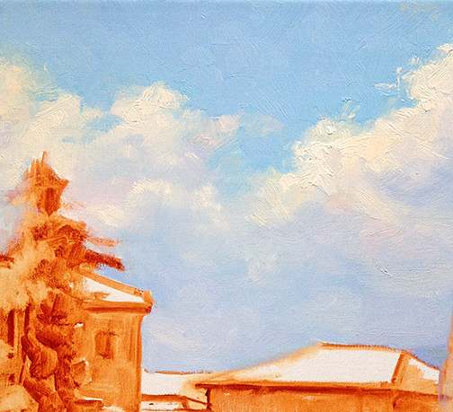
I am not sure if it's evident in this photo, but I have used an array of colors(cad orange, cad red light, alizarin permanent, ultramarine and sevres blue) to tint the clouds. The blue sky is a combo of ultramarine, sevres blue, and white.

landscape painting clouds detail by Jennifer Young

Next distant mountains progressively deepen in value, but they are still very cool in temperature, so that they will sit back behind what's to come in the foreground. After evaluating my composition further, I decided to raise the distant horizon line, so as to push those cliffs back a bit more, in relation to the foreground town.

Lake Como landscape painting in progress by Jennifer E. Young

 After I get the painting a little further on, I may come back and tweak what I've done here. But for now  it's time to address  the water and the heart of the matter; the town of Varenna.


Studies

I'm baaaack. And I'm kicking off my return to blogging with a new Varenna study. I actually hesitate to call this a study, given the amount of time it took. I guess a month away from painting has left me feeling a litle rusty and slow! In any case, this painting will serve as a preliminary study for a larger piece.

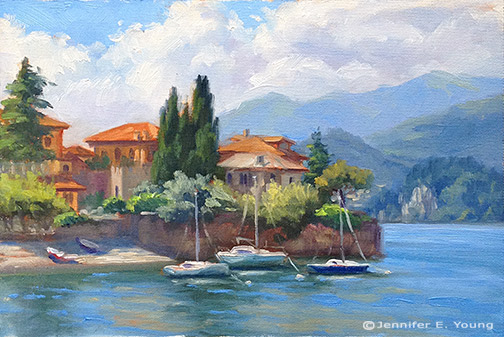
Landscape painting of Lake Como Italy by Jennifer Young Varenna Study Oil on canvas, 6"x9" Contact me for more info.

We have had rounds of winter sickness followed by school closings due to snow, so with my foray back into painting being twarted quite a bit, I had the thought to develop a number of small scale studies of some larger painting ideas that  I've been wanting to tackle. I'll be painting some of these to scale up to my larger sizes. For example this 6x9" piece will scale up to 24x36".

I've painted various views of this harbor a few times now, which you can see herehere, and here. I guess you can tell I am enamored with this particular view of this  lovely Italian lake town! This composition emphasizes the strong horizontal of the walled town jutting out onto the lake, contrasted by the verticals of the buildings and tall cypresses.

While I almost always sketch out my composition on paper before I tackle a canvas, I usually leave the painted study for when I am out in the field painting from life. In fact, I have painted lots of studies and lots of larger scale studio pieces and quite a bit in between. Not all small paintings warrant a big statement, but I haven't been all that great about developing my viable studies into larger, more fleshed out studio concepts.  My schedule has been so sporadic for such a long time now, and with not much chance of an end in sight, I really feel like I need to have a more methodical  approach to my work habits. I am hoping that by tightening up my studio practices a bit, I might find more equilibrium when I do get a chance to enter the studio, and I will waste less time and feel less at a loss about what I am going to tackle next.

Well, nothing informs like experience, and since these small ones can presumably be completed in a fraction of the time, (ahem!) I thought it was worthwhile to have a go at a few of them, done, specifically with larger paintings in mind. I will also mine some of my other small works, in particular the plein air pieces I've done, as I think a number of them have potential for further development. I have worked from a number of them here and there, but I think there is more potential (especially in my James River series) and it could be something fun to do during these cold winter months when I'm not getting outside.

Ansouis (W.I.P.- continued)

Here's some progress to report on the composition I sketched out in my last post.

Provence France village painting in progress by Jennifer E Young

After laying in the sky and distant mountains, I set out to establish the broad areas of light and dark in the painting. I'm really trying to think of my composition in terms of underlying masses of light and shadow, and not just a group of individual objects.

Provence France village painting in progress by Jennifer E Young

I'm using a broad palette of colors- my usual red, yellow, and blue, plus cad. orange, cad. red, permanent rose, sevres blue, as well as two earths; gold ochre and burnt sienna (for the tonal sketch) and, of course, white (titanium).

This is as far as I got today- about 2 1/2 - 3 hours' work- before it was time to pick up my daughter from preschool.

Provence France village painting in progress by Jennifer E Young

I'd really rather not allow this to set up, as this is my "first pass," and there is so much more to lay in. I am going to try and work on this again tonight after my little girl falls asleep, but I'm not normally good for much creative work after wearing the "mom hat" in the evenings. We will see. Otherwise my next dedicated painting day will be Friday, and I'm afraid it may be too tacky for my liking by then.
Shadows, doors and floors

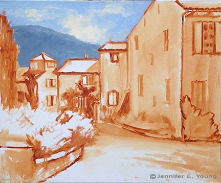
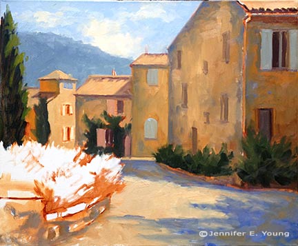
Here is a little progress on my painting of the Tuscan street scene I posted a sketch of in my last entry. Now that I have my design, I am ready to start laying in some color. My palette is fairly expansive, which I tend to do in the studio when I am more pressed for time. Here I'm using a few convenience colors in addition to my basic primary palette of red/yellow/blue. My colors for this piece are Titanium White, Cad Yellow light, Cadmium Red Light and Medium, Alizarin Permanent, Ultramarine Blue, Sevres Blue, (Rembrandt- kind of like Cerulean but a bit brighter with more tinting strength),  Gold Ochre (also Rembrandt brand- like Raw Sienna but warmer and more golden; yum) and Burnt Sienna (tonal sketch only). I start by laying in more concretely the pattern of shadow and light. I really love the way the shadows from the potted flowers spill onto the stone wall and red door:

Painting in progress of Tuscan village street scene by Jennifer Young

 I use lots of the Gold Ochre for the wall, mixed with both blues and Alizarin in varying degrees, as the stone has lots of warmth but lots of variation in it too. For the door I started out with pure Cadmium Reds in the sunlit area, but whoa! I then decided to mute this a bit with touches of white and a tiny bit of yellow plus Sevres Blue to give it a more authentic sun-washed look. The door in shadow is a mix of Cad Red Medium, plus Ultramarine and Alizarin.  Next I start to lay in some of stone bench:

Work in progress of Pienza village in Tuscany by Jennifer Young

As you can see, I use violets in the shadows (Ultramarine Blue and Alizarin, plus touches of  white and yellow) to contrast with the bright warmth of the sunlit stone.

Tuscan village street scene in progress by Jennifer E. Young

The bench established, I add a little more texture to the stone wall and then begin to lay some pavers. Even though they are terra cotta- colored pavers, they are still very light in value in relation to the wall. I've cooled them off with a bit of  Sevres Blue as they recede, to send them back and lay them down where they belong. Next I'll start working on the potted plants and add some more color to the scene. Stay tuned!

A trip to the Mountains

This past weekend my fabulous husband gave me a wonderful gift of a getaway to the Blue Ridge Mountains. It was just an overnighter, so I didn't have a ton of painting time; but I did have enough to do this little mountain study.

Blue Ridge mountain plein air painting by Jennifer Young

I also spent part of the trip scouting around for future painting sites.I was in the town of Nellysford, VA (near Wintergreen) which has long been a favorite of mine. In the past though, I have always been able to scout while my husband drove. Driving on my own through this gorgeous countryside, I realized how oblivious I have been in the past to what a white-knuckle a drive route 151 can be (sorry honey!)  It wasn't very easy to ogle without also risking driving oneself off a cliff. I did find a few spots to pull over though, and even though the leaves haven't yet made their autumn transformation there, it was still stunningly gorgeous and inspiring.

The above painting is really a study. I was mainly interested in getting a feel for the planes and shadows of the mountain. I struggled with the canvas panels I brought though. They were oil primed linen, which are supposed to be primo, right? But I found them to have a both a heavier weave  and yet to be much slicker than I am accustomed to, at the same time. It might just be a matter of getting used to them, but they gave me problems last weekend and I felt like the surface was a major distraction.

I also learned that my overreliance on my handy dandy rolling bag has caused my plein air painting gear to get a little hefty. I love using the Soltek easel (when it's functioning properly) when I'm around town, but if I am going to get back into traveling I really need a lighter setup for my backpack. I do have a very light setup already, but it has proven almost too light for me, and I find it to be so much less stable-feeling  than my Soltek or other pochade boxes I've used in the past. I also have become extremely reliant on the large paint-mixing surface of the Soltek (which I have expanded even further--more about that in a future post). So the tiny mixing area of my current travel box makes me feel like a giant in Munchkin-land.

Yet again, I may just need to get myself accustomed to the change. But I've been finding myself eyeing another paint box of late (here we go again!). I've had my eye on it for a number of years. It's by Alla Prima Pochade. The models I am considering are either the Bitterroot or the Bitterroot lite. I can always rationalize needing an auxiliary easel  for travel and for use in case my Soltek breaks down again. They seem really well made and are so intelligently designed (I've seen them before in action.) But will either one significantly reduce my setup size while still allowing an adequate paint mixing area? That is the question.

Pescallo cafe complete

We have had a bout of sickness at our house (first me, then my daughter) but I finally had a chance to get back to my Pescallo painting over the holiday weekend. Let's wrap this up! Picking up from my last installment, I am ready to paint in the flowers. Bougainvillea spills over the arbor with mixtures of alizarin crimson, permanent rose and a touch of cadmium red to warm things up. Normally I would block those colors in sooner but I was still trying to decide about the placement of that arbor structure and reds are such high staining colors that I didn't want to put them in until I had the composition pretty well established. Now I guess I am committed! ;)

Pescallo Italy landscape painting in progress by Jennifer E. Young

Geraniums in shades of red fill out the planters using the same colors as the bougainvillea (but in much different ratios).  I also flesh out the columns on the terrace and I am nearly done with the pier.

Now it's time to move down to finish the foreground water and reflections. There is a lot of movement in this water, and with much of this water in semi-shadow, reflections are subtle and broken by waves rather than the strong, mirror-like reflections seen in still water. For the darkest shades I mix Ultramarine and Gold Ochre, warmed or cooled by touches of Cadmium Orange or Sevres blue as the situation allows. Water highlights are deeper shades of the sky color.

Lake Como Italy paitning in progress by Jennifer E. Young

My finale is to include the rest of my vertical lines- the mast on the boat and the railing along the pier. These verticals act as a strong counter-balance to the horizontals of the mountains, boat and pier. I think the railing also serves to further push the background more firmly in the distance.

Lake Como landscape painting by Jennifer E. Young

"Alfresco in Pescallo" Oil on Linen, 24x30" Click here for more info!

This piece was a challenge to me, largely because of all of the interruptions I had, which caused the painting to set up quite a bit more in between sessions. I much prefer painting wet-into-wet, to avoid the extra work of opening the painting back up and scraping the dry paint down off of my palette. But sometimes it just can't be helped. In any event, I hope you like the final piece!

No babysitting this week, so there will be lots of trips to playgrounds and possibly the zoo, and I likely won't have much in the way of new work to post until after my daughter is back in preschool on the 9th.

Moving forward

Before I could really tackle the foreground on my Pescallo painting-in-progress, I needed to establish the background water. It shimmers with a pale sparkling light in the distance, the color becoming deeper and more varied in contrast as it moves in waves toward the viewer.

Lake Como painting in progress by Jennifer E. Young

Lest I got too caught up in the romance of Italy or the gentle waves of Lake Como, my husband brings me back to reality with a screeching halt and a critique of my painting. His opinion is to flip the direction of the boat so that it leads into the painting rather than out. I have to agree with him here, so being the always obedient wife (ha ha) I do as I'm told.

Next, I really need to address what is happening on the pier so that I can paint the reflections in the foreground water. I paint the tires that hang along the pier and serve as a rustic contrast to the elegant beauty of the backdrop. This epitomizes Pescallo to me; it is rustic but beautiful, quaint but elegant, sleepy but exciting, all at the same time. The tires are in higher contrast on the sunny side and in low contrast in the shadows.

Lake Como Italian landscape painting in progress by Jennifer E. Young

Black is not black and white is never white. By this I mean that I don't use a tube black to paint black-colored objects, or a straight out of the tube white for most white-colored objects. This would create very flat, dead color. Instead, I mix my "blacks" with my darkest translucent colors on my palette, ultramarine blue and alizarin crimson, and just the tiniest bit of cad. orange or yellow to neutralize some of that purple undertone.

Lake Como Italy painting in progress by Jennifer E.Young

Flowers and flowering vines grow out of every crack and cranny around these parts, and I paint those in delicately so as not to overpower. The showy flowers will be the geraniums and bougainvillea to come.

School is back in session, which means that our babysitter has become a lot less available now that she's returned to college classes. It also means I will have less time to paint over the next two weeks until my daughter returns to preschool. I didn't get the time to paint outside last week, but my goal is to finish this studio piece with one more session tomorrow, so that I can still fit in a plein air session by week's end. I'm close...wish me luck!

Pescallo cafe painting demo (cont'd)

Here's a little more progress on the Pescallo painting I started in my last post.  I'm trying to write this as a demo of sorts, which means that with my  time constraints it is taking longer for me to post than I'd like. But noting ventured nothing gained, and I'm now ready to talk about some color! My palette for this painting is as follows: titanium white cadmium yellow light cadmium orange cadmium red alizarin crimson ultramarine blue sevres blue (Rembrandt- it's like a cerulean but more intense) burnt sienna gold ochre

This is a bit more expanded than the single primary I have experimented with a lot in the past, but with limited time in the studio now, it is helpful to have a few more "convenience" colors in my arsenal. With the tonal drawing laid to canvas as my guide, I begin by blocking in my color, starting with the sky and mountains. I start with very general shapes at first and then work to refine them as I move along. For the sky I am using combinations of sevres and ultramarine and white, and for the clouds, touches of cadmium orange and red, plus white. The mountains are basically varying degrees of cadmium orange and ultramarine blue.

lake como Italy painting in progress by Jennifer Young

Since so much of the background peeks through what I will have going on in the fore, I decide to work out the background first, fleshing out the highlights of the mountains. The greens of the mountains are very grayed down- just the slightest amount of cad yellow light is used, in combination with the blues. I also add a little alizarin crimson to neutralize it further.

Italian landscape painting in progress by Jennifer Young

I decide to soften the sky a bit to make the background stay back and be less busy. Then I start to lay in a first pass at the water. I use a slightly darker variation of the blues from the sky for the distant water, using less white as I move forward. I also add in some cadmium orange to the blues as the water edges closer to the pier and foreground. This won't be the final word on the water, but I have gotten rid of that white canvas and have enough of the background tones to start laying in the foreground. Next I will begin work on establishing the shadows and highlights of the pier.

lake como Italy painting in progress by Jennifer Young

Quite a lot still to go, but things are starting to take shape. But as they say, the devil's in the details.

Blue Ridge Mountains Commission- WIP, cont'd

This week I continued work on the mountain meadow commission painting I began blogging about in my last post. My approach for this piece seems to be that I am working more or less from back to front, as edges are softer farther away and come into greater focus in the foreground. The sky is painted together with the distant mountains, since there is such an interplay of clouds and mist back there. The distant trees are addressed rather uniformly at this point, as I tweak their values and placement in the composition.

Blue Ridge Mountain Meadow Commission- WIP

Next I decide to address the darkest value in the painting, which is the focal tree, so that I can better assess the value relationships as a whole. I am not getting into the tree edges yet, as I need some of the meadow colors laid down first in order to create the soft edges of a misty morning.

Jennifer Young Morning Meadow commissioned painting in progress

Next I mass in very generally the flowers in the field. There will be a lot more color variation but I just want to get the generalized color and pattern down on the canvas first.

Jennifer Young Morning Meadow painting commission- WIP

Soft greens of the grasses follow the blue, and merge to soften the edges further.

Jennifer Young painting commission "Morning Meadow" WIP

With the field of the meadow laid in, I can now start to give the focal tree a nicer shape, with soft lacy edges and a few subtle tree holes. I may need to tease out those holes a little further, perhaps darken them a bit, so that they aren't so "holey", but now I can see the  painting really start to take shape.

Jennifer Young mountain landscape painting in progress

The sky has gotten washed out in the photo above, but I will try to get a better shot with different lighting conditions. It's been raining and cloudy a lot lately, so I am relying on indoor lighting (which isn't all that reliable!) What comes next will be more work on that field. Both grasses and flowers are cooler and softer as they recede, and show more detail, warmth,  color intensity and contrast as they come forward.

A spring commission

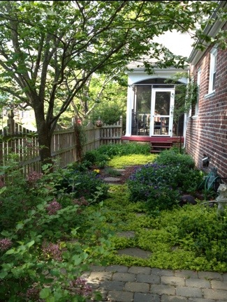
With the spring shows hung and the winter commission complete, I was thinking I would be able to turn next to some plein air painting, or perhaps to develop a couple of my James River plein air paintings into larger studio works. But that will have to wait, as I have gotten another commission! :-) But first, a couple of shots of the garden, which, when last photographed was in a state of sad dishevelment! The gardens around the studio really come into greater color in the summer. But with the rubbish cleared and weeds pulled, things are coming alive in the side garden with Creeping Jenny on the path, flanked by Mountian Bluets (Bachelor's Buttons) and creeping phlox. A flowering Dogwood makes a nice canopy, and the lilac in the fore is just starting to put off its heady scent.

20130427-063451.jpg Here's another shot below of the garden opposite the studio. In summer there are lilies, cone flowers, tall phlox and a butterfly bush. But my big thing lately is succulents. I love that they are water-wise and so marvelously sculptural. In the center is a succulent topiary I made last year. I will need to replenish a few of the tender plants that didn't survive our winter, but it hasn't been quite warm enough here to see much variety in the garden centers yet.

20130427-063539.jpg

Now that my daughter is a toddler, I can usually patch together enough time to noodle in the garden while she plays nearby. Working in the studio is a different story. At just 2 1/2 years old, her attention span is still pretty limited. So while she loves being in the studio, (and I love having her there,) I do have to shoo her out when it comes time to work, amidst howls of protest (and a certain amount of Mommy guilt as well).

...Which leads me to the commission! If you have been a reader for some time, this image might be familiar to you. In fact, I have painted variations of this scene a few times, beginning with the small painting done en plein air in the Blue Ridge mountains, and following with two larger 30x40 versions.

The commission came about as the result of my April show currently taking place at Design Domaine Gallery in Bernardsville, New Jersey. The client loved the painting "Morning Meadow" (click here to read my blog about this painting in the making) but it was much too large for her space. So my task is to recreate this scene in a 16x20 format.

Since a 30x40" painting doesn't exactly scale down to 16x20", we thought it best to start with a sketch of the new painting so that the client could have a visual idea of how it would look compositionally.

20130427-063621.jpg

While on the one hand, it may seem easier to recreate something I have basically already done a number of times, it can sometimes be a challenge to meet client expectations. Sometimes, though not always, a client may, for instance, expect the new painting to be exactly like the first, only smaller. So an effort always has to be made to explain in advance that as an original work of art, a painting can't be recreated stroke-for-stroke like the last.

The client does understand this, though she would like the color of the new piece to be as close as possible to the last. It was, after all, the combination of colors in Morning Meadow that she fell in love with.

Luckily, my prior blog post listed the exact color palette I used to create the larger piece! :) (I can't tell you how often I have referenced my own blog to get this kind of historical information.) So while I won't be able to remember exactly the combinations of color mixtures, I will be able to take some of the guesswork out of the process and use the same palette for this piece.

20130427-063635.jpg

Above is the sketch, reinterpreted onto canvas. At this point in sketch stage, I want to make sure I get an accurate placement for the various elements in the composition, so I've marked off in pencil the horizontal and vertical mid-points in the pencil sketch as well as on the painting to guide me. More to come in an upcoming post, where I will get into some color!

Lake Como W.I.P./Demo (continued)

Well I promised color in my last post, so let's get started! I don't know if I mentioned it lately, but I have been experimenting with expanded palettes for my latest paintings, and that exploration continues with this one. Regular readers may remember that I have for a long while used a limited palette of red, yellow, and blue, plus white (like this one). For this painting, my palette is (as I lay it out from left to right) Titanium White, Cadmium Yellow Light, Golden Ochre (Rembrandt), Cadmium Orange, Cadmium Red, Alizarin Permanent (Gamblin), Cobalt Blue, and Ultramarine Blue. (I've specified brands where color names are specific to a particular brand.)   I haven't used any pre-mixed greens, as you can really mix a zillion different greens with this palette. I have used most of these colors off and on, with the exception of Cobalt Blue. To be honest, I was really hoping that I wouldn't like it, because it is a terribly expensive tube of paint. Of course, I love it!  It is a cooler blue than Ultramarine, which has more red in it. I still love Ultramarine, but Cobalt has some really wonderful possibilites. Any way, back to the painting...I start by painting in the sky, which contains the light source and is also the farthest in distance. The sky is Cobalt blue plus white, with cad yellow lt. added as it nears the horizon. For the clouds I've mixed a combination of blues and cads red and orange + white for the shadows, and Cad orange and red + white for the highlights.

20120921-150523.jpg

Working from back to front, I next paint in the distant cliffs, which have a beautiful shadow casting down over them from low-lying clouds. The photo is a bit dark here (apologies) but I will try to get some more accurate photos in subsequent blog posts so you can get a better idea of the colors.

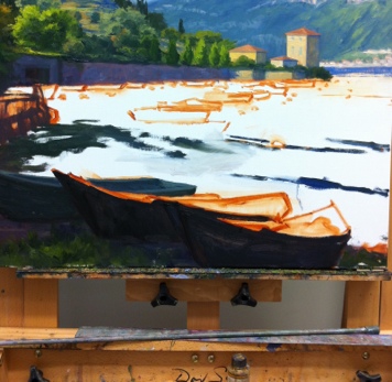
The distant mountains complete, I block in the buildings that jut out into the harbor, as they will serve as my area of interest in the painting, and everything will kind of flow to lead the eye towards them. I also decide to lay down my pattern of darks, to restate the plan I made in my notan sketch. Again, this photo just blackens everything out, but I had to make a choice between using my time blogging or photo editing, and at this point, I've chosen blogging.

20120921-150612.jpg

Next, I work on the terraced hillside in the middle distance. What a joy it is to paint...all of those shadows and varied greens! A nice round bristle brush is great for painting in those cypress trees, which have always struck me as distinctive punctuation marks in the Italian landscape. .

20120921-150639.jpg

 A mahl stick (shown in the next photo  on my easel below the painting) is a handy tool to have to steady the hand without smudging the painting, when painting details like architecture and tall skinny cypress trees.

20120921-150656.jpg

I have yet to paint in the highlights on the cypresses, but once I've done that I will be ready to move on to the middle distant water and boats, and finally the boats in the foreground. All that will be left after that point will be fine tuning  wherever's needed.