A new thing-a-majig and a new painting
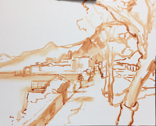
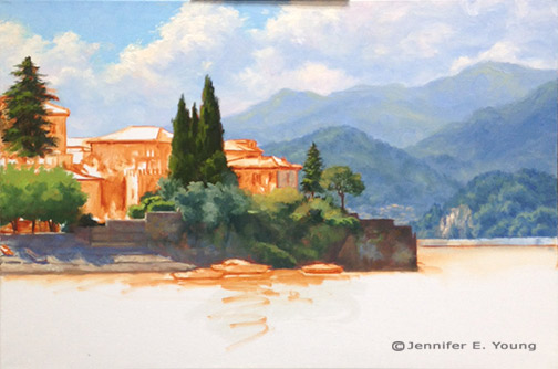
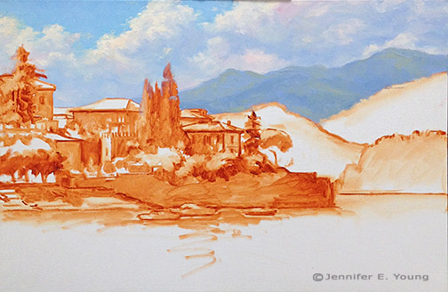
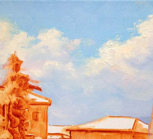
In the wake of the plein air weekend I wrote of in my last post, last week was mostly a recovery week for me. I did manage to get a new studio painting started, however. This is the initial tonal sketch on a 20x24" linen canvas.

Landscape painting tontal sketch by Jennifer E Young

This painting  may prove to be a challenge for me because much of this scene is in shadow. But there are a few pops of light that I am arranging in strategic places that I hope will carry the painting. Hey, you never know unless you try, right?

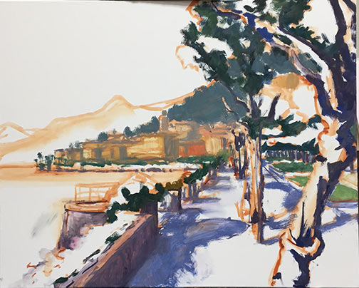
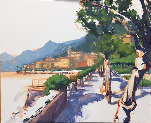
As with the other recent studio oils, I'm working with water miscible paints. One thing I'm noticing with these paints is that the paint blobs on my palette tend to gum up a little quicker once they are laid out, especially when I can't get back to the studio within a day. The manufacturer, Royal Talens recommends in their product info to mist the unused paints with a little water and cover  with foil to keep them moist and reduce the exposure to air. I have never liked putting plastic or foil directly on my paints though, because I feel that it wastes too much in the removal (yes I realize there is a bit of faulty logic in there but we all have our pet peeves).  So I'm experimenting with this:

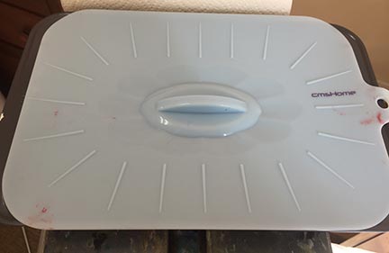
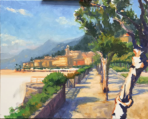
What you are seeing is a basic 9x13" cake pan covered with a silicone doo-jobby that I found on Amazon. It is supposed to create an airtight seal, and the cake pan is deep enough that this cover-thing doesn't actually touch the paint. Whether it will be sufficient to keep the paint from oxidizing remains to be seen. I haven't been back at the easel since Saturday so I guess I will find out this morning when I go to work. I will report back with my findings, as well as an update on my progress with the painting, in an upcoming post.

Bellagio From Above--Redux

The painting below was completed a while ago and has been sitting in my office since the move to our new home. So  I have had a lot of  opportunity to look at it lately with new eyes:

arielbellagio

 While I liked the painting before, I felt it could be improved and opened up a bit more to give this view a little more breathing room. So I looked back through my image archives from my trip to the Italian lakes and found several different views from this approximate vantage point. I then followed my own guidance and decided to play around with the composition in Photoshop to see "what would happen if..." I really wanted to capture more of the beauty of the lush blues in the lake and the mountains beyond:

bellagiofromabove "Bellagio From Above" Oil on Linen, 20x16" Click here for more info!

Of course, one change lead to another and my minor edits became quite a re-working. I oiled out the areas I wanted to repaint, and then set to task. This doesn't always work for me, as sometimes the paint layers have too much " skin' or texture, but this time around I guess the paint was more evenly applied.  I really like the way this turned out! It is much more aligned with the concept I had from the start- only now a little better executed.

Bellagio Promenade

As I mentioned in my last post, I've been working on a large(ish) painting of the Bellagio promenade that leads to the Villa Melzi. It took me a little longer to bring this painting to a conclusion and, because I painted at night, my progress shots were too bad to post. So what I am sharing today is the final piece:

Lake Como Italy landscape painting by Jennifer E Young"Bellagio Promenade" Oil on Linen, 24x30" For more info, click here. To purchase, please contact me!

 Because I had to work on this over a succession of days, I worked pretty lean until the last couple of sessions. In the end though, this bad boy has a lot of paint! Of all of the places I have visited so far in Italy, Lake Como in general, and Bellagio in particular, hovers near the top of my list for achieving that dazzling combination of natural and manmade beauty. The trifecta of pre-Alpine mountains, deep blue waters and classic Italian architecture dripping with flowers is pretty hard to beat.

New Lake Como painting in progress

School's out this week due to snow, so my painting time is catch as catch can. Nevertheless, we have been conspiring with other desperate parents to arrange play dates here and there, which allows a little painting and blogging time. So I thought I'd share the Bellagio painting I have my easel this week. This is a promenade on the outskirts of bella Bellagio, leading to the stunning grounds of the Villa Melzi.  This view however, looks back towards the town. Apologies in advance for the poor quality photos and the cast shadow of part of my easel on the painting. I don't have a lot of time to photo edit anything but the final these days, so I hope you will bear with me. I start in the usual fashion, with a loose sketch of my composition in Burnt Sienna:

Lake Como painting demo by Jennifer Young

Next I lay in the shadow family and darkest notes.

Lake Como painting demo by Jennifer Young

At this point I'm laying in some general blocks of color. Still no highlights yet...

Lake Como painting demo by Jennifer Young

And here's my starting point this morning:

Lake Como painting demo by Jennifer Young

Next I will continue blocking in, including the water and distant village. I'm still working up the nerve to paint outside while there's snow on the ground, but we will see. Not much of a fan of the cold, but that snow sure is pretty.

Varenna Sparkle

I'm calling this one complete. Maybe a tweak or two to come, but I feel like I have been looking at this painting so intently that I need to take step back from it for a while and start something new.

varennasparkle4

"Varenna Sparkle" Oil on Linen, 20x24" Click here for more info. Contact me to purchase!

This is a painting of the harbor of Varenna in beautiful Lake Como. It's a theme I have explored a few times now in different compositions. The complement of warm and cool colors really attract me. This one took me a while, but it got me through a number of cold, wintery days filled with bitter wind and ice. Maybe it was a complicated piece, or maybe I just enjoyed all that sparkle and warmth and wanted to linger a bit ;-).

A new year, a new painting

Welcome to 2015! I will spare you the laundry list of lofty goals or resolutions, mainly because I don't have one! Seriously though, my one overarching goal for this year is to paint more often and more consistently. That shouldn't be too hard to obtain, right? I've had some obstacles lately but they are not insurmountable, and to prove it, here is a new studio piece I've been blocking in:

Lake Como Italy landscape painting in progress by Jennfier E Young

This composition might look familiar to you. And there's a reason for that! It's based on a little gouache study I did not too long ago, only scaled up considerably (from 4x5" to 20x24") and in oils. Much more to go on this, but it's a decent start, and the year is young.  ;-)

Varenna mini gouache study

Thought I'd do a little experimenting with this fun little 5x6" study in gouache.

Varenna gouache landscape painting by Jennifer Young
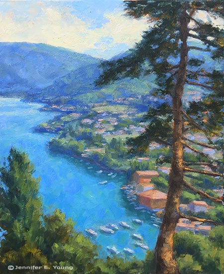
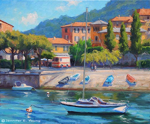
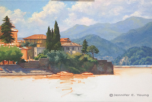
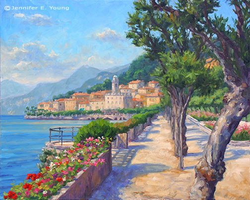
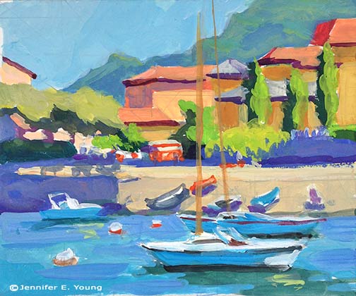
Colors of Varenna (study) Gouache on Cottonwood Arts Coldpress paper, 5x6"
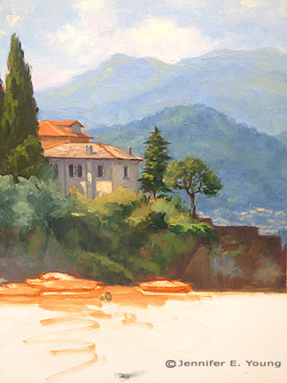
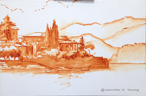
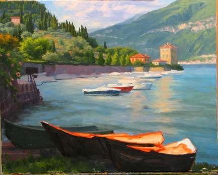
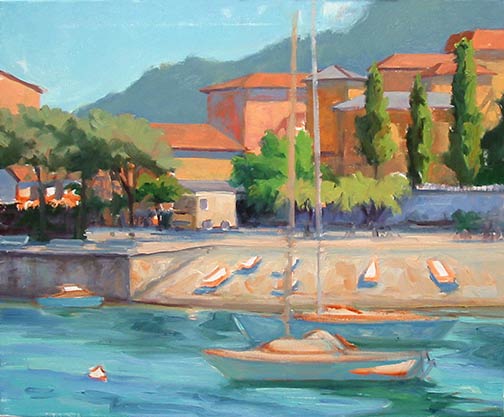
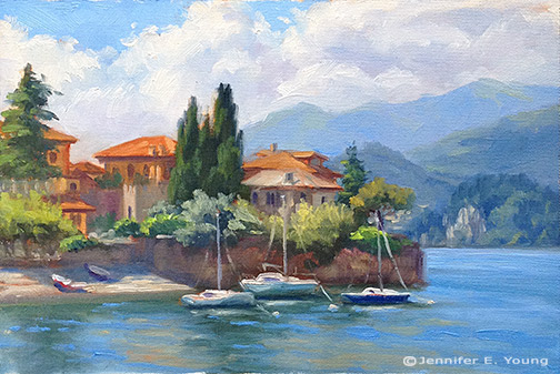
Here I'm just trying to get an idea about my lights and shadows and the basic shapes, so I've not much detail. For this composition I experimented with using a compositional grid that we studied during Kevin Macpherson's workshop (you can probably make out some of it in pencil beneath the gouache. I mentioned it briefly in my last post, but basically this is a method to achieve an informal subdivision of space, as discussed in Andrew Loomis' book called Creative Illustration:

loomisgoldensection

After I learned more about this "grid thing", I realized that I had often been using this kind of subdivision intuitively. But it is good to have a tool handy to be more deliberate about it when one wants to, or if you are dealing with a complicated subject and are trying to decide what to leave in, what to edit out, and how to arrange a painting for the most pleasing effects.

It's been a while since I have worked with gouache and had forgotten that the colors shift a bit when they dry. Nevertheless I had a good time and really look forward to working with them again.

Light and Edges; Varenna painting progress (W.I.P.)

Here is some progress to report on the Varenna painting  I've been working on.  In my last post I had pretty well laid out the background. But when I came back  to the easel again I decided that before jumping into the foreground I should add a little more contrast to the nearest mountains and soften up some edges to the distance overall.

Painting edges by Jennifer E. Young

That done, I address the walled village of Varenna next. I want to establish the village before the water, so that when I get to the water I will be able to properly address the reflections. First, I set about laying in the darkest passages.

Lake Como Italy painting in progress by Jennifer E Young

Next I start in on the buildings. The direction of the light is upper left. This was close to 11 a.m., so the sun is high but not directly overhead. Even so, I think with the movement of those clouds and the way the trees and shrubs are positioned, there are some interesting shadows being cast on the buildings. I hint at this in my study, but in the larger composition it took some time and concentration to get it to look right.

Varenna Italian landscape painting by Jennifer Young

Here's where I am this morning with the painting. I'll be working on this today and again Wednesday, so assuming nobody gets sick and we don't get more snow  I will have some more progress to report this week!

Italain landscape painting in progress by Jennifer Young

Varenna's dramatic skies (W.I.P. continued)

When I traveled to Bellagio and Varenna, one of the things that struck me about the landscape was the dramatic cloud formations that settled over these little lake towns. Possibly this is due to the altitude, or the difference in altitude between the lake and the surrounding mountains. OR, it could have just been my timing. In any event, while they were very beautiful and created spectacular displays, they also made  it pretty tricky to sketch/paint en plein air because the daggone light kept changing from minute to minute. In the studio, of course all of that is much easier to control, and I get to celebrate the beauty of the clouds without at the same time cursing the inconvenience of them ;-). After I sketch in my composition, my most common approach to landscape painting is to lay in the sky and the far distance. Since the sky contains my light source, the highlighted sides of the clouds will hold some of the lightest values in the painting. Probably the only other things that approach this high value is the light bouncing off of the white painted boats.

Landscape painting of Varenna Italy in progress by Jennifer E Young

I am not sure if it's evident in this photo, but I have used an array of colors(cad orange, cad red light, alizarin permanent, ultramarine and sevres blue) to tint the clouds. The blue sky is a combo of ultramarine, sevres blue, and white.

landscape painting clouds detail by Jennifer Young

Next distant mountains progressively deepen in value, but they are still very cool in temperature, so that they will sit back behind what's to come in the foreground. After evaluating my composition further, I decided to raise the distant horizon line, so as to push those cliffs back a bit more, in relation to the foreground town.

Lake Como landscape painting in progress by Jennifer E. Young

 After I get the painting a little further on, I may come back and tweak what I've done here. But for now  it's time to address  the water and the heart of the matter; the town of Varenna.


Varenna Shoreline W.I.P.

I feel a bit like Punxsutawney Phil, poking my head out into the public for a brief moment, only to run back into obscurity and wait out the rest of winter. It's not really fair to blame a pudgy little rodent for my absence and for all of the crazy snow days we've been dealt this winter. But given he's fictional and defenseless and  I've no one else to point a finger at, Phil it is. Nevertheless, I've started a new painting based on the small study I posted in my last entry. This is the tonal lay-in on a 24x36" canvas. Some of the lighter  areas got a little too "tonal" as I made adjustments to the drawing, (most notably the boats) but as I have my study and photos, I will make those corrections when I get into color.

Landscape painting Varenna Italy in progress by Jennifer Young

 There are only slight variations in design at this point-- just a minor reshaping of the distant hills to slow the speed of the downward slope. I also simplified and "skooched" back (sorry for the technical lingo) one building that sat directly behind the villa sitting closest to center to minimize the confusion of these overlapping forms and hopefully  create a more elegant design.

I 'm generally happy with the color plan I used in the study though, so at this point my plan is to follow its lead as I start my next steps of diving into color.

Studies

I'm baaaack. And I'm kicking off my return to blogging with a new Varenna study. I actually hesitate to call this a study, given the amount of time it took. I guess a month away from painting has left me feeling a litle rusty and slow! In any case, this painting will serve as a preliminary study for a larger piece.

Landscape painting of Lake Como Italy by Jennifer Young Varenna Study Oil on canvas, 6"x9" Contact me for more info.

We have had rounds of winter sickness followed by school closings due to snow, so with my foray back into painting being twarted quite a bit, I had the thought to develop a number of small scale studies of some larger painting ideas that  I've been wanting to tackle. I'll be painting some of these to scale up to my larger sizes. For example this 6x9" piece will scale up to 24x36".

I've painted various views of this harbor a few times now, which you can see herehere, and here. I guess you can tell I am enamored with this particular view of this  lovely Italian lake town! This composition emphasizes the strong horizontal of the walled town jutting out onto the lake, contrasted by the verticals of the buildings and tall cypresses.

While I almost always sketch out my composition on paper before I tackle a canvas, I usually leave the painted study for when I am out in the field painting from life. In fact, I have painted lots of studies and lots of larger scale studio pieces and quite a bit in between. Not all small paintings warrant a big statement, but I haven't been all that great about developing my viable studies into larger, more fleshed out studio concepts.  My schedule has been so sporadic for such a long time now, and with not much chance of an end in sight, I really feel like I need to have a more methodical  approach to my work habits. I am hoping that by tightening up my studio practices a bit, I might find more equilibrium when I do get a chance to enter the studio, and I will waste less time and feel less at a loss about what I am going to tackle next.

Well, nothing informs like experience, and since these small ones can presumably be completed in a fraction of the time, (ahem!) I thought it was worthwhile to have a go at a few of them, done, specifically with larger paintings in mind. I will also mine some of my other small works, in particular the plein air pieces I've done, as I think a number of them have potential for further development. I have worked from a number of them here and there, but I think there is more potential (especially in my James River series) and it could be something fun to do during these cold winter months when I'm not getting outside.

Pescallo cafe complete

We have had a bout of sickness at our house (first me, then my daughter) but I finally had a chance to get back to my Pescallo painting over the holiday weekend. Let's wrap this up! Picking up from my last installment, I am ready to paint in the flowers. Bougainvillea spills over the arbor with mixtures of alizarin crimson, permanent rose and a touch of cadmium red to warm things up. Normally I would block those colors in sooner but I was still trying to decide about the placement of that arbor structure and reds are such high staining colors that I didn't want to put them in until I had the composition pretty well established. Now I guess I am committed! ;)

Pescallo Italy landscape painting in progress by Jennifer E. Young

Geraniums in shades of red fill out the planters using the same colors as the bougainvillea (but in much different ratios).  I also flesh out the columns on the terrace and I am nearly done with the pier.

Now it's time to move down to finish the foreground water and reflections. There is a lot of movement in this water, and with much of this water in semi-shadow, reflections are subtle and broken by waves rather than the strong, mirror-like reflections seen in still water. For the darkest shades I mix Ultramarine and Gold Ochre, warmed or cooled by touches of Cadmium Orange or Sevres blue as the situation allows. Water highlights are deeper shades of the sky color.

Lake Como Italy paitning in progress by Jennifer E. Young

My finale is to include the rest of my vertical lines- the mast on the boat and the railing along the pier. These verticals act as a strong counter-balance to the horizontals of the mountains, boat and pier. I think the railing also serves to further push the background more firmly in the distance.

Lake Como landscape painting by Jennifer E. Young

"Alfresco in Pescallo" Oil on Linen, 24x30" Click here for more info!

This piece was a challenge to me, largely because of all of the interruptions I had, which caused the painting to set up quite a bit more in between sessions. I much prefer painting wet-into-wet, to avoid the extra work of opening the painting back up and scraping the dry paint down off of my palette. But sometimes it just can't be helped. In any event, I hope you like the final piece!

No babysitting this week, so there will be lots of trips to playgrounds and possibly the zoo, and I likely won't have much in the way of new work to post until after my daughter is back in preschool on the 9th.

Moving forward

Before I could really tackle the foreground on my Pescallo painting-in-progress, I needed to establish the background water. It shimmers with a pale sparkling light in the distance, the color becoming deeper and more varied in contrast as it moves in waves toward the viewer.

Lake Como painting in progress by Jennifer E. Young

Lest I got too caught up in the romance of Italy or the gentle waves of Lake Como, my husband brings me back to reality with a screeching halt and a critique of my painting. His opinion is to flip the direction of the boat so that it leads into the painting rather than out. I have to agree with him here, so being the always obedient wife (ha ha) I do as I'm told.

Next, I really need to address what is happening on the pier so that I can paint the reflections in the foreground water. I paint the tires that hang along the pier and serve as a rustic contrast to the elegant beauty of the backdrop. This epitomizes Pescallo to me; it is rustic but beautiful, quaint but elegant, sleepy but exciting, all at the same time. The tires are in higher contrast on the sunny side and in low contrast in the shadows.

Lake Como Italian landscape painting in progress by Jennifer E. Young

Black is not black and white is never white. By this I mean that I don't use a tube black to paint black-colored objects, or a straight out of the tube white for most white-colored objects. This would create very flat, dead color. Instead, I mix my "blacks" with my darkest translucent colors on my palette, ultramarine blue and alizarin crimson, and just the tiniest bit of cad. orange or yellow to neutralize some of that purple undertone.

Lake Como Italy painting in progress by Jennifer E.Young

Flowers and flowering vines grow out of every crack and cranny around these parts, and I paint those in delicately so as not to overpower. The showy flowers will be the geraniums and bougainvillea to come.

School is back in session, which means that our babysitter has become a lot less available now that she's returned to college classes. It also means I will have less time to paint over the next two weeks until my daughter returns to preschool. I didn't get the time to paint outside last week, but my goal is to finish this studio piece with one more session tomorrow, so that I can still fit in a plein air session by week's end. I'm close...wish me luck!

Pescallo cafe painting demo (cont'd)

Here's a little more progress on the Pescallo painting I started in my last post.  I'm trying to write this as a demo of sorts, which means that with my  time constraints it is taking longer for me to post than I'd like. But noting ventured nothing gained, and I'm now ready to talk about some color! My palette for this painting is as follows: titanium white cadmium yellow light cadmium orange cadmium red alizarin crimson ultramarine blue sevres blue (Rembrandt- it's like a cerulean but more intense) burnt sienna gold ochre

This is a bit more expanded than the single primary I have experimented with a lot in the past, but with limited time in the studio now, it is helpful to have a few more "convenience" colors in my arsenal. With the tonal drawing laid to canvas as my guide, I begin by blocking in my color, starting with the sky and mountains. I start with very general shapes at first and then work to refine them as I move along. For the sky I am using combinations of sevres and ultramarine and white, and for the clouds, touches of cadmium orange and red, plus white. The mountains are basically varying degrees of cadmium orange and ultramarine blue.

lake como Italy painting in progress by Jennifer Young

Since so much of the background peeks through what I will have going on in the fore, I decide to work out the background first, fleshing out the highlights of the mountains. The greens of the mountains are very grayed down- just the slightest amount of cad yellow light is used, in combination with the blues. I also add a little alizarin crimson to neutralize it further.

Italian landscape painting in progress by Jennifer Young

I decide to soften the sky a bit to make the background stay back and be less busy. Then I start to lay in a first pass at the water. I use a slightly darker variation of the blues from the sky for the distant water, using less white as I move forward. I also add in some cadmium orange to the blues as the water edges closer to the pier and foreground. This won't be the final word on the water, but I have gotten rid of that white canvas and have enough of the background tones to start laying in the foreground. Next I will begin work on establishing the shadows and highlights of the pier.

lake como Italy painting in progress by Jennifer Young

Quite a lot still to go, but things are starting to take shape. But as they say, the devil's in the details.

Pescallo Cafe (in progress)

Call us crazy, but we are seriously entertaining the idea of returning to Italy next year-- with a toddler along for the ride. I am not really certain where we will go or how this will work with me painting, us touring, and one of us being only 3 1/2, but the fact that we are seriously talking about it seems fairly miraculous in and of itself. Every time I go through my photos and sketches of past travels, I end up wanting to return to this region or that region, and I am no closer to settling on a destination than when we started talking about this trip last winter. And then there are the places we haven't even gotten to yet. Each part of Italy seems to have its own alluring qualities, unique to themselves but quintessentially Italian.

Lake Como remains near the top of my list (so far) in terms of sheer beauty and aesthetic pleasure. It's not heavily endowed with art history or artifacts, (compared to, say, Rome, Florence, or Venice) but what it lacks in museums it makes up for in natural beauty and storybook enchantment.

This is a quick sketch of a composition I have been playing around with for a little while. It is of a little cafe set upon a pier in Pescallo. Not a great photo, but hopefully you get the general idea.

This was drawn to scale on my sketchpad so that when I "scale up" that there will not be a great distortion when I put it to canvas. There will still be some adjustments along the way, but by remaining in the same format, there shouldn't be any major surprises.

Here is the line composition drawn out in oil (burnt sienna) on canvas. I do some toning here to work out a value pattern, but it's not a 100% tonal drawing-- just enough to cement my concept in my mind and get me excited about the piece.

tonal sketch Lake Como cafe by Jennifer E. Young

Stay tuned for more to come soon as the painting progresses.

Revisions, revisions...and finally the final!

Well is this the slowest moving demo ever, or what?  Sorry about that, and thanks for sticking with me! I  have  enjoyed this painting, but  I struggled with the foreground boats I had planned to include.  I took them out and put them back in several times. I felt like I wanted something there to lead the eye into the picture, but the boats as I had them seemed to block my entrance  rather than aid it. So I finally settled on a single rowboat to lead the eye in while still allowing some breathing room. Lake Como landscape painting in progress by Jennifer Young

After that was all hashed out (whew! ) I set about laying in the background boats against the retaining wall, half of which are in shadow, and half in light.

Lake Como Italy landscape painting by Jennifer Young

Next came the masts, sails, and water. The reflections in this scene were very soft and shimmery. Light reflections tend to cast a wee bit darker than what is being reflected, and dark ones are a tad lighter. I tried to keep the whites on the warm side, as they take on a lovely golden glow as they glimmer in the low angle of the sun.

Landscape painting of Lake Como Italy by Jennifer Young

"Pescallo Glow" Oil on Linen, 24x30"

So, did I keep with my grayscale plan I mapped out at the beginning of this demo?  You tell me:

grayscale Pescallo landscape painting by Jennifer Young

grayscale sketch by Jennifer Young

I must say that I liked having the grayscale notan and I actually did reference it often during the entire process of my painting. While I think it is a valuable tool, I think I would still have benefitted from doing a compositional line drawing in addition, especially with such a complicated scene. I probably reference the notan sketch more throughout the painting, but a strong compositional line plan may very well have eliminated the foreground boat dilemma I struggled with midway through the painting.  Live and learn!

Moving forward (Lake Como W.I.P., continued)

At this point in the process I feel that I have sufficiently addressed the nearest hillside to the point that I can now move forward and focus on the middle distance boats and water.

lake como painting in progress by Jennifer Young

I also realise that there is still a lot of white canvas around this painting and I really want to at least block the rest of it in so that I can better gauge my color and value relationships. Ideally I probably should have done this earlier, but as you might have noticed I have been short on easel time in the last week, and I want to address the water in as close to an alla prima fashion as I can, because otherwise I end up having to scrape off a lot of dried paint from my palette and remix everything to try and get back to where I had previously left off.

Pescallo painting Italian landscape

Ah, that's better!  I've painted in the little stone wall/pier to the left, and have at least suggested that there is a lake here somewhere! The paint layer on the water is still a very thin block-in here, but at least I have some color down and have indicated approximately where the boats are going and where the water highlights will be. This last picture shows where I had to leave off this morning. No matter how early I try to get out to the studio, I seem to always feel that I have one hour too little. But that's the way it goes, right now. Depending on how much painting time I will get this weekend, I hope to finish this piece up in another session or two.

painting-in-progress of Pescallo Italy