In my last two posts, I took you through the proposal process of one of my recent commissions. If you wish to read this series from the beginning, start with Part I, followed by Part II.
Today I'd like to share with you how the commissioned paintings turned out. I also have a few thoughts on commissions in general; both what to expect if you are a collector, and how to consider going about them, if you are an artist.
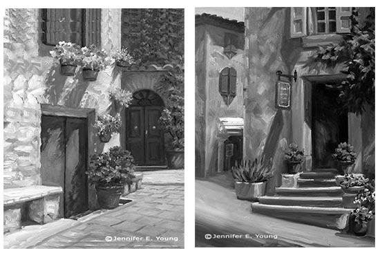
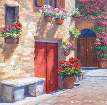
After having submitted my proposals for both of the paintings, I have now received the go-ahead to proceed. Here are the two completed paintings:
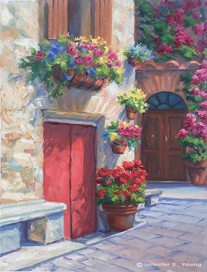
"The Potted Garden II", Oil on linen, 16x12"
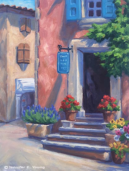 "The Corner Shop, Roussillon", Oil on Linen, 16x12"
I'm very glad to say that the client expressed great satisfaction with the two paintings and they are now framed and in their new home.
Commissions are great experiences for artists because they push us to think about our art from a new perspective. Yes, as artists we all want our work to stand on its own. At the same time, nothing exists in a vacuum, and I am ok (and in fact, really flattered) with the knowledge that my paintings will coexist with other art in a collection, as well as other family heirlooms that will be important and valued by a family, possibly for generations. So it's a great honor to even be asked about commission work and I am always happy to discuss that possibility and to converse in-depth about not only the art but the environment where the art is intended to be placed. With this in mind, here are a few things to note that make commissioned work a special animal, worthy (apparently) of three blog posts!
1) The Conversation
The conversation ( usually more than one) is probably the single most important element of any commission. This is the artist's opportunity to gather all of the relevant information about size, environment, and (very important) color preferences. Color, in fact, is the one topic that comes up rather emphatically in nearly every conversation I have with prospective commission clients. It's understandable, as color elicits so many varying emotions.
Ideally these conversations would be done face-to-face, but that is usually either not possible or practical. Most of my commissions have actually been negotiated, in fact, via email and phone. In these cases, Photoshop is definitely my friend!
2) The Proposal:
This is where I do my best to incorporate the ideas and desires of the client into a work of art. Sometimes, as in the examples I've provided in these last couple of posts, I have studies or compositions already worked out. In these cases, I just use my old buddy Photoshop. More often, though, I am creating something from scratch. In these cases I will submit a sketch with color notes, as well as a few of my photo references that I will use to incorporate some elements into the composition. The more visual examples given at this stage, the better.
3) The Approval:
The next step is to await the feedback of the client, or, if things go really smoothly, await the client's approval to proceed.
3) The Deposit:
This topic is often one that people don't like to talk about, but it's an essential part of many artists' working methods, so I am going to throw this horse right on out there on the middle of the dining room table. As artists, we need to decide for ourselves our best practices so that we feel good about the work we are doing.
Earlier in my career, I did not ask for a deposit for most of my commissions. As long as I felt like I was able to sell the work in a gallery if needed and that it didn't stray too far from the rest of my body of work, I felt okay about working on speculation. Times change though and though the vast majority of my experiences were excellent, an odd one or two "hiccups", as well as certain life experiences (like having a child) helped to shape my perspective on the boundaries I should set for myself and my work.
Nowadays, with few exceptions I require a deposit to proceed. This would occur once my proposal has been approved by the client. The amount is either 1/2 down, or, if it is a very large and involved commission, 1/3 down, 1/3 at approval half-way, and 1/3 prior to delivery. Most collectors are okay with this arrangement and understand the whole working -for-compensation thing. I also think they appreciate that that it is to everyone's advantage that there is a commitment made to secure the agreement.
A deposit doesn't just cover an artist's materials, by the way. It also covers her time. Keep in mind that a proposal already commands a good deal of time and effort to prepare. Time is the most precious commodity I have. It is up to each individual to determine how they wish to work and what they want to spend their time working on.
4) Art Direction
Some artists are more ok with art direction than others. Having had a taste of the heavy-handed variety, I can most definitely state that I am not in favor. ;-) This is not to say that I am adverse to hearing client's preferences and feedback! This is the whole point of "The Conversation", and I do welcome it if a minor adjustment is desired. However, I can't start over with a new concept, (which would mean a new painting) make profuse alterations, or do anything that I feel would greatly compromise the integrity of the painting.
Most clients understand, and I do my best to clarify in advance, that any painting I make is going to be unique, not a copy--either of my own work or anyone else's . Beyond preference in color and subject, a collector commissions an artist because the artist has his or her own voice, and it's up to the artist, ultimately, to determine the best expression of their idea. In other words....Nobody puts Baby in a corner!
All joking aside, most people are really very happy to let the artist do her thing. In fact, "that thing she does" is the whole reason the client was attracted to her work to begin with. Nevertheless, it's good policy, and indeed it's the artist's responsibility to clarify all of that with the client so that expectations are managed. Of course, every commission is unique and there are definitely nuances that can vary my approach to a certain degree. The key is to keep communication lines open and to be open to honest feedback.
This just about wraps up my commission process, or at least the highlights. If there is anything I have missed, or if you have any questions, please feel free to leave your thoughts in the comments. If you are an artist, feel free to share how you handle your own commissions. I would most especially welcome the thoughts of collectors (or potential collectors) also. Have you ever commissioned an artist? What was your experience? Let me hear from you!


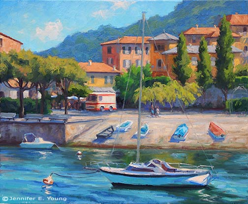
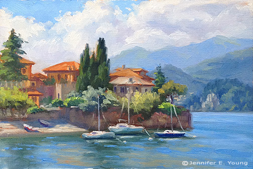
 Colors of Varenna (study)
Gouache on Cottonwood Arts Coldpress paper, 5x6"
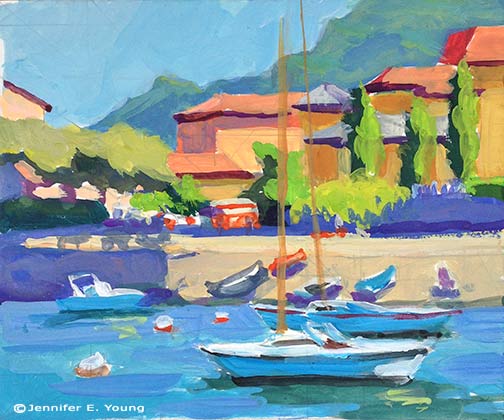
Colors of Varenna (study)
Gouache on Cottonwood Arts Coldpress paper, 5x6"
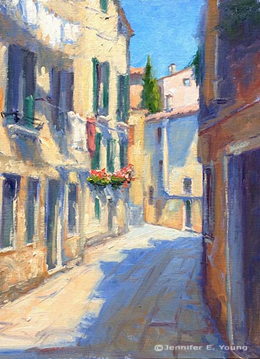 "Morning Wash", Venice
Oil on Linen, 16x12"
"Morning Wash", Venice
Oil on Linen, 16x12"


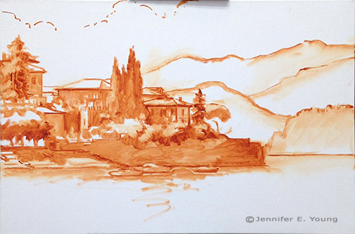
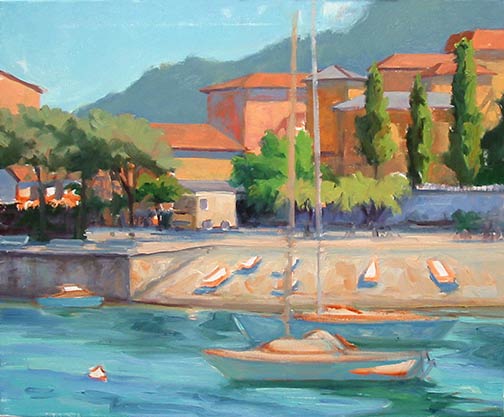
 Varenna Study
Oil on canvas, 6"x9"
Varenna Study
Oil on canvas, 6"x9"


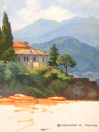
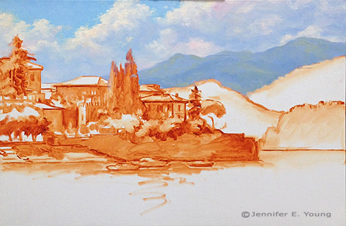
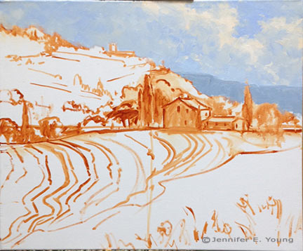 Next come the hill town and terraced hillside of the background. At this point I am still establishing the compositional elements so there is not much color or value variation. I will go back into these areas again, but I really want to develop the entire canvas to the same level before it sets up too much, as I'm not sure when my next painting session will be.
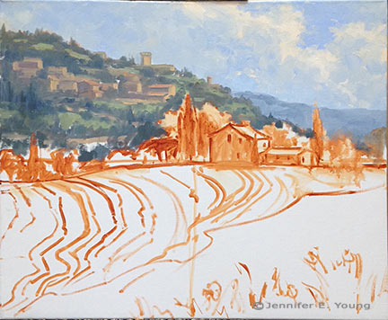 Now for the middle distance, where my area of interest (the house) resides. I decided to lower the cypress to the right of the house, as I felt there needed to be some height/shape variation in the trees flanking the house. I'll have to go back into that sky area again where I made this change to clean it up a little more. Good thing I still have plenty of that sky color on my palette! Again, I don't have much in the way of highlights yet...just a few value shifts to give certain objects a little form.
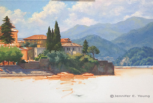
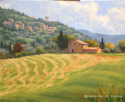
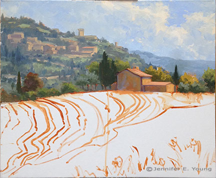 Now I'm ready to start laying in the foreground hill and those groovy hay tracks.
 That was fun! Now I have the whole canvas covered more or less to the same level of finish. There's a good deal more to do, but this feels like a pretty good start for around 4 hours of work.


