Revisions, revisions...and finally the final!
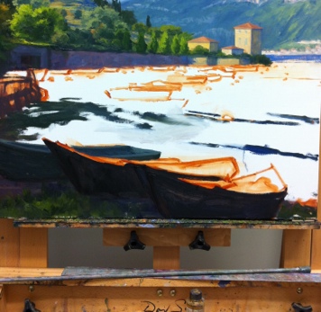
Well is this the slowest moving demo ever, or what?  Sorry about that, and thanks for sticking with me! I  have  enjoyed this painting, but  I struggled with the foreground boats I had planned to include.  I took them out and put them back in several times. I felt like I wanted something there to lead the eye into the picture, but the boats as I had them seemed to block my entrance  rather than aid it. So I finally settled on a single rowboat to lead the eye in while still allowing some breathing room. Lake Como landscape painting in progress by Jennifer Young

After that was all hashed out (whew! ) I set about laying in the background boats against the retaining wall, half of which are in shadow, and half in light.

Lake Como Italy landscape painting by Jennifer Young

Next came the masts, sails, and water. The reflections in this scene were very soft and shimmery. Light reflections tend to cast a wee bit darker than what is being reflected, and dark ones are a tad lighter. I tried to keep the whites on the warm side, as they take on a lovely golden glow as they glimmer in the low angle of the sun.

Landscape painting of Lake Como Italy by Jennifer Young

"Pescallo Glow" Oil on Linen, 24x30"

So, did I keep with my grayscale plan I mapped out at the beginning of this demo?  You tell me:

grayscale Pescallo landscape painting by Jennifer Young

grayscale sketch by Jennifer Young

I must say that I liked having the grayscale notan and I actually did reference it often during the entire process of my painting. While I think it is a valuable tool, I think I would still have benefitted from doing a compositional line drawing in addition, especially with such a complicated scene. I probably reference the notan sketch more throughout the painting, but a strong compositional line plan may very well have eliminated the foreground boat dilemma I struggled with midway through the painting.  Live and learn!

Lake Como W.I.P./Demo (continued)

Well I promised color in my last post, so let's get started! I don't know if I mentioned it lately, but I have been experimenting with expanded palettes for my latest paintings, and that exploration continues with this one. Regular readers may remember that I have for a long while used a limited palette of red, yellow, and blue, plus white (like this one). For this painting, my palette is (as I lay it out from left to right) Titanium White, Cadmium Yellow Light, Golden Ochre (Rembrandt), Cadmium Orange, Cadmium Red, Alizarin Permanent (Gamblin), Cobalt Blue, and Ultramarine Blue. (I've specified brands where color names are specific to a particular brand.)   I haven't used any pre-mixed greens, as you can really mix a zillion different greens with this palette. I have used most of these colors off and on, with the exception of Cobalt Blue. To be honest, I was really hoping that I wouldn't like it, because it is a terribly expensive tube of paint. Of course, I love it!  It is a cooler blue than Ultramarine, which has more red in it. I still love Ultramarine, but Cobalt has some really wonderful possibilites. Any way, back to the painting...I start by painting in the sky, which contains the light source and is also the farthest in distance. The sky is Cobalt blue plus white, with cad yellow lt. added as it nears the horizon. For the clouds I've mixed a combination of blues and cads red and orange + white for the shadows, and Cad orange and red + white for the highlights.

20120921-150523.jpg

Working from back to front, I next paint in the distant cliffs, which have a beautiful shadow casting down over them from low-lying clouds. The photo is a bit dark here (apologies) but I will try to get some more accurate photos in subsequent blog posts so you can get a better idea of the colors.

The distant mountains complete, I block in the buildings that jut out into the harbor, as they will serve as my area of interest in the painting, and everything will kind of flow to lead the eye towards them. I also decide to lay down my pattern of darks, to restate the plan I made in my notan sketch. Again, this photo just blackens everything out, but I had to make a choice between using my time blogging or photo editing, and at this point, I've chosen blogging.

20120921-150612.jpg

Next, I work on the terraced hillside in the middle distance. What a joy it is to paint...all of those shadows and varied greens! A nice round bristle brush is great for painting in those cypress trees, which have always struck me as distinctive punctuation marks in the Italian landscape. .

20120921-150639.jpg

 A mahl stick (shown in the next photo  on my easel below the painting) is a handy tool to have to steady the hand without smudging the painting, when painting details like architecture and tall skinny cypress trees.

20120921-150656.jpg

I have yet to paint in the highlights on the cypresses, but once I've done that I will be ready to move on to the middle distant water and boats, and finally the boats in the foreground. All that will be left after that point will be fine tuning  wherever's needed.

Lake Como W.I.P. & Demo

I mentioned in my last post that I had a new painting in the works, and I thought I'd attempt a little demo with this one. I say "attempt" because my laptop finally gave up the ghost, and these days I tend to do a lot of my writing via my mobile. Not only am I "all thumbs" (literally) but I have to sneak it in before my phone gets snatched away by the chubby little hands of my daughter who wants to "see pictures" whenever she sees it emerge from my pocket. This will be a painting of the beautiful fishing village of Pescallo. Pescallo is a tiny, sleepy  little place that sits just down the slope from Bellagio (also very beautiful). In fact, I could see Pescallo from the balcony of my Bellagio hotel, and the drama of the light as it poured over the mountains and harbor beckoned me to take a stroll down there many mornings before we started the day's touring.

I begin by sketching out a compositional plan that is also a value plan for the painting. I do this using light, middle, and dark value gray oil paints in my sketchbook. I often do a similar thing with Tombo pens (the grayscale ones), but mostly when I am painting outdoors as a way to quickly hone in and get a handle on my composition (in an environment that is bombarded with stimuli). But it is a good practice with studio work too. The oils are mentioned in Kevin Macpherson's book, "Landscape Painting Inside and Out," and I have long wanted to buy these paints so I could give it a try. They are Portland Gray Light, Medium, and Deep, by Gamblin. Hey, if it's good enough for "KMac", (as my husband calls him) it's good enough for me!

notan sketch

The point of this is to see if your painting has a strong underlying structure with a unifying value plan without getting bogged down in details. This is really supposed to be more of a notan sketch at this stage, which is a very simplified thing and addresses more of the armature of the painting rather than the pinpoint accuracy of objects and shapes. It's been a while since I've done this kind of study, and I realized at some point that I had not allowed much for the fourth value I was working with, which was the white of the paper. Oops! So I had to amend my sketch a little and add in some white for the lightest areas.

Still, I feel that my plan is solid and I'm ready to move forward by sketching out a line drawing on my 24x30" canvas.

oil sketch lake como painting by Jennifer Young

For this I am using burnt sienna (Winsor Newton), thinned with Gamsol mineral spirits. I don't much use this earth color in the rest of my painting stages, and while I could mix up  a good earth for such a job using my standard red, yellow, and blue, it is more of a convenience for me to use a premixed paint at this preliminary stage. I also like it because it lends a nice warm undertone to the canvas as I go along, and it doesn't bleed into my other colors (especially the light ones like the sky) when I move beyond the sketching stage.

Now that I have a plan, I am ready to start painting with color! I'll get into that in the next post .