Resurrection of a W.I.P

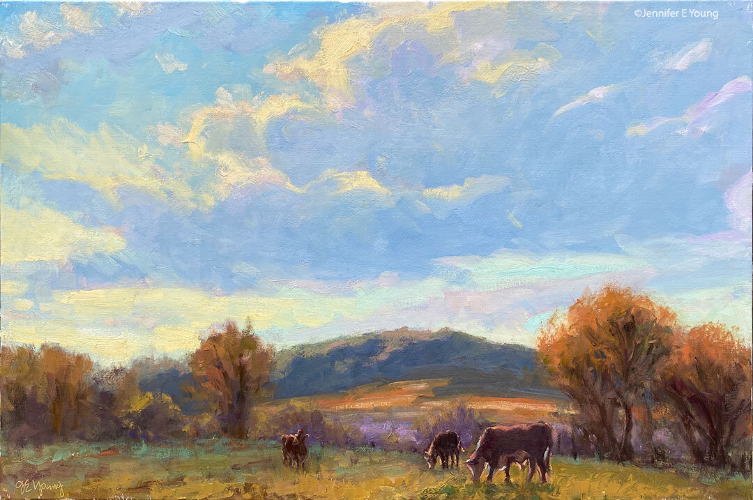
I've been doing a little Spring cleaning lately and came across a few unfinished canvases tucked away. Why I never finished them, I don't know (I look back at my former self a little jealously now when I think of all of the time I had to paint!) But at least a couple of these lost souls seem worth the attempt. Except for some paint and a little more time, what have I got to lose? I decided to work on this painting of the Tuscan hillside first, since the whole canvas  was pretty far along and just needed to be fleshed out a little more.

 oil painting tuscany work in progress

Looking back through my blog archives, I actually posted this as a W.I.P. back in October of '09 (!) According to this post, I was suffering from shoulder tendonitis at the time. I guess between that and whatever else I had going on at the time, this canvas fell out of sight, and subsequently out of mind...until now.

When I first worked on this painting, I used an alkyd medium to speed the drying. So I've started in again by using some of the medium to "oil out" the areas that I want to work on. I've altered the composition slightly by elongating the shadows (it's a dusk scene) and also by simplifying the road in the foreground. It seemed to be moving too fast around the bend and leading me right out of the canvas, so I altered that area slightly by extending the shrubs to slow this movement down. I'm also toning down the yellow in the hillside because the foreground shrubs are meant to be yellow broom, and I want a different color behind them to contrast. As a result,  I'm laying in a lot more of that terra cotta earth so prevalent in this region. We will see how this goes...  A lot more work needs to be done to the hillside, the olive trees, and their shadows, and I may need to add some of the greens back. But for the moment I'm liking the predominately warm tones. I'm working more on this painting this afternoon, so  if all goes well, I hope to post a conclusion by  Friday.

Painting on a colored ground

Every so often I'll get a question about my painting process that I think might be an interesting topic to share here on my blog. Recently an artist friend asked me about the red ground I prepped my canvases with at one time (I think he must have seen the "Springtime Glory" demo from my site). I'm sure I've addressed toning a canvas a few times here on the blog, but since I've been asked about painting on a red canvas a number of times, I thought it would be a good idea to address this question specifically. Here is his question, followed by my response: Question: Are you still using red underpainting most of the time? Is that landscape specific or do you switch up for sky/water? 

My response: As for the red ground, I never use it any more. I really only used it for landscapes. It was fun because the underpainting gave vibratory effect due to it being a complement to the greens.  But it was too much of a distraction for sky and water, and ultimately I personally found it so for all of my landscapes, especially as I moved a little closer to realism.  Plus I got too lazy to tone my canvases that color as I'd have to let it dry first. Otherwise the red would lift and get mixed into my painting too much. Now in the studio I either just paint on a white canvas, or tone it with just a quick wash of transparent red  oxide (a.k.a PR101- the color I used in the tonal underpainting here).  That still adds a warm tone but is muted enough that it doesn't distract. It also isn't as high staining so I can apply a wash and then start painting immediately after.

*This artist is a studio painter, but I'll add here for the benefit of my blog readers that if I'm painting outdoors, I pretty much always use a mid-toned canvas of either gray, or a wash of trans red oxide or raw sienna, as sun on the white canvas creates too much  bounce and glare.

Coastal Sunset Painting- WIP

While the last work in progress I posted still seems to be...er...in progress I offer you this new WIP that seems to be moving along a little more easily. I have decided to return to the nontoxic (or less toxic, any way) painting process that I was doing while I was pregnant.  Essentially this process was to paint without solvents and instead to thin the paint and clean my brushes with walnut oil.

sunset oil painting work in progress

What was formerly a struggle to me using this method now seems to be working to my advantage. Working with the walnut oil keeps my paintings wetter longer. This is a good thing for me now, as I am only able to get dedicated painting time for about 3 half-days a week. So I can now return to my painting in a more malleable state without having to feel like I need to rework everything in order to open it back up again (which is what kept happening with the Venice WIP). 

sunset oil painting work in progress

I also decided to try working with M. Graham paints again, which I had tried (unsuccessfully) to use en plein air some time ago. Initially I found them rather more fluid than I was accustomed to, particualrly for juicy plein air work that I need to have set up rather quickly. It was also a hot summer day when I last tried to use them, and what I ended up with at that time was a mushy, gooey mess. But, again, what seemed like a liability is now working to my advantage, and I am really enjoying these paints now, for the precise reason that they are more fluid and very buttery.

For this painting I am using a single primary palette of red yellow and blue plus white. For my red I've chosen Quinacridone Rose; my yellow is Indian Yellow, and the blue is my old friend Ultramarine. I am, of course, also using white, which is my favorite white and what I have on hand, made by Classic Artist Oils. It is buttery, but has a little more body to it and blends nicely with the more fluid colors. This is a really good palette, I am finding, for sunset paintings, as the colors are both rich and transparent and lend themselves to that luminous quality I'm after. And since at sunset everything seems to take on the color of the sky, using a limited palette creates a nice unity in the painting.

sunset oil painting work in progress

These pictures show the progression of my 24x30 inch canvas so far. If all goes well, I should be able to finish this piece today for a posting of the final product later in the week. That is, if I can get myself off of this computer!

Bellagio from above; more oil painting w/out solvents

Following up from my prior WIP, here is the final painting. This is a view of Bellagio from a hike we took up to Villa Serbelloni. The villa is now maintained by the Rockefeller Foundation, who uses it as a retreat for  the Bellagio Study and Conference Center for artists and writers (wouldn't that be nice?) For this reason, we couldn't go inside the villa when we visited, but we could tour the grounds, which offers gorgeous views over Bellagio.

Oil painting of Bellagio, Italy

"Bellagio From Above" Oil on Linen, 20x16"

SOLD!

Both this piece and my previous Lake Como painting, were done without the use of solvents or any other medium other than small amounts of walnut oil to clean brushes and thin paint when necessary. But even when used judiciously, the walnut oil served to slow drying considerably. At present this is not a huge problem, as I am spending most of my time painting/renovating/preparing home and life for the new baby! But it does change the nature of things and the overall result became more impressionistic due both to the behavior of the paint, and probably also the gaps in my working sessions.

I know that an oil painting requires a certain length of time for all of the layers to fully dry (sometimes as much as 6 months or a year.) But normally the top layers will dry to the touch in about a week's time.  Not so with the walnut oil method, which seems to require at least an additional week to my usual handling time.

Maybe it's just that my painting habits are not particularly suited for this method, or maybe I just need to get used to new ways of doing things. Overall, except at the very beginning stage, I don't paint in thin layers. In fact, while I don't lay it on with a palette knife, I do paint passages that are relatively thick and juicy. But oddly, I experience the most difficulty in the lay-in, (early stage) which I am used to having set up rather quickly.

First of all, in order to follow the "fat over lean" rule, I have been trying not to make the paint too "fat", too soon. So I keep the walnut oil I use in my initial lay-in stage very spare. The result is that instead of a thinly painted initial sketch and color block-in, I find myself with trying to move paint around that has a definite drag and is less fluid. The lay-in becomes more often a "rub-in" with a rag or a "scrub-in" with an old brush, and the edits and corrections are very hard to lift off the canvas.

On the other hand, if I use more walnut oil at this stage, the paint can get too smeary and unmanageable for successive layers, not to mention less stable (with any medium you use, you should only use no more than 20% total volume when mixed directly into the paint, and I usually err on the side of caution and use rather less than that.)

One solution may be to use a runnier paint in the lay-in stage. M. Graham walnut oil paints are such a paint. I do have a few tubes on hand, as I've tried them in the past. As much as I wanted to like them, I normally prefer more body to my paints. But they might just work for my purposes now--but still probably just in the initial stage only. (Incidentally, it's perfectly okay to mix walnut oil with linseed oil based paint, so even if you want to paint solvent-free, you do not need to buy their paints exclusively.)

Aside from walnut oil to thin,  there are other oils to try. Linseed oil is commonly used by artists, both in mixtures of ground paint and in various mediums. And while both linseed and walnut oils are considered to be "drying oils", linseed tends to be the faster-drying of the two.  However, I seem to read a lot about how linseed oil tends to yellow over time. Maybe this is an exaggerated worry, but a quick look at experiments like this one swayed me to first try the walnut oil over linseed.

So, to sum up from this layperson's perspective, some of the pros of using walnut oil to thin/clean are:

  • Non-yellowing
  • Non-toxic/ solvent-free painting (though other oils can also serve to achieve the same thing.)
  • Odorless
  • Does not evaporate like solvents, so it seems fairly long-lasting
  • Conditions brushes nicely

Cons:

  • Walnut oil is expensive! (If you are only using oil to clean your brushes, you could probably get by with a less expensive oil.)
  • Slows drying considerably (this could actually be a "pro", depending on your painting technique.)
  • Compared to solvent, it requires using more brushes and/or more wiping of brushes between colors in order to keep the color clean.
  • Walnut oil is expensive!

A WIP and oil painting without solvents

After a couple of wipers, I finally have at least a work-in-progress to post. I've continued with the Bellagio theme, this time with an ariel view. I guess I'd call this a color block-in:

bellagio painting work in progress

Why the wipers? Well, I've been oil painting without solvents, and it's taking some practice to get the hang of things. Now as a fairly long-time an oil painter, I'm quite used to being around solvents. I do try to be conscientious of the risks and precautions, so I minimize odor (through ventilation and the use of a high quality OMS) and contact (wearing nitrile gloves) when handling my paints. But otherwise I admit I haven't thought too much about what potential hazards might be involved.

I guess I've been fortunate, in that I haven't experienced some of the allergies that other artists have suffered. But allergies or not, now that I am in the midst of  pregnancy, taking the utmost care in the studio has taken on a new significance. So I decided to do a little investigating....

* Warning, this post is rather long...it's the first in a series of postings about what I've learned on alternatives to my usual oil painting method, presented in my usual rather rambling way. It's certainly not the definitive source on the topic, but may hopefully provide some insight or a jumping off point for other painters who may be wondering about some of this stuff.

Pigments

When considering alternatives to my usual method of painting, I first took a look at the  pigments I was using, simply because they are essentially the same substance found in oils, watercolors, acrylics, casein, etc.  Pigments are the ground powder, either natural or synthetic, that comprises the "colored part" of the paint.

From what I can gather, due to the risk of inhalation, pigments seem to be most hazardous when in their ground, dry form. Some folks using manufactured paints from the tube are rather indifferent in their attitude about pigments in paints, saying, "Well, as long as you don't snort or eat your paints you'll be fine."  Nevertheless, some pigments do contain toxins and heavy metals, which could potentially be ingested or absorbed through the skin on surface contact. So for this reason it's always a good idea to wear gloves when handling them, and avoid eating, smoking, etc., around them, at least not without thoroughly scrubbing with soap before hand.

I put the question of hazards in manufactured artist oils to the maker of the oil paints I use most frequently- Winsor Newton. The technician, Amy Faris, was extremely helpful and very quickly responsive to my queries. Here's an excerpt of some of what she wrote about pigments:

"Depending on the color, our oil paints contain either linseed oil or safflower oil, with the possible addition of a drier, again depending on the color.  Other than than, I am unable to give you any specific recipes regarding the oils, because that information falls under the category of proprietary, and they won't even share it with me." (*Jen's note: this last sentence is one I heard over and over from the manufacturers of artist's materials that I queried directly.)"

"What I can tell you is that all of our products are tested and labeled for health and safety by an independent toxicologist at the Art and Creative Materials Institute (ACMI).  An AP label - or a non-toxic label signifies that the toxicologist has not found anything in the product that can cause you harm, as long as you are using the product in the manner for which it was created - in other words, you are not eating it, applying it to your friend's body, etc.  A CL warning label signifies that the toxicologist has found something in the product that can potentially cause harm.  This CL label is usually followed by a statement on how to use the product safely."

"All health labeling can be found right on the back of every tube of paint we manufacture and on every container of medium, solvent etc.  If you would like more information on the toxicologist or on health and safety in general, please visit the ACMI website at:  http://www.acminet.org/"

"In terms of pigments:  some mineral or metallic based pigments can be hazardous to your health if they build up in your system over time. Lead, cadmium,cobalt  and chromium are some problematic pigments that spring to mind. Generally, the biggest hazard comes in to play if you are working with these pigments in their dry, powder form and are breathing the pigment dust into your lungs.  In terms of the pigment while it is contained in a vehicle (contained in the paint form we are all used to working with) as long as you are not spraying the paint (cadmiums breathed into the lungs prove to be cancer-causing), or ingesting it in large quantities over time ( I sometimes joke about eating it, but if you point your brush in your mouth or eat or drink in the studio with paint covered hands you run the risk of ingesting the paint)  you should be okay.  Paint that contains lead (usually whites such as flake or cremnitz white)  needs to be handled with great care - the lead can be carried through your skin layer if the paint has been diluted with a thinner - you never want to clean your brushes by rubbing them in the palm of your hand - doing so can drive pigments directly into your skin.  Cobalt can be a skin irritant to some people."

...And the vehicles?

So basically, since I don't grind my own paints, I can take care in handling and just make note of the labels (and manufacturers that use such labeling) to make my choice of paint. But what about the vehicles used to suspend the pigment in the paints and give them their characteristics? In many cases it is nothing more than a seed or nut oil (linseed oil, walnut, poppy, etc.) But in other cases, there are other additives, and they seem to be both more mysterious and potentially more hazardous to me (and my unborn baby) since they can be inhaled as they float about in the air. Paint manufacturers are, as I said, pretty hush-hush about the specific additives used in their formulas.  As artists, even with the labeling, it's often difficult to impossible to derive specific information on which elements beyond the pigments in the paint are potentially toxic. But through a very cursory look around the web, I learned that  some of the potential additives to common artist paints (oils, acrylics, etc.) could be various solvents and resins that are volatile organic compounds (toxic inhalants), formaldehyde, preservatives, and mercury. Yikes!

And contrary to popular belief, in terms of tubes of paint, it doesn't seem to me that oil paints are necessarily any more toxic than say, acrylics. In fact, while acrylics clean up with water, many acrylics use vehicles that contain ammonia and formaldehyde that off-gas as they dry.

So, being at best a dabbler in watercolors, not having enjoyed my past experience with water soluble oils, and seeing no compelling reason to jump over to acrylics, it looked like oil painting without solvents was still worth pursuing for me. It would require some changes in my work habits, but if I could use precautions and avoid both the use of solvents to clean my brushes, as well as solvents, driers, and other potentially noxious fumes that come from various painting mediums , it could be done.

And that has been my aim. The W.I.P. pictured above, as well as and the one from my prior post were both done without the use of solvents. I'm using my usual paint brands--just using walnut oil instead of OMS to clean my brushes and a very tiny bit to thin my paint if needed. But it's slow going. This old dog is still having some trouble with her new tricks, and it's taking some getting used to. I'll write more about those challenges in a future post.

Post- Paint Annapolis

Sorry to say, my blog has suffered a bit from benign neglect since I left for my travels a few weeks ago. Rain and 30 mile/hr wind consumed most of our beach vacation, so while it was still beautiful, there was no chance of painting boats or coastal motifs before the Paint Annapolis competition that followed just a week later. Paint Annapolis itself was fun and enlightening, but since I am still dealing with shoulder tendinitis and pain, it was physically stressful and pretty exhausting. For the first two days, it seemed that I had brought the crappy weather I'd had at the beach right along with me up to the Annapolis event. The weather did turn beautiful during the last portion, but I think I kind of "blew myself out" trying to get something interesting down early on while the weather was gray and the light exceedingly flat.

The previous paragraph makes it sound like I didn't enjoy myself at all, but that was not the case! In fact, while I didn't come home with any prizes, I still received a lot of reward. My early struggles notwithstanding, the city of Annapolis is charming. I had a lovely host for the event, and everyone I encountered in the event organization, and even in the town at large, was warm and friendly. AND I'm delighted to say that I sold a study right from the easel!  :-)  I also found myself among some incredibly talented painters and it was truly inspiring to see so much fine work being produced by my contemporaries. Almost all of the artists were friendly, uplifting, and inclusive, making the atmosphere feel more like a (highly motivated) community than a competition.  So much so, in fact, that by the time it was all over with, in spite of my exhaustion, I was actually sad to see it end.

plein air oil painting of Annapolis, MD, by Jennifer Young

"A Banner Day", Oil on linen, 12x12"

As a painter, I also I learned a lot. I learned that if it isn't happening, don't force it. I learned that if the light is truly uninteresting, you're better off sleeping in a day or two and staying up at night to paint nocturnes!  I learned that in the overwhelm of an unfamiliar environment, I'd be much better off painting simple studies successfully than failing at capturing a very complicated scene. I learned that even in the anxiety of knowing you only have 3 days to paint,  you really do have to pace yourself, take care of yourself, be kind to yourself, and give your mind and body enough time to rest and relax. And I learned that all of the things I thought I knew can so easily fall by the wayside in this thing called "competition".

As is usually the case with me, I learned much of this more through error than through trial. In a way, the lessons I learned at the competition are only larger-than-life versions of the lessons I learn all the time through the act of plein air painting. These paintings can be like mini thrills-of-victory or agonies-of-defeat, though often they fall somewhere in between. Much is made of the victories (and with good reason) but for the painter who is fortunate enough to recognize it, they all hold value. The value lies in what you take away from it.

p.s. The painting posted was painted during the sunny portion of the event. It's from the quick draw called "Dueling Brushes". Please contact me for purchase inquiries. I posted about this event also last year and you can read my account here.

Ahh, oops, ah-ha, and ouch!

I have one more work to share today from the group I'll be taking to North Carolina for the "All Things French" show next week. This was done alla prima. More fun with light and shadow, and lots of paint! Ah, it's been such fun revisiting these lovely places through the act of painting them.

landscape painting southern france by Jennifer Young "Coleurs dus Sud" Oil on linen, 20x24" sold

For this painting and the last one I posted, I experimented with an interesting double primary palette- Titanium white, Cad Yellow Pale, Golden Ochre (Rembrandt) , Organic Vermillion (Daniel Smith), Quinacridone Rose, Ultramarine Blue, and Manganese Blue (Old Holland).  I must say it was a lot of fun playing with these different colors. The gold ochre is dangerously lovely, and the organic vermillion was nice change up from cad. red light. In fact, it's similar, but the tinting strength isn't quite as strong so in some ways it was easier to use.

I went with this palette for a couple of reasons, but the key word is "economy". First it's an economy of time. The increasing pain in my arms was making it difficult to spend an inordinate amount of time mixing certain colors, even though I've learned enough about color mixing to know how to acheive most of what I need. I almost never use any color directly from the tube any way, but it helped to have a premixed earth, for the buildings for instance, and when such warmth in the scene predominates.

Second, it's an economy of money. I mentioned before that I have a lot of art supplies that kind of fell by the wayside once I discovered some preferred methods and materials, but now I'm starting to revisit those supplies to try and economize where I can. All of the paints and substrates are archival, quality materials, but I do have some far-out tubes of colors--some dating back to before I started painting landscapes!

The paint department at the Lowe's hardware store near our house has something they call the "oops bin". These are mixed paints of specialty colors that presumably didn't come out as expected. I guess you could say that I have my own "oops bins".  After limiting myself to nothing much larger than a double primary palette for years (without much variation), I think it's time to mine some of these strange old friends. Maybe the "oops" will even lead to some ah-ha's along the way!

p.s. I think I'm narrowing down what the problem in my arms might be. Unfortunately it's not limited to just my arms and hands, but radiates from my neck and shoulders all the way down both sides. It's taken a couple of days to write this post, so suffice it to say that my blogging will slow down a bit for a while. (I know I said that before but I really mean it this time!)  Sadly, I will probably have to take a brief rest from painting too. And gardening. I'm typically not too good at "resting" so let's hope I don't go nuts in the interim!

Dusk Approaches

If you're tired of French paintings, don't read this post! I've been on a roll. Here's another one of the Dordogne, with my favorite light and a play of long shadows:

landscape painting of the French countryside with poppies

"Dusk Approaches" Oil on Linen, 20x24" sold

The paint is thick and it's still a bit soft, but if it sets up enough to receive a retouch varnish, I may include it my show of French works that opens next week. This new piece was done on a rather rougher weave linen than I'm accustomed to using, but since I'm trying to economize, I'm working my way through the art supplies I have on hand (rather than just ordering more of my 'preferred' materials.)

The linen is a quality product, just not as fine a weave as I normally like; so up to now these canvases have been collecting dust. It came stretched and pre-primed, but I did add a couple of extra coats of gesso beforehand (with sanding in between) which helped to smooth the surface a little. But still its grip on the paint was significant, so some use of the palette knife came in mighty handy.

One of these days I will do a serious update to my website and post my new paintings there as well. But in the meantime, please contact me for purchasing info.

French market painting #2

Here is something of a companion piece to the other Cahors market painting I posted a couple of days ago:

French market oil painting by Jennifer Young

"Legumes du Jour" Oil on Linen, 20x16"

sold!

For both this painting and the previous market painting I have again experimented with a single primary palette of just 3 colors (red, yellow, and blue) plus white. I don't normally use a huge palette any way, but sometimes I feel I can become over-reliant on certain colors. Using a very limited palette helps me to feel as if I am taking back in control of my color mixing and really forces me to think more about color relationships. It also pretty much ensures more unified color. My three primaries for these two paintings were cadmium yellow pale, cadmium red medium, and ultramarine blue, and the white was titanium.

More alla prima portraits

Following up on my previous post about the Rob Liberace's portrait workshop, I thought I'd start this entry by posting my painting from day 2 of the class. This was a very different model from the one who sat for us on the first day:

alla prima portrait study by Jennifer Young

Portrait study- "The Captain", Oil, 20x16"

I heard quite a few people calling this gentleman the Captain, but I'm not sure if they were doing so because he actually was a captain, or just looked like one! In any event, he was a riot and really seemed to get a kick out of sitting for us. He was an excellent model, able to stay still for an extraordinary amount of time (which he attributed to the fact that he was a long-time turkey hunter.)

I got a little further along with this portrait than I had done on the first day, though I think I had a bit of a handicap to overcome. I had toned this canvas rather too dark. Prior to the class we were sent instructions to tone our canvases in acrylic to a middle value gray. I'm ususally pretty good with my value judgements, but I'd not used acrylics in a long time and they seemed to dry darker than I had expected them to.

This ground had me feeling like I had to do a good deal of extra work to get rid of it so that I could acheive the fair complexion and hair of this gentleman. Normally the middle value gray would be a nice gauge  for judging mid tones, but with this model's coloration especially, the darker than mid gray tone was just not helpful.

This next portrait below was actually not done in the workshop, but comes from a session last week after I returned back home. I met up with a local portrait group that meets weekly here in Richmond. I have actually wanted to meet up with this group for quite a while but for some reason the mid-week evening sessions have not jived with my schedule. Any way, this is Joey:

alla prima portrait study by Jennifer Young

"Joey" (portrait study), 16x12, oil on linen

Since I knew we'd only have this model for a 3 hour segment of time, I thought I'd make it a little easier on myself by choosing a smaller canvas (toned in a light wash of burnt umber, on the spot). As it turned out, I didn't get much farther with my level of finish; which is too bad because Joey had on a great oversized black leather jacket and was holding a guitar.

Nevertheless, I think this is my favorite alla prima portrait so far, as I was very happy with the likeness I was able to acheive. I went about it in the same manner as the two previous studies, using same palette as I'd used in the portrait workshop. But this one just seemed to "click" a little better. Even though that electric blue could use some toning down around his jawline, I like what's happening with the color sense and the brushwork.

I'm missing the portrait group's meeting this week because I'm going to the Shins concert (woo hoo!) but I intend to keep up with them on as regular a basis as I am able. Whether or not I ever "do anything" formally with portraiture, I've made it my goal because I'm convinced that the challenge of working from the live model will improve my abilities to render and to see light and color more accurately overall.

Alla prima portrait study

In my previous post I mentioned an out of town trip last weekend. I was over in Colonial Beach VA pursuing one of my main 2009 goals (exploring the figure) by taking another class with painter/portrait artist Robert Liberace. This class was a 2 day workshop on alla prima portrait painting. Since this is the way I am accustomed to painting with my landscapes (particularly smaller works and those done en plein air) I was really drawn to the class. Rob is as enthusiastic and energetic as I remember him to be from my first class with him in figure drawing last semester at the Art League School. I am continually enthralled by his masterful demos, and I found it interesting that the process he set forth for this style of portraiture was very similar to the method I use to paint my landscapes.

The palette we used, however, was quite a bit different and more expansive than what I typically use for my landscapes; burnt umber, cad yellow light, followed by several reds, several blues, two violets and a couple of greens. He also used two different kinds of white, Titanium (a very strong, bright white) and Lead White (the most opaque of the whites.)

Rob began with an imprimatura (toning) in burnt umber on Ampersand panel, and a very quick and sketchy (though amazingly accurate) grisaile. From there he then built his way to layers of color from shadow to midtone, halftone and finally highlights. Of course he made it look so easy, but I soon found out otherwise!

The model I painted on this first day was a very stunning young lady who looked to be about 15 or 16. Turns out she was actually only 12. I think for her age and energy level she did exceedly well sitting for us, and it was a real visual treat to paint her. By the luck of the draw, I found myself setting up in a spot that put the model in complete profile. I'm not normally overly excited with profile views. In fact I find them boring. But the model had a great hairdo and a nice twist to her torso that actually enlivened my view and made it fun to paint:

portrait study by Jennifer Young

She was wearing a great red satin dress in the Asian style, which went well with her beautiful golden skintone and almond shaped eyes. Unfortunately in the remaining time we had left to work (after Rob's excellent demo) I got none of the dress, save for a brief outline. I did take a photo of her though, in case I decide to work more on the painting. But most times I leave my workshop studies as is, to serve as a reminder of what I learned and in what areas I still need to grow.

In any case, I  learned a lot from this first sitting. First of all, just as in plein air painting, it's important to get your drawing down accurately and commit to your big idea as soon as possible. While the lighting in a portrait studio doesn't change the way the natural light does en plein air, what does change incrementally is the model. It's really hard for a model to get the exact same pose and facial expression after a break. And it's also really hard to hold a pose for any length of time (especially if you happen to be 12 years old!) So while it's tempting to jump right in to color, Rob wanted us to spend a good deal of time first developing a strong grisaille and really fleshing out the portrait in it's proper porportion, placement, light, shadow, and halftone-- BEFORE putting down the first dab of color.

Another very important thing I learned once I moved beyond the grisaille had to do with painting children. As in landscape painting, it is oh so very easy to overdo it by getting lost in details. It's an interesting dance; because while you want to accurately record what you see, too much unnecessary detail can detract from the character of the subject and weaken the overall painting. At about an hour into my painting I was well into color, painting in every shadow I could possibly see on the model's face. I knew the likeness in her profile was pretty accurate, but still  I wasn't getting her character--her "glow".

Then Rob came by and said, "You're aging her." Taking my brush, with literally two sweeping strokes he pulled some of the middle skintone I had put down on her upper cheek and quickly swept it downward, blending away almost all of the shadow work I'd done around her mouth and nose, leaving only part of the cheekbone shadow and the shadow work I'd done under her jaw. I just stood there and chuckled. It was like one of those "miracle line eraser" wrinkle ads you see on the Internet.

"You just took 10 years off of her, " I said. Ah, if only it were that easy in real life!

p.s. The above 20x16" study was after about 2 to 2 1/2 hrs. of work. The sketch in the upper right corner of the canvas was a hands-on instructive from Rob early on, because the initial lines of my grisaille around the eyes were too juicy and lacked definition.

Southern France painting demo continues

This post continues a demo I started last week. To start from the beginning, click here!

Before going too much further I like to get a good feel for my area of interest, so I lay in the general colors and highlights of the wall of the Abbey ruins. I've worked wet into wet to blend the purple shadow colors with the warm local colors of the Abbey wall, which gives me a nice mixture of golds, browns and muted violets.

Landscape painting demo by Jennifer Young

At this point I am ready to dig in to the rest of the landscape and get that canvas covered. To keep the flow going, I try not to be "stingy with my paint". For this painting I'm using a somewhat more expanded palette than I do when I paint on location.

oil painting demo by Jennifer Young

I  want to have large enough puddles of the colors I see so that I don't have stop every five seconds to mix up more paint. This process is pretty organic so it's difficult to give a step by step process of mixing colors. In addition to blending paint wet-into-wet on the canvas, I also tend to dip into various larger puddles to make new blends as I go along. The most important thing during this process is just to compare one color, one value to the others, constantly asking myself, "Darker or lighter? Warmer or Cooler?"

french landscape painting demonstration by Jennifer Young

I also decide to indicate the basic iris colors so that I know where I'm at. I have to be careful here--even the middle value of the purple/blue flowers has a lot of white in it, so I really don't want to paint these too thickly or it will be hard to control the darks, making them muddy and less pure. A lot of these preliminary iris lay-ins will need to be restated, and, of course defined, but I felt like I wanted some indication of them in there at this point so I wouldn't get lost (if that makes any sense!)

painting demonstration by Jennifer Young

Here you can see that I've continued on working my way down the canvas so that eventually everything is pretty well laid in. I've held off putting down much of my strongest highlights. That will be among my next steps, along with further refining, defining, tweaking, and adjusting.

paintings of France by Jennifer Young

Up to this point I have used just a few brushes. Aside from the one round I used for the linear drawing of my composition in the earliest stages, I've used my larger flats and filberts. Being the very messy painter that I am, I can't tell you the size numbers of any of these, as there is old smeared paint on all of my handles, completely obscuring any info that once was printed on them! I think probably the smallest in use is around an 8 or 10(flat) but the ones I used the most were the largest filberts I have, with widths ranging from 1 and 1/4" to 1 and 3/4". I love these large filberts, as you get a nice thin edge at the tip and a broad flat side too, making them very versatile for my purposes. I could even stand to go to a larger size brush for this size painting, but I need to conserve my expenses so I'm trying to use what I have on hand right now. Even so, if I use the broad side of the brushes I can get a pretty broad and loose stroke and avoid getting too fussy with too many details too early!

landscape oil painting demonstration by Jennifer Young

To be continued...

French country garden painting WIP, cont'd

Now that my gardens are right outside my studio doors, I'm finding it far too easy to get distracted with gardening instead of painting--especially now that spring is here. I did do some more work on the painting of the garden passage in St. Cirq Lapopie started earlier in the week though, so I thought I'd continue to post the progression. It's almost there, but I will probably do a bit more work on it before it's all said and done:

France garden landscape oil painting

I've learned something from the last few oils I've done and I'll share it in case it may be of help to other painters. As odd as it seems, I am finding it is actually easier to manipulate the paint and have better effects with my edges if I use a lot more of it. I've never considered myself to be terribly stingy with paint to begin with, (and it may not be all that obvious in this picture,) but lately I've been laying it on pretty thickly and it's like, "Wow, that makes things so much easier!"

When I've taught workshops, I've definitely noticed a certain "stinginess" in beginning painters, both in terms of the amount of the paint colors they'll mix up on their palette, and in the application of the paint onto the canvas. This usually stems from just being uncertain, tentative, and maybe even a little intimidated. But what I try to get across is that in alla prima painting, they are actually creating a lot more work for themselves by mixing up flat little puddles of paint and using skinny, dabby little strokes.

There is a caveat, though (isn't there always when it comes to any kind of painting "rules"?) It helps to have a certain amount of confidence in your drawing and compositional skills if you're going to lay it on thickly (and in fact, this may be part of what's going on with beginners who are feeling tentative and intimidated). Otherwise when painting thickly, you may find yourself needing to do more scraping to make significant changes.

But over all for the kind of direct painting I'm doing, using a lot more paint is helping me to actually have better control AND keep it looser at the same time (if that makes any sense.) Manipulating thicker paint to soften edges and refine shapes does require a light touch though. You aren't moving it around to such an extent that you're smearing it or picking up too much of the underneath and surrounding paint layers. If you do that, there's a danger of having a mud-fest on your hands.

Creek study

After the blizzard we had last week, it was really nice (albeit a little bizarre) to have a day of sunshine and temperatures in the upper 70's on Monday. So I took advantage of it and went over to to our local Bryan Park to do a little painting. I had some other work to do in the morning, so by the time I got there I only had about an hour and a half to paint on site:

plein air landscape painting by Jennifer Young

This is a 12x9 oil on linen panel. The rocks were more of a challenge than I expected but it was a good exercise, and I plan to return to have another go at this scene to rework the composition and do a better job with some of the values. I also saw a few other spots in the park that interested me, and with it being so near my house, I will definitely return at different times of the day.

I'm still using a pretty limited palette both in the studio and en plein air. I have been experimenting lately with my red; trying to find ONE tube that can act as a substitute for the two or three tubes of red that I commonly use (alizarin crimson, permanent rose, and sometimes cadmium red light.) What I'd like to do is try and limit the number of tubes I bring outside to lighten my load and get better/faster at mixing my colors.

Alizarin crimson works pretty well to this end, but sometimes the color doesn't have the "punch" I'd like, expecially if I'm painting sunsets or flowers. On the other hand, it works well to mix deep purples, browns, and darker values in general. Permanent rose is great for that brighter punch, but then I'm challenged to use it for deeper values and still keep the color looking "red". I find cad. red light the most limiting of the bunch, though it works great for some things also.

To confuse matters even more, paint colors that go by the same name vary widely between manufacturers. Windsor & Newton's alizarin crimson is a bright, and relatively clean and versatile color, but it's permanance rating is listed as "B", moderately durable. Gamblin offers a "permanent alizarin", which has been my fall back, but it is a good deal duller and darker than W&N's, and tends to create a muddier color when tinted. So right now I am experimenting with a quinacridone red by Williamsburg Oil Paint company. This is a definte contender, though it is such a clean pure and strong color that it may require a little TOO much work to tone the mixtures down, which isn't exactly desirable in the field when the light changes so quickly. Quinacridones are also modern pigments and tend to be a lot more expensive than some of the other reds.

Any way, I'm still experimenting, but if you're an oil painter and have a solution or suggestion, I'd love to hear it. What red would you choose if you had to pick just one? I may stick with my old tried and true (permanent alizarin) and finish the color charts I started a long while ago to see if I can get a better handle on mixing it. But I'm open to other ideas. Artists, if you work with oils and have a suggestion, let me know, and be sure to identify the manufacturer you use as well as the color name.

French pastoral WIP and art studio WIP, cont'd

The misty painting of the Lot Valley continues....

Lot valley france landscape painting

Still trying to keep things soft, but articulate them at the same time. Today I'm working on the sheep. Meanwhile, I've been told that it's okay to continue my obsessive postings about the new studio ;-) . So here's a little mini tour:

First of all, so much of the furniture in this space came from IKEA that you'd think I had an interest in the company or something (none exists--other than a serious interest in shopping there. ) In fact, we put so many of my "IKEA finds" together that Dave started calling it "I killya" because of how much this stuff weighs. Still, there's no denying that they have some intelligent designs to outfit an office and art studio (and the price is right too!)

Here's a view of my painting area and the sink. At first I was going to go with a regular utility sink and cabinet, until I found the "Udden" sink at IKEA.

artist's studio jennifer young

That sink nearly DID kill us, actually--trying to lift the coordinating cabinet up to screw it into position in it's nifty little slot. For a while after that little ordeal I seriously thought I had nerve damage in my hand (my "painting hand, too!)

Below is a view from my little sitting/library area looking toward the art bins that Dave built for me. There are some more bins on top temporarily, but they will go up in the loft area when we're finished with them. At this writing, we're still working on studio storage, so I'll write more on that in a future post. A bookcase blocks the view, but the sink sits across from the bins, and my main easel stands across from the full-length mirror pictured, so I can check my work in reverese.

artist's studio jennifer young

And now flipping my position, here is a view of my sitting/reading area from beside my art bins (still populating the shelves with my many art books!)

artist's studio jennifer young

I have divided my sitting and office area from the painting/sink area with a large 6 foot room divider with storage cubbies from IKEA's Expedit storage series. I like that it divides the space while still giving me a feeling of openness. What is hard to see is that I've bolted this unit at a right angle to a white bookcase that faces the French doors for added function and stability.

The ladder is actually an old telephone ladder like this one that I bought cheap on Craigslist. We're still working to make it a moving ladder on a track...almost there.

Now we're on the other side of the room divider looking at my table where I do my framing, plein air panel prep, and flat art-mounting. All those little drawers are great for my framing tools and fasteners.

artist's studio jennifer young

In this same "room" sits my office. Can you tell how much I like paperwork? I've rather been avoiding going through my files, but since it's tax season, it's the task before me:

art studio jennifer young

Note those big squares of light from the windows and how far they come into the room. This is why I opted not to have east-facing windows also on my painting side. I will likely put up some kind of sheer window treatment soon to diffuse this light so it won't be so harsh.

Conspicuously absent from these pictures are my paintings that will in future be on the walls and in the bins. We have yet to get them out of my temporary storage space until we have finalized our art storage solutions....but more on that in a future post.

On painting that ever changing light

This post is inspired by a comment Molly left for me yesterday on the challenge of painting sunsets en plein air. As I've noted before, this golden hour of the day is my favorite time to be out painting-- but it's also one of the most challenging because the light changes incredibly fast. Since I've made my share of stinkers (and had a few successes too) I thought I'd offer a few tips from what I've observed along the way.

  • At first, try keeping it small! This will ensure that you can cover the entire canvas within the time limitations you have.
  • Broadly tackle first the overall light and shadow pattern and don't give into the temptation to lose yourself in details in the early stages.
  • For as long as you can, try thinking in terms of light and dark, shapes and patterns instead of objects and things.
  • Simplify.
  • Squint.
  • Develop what you know is going to change the fastest.  In the recent harbor paintings I did in Annapolis, those clouds were such an important element in the paintings and I knew they'd change quickly as the sun was breaking through them across the sky. So I set about developing the sky and clouds first, even though I'd merely blocked in the dark shape of the boats.
  • Make a commitment. Try not to change your entire painting with each change of the sky (or light). This will drive you crazy and it will quickly start to cause  your painting to look confused. At some point you have to decide on the statement you want to make with your painting and commit to it. Learn to develop those memory muscles so that when the light changes you can recall the moment you were trying to capture. This is why blocking in the overall light and shadow pattern is so very important at the beginning.
  • At the same time (and this is going to sound like a contradiction to the previous statement,) if you want to capture that elusive golden moment, you almost have to try and anticipate what's going to happen next and be ready for it. The best way to do this is to observe, observe, observe. Paint at different times of the day often enough and you will really begin to notice and observe what happens to the quality of the light. I find myself doing this mentally now, even when I'm not painting.
  • Color is seductive, and it's understandable to want to change and tweak it as the sky gets more and more beautiful with that rosy/golden evening glow.  Sometimes it is necessary to add that flourish of color at just the right moment  in your process to get the feeling you want. If you feel you really must change the color, I'd first try changing the color without changing the value.  It's not as simple as it sounds. Those sunset colors can be pretty intense. Too much white will kill the intensity. Too much change can shift the value (and/or color temperature) to the point that it throws off your whole design. It really is a dance.
  • Don't be stingy with your paint. Many don't put enough paint out on their palette, and/or mix smaller piles of color than they'll really need. While I usually keep my shadow areas relatively thin, I can really load it on in the highlight areas.
  • Be grateful for the stinkers. (I am still working on this one.) Nowadays, while I still indulge in a brief tantrum, I am more and more appreciating the duds, and how well they teach me. Each one gives fuel to the fire and helps to inform a future masterpiece :-)
  • Time is of the essence, but remember, this is a process of both measured intent and spontaneous response. These two approaches may seem to be at odds, but really they can work in tandem. For me, they are easiest to apply if I can relax, have fun, and enjoy the moment.

Wet panel carriers, plus more on pochade boxes

I have a new painting to share, but the rain we're getting is making it hard for me to get good light for a photo. Hopefully I'll get something to show a little later today. Meanwhile, those readers who are "gear-heads" like me might enjoy some light reading on plein air gear: Wet Panel Carriers:

Raymar's wet panel carrier for plein air paintingEver wonder how to carry those wet paintings around after a day of plein air painting? Never fear, that's why wet panel carriers were invented. :-)  There are a number of commercially available boxes designed with interior slots to hold a few wet panels at a time. Raymar is well known  among plein air painters for their lightweight and moderately priced wet panel carrier made out of corrugated plastic.

But with very little time, ingenuity, and even less cash, it's easy to make your own, even if you aren't into gagetry or woodworking. The folks on the WetCanvas plein air forum have discussed this topic endlessly. Here are a few of the solutions I've bookmarked:

  1. Marc Hanson's wet panel carrier, cheap and fast.
  2. Cost Cutter Ideas from Larry Seiler and others- includes wet panel carriers and other home made solutions for some of your plein air painting gadgetry.
  3. And lastly, here's Wayne Gaudon's solution, and the one I've tried myself (with a few modifications.) Easy!  It uses el-cheapo Walmart picture frames and a few very simple tools. I pretty much ditched the tools and came up with the lazy woman's version. As soon as I photograph it I'll write about my own experience with this version of the home made panel carrier.

Pochade boxes

Don't worry, you'll not get another thousand-word dissertation from me on plein air easels (but if you missed it the first time, you can read my thoughts here, here  here and here).

This time, Charlie Parker has taken good care of this task on his most interesting art blog Lines and Colors. If you're in the market for a pochade box and feel overwhelmed by the choices, this post will go a long way towards helping you along in your decision. I was happy to see that he wrote about  a new pochade box I've been lusting after myself- made by Alla Prima Pochade.

I first saw one of these boxes (the Bitterroot Lite)  demo'ed in France by fellow artist-traveler Joyce Gabriel, and I was impressed with the many thoughtful and unique features, and how all of it folded up into one neat little package to fit inside her everyday backpack.

P.S. If you have extra reading time, check out the rest of Charlie's site for lots of great art coverage, including his latest post on a painter I've long admired, Richard Schmid.  This is a timely post for me personally, as this summer I've been re-reading Schmid's wonderful book, "Alla Prima" (also available in a more  affordable paperback) and doing the color charts he recommends (incredibly enlightening!)  You also might enjoy Joyce's posts and pics on her trip to France . I met Joyce at Le Vieux Couvent where I'll be teaching my own workshop next spring.

Plein air painting tip- protecting your hands.

I'm heading out this morning to do a little plein air painting, so for now I'll post a plein air painting tip. This was a question posed to me by a fellow artist from Texas. My answer follows: Hi Jennifer,

 Came upon your site from a demo you have at EmptyEasel.com.  I have a dumb question but  couldn't find  an answer on your site. You use a blue glove while  painting in some of  the photos. Could you give me the brand name and  do you use them in plein  air? Seems like the ones I am getting do not  last through a painting  session. -G.K. in Texas

Answer: Hi G.K. -

Your question isn't dumb at all. I still have a box of 200 white latex gloves collecting dust because they broke down so easily with oil paints and solvents. What I'm using now are called nitrile gloves.  They're thin and disposable, but hold up well to solvents.  I find if I'm not too messy I can reuse them for another session.

I get the blue ones you've seen in some of my photos at Lowe's or Home Depot in the painting section. I know for sure that Lowe's has them. You might try them out by getting a small pack locally, and then if you like them, you could probably find a better price online, especially if you buy larger quantities. (I also found a great deal on them at Costco, and they were gray, not blue. At Costco they're called "Nitrile Examination Gloves". I don't have large hands, but to be safe, I bought the medium size and I'm glad I did. They fit perfectly--not too tight, not too loose).

As for plein air painting, I use the gloves when I think to pack them! Sometimes though they can be a little much when it's 85-90+ degrees outside. In that case I just can't bear them, as they do make your hands "sweat" in the heat. But wear them if you can stand it. It's really not a good idea to expose your skin to daily paint and solvents.

Here's another idea I learned from fellow plein air painter Mary Pettis, who in turn learned it from painter Jim Wilcox. Dentist's bibs! If you can find them, that is. They have the paper towel properties on one side, and a plastic lining on the other side, so the solvents don't get through to your hands. I have yet to check out our local medical supply place, but intend to do so soon so I can give it a try. Apparently works great, and no sweaty hands en plein air!

An ideal art studio?

So all of this moving stuff has gotten me working on new studio plans, and I have certain things that I know I want for my next space. Namely these are: lots of storage, lots of light, good ventilation, and enough room to step back and forth while I'm painting. In the book Organizing From The Inside Out by Julie Morgenstern, the author suggests setting up whatever area you're organizing in "stations" by the kinds of activities you do. The Setup
  • A painting station, comprised of:
    • Easel, palette, monitor, large mirror (set up across from the easel to check my work).
    • Additional items: Optiona secondary easel for a larger wet painting or WIP, bins or shelves for my paints and supplies, a drying station - preferably a "drying wall" for larger works in progress, and/or some shelving to prop up wet panels after plein air painting.
  • A flat work, framing & shipping station (There are several different activities here, but for all of them I use a table with lots of drawers  from IKEA and shelving to store supplies, organized by activity.)
    • Picture framing, matting, and mounting artwork
    • Surface, panel and canvas preparations
    • Packaging/shipping
    • Work surface for watercolors, sketching, printmaking, etc.
  • Cleanup- Utility sink, shelves, paper towels, etc.
  • Office (computer stuff, desk, files)
  • Previously mentioned in the above notations, but bears empahsizing: Storage (of all kinds- shelves & bins for canvases, frames, books, etc.) and as much wall space as possible.

Optional but desired:

  • A sitting/viewing area- for reading and assessing my work
  • High ceilings (in a smaller space it can provide a more "open" feeling")

I don't ask for much, do I? ;-)

Into the light

Of all of the concerns, good natural lighting is among the biggest wants for me, because for one, working with inadequate light is hard on the eyes, and in my current workspace it has been less than adequate. But you have to be careful because if there's too much of it shining directly on your canvas;  it causes glare problems with oils.

Artists always talk about north light as being the best for the most consistent, even and balanced natural light in the studio.  But a north-facing studio isn't always possible (my northern light is indirect at best because it's blocked by the building across the alley from us.) And any natural lighting will still need to be supplemented by artificial light, for overcast days and evenings when I may need to work, and for this I've found a few options.

Full spectrum lighting mimicks daylight, and it's what I currently use in my studio work area. I have this long flourescent bulb by Ott-Lite installed in a regular shop light that hangs just above and slightly behind me in my painting area. It does a pretty good job on my workspace, but I still feel the need to supplement with additional lamps.

The reason full-spectrum is recommended is that it is more "neutral" than the yellow cast that is often put off by incandescent bulbs. Artist Nita Leland has a good article explaining this further, so if you're an artist you may wish to check it out.

In addition to the above-mentioned option, we're looking into some kind of solar tube lighting. Friends of ours have these installed in their home, and it's amazing how much light it can put out. I light this option better than a skylight for my painting area, as a skylight can cause a more spotlight effect and the solar tube is less directional and more all-over and diffused.

One other option I hope to incorporate is clerestory windows. If I can get ones that open, they can serve number of purposes;  indirect natural light, additional ventilation, and the preservation of precious wall space in the painting area.

What's your ideal studio?

If you're still awake and reading all of this, I'd love to hear your thoughts. Anything I've missed? What's your ideal studio? And while you're mulling that over, check out talented artist Casey Child's blog - in particular his chronicles of the fabulous new (huge) garage/studio in progress- northern lit and all. His early posts on the topic have some great inspiration pictures too. I bookmarked his site some time ago, and in fact, his research is so exhaustive that I might not have bothered with a post of my own. But I'm nearly finished, so I might as well hit the publish button now!

Painting tips: Saving paint, and color vs. mud

On saving paint Okay, you had a good day of painting outside, but you still have a good deal of paint left over on your palette. What do you do with the leftovers?  Obviously you can save your "clean" piles of pure color, either to transfer for use back in the studio, or to just leave on your palette ( if you're able) for the next day's plein air painting session.

For the mixed colors that are left at the end of a session, some artists just scrape them altogether in one big pile and use this "mud" to tone their plein air panels. Others save the "mud pile" to soften or mute their color mixtures at the next session. Good ideas, though I usually find that many are "successful" enough at mixing mud without having to keep big piles of it on hand ;-).

Here's what works for me. When I clean my palette after a session, I scrape up all of my usable color mixtures that relate to each other by color family and make piles for use in the next session. For instance, if I have piles of mixed reds, yellows, and to some extent earth colors on my palette, I'll scrape them together to make a warm orange/red/ earth pile. If I have piles of blues and violets, those would be scraped together for another use. If I have piles of greens (which I usually have aplenty when plein air painting in Virginia!) this forms another single pile. So now I have 2 or 3 piles of secondary mixed colors that I can use for another day.  These mixtures are still clean looking and, if I have enough of them, they may save me some extra elbow grease the next day.

Color vs. Mud

The "mud" occurs when you mix together two secondary colors, or a primary color with its secondary complement. For instance red mixed with greens, blues mixed with oranges, violets with yellows, etc. *Note: One man's "mud" is another man's "colored gray". In fact, some of the most beautiful paintings I've admired are those made of primarily muted, colored gray mixtures. But if your challenge is to mix clean color, the above may be a useful tip both in terms of conserving paint and keeping your colors clean in the process.