My painting (and posting) has been so sporadic lately that there are times when I am tempted to just announce a summer hiatus once and for all. At least this way, (I say to myself) I can engage myself fully in mothering an already active baby (who is soon to be an even more active toddler) and I won't have this anxious, "torn between two worlds" feeling when I can't make it to the easel (or produce anything noteworthy when I do). But the hubby doesn't think this is a good idea, and doubts I'd be happy with not painting at all, if even for a couple of months. He's probably right, but that still leaves me with trying to figure out how to enjoy the time I have in these two seemingly opposing life roles, without the anxiety I sometimes have that I am not doing well enough at either one.
So I was taking my baby out for a stroller ride not long ago, and ran into a neighbor, who is also a mother, and happens to be a very fine artist. We have exchanged pleasantries a few times, but this was our first actual introduction and chat. We spent a good deal of time talking about the ups and downs of being both a working artist and a mother . We talked about finding the time and the peace of mind to be fully engaged in both roles, and perhaps most importantly, to enjoy the process along the way. I asked her if she felt that her work had changed as a result of having had a child.
"Oh yes!" she replied, "For quite a while I had to paint a lot smaller. "
This may sound like a punchline, but in fact, it makes a lot of sense. Before the baby, I had become accustomed to painting small in the field and using my studio work to develop my ideas and studies into larger scale works. As a landscape painter, my feeling was, why paint small landscapes inside if I can paint the same small scale from life?
But at present, plein air opportunities have been few and far between, so often it is studio work or no work at all. While I never really paint HUGE, I have struggled with my studio sessions, as they are both shorter in length and spread farther apart. Often enough I have found myself spending a good deal of a studio session just trying to get the painting opened up enough to start working on it again...just in time to clean up!
So, it makes sense, for the next little while, to try and work on a few small things. They may not all be landscapes, (and who knows? They may not all be oil paintings) but at least I will still be doing something.
So that is my commitment to you, dear reader. I will do something instead of nothing. And furthermore, I will post it here often enough so that you know I am still alive. How's that for an inspirational statement of purpose? Sorry, but this is the best I can do right now. ;-)
Even if it's just a little thing, it will hopefully keep the creative juices flowing, and perhaps make it easier to develop some skills that need brushing up, or to experiment with various designs, compositional choices and different color palettes. In the very least, I will get the satisfaction of having finished something!

"Evening Light, Tuscany"
Oil on linen, 6x12"
Click here for more info, or just contact me to purchase.


 "Montalcino Valley"
Oil on linen, 24x30"
"Montalcino Valley"
Oil on linen, 24x30"
 "Piccolomini Vineyard"
(SOLD)
"Piccolomini Vineyard"
(SOLD)


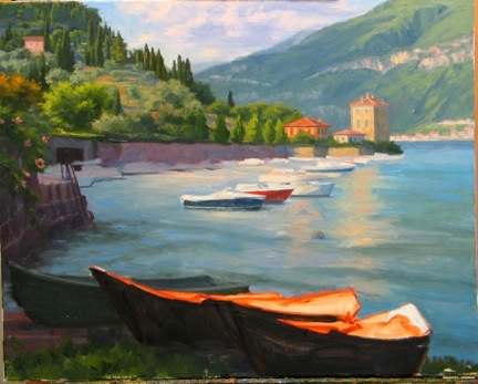
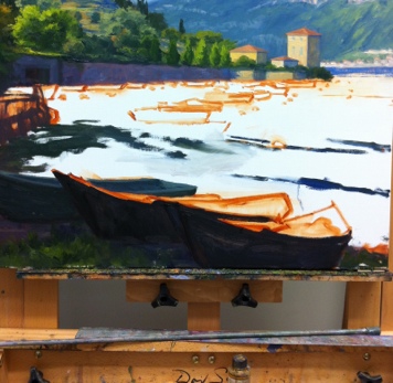
 "Varenna Harbor"
Oil on Linen, 16x12"
To purchase, please
"Varenna Harbor"
Oil on Linen, 16x12"
To purchase, please 


