Pescallo cafe demo updated

Ever tried painting on four hours of sleep? It ain't pretty! In fact, doing anything on "sleep fumes" (as I call it) is a bit like running through wet cement. That's how it's been lately for me as my insomnia issue has again reared its ugly head. And it's why I typically have avoided doing a full-fledged painting demonstration recently. Nevertheless, I have progressed a bit with the Pescallo painting, and I'll continue to share my process for it despite the break in continuity. When I last left off, I had a good deal of the background mapped out. Now I am tackling the foreground.

Lake Como painting in progress by Jennifer E. Young

Even though I felt as if I had a pretty good compositional plan going in, I continue to tweak elements of the composition as I go along. For instance, I decided to extend the tip of the closest mountain off further to the right, so that it wasn't in danger of butting up against the foreground verticals. I also wondered if the boat was too large in the original drawing for where I had placed it in the picture plane. So I've experimented with reducing it slightly below.

Lake Como Italian landscape in progress by Jennifer E. Young

Mainly though I've been working out the shadows and highlights of the foreground café and the pier. I need to get those pier elements in place before I can address the foreground water and any reflections down there.

I hope I can wrap this up in another session or two, depending on how much time I can carve out to do it. I'll continue to post my updates and painting notes as I go. Thanks for tuning in!

Pescallo cafe painting demo (cont'd)

Here's a little more progress on the Pescallo painting I started in my last post.  I'm trying to write this as a demo of sorts, which means that with my  time constraints it is taking longer for me to post than I'd like. But noting ventured nothing gained, and I'm now ready to talk about some color! My palette for this painting is as follows: titanium white cadmium yellow light cadmium orange cadmium red alizarin crimson ultramarine blue sevres blue (Rembrandt- it's like a cerulean but more intense) burnt sienna gold ochre

This is a bit more expanded than the single primary I have experimented with a lot in the past, but with limited time in the studio now, it is helpful to have a few more "convenience" colors in my arsenal. With the tonal drawing laid to canvas as my guide, I begin by blocking in my color, starting with the sky and mountains. I start with very general shapes at first and then work to refine them as I move along. For the sky I am using combinations of sevres and ultramarine and white, and for the clouds, touches of cadmium orange and red, plus white. The mountains are basically varying degrees of cadmium orange and ultramarine blue.

lake como Italy painting in progress by Jennifer Young

Since so much of the background peeks through what I will have going on in the fore, I decide to work out the background first, fleshing out the highlights of the mountains. The greens of the mountains are very grayed down- just the slightest amount of cad yellow light is used, in combination with the blues. I also add a little alizarin crimson to neutralize it further.

Italian landscape painting in progress by Jennifer Young

I decide to soften the sky a bit to make the background stay back and be less busy. Then I start to lay in a first pass at the water. I use a slightly darker variation of the blues from the sky for the distant water, using less white as I move forward. I also add in some cadmium orange to the blues as the water edges closer to the pier and foreground. This won't be the final word on the water, but I have gotten rid of that white canvas and have enough of the background tones to start laying in the foreground. Next I will begin work on establishing the shadows and highlights of the pier.

lake como Italy painting in progress by Jennifer Young

Quite a lot still to go, but things are starting to take shape. But as they say, the devil's in the details.

Pescallo Cafe (in progress)

Call us crazy, but we are seriously entertaining the idea of returning to Italy next year-- with a toddler along for the ride. I am not really certain where we will go or how this will work with me painting, us touring, and one of us being only 3 1/2, but the fact that we are seriously talking about it seems fairly miraculous in and of itself. Every time I go through my photos and sketches of past travels, I end up wanting to return to this region or that region, and I am no closer to settling on a destination than when we started talking about this trip last winter. And then there are the places we haven't even gotten to yet. Each part of Italy seems to have its own alluring qualities, unique to themselves but quintessentially Italian.

Lake Como remains near the top of my list (so far) in terms of sheer beauty and aesthetic pleasure. It's not heavily endowed with art history or artifacts, (compared to, say, Rome, Florence, or Venice) but what it lacks in museums it makes up for in natural beauty and storybook enchantment.

This is a quick sketch of a composition I have been playing around with for a little while. It is of a little cafe set upon a pier in Pescallo. Not a great photo, but hopefully you get the general idea.

This was drawn to scale on my sketchpad so that when I "scale up" that there will not be a great distortion when I put it to canvas. There will still be some adjustments along the way, but by remaining in the same format, there shouldn't be any major surprises.

Here is the line composition drawn out in oil (burnt sienna) on canvas. I do some toning here to work out a value pattern, but it's not a 100% tonal drawing-- just enough to cement my concept in my mind and get me excited about the piece.

tonal sketch Lake Como cafe by Jennifer E. Young

Stay tuned for more to come soon as the painting progresses.

Sant' Antimo painting progress

I thought I'd share a few quick shots of the Sant' Antimo Tuscan landscape I've been working on. The first color I lay in is the sky and clouds and distant mountains. The clouds will be the lightest value in the painting, so I want to "key" that in at the start.20130705-145652.jpg

Next come the darkest values- the majestic cypress trees so prevalent in Tuscany. At this point I also establish a rough lay in of the shadows of the abbey and cypresses:

20130705-145724.jpg

Once that's done I set about fleshing out the rest of the painting. No highlights on these areas yet. But I am establishing some of the wonderful patterns in the terraced hillside and distant landscape.

20130708-085916.jpg

Blue Ridge Mountains Commission- WIP, cont'd

This week I continued work on the mountain meadow commission painting I began blogging about in my last post. My approach for this piece seems to be that I am working more or less from back to front, as edges are softer farther away and come into greater focus in the foreground. The sky is painted together with the distant mountains, since there is such an interplay of clouds and mist back there. The distant trees are addressed rather uniformly at this point, as I tweak their values and placement in the composition.

Blue Ridge Mountain Meadow Commission- WIP

Next I decide to address the darkest value in the painting, which is the focal tree, so that I can better assess the value relationships as a whole. I am not getting into the tree edges yet, as I need some of the meadow colors laid down first in order to create the soft edges of a misty morning.

Jennifer Young Morning Meadow commissioned painting in progress

Next I mass in very generally the flowers in the field. There will be a lot more color variation but I just want to get the generalized color and pattern down on the canvas first.

Jennifer Young Morning Meadow painting commission- WIP

Soft greens of the grasses follow the blue, and merge to soften the edges further.

Jennifer Young painting commission "Morning Meadow" WIP

With the field of the meadow laid in, I can now start to give the focal tree a nicer shape, with soft lacy edges and a few subtle tree holes. I may need to tease out those holes a little further, perhaps darken them a bit, so that they aren't so "holey", but now I can see the  painting really start to take shape.

Jennifer Young mountain landscape painting in progress

The sky has gotten washed out in the photo above, but I will try to get a better shot with different lighting conditions. It's been raining and cloudy a lot lately, so I am relying on indoor lighting (which isn't all that reliable!) What comes next will be more work on that field. Both grasses and flowers are cooler and softer as they recede, and show more detail, warmth,  color intensity and contrast as they come forward.

Revisions, revisions...and finally the final!

Well is this the slowest moving demo ever, or what?  Sorry about that, and thanks for sticking with me! I  have  enjoyed this painting, but  I struggled with the foreground boats I had planned to include.  I took them out and put them back in several times. I felt like I wanted something there to lead the eye into the picture, but the boats as I had them seemed to block my entrance  rather than aid it. So I finally settled on a single rowboat to lead the eye in while still allowing some breathing room. Lake Como landscape painting in progress by Jennifer Young

After that was all hashed out (whew! ) I set about laying in the background boats against the retaining wall, half of which are in shadow, and half in light.

Lake Como Italy landscape painting by Jennifer Young

Next came the masts, sails, and water. The reflections in this scene were very soft and shimmery. Light reflections tend to cast a wee bit darker than what is being reflected, and dark ones are a tad lighter. I tried to keep the whites on the warm side, as they take on a lovely golden glow as they glimmer in the low angle of the sun.

Landscape painting of Lake Como Italy by Jennifer Young

"Pescallo Glow" Oil on Linen, 24x30"

So, did I keep with my grayscale plan I mapped out at the beginning of this demo?  You tell me:

grayscale Pescallo landscape painting by Jennifer Young

grayscale sketch by Jennifer Young

I must say that I liked having the grayscale notan and I actually did reference it often during the entire process of my painting. While I think it is a valuable tool, I think I would still have benefitted from doing a compositional line drawing in addition, especially with such a complicated scene. I probably reference the notan sketch more throughout the painting, but a strong compositional line plan may very well have eliminated the foreground boat dilemma I struggled with midway through the painting.  Live and learn!

Moving forward (Lake Como W.I.P., continued)

At this point in the process I feel that I have sufficiently addressed the nearest hillside to the point that I can now move forward and focus on the middle distance boats and water.

lake como painting in progress by Jennifer Young

I also realise that there is still a lot of white canvas around this painting and I really want to at least block the rest of it in so that I can better gauge my color and value relationships. Ideally I probably should have done this earlier, but as you might have noticed I have been short on easel time in the last week, and I want to address the water in as close to an alla prima fashion as I can, because otherwise I end up having to scrape off a lot of dried paint from my palette and remix everything to try and get back to where I had previously left off.

Pescallo painting Italian landscape

Ah, that's better!  I've painted in the little stone wall/pier to the left, and have at least suggested that there is a lake here somewhere! The paint layer on the water is still a very thin block-in here, but at least I have some color down and have indicated approximately where the boats are going and where the water highlights will be. This last picture shows where I had to leave off this morning. No matter how early I try to get out to the studio, I seem to always feel that I have one hour too little. But that's the way it goes, right now. Depending on how much painting time I will get this weekend, I hope to finish this piece up in another session or two.

painting-in-progress of Pescallo Italy

Lake Como W.I.P./Demo (continued)

Well I promised color in my last post, so let's get started! I don't know if I mentioned it lately, but I have been experimenting with expanded palettes for my latest paintings, and that exploration continues with this one. Regular readers may remember that I have for a long while used a limited palette of red, yellow, and blue, plus white (like this one). For this painting, my palette is (as I lay it out from left to right) Titanium White, Cadmium Yellow Light, Golden Ochre (Rembrandt), Cadmium Orange, Cadmium Red, Alizarin Permanent (Gamblin), Cobalt Blue, and Ultramarine Blue. (I've specified brands where color names are specific to a particular brand.)   I haven't used any pre-mixed greens, as you can really mix a zillion different greens with this palette. I have used most of these colors off and on, with the exception of Cobalt Blue. To be honest, I was really hoping that I wouldn't like it, because it is a terribly expensive tube of paint. Of course, I love it!  It is a cooler blue than Ultramarine, which has more red in it. I still love Ultramarine, but Cobalt has some really wonderful possibilites. Any way, back to the painting...I start by painting in the sky, which contains the light source and is also the farthest in distance. The sky is Cobalt blue plus white, with cad yellow lt. added as it nears the horizon. For the clouds I've mixed a combination of blues and cads red and orange + white for the shadows, and Cad orange and red + white for the highlights.

20120921-150523.jpg

Working from back to front, I next paint in the distant cliffs, which have a beautiful shadow casting down over them from low-lying clouds. The photo is a bit dark here (apologies) but I will try to get some more accurate photos in subsequent blog posts so you can get a better idea of the colors.

The distant mountains complete, I block in the buildings that jut out into the harbor, as they will serve as my area of interest in the painting, and everything will kind of flow to lead the eye towards them. I also decide to lay down my pattern of darks, to restate the plan I made in my notan sketch. Again, this photo just blackens everything out, but I had to make a choice between using my time blogging or photo editing, and at this point, I've chosen blogging.

20120921-150612.jpg

Next, I work on the terraced hillside in the middle distance. What a joy it is to paint...all of those shadows and varied greens! A nice round bristle brush is great for painting in those cypress trees, which have always struck me as distinctive punctuation marks in the Italian landscape. .

20120921-150639.jpg

 A mahl stick (shown in the next photo  on my easel below the painting) is a handy tool to have to steady the hand without smudging the painting, when painting details like architecture and tall skinny cypress trees.

20120921-150656.jpg

I have yet to paint in the highlights on the cypresses, but once I've done that I will be ready to move on to the middle distant water and boats, and finally the boats in the foreground. All that will be left after that point will be fine tuning  wherever's needed.

Lake Como W.I.P. & Demo

I mentioned in my last post that I had a new painting in the works, and I thought I'd attempt a little demo with this one. I say "attempt" because my laptop finally gave up the ghost, and these days I tend to do a lot of my writing via my mobile. Not only am I "all thumbs" (literally) but I have to sneak it in before my phone gets snatched away by the chubby little hands of my daughter who wants to "see pictures" whenever she sees it emerge from my pocket. This will be a painting of the beautiful fishing village of Pescallo. Pescallo is a tiny, sleepy  little place that sits just down the slope from Bellagio (also very beautiful). In fact, I could see Pescallo from the balcony of my Bellagio hotel, and the drama of the light as it poured over the mountains and harbor beckoned me to take a stroll down there many mornings before we started the day's touring.

I begin by sketching out a compositional plan that is also a value plan for the painting. I do this using light, middle, and dark value gray oil paints in my sketchbook. I often do a similar thing with Tombo pens (the grayscale ones), but mostly when I am painting outdoors as a way to quickly hone in and get a handle on my composition (in an environment that is bombarded with stimuli). But it is a good practice with studio work too. The oils are mentioned in Kevin Macpherson's book, "Landscape Painting Inside and Out," and I have long wanted to buy these paints so I could give it a try. They are Portland Gray Light, Medium, and Deep, by Gamblin. Hey, if it's good enough for "KMac", (as my husband calls him) it's good enough for me!

notan sketch

The point of this is to see if your painting has a strong underlying structure with a unifying value plan without getting bogged down in details. This is really supposed to be more of a notan sketch at this stage, which is a very simplified thing and addresses more of the armature of the painting rather than the pinpoint accuracy of objects and shapes. It's been a while since I've done this kind of study, and I realized at some point that I had not allowed much for the fourth value I was working with, which was the white of the paper. Oops! So I had to amend my sketch a little and add in some white for the lightest areas.

Still, I feel that my plan is solid and I'm ready to move forward by sketching out a line drawing on my 24x30" canvas.

oil sketch lake como painting by Jennifer Young

For this I am using burnt sienna (Winsor Newton), thinned with Gamsol mineral spirits. I don't much use this earth color in the rest of my painting stages, and while I could mix up  a good earth for such a job using my standard red, yellow, and blue, it is more of a convenience for me to use a premixed paint at this preliminary stage. I also like it because it lends a nice warm undertone to the canvas as I go along, and it doesn't bleed into my other colors (especially the light ones like the sky) when I move beyond the sketching stage.

Now that I have a plan, I am ready to start painting with color! I'll get into that in the next post .

This week on the easel: Val d'Orcia W.I.P.

Just a quick post to share what is in progress on the easel this week: My studio time (which includes painting, but also varnishing and framing, website updates, emails, blogging, photography, sales/marketing, office work, etc.) is now limited to a few hours every other weekday. Painting takes precidence, but every now and then I really must play catch-up with "everything else". So it was with Monday, and I only had time to do the layout in sepia:

Tuscany landscape painting in progress by Jennifer Young

Upon my return to the easel, I tackeled the block-in (first pass) which is still mainly shadows and midtones:

tuscany landscape painting in progress by jennifer young

Time ran out before I was able to get to the hilltop buildings, but I was happy to have covered the rest of this 24x30" canvas in about 3 1/2 hours. Because I can't always get back to an "open" painting, I at least want to return to a canvas that is brought to the same level of completion in all areas.

This is a view I have painted before (a number of years ago) and I am returning to it now to see if I can use a looser approach. There is quite a bit of information in this scene, and my aim is to relay a feeling of the variety in the landscape of Tuscany, but in a more unified, simplified manner, without articulating everything in minute detail.

Rooftops, St. Cirq Lapopie (final)

I've been struggling with a killer cold or allergy or something for over a week now, so it's really thrown me for a loop in the studio. But I have now finished the French village painting I have been blogging about in my last couple of posts (here and here). I did not have a chance to take any more progression shots due to the amount of time I lost, so my apologies to those who were following the progression of the work-in-progress.

French village landscape painting St Cirq Lapopie

"Rooftops, St. Cirq Lapopie" Oil on Linen, 30x24" SOLD

There was a certain quality of light I was after in this painting...a slight haziness that comes on a warm day when the sun begins to filter through the clouds after a soft rain (the weather when I visited there could best be described as "changeable"!) So there are a soft edges and close values to tackle, especially in the middle and far distance.

St. Cirq Lapopie is a fortressed village dating back to the Middle Ages. Sitting high above the Lot River, it is, as I mentioned in my prior post, dripping with so much charm that it really does invoke fairy tales of knights and damsels in distress!Narrow cobbled streets wind their way through cliffsides, leading up to a fortressed peak that allows stunning views of the steep tiled rooftops and the Lot valley.

St. Cirq Rooftops WIP (cont'd)

As it turned out, there was too much weather and too little opportunity to do any plein air painting last week. But I have been plugging away at my studio painting of St. Cirq La Popie. The images below show my continued progress thus far. Laying in my lightest passages, I worked on the sky and distant cliffs and ruins first. Next, I started on my rooftops. In this region, I noticed that there were a lot of gray-blue undertones along with the terra cotta-tiled rooftops, so I experimented with laying in a gray base to start. I am not really sure if doing so helped me or hindered me, but nothing ventured, nothing gained.

France landscape painting in progress by Jennifer Young

St. Cirq Lapopie

France landscape painting in progress by Jennifer Young

France landscape oil painting by Jennifer Young

At this point, I need to refine, work on the garden, and bring out my highlights, so this is what I'll be working on today. This painting is all angles and not much actual landscape, so my progress has been a little slow going at times. Nevertheless, the composition and the concept interest me. I do miss plein air painting, but I have decided I need to make the most of being studio-bound by experimenting, working on new challenges, and working out some new ideas.

In the works- Rooftops, St. Cirq La Popie

Just thought I'd do a quick post of what is currently on my easel. It's a 24x30" painting of  a location I visited on my last trip to France; St. Cirq La Popie. St. Cirq La Popie is probably one of the most storybook-pretty villages in France that I have yet seen. I am actually hoping to do a little plein air painting today during baby E's naptimes, so this will be brief. Let's hope the nap gods are with me!

France landscape St. Cirq La Popie


France landscape St. Cirq La Popie

Tuscan Vineyard (remaining progress pics & final)

Here are the final images for the Tuscan Vineyard W.I.P. I have been posting about. Again, the progress images are not color corrected, though the final is. The linen canvas I used originally had a clear primer on it (as opposed to a white gesso). While it is an archival product, the surface seemed more absorbant, so I applied a couple of additional layers of my own white gesso (and sanded in between) to get the paint to sit better on the top. Even so, it still ended up with more of a surface texture, which compelled me to use a lot of thick paint. As a result, I had a really hard time photographing this painting because I kept getting glare in some spot or another.

Okay, now that I'm done with my disclaimers, I'll wrap this up! Having worked out my compositional problems, I next spent a good deal of time developing the treeline in the middle distance.

Tuscany painting work in progress by Jennifer Young

My aim is to keep the edges soft but defined. I want to lead the eye to the out-building, and not distract from it, so I put slightly more definition in the pale sivery trees directly behind the building.

tuscany painting in progress by Jennifer Young

Next I work my way forward again, to resolve the farmland around the building.

tuscany painting in progress by Jennifer Young

And finally, I put the finishing touches on the vineyard.

Tuscany landscape painting by Jennifer Young "La Vigna Privata" (The Private Vineyard) Oil on Linen, 24x30" SOLD!

Tuscany vineyard W.I.P.

I spent some time late last week and Monday working on the painting I had sketched out in my last post. I will say before I begin, that these photos are not color corrected due to limited time, but hopefully you can still get an idea of how the painting is developing. Sketch in transparent oxide red, with some shading...

Tuscany painting work in progress by Jennifer Young

I usually lay in the sky first, but since there is so little of it in this painting, I have decided to start laying in the ground. More or less, I am working front to back.

Tuscany landscape painting by Jennifer Young

Tuscany vineyard landscape painting

tuscany painting in progress by Jennifer Young

At this point I had to step back and think about the plane trees I had sketched in on the upper right. As much as I love the plane trees, I was afraid they would be too busy in this painting, when there is already a lot going on. You might even be able to tell that I struggled with those trees from the outset, by all the transparent red oxide rubbed into that side of the canvas. I kept wiping them out and putting them back in, until finally I surrendered and took them out for good. Sometimes you just have to accept that you can't say everything you want to say in a single painting.

I still wanted something in the upper right for balance, so instead I massed in a "less interesting" tree. I also changed the skyline slightly so as not to feel so hemmed in. The sky is pretty washed out here but my sky, while very light and simple, has more color (pale golds and blues).

Tuscany vineyard landscape painting

Up to the point pictured is about 5 or 6 hours' work. I started this late Friday afternoon and came back after dinner (and after the baby went to bed) to work on it some more. I just wanted to get it to a point where the whole canvas was brought up to the same level of "finish" (more or less) so that it would be easier for me to pick up again when I returned to the easel.

Once upon a time I was a total night owl and I'd habitually paint late into the night (this was before I started painting landscapes). I haven't done this in a really long time, and I'm not sure it's such a good thing for me. I only meant to work for a couple of hours but it was close to midnight by the time I cleaned up and I was so wound up I couldn't sleep for a while. Maybe I'll get used to it in time, but as it was, every time I'd go to clean up I'd tell myself, "just five more minutes!" Afterwards, I felt like I had had an entire pot of coffee! I kept telling myself it was time to stop, but now that I feel so often on a time crunch, any studio time is a real treat.

Ciel Dore

Here are the final images for the French landscape painting-in-progress I've posted about recently (see the progression at this link and this one.)  As I mentioned before, at this stage in the game, my main "statement" has taken shape, so  it is all about refining the idea. It might not be evident in the previous photos, but when I returned to the easel to finish the painting, I felt that the greens in the grass and shrubs were looking a bit too light/bright and slightly too cool for the quality of the light I was aiming for. So the first thing I did was to warm all of that up to give it more of that late evening sun-kissed feeling. Next, I worked on the shape, shadows and highlights of the foreground shrubs:

France landscape painting in progress by Jennifer Young

Followed by some subtle shading on the pigeonniere and refining the edges of the background shrubs:

France painting work in progress Jennifer Young

My final decisions have to do with working out the shadows and highlights in the clouds to give them form. I was really reluctant to go back into the sky because I liked so much what was going on there and I didn't want to mess with it too much. But, given the state of the rest of the painting, I felt that it really needed some further development. So I took a page from the lessons learned from my abstract expressionist art school days. Namely, that one should not hold any single portion of a painting as "too precious" if it doesn't benefit the painting as a whole. I also have made minor alterations to the shapes of some of the clouds, and warmed up the sky at the horizon, because it was feeling a bit too cool for a sky that had so much warmth in the clouds.

France landscape oil painting by Jennifer Young

Here is the final. I kept the composition simple because I really decided to push the color in this piece and make this a sky painting. Since I was working from composite images and memory rather than from life, the challenge was to make the light cohesive with the drama going on in the sky. I feel like I've gotten a pretty good representation of what I set out to achieve, so I am happy with the outcome.

French landscape painting of the Lot Valley by Jennifer Young

"Ciel Dore" (Gilded Sky) Oil on Linen, 20x24" Sold!

Pigeonniere W.I.P. (continued)

Here are a few more progressive shots of the French landscape work-in-progress that I posted about last time. Since I have to spend a bit of time cropping, resizing, and uploading each photo, I again don't have much time to write if I also want to paint today. So let's hope the pictures will be at least a hundred words. ;-) Developing the clouds:

french landscape painting demonstration by Jennifer Young

french landscape painting demonstration by Jennifer Young

And the pigeonniere:

France landscape painting in progress by Jennifer Young

Now I will spend some time refining (working on edges, tweaking shadows, developing highlights, etc.) The challenge for me is usually at this stage--to refine/change but to still keep it fairly loose and avoid overworking. We'll see how well I do in today's studio session!

Painting on a colored ground

Every so often I'll get a question about my painting process that I think might be an interesting topic to share here on my blog. Recently an artist friend asked me about the red ground I prepped my canvases with at one time (I think he must have seen the "Springtime Glory" demo from my site). I'm sure I've addressed toning a canvas a few times here on the blog, but since I've been asked about painting on a red canvas a number of times, I thought it would be a good idea to address this question specifically. Here is his question, followed by my response: Question: Are you still using red underpainting most of the time? Is that landscape specific or do you switch up for sky/water? 

My response: As for the red ground, I never use it any more. I really only used it for landscapes. It was fun because the underpainting gave vibratory effect due to it being a complement to the greens.  But it was too much of a distraction for sky and water, and ultimately I personally found it so for all of my landscapes, especially as I moved a little closer to realism.  Plus I got too lazy to tone my canvases that color as I'd have to let it dry first. Otherwise the red would lift and get mixed into my painting too much. Now in the studio I either just paint on a white canvas, or tone it with just a quick wash of transparent red  oxide (a.k.a PR101- the color I used in the tonal underpainting here).  That still adds a warm tone but is muted enough that it doesn't distract. It also isn't as high staining so I can apply a wash and then start painting immediately after.

*This artist is a studio painter, but I'll add here for the benefit of my blog readers that if I'm painting outdoors, I pretty much always use a mid-toned canvas of either gray, or a wash of trans red oxide or raw sienna, as sun on the white canvas creates too much  bounce and glare.

Bellagio from above; more oil painting w/out solvents

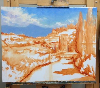
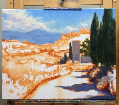
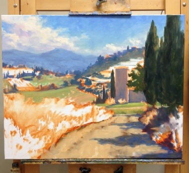
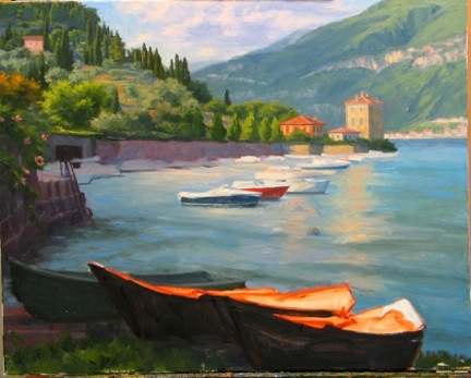
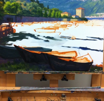
Following up from my prior WIP, here is the final painting. This is a view of Bellagio from a hike we took up to Villa Serbelloni. The villa is now maintained by the Rockefeller Foundation, who uses it as a retreat for  the Bellagio Study and Conference Center for artists and writers (wouldn't that be nice?) For this reason, we couldn't go inside the villa when we visited, but we could tour the grounds, which offers gorgeous views over Bellagio.

Oil painting of Bellagio, Italy

"Bellagio From Above" Oil on Linen, 20x16"

SOLD!

Both this piece and my previous Lake Como painting, were done without the use of solvents or any other medium other than small amounts of walnut oil to clean brushes and thin paint when necessary. But even when used judiciously, the walnut oil served to slow drying considerably. At present this is not a huge problem, as I am spending most of my time painting/renovating/preparing home and life for the new baby! But it does change the nature of things and the overall result became more impressionistic due both to the behavior of the paint, and probably also the gaps in my working sessions.

I know that an oil painting requires a certain length of time for all of the layers to fully dry (sometimes as much as 6 months or a year.) But normally the top layers will dry to the touch in about a week's time.  Not so with the walnut oil method, which seems to require at least an additional week to my usual handling time.

Maybe it's just that my painting habits are not particularly suited for this method, or maybe I just need to get used to new ways of doing things. Overall, except at the very beginning stage, I don't paint in thin layers. In fact, while I don't lay it on with a palette knife, I do paint passages that are relatively thick and juicy. But oddly, I experience the most difficulty in the lay-in, (early stage) which I am used to having set up rather quickly.

First of all, in order to follow the "fat over lean" rule, I have been trying not to make the paint too "fat", too soon. So I keep the walnut oil I use in my initial lay-in stage very spare. The result is that instead of a thinly painted initial sketch and color block-in, I find myself with trying to move paint around that has a definite drag and is less fluid. The lay-in becomes more often a "rub-in" with a rag or a "scrub-in" with an old brush, and the edits and corrections are very hard to lift off the canvas.

On the other hand, if I use more walnut oil at this stage, the paint can get too smeary and unmanageable for successive layers, not to mention less stable (with any medium you use, you should only use no more than 20% total volume when mixed directly into the paint, and I usually err on the side of caution and use rather less than that.)

One solution may be to use a runnier paint in the lay-in stage. M. Graham walnut oil paints are such a paint. I do have a few tubes on hand, as I've tried them in the past. As much as I wanted to like them, I normally prefer more body to my paints. But they might just work for my purposes now--but still probably just in the initial stage only. (Incidentally, it's perfectly okay to mix walnut oil with linseed oil based paint, so even if you want to paint solvent-free, you do not need to buy their paints exclusively.)

Aside from walnut oil to thin,  there are other oils to try. Linseed oil is commonly used by artists, both in mixtures of ground paint and in various mediums. And while both linseed and walnut oils are considered to be "drying oils", linseed tends to be the faster-drying of the two.  However, I seem to read a lot about how linseed oil tends to yellow over time. Maybe this is an exaggerated worry, but a quick look at experiments like this one swayed me to first try the walnut oil over linseed.

So, to sum up from this layperson's perspective, some of the pros of using walnut oil to thin/clean are:

  • Non-yellowing
  • Non-toxic/ solvent-free painting (though other oils can also serve to achieve the same thing.)
  • Odorless
  • Does not evaporate like solvents, so it seems fairly long-lasting
  • Conditions brushes nicely

Cons:

  • Walnut oil is expensive! (If you are only using oil to clean your brushes, you could probably get by with a less expensive oil.)
  • Slows drying considerably (this could actually be a "pro", depending on your painting technique.)
  • Compared to solvent, it requires using more brushes and/or more wiping of brushes between colors in order to keep the color clean.
  • Walnut oil is expensive!

Landscape painting demo of southern France- conclusion!

Well there's nothing like computer woes and an out of town trip to keep up the momentum for a painting demonstration! But at long last, here is the resolution to the demoI started in late April:

When I last left off, I had my concept and composition well planned out, so now I set to work on finishing. This involves painting in the foreground and punching up the highlights of the middle distance and background, where needed.

french landscape painting demonstration by Jennifer Young

But something happens at this point. I kind of get too lost in the irises, making them too defined and pronounced. Soon I find my tunnel vision has gotten me so lost in the irises that they start to take over.

painting of the french countryside

Argh! Attack of the irises! They've taken over and are rather too big and too saturated, creating more of a competition with the old abbey. I've also lost the lower wall in the middle distance almost entirely, which I rather liked, as it helped to lead the eye further into the painting.

France landscape oil painting by Jennifer Young

My solution? Basically I scraped down the entire lower portion of the painting! Eh, it happens. The paint had become too thick to really rework, and sometimes it's easier and less distracting to just scrape it off in order to open it back up. In this case I felt a "do-over" was warrented.

Landscape painting of southern France by Jennifer Young

"Irises at Abbaye Nouvelle" Oil on Canvas, 40"x30" Click here for more info!

Ahh...better. (At least I think so!) I've gotten my herb-covered wall back, and reworked the irises in the foreground so as to frame but not overpower. I've treated them a bit more impressionisitcally too,  to flow better with the rest of the painting. I also decided to tone down some of the greens and golds in the middle distance to make them "sit back" in the picture plane.

At this point I'll conclude. If I touch it any more it will be only a tweak here and there. I've shot and reshot the final several times but we are getting such dark days lately with all this rain that I can't seem to get the nuances in the colors quite right in the photo. This picture is close, but I'll likely try another shot once the sun comes out.