Pescallo cafe painting demo (cont'd)
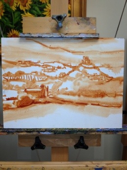
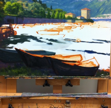
Here's a little more progress on the Pescallo painting I started in my last post.  I'm trying to write this as a demo of sorts, which means that with my  time constraints it is taking longer for me to post than I'd like. But noting ventured nothing gained, and I'm now ready to talk about some color! My palette for this painting is as follows: titanium white cadmium yellow light cadmium orange cadmium red alizarin crimson ultramarine blue sevres blue (Rembrandt- it's like a cerulean but more intense) burnt sienna gold ochre

This is a bit more expanded than the single primary I have experimented with a lot in the past, but with limited time in the studio now, it is helpful to have a few more "convenience" colors in my arsenal. With the tonal drawing laid to canvas as my guide, I begin by blocking in my color, starting with the sky and mountains. I start with very general shapes at first and then work to refine them as I move along. For the sky I am using combinations of sevres and ultramarine and white, and for the clouds, touches of cadmium orange and red, plus white. The mountains are basically varying degrees of cadmium orange and ultramarine blue.

lake como Italy painting in progress by Jennifer Young

Since so much of the background peeks through what I will have going on in the fore, I decide to work out the background first, fleshing out the highlights of the mountains. The greens of the mountains are very grayed down- just the slightest amount of cad yellow light is used, in combination with the blues. I also add a little alizarin crimson to neutralize it further.

Italian landscape painting in progress by Jennifer Young

I decide to soften the sky a bit to make the background stay back and be less busy. Then I start to lay in a first pass at the water. I use a slightly darker variation of the blues from the sky for the distant water, using less white as I move forward. I also add in some cadmium orange to the blues as the water edges closer to the pier and foreground. This won't be the final word on the water, but I have gotten rid of that white canvas and have enough of the background tones to start laying in the foreground. Next I will begin work on establishing the shadows and highlights of the pier.

lake como Italy painting in progress by Jennifer Young

Quite a lot still to go, but things are starting to take shape. But as they say, the devil's in the details.
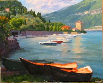
Pescallo Cafe (in progress)

Call us crazy, but we are seriously entertaining the idea of returning to Italy next year-- with a toddler along for the ride. I am not really certain where we will go or how this will work with me painting, us touring, and one of us being only 3 1/2, but the fact that we are seriously talking about it seems fairly miraculous in and of itself. Every time I go through my photos and sketches of past travels, I end up wanting to return to this region or that region, and I am no closer to settling on a destination than when we started talking about this trip last winter. And then there are the places we haven't even gotten to yet. Each part of Italy seems to have its own alluring qualities, unique to themselves but quintessentially Italian.

Lake Como remains near the top of my list (so far) in terms of sheer beauty and aesthetic pleasure. It's not heavily endowed with art history or artifacts, (compared to, say, Rome, Florence, or Venice) but what it lacks in museums it makes up for in natural beauty and storybook enchantment.

This is a quick sketch of a composition I have been playing around with for a little while. It is of a little cafe set upon a pier in Pescallo. Not a great photo, but hopefully you get the general idea.

This was drawn to scale on my sketchpad so that when I "scale up" that there will not be a great distortion when I put it to canvas. There will still be some adjustments along the way, but by remaining in the same format, there shouldn't be any major surprises.

Here is the line composition drawn out in oil (burnt sienna) on canvas. I do some toning here to work out a value pattern, but it's not a 100% tonal drawing-- just enough to cement my concept in my mind and get me excited about the piece.

tonal sketch Lake Como cafe by Jennifer E. Young

Stay tuned for more to come soon as the painting progresses.

Sant' Antimo (Tuscany) painting complete

It took longer than I would have wanted to finalize my latest landscape painting of Tuscany, but I am really pleased with the final. Picking up from my prior post about this painting, here are a couple of additional progress shots: Continuing work to further articulate the background landscape:

Tuscany landscape painting in progress by Jennifer E. Young, All Rights Reserved

...and here I begin to work on the Abbey:

Tuscany painting in progress by Jennifer E Young, All Rights Reserved

Here, at last, is the final!

Tuscan landscape paitning Sant Antimo Abbey by Jennifer Young. All rights reserved.

"Path to Sant' Antimo" Oil on Linen, 24x30" Click here for more info!

Sant' Antimo Abbey is a beautiful Romanesque (formerly Benedictine) monastery dating back to the 1100's. It is situated in the stunning landscape of the Montalcino commune, and rests about 10 km from the town of Montalcino, (home of the gorgeous Rosso di Montalcino and Brunello wines).

In springtime the landscape of Montalcino and surrounds are strewn with poppies and other wildflowers, and the hillsides are often touched with the soft yellows and greens of golden broom.

I have a lot of reference photos of this abbey from my visit there several years ago. But I particularly like this view, which shows the focal point as a hint of the abbey in its lovely setting, but doesn't scream "portrait of a building". I also enjoy the point of view, which puts the viewer firmly on the pathway beneath the tall cypress trees, and nearly eye level with the abbey, adding to the sense of "being there".

Sant' Antimo painting W.I.P. (cont'd)

I thought I would share a progress shot of the painting of the Montalcino valley (Tuscany) I've been working on. I have been under the weather, which delayed my progress for a few days. But now I think I'm getting back on track.

Tuscany landscape painting in progress by Jennifer Young

I now have the whole canvas more or less blocked in. I decided to remove the tree foliage that I'd indicated  in front of the abbey because I felt it hindered rather than added interest. I had to refer to a few other photos I had taken from different angles to figure out what is behind there, but I think the change opens it up a bit and things make more sense overall. I hope soon to be able to share the final piece....I'm getting closer!

Painting water

A reader recently asked me in my comments section about painting water, and as I am in the middle of painting Venice scenes I thought it might be good to "reflect" a bit on it here (pun intended). As we all know, pure water is transparent and has no color. It's power, pictorially speaking, lies in the colors and shapes it reflects. It's always a bit dangerous to apply too many formulas to painting, but some general guidelines are useful (just be sure to verify these with your observing eyes!)

Obviously, if you are painting a still body of water like a pond or lake that reflects the surrounding landscape, the reflected elements are upside down and reversed in the water. Reflected shapes are sometimes foreshortened, and water's movement also distorts the shapes reflected, depending on how much of a breeze or current is at play.

A common error is to paint reflected items tone for tone exactly as they appear in their solid counterparts. But unless they are in deep shadow (which does sometimes happen in the narrow canals of Venice) dark elements usually appear lighter in their reflections, and light tones appear darker. For me, painting the reflections (and especially the dark values) fairly thinly works best, as standing water has a glass-like appearance.

A common error of beginners is to paint everything reflected in horizontal strokes, and in doing so, overwork and over-blend these areas until everything is kind of a muddy mess.

I like to paint the basic value-shapes of the reflections in downward or vertical strokes first to follow the forms above, and then add strokes of movement horizontally. For detail and highlights, it's easy to "overdo" them in reflections, so take a subtle approach to start. Sometimes that is the most effective. You can always add more touches later, but it's harder to take away unless you just scrape down or wipe the whole thing clean!

Moving water like rivers, rapids and ocean waves are another thing altogether. They have their own unique properties, and probably could benefit from their own (future) post!

Some of my favorite reference sources for painting techniques regarding water (and everything else!) are the books by Emile Gruppe. Gruppe was a wonderful impressionist painter and teacher who was a part of the Cape Ann School of artists. He worked in and around Gloucester and Rockport Massachusetts. He wrote a triad of books on painting and they are all invaluable to the landscape painter.

Blue Ridge Mountains Commission- WIP, cont'd

This week I continued work on the mountain meadow commission painting I began blogging about in my last post. My approach for this piece seems to be that I am working more or less from back to front, as edges are softer farther away and come into greater focus in the foreground. The sky is painted together with the distant mountains, since there is such an interplay of clouds and mist back there. The distant trees are addressed rather uniformly at this point, as I tweak their values and placement in the composition.

Blue Ridge Mountain Meadow Commission- WIP

Next I decide to address the darkest value in the painting, which is the focal tree, so that I can better assess the value relationships as a whole. I am not getting into the tree edges yet, as I need some of the meadow colors laid down first in order to create the soft edges of a misty morning.

Jennifer Young Morning Meadow commissioned painting in progress

Next I mass in very generally the flowers in the field. There will be a lot more color variation but I just want to get the generalized color and pattern down on the canvas first.

Jennifer Young Morning Meadow painting commission- WIP

Soft greens of the grasses follow the blue, and merge to soften the edges further.

Jennifer Young painting commission "Morning Meadow" WIP

With the field of the meadow laid in, I can now start to give the focal tree a nicer shape, with soft lacy edges and a few subtle tree holes. I may need to tease out those holes a little further, perhaps darken them a bit, so that they aren't so "holey", but now I can see the  painting really start to take shape.

Jennifer Young mountain landscape painting in progress

The sky has gotten washed out in the photo above, but I will try to get a better shot with different lighting conditions. It's been raining and cloudy a lot lately, so I am relying on indoor lighting (which isn't all that reliable!) What comes next will be more work on that field. Both grasses and flowers are cooler and softer as they recede, and show more detail, warmth,  color intensity and contrast as they come forward.

A spring commission

With the spring shows hung and the winter commission complete, I was thinking I would be able to turn next to some plein air painting, or perhaps to develop a couple of my James River plein air paintings into larger studio works. But that will have to wait, as I have gotten another commission! :-) But first, a couple of shots of the garden, which, when last photographed was in a state of sad dishevelment! The gardens around the studio really come into greater color in the summer. But with the rubbish cleared and weeds pulled, things are coming alive in the side garden with Creeping Jenny on the path, flanked by Mountian Bluets (Bachelor's Buttons) and creeping phlox. A flowering Dogwood makes a nice canopy, and the lilac in the fore is just starting to put off its heady scent.

20130427-063451.jpg Here's another shot below of the garden opposite the studio. In summer there are lilies, cone flowers, tall phlox and a butterfly bush. But my big thing lately is succulents. I love that they are water-wise and so marvelously sculptural. In the center is a succulent topiary I made last year. I will need to replenish a few of the tender plants that didn't survive our winter, but it hasn't been quite warm enough here to see much variety in the garden centers yet.

20130427-063539.jpg

Now that my daughter is a toddler, I can usually patch together enough time to noodle in the garden while she plays nearby. Working in the studio is a different story. At just 2 1/2 years old, her attention span is still pretty limited. So while she loves being in the studio, (and I love having her there,) I do have to shoo her out when it comes time to work, amidst howls of protest (and a certain amount of Mommy guilt as well).

...Which leads me to the commission! If you have been a reader for some time, this image might be familiar to you. In fact, I have painted variations of this scene a few times, beginning with the small painting done en plein air in the Blue Ridge mountains, and following with two larger 30x40 versions.

The commission came about as the result of my April show currently taking place at Design Domaine Gallery in Bernardsville, New Jersey. The client loved the painting "Morning Meadow" (click here to read my blog about this painting in the making) but it was much too large for her space. So my task is to recreate this scene in a 16x20 format.

Since a 30x40" painting doesn't exactly scale down to 16x20", we thought it best to start with a sketch of the new painting so that the client could have a visual idea of how it would look compositionally.

20130427-063621.jpg

While on the one hand, it may seem easier to recreate something I have basically already done a number of times, it can sometimes be a challenge to meet client expectations. Sometimes, though not always, a client may, for instance, expect the new painting to be exactly like the first, only smaller. So an effort always has to be made to explain in advance that as an original work of art, a painting can't be recreated stroke-for-stroke like the last.

The client does understand this, though she would like the color of the new piece to be as close as possible to the last. It was, after all, the combination of colors in Morning Meadow that she fell in love with.

Luckily, my prior blog post listed the exact color palette I used to create the larger piece! :) (I can't tell you how often I have referenced my own blog to get this kind of historical information.) So while I won't be able to remember exactly the combinations of color mixtures, I will be able to take some of the guesswork out of the process and use the same palette for this piece.

20130427-063635.jpg

Above is the sketch, reinterpreted onto canvas. At this point in sketch stage, I want to make sure I get an accurate placement for the various elements in the composition, so I've marked off in pencil the horizontal and vertical mid-points in the pencil sketch as well as on the painting to guide me. More to come in an upcoming post, where I will get into some color!

Sogno Rosso

We have been back from Thanksgiving travels for a week now, and we all received an awesome airline door prize in the form of the virus-of-the-day.  It's on the way out now, but I guess I should not be surprised to have contracted something, travelling with a toddler (who, especially since she has been in preschool has become the human petri dish!) Well, I guess as they say, what doesn't kill you makes you stronger. Any way, I am back to painting now, and I have really missed my studio time.  As I mentioned before, I am sticking to some smaller paintings for a while. The holiday schedule seems to just get fuller and crazier with each passing year. So, for sanity's sake, I think I am finally learning to just be kind to myself at the outset and not even attempt anything overly ambitious during this time.

So December is officially small painting month for me! And here, to prove my point, is a 12x16" painting of the Val d'Orcia, in Tuscany:

The compositional sketch:

20121202-185123.jpg: First lay in... 20121130-170359.jpg Final... 20121202-185404.jpg

"Sogno Rosso" Oil on Canvas, 12"x16" Click here for purchasing info or just contact me !

The Tuscan landscape just seems to roll on forever. It is a painter's dream. That idea is the inspiration for the title. "Sogno" (= dream), and "Rosso" (= the red field of poppies). I am painting from photos, memory, and imagination. The photos are the touchstone, but through memory I hope to convey my feelings for this place, which, from the very first time I laid eyes on it, has pulled at my heartstrings.

I rarely paint anything exactly as it is, (whether painting from photographs or life) so that's where the "imagination" comes in. I compose, rearrange, and edit until I acheive a composition and a statement that is pleasing to me. I want to stay true to the place, but really, it's just a moment in time, and an impression of the natural world that I'm after.

Though I am temporarily committed to keeping my painting sizes small, I think this composition cries out to be reincarnated as a larger piece at some future point. What do you think?

Revisions, revisions...and finally the final!

Well is this the slowest moving demo ever, or what?  Sorry about that, and thanks for sticking with me! I  have  enjoyed this painting, but  I struggled with the foreground boats I had planned to include.  I took them out and put them back in several times. I felt like I wanted something there to lead the eye into the picture, but the boats as I had them seemed to block my entrance  rather than aid it. So I finally settled on a single rowboat to lead the eye in while still allowing some breathing room. Lake Como landscape painting in progress by Jennifer Young

After that was all hashed out (whew! ) I set about laying in the background boats against the retaining wall, half of which are in shadow, and half in light.

Lake Como Italy landscape painting by Jennifer Young

Next came the masts, sails, and water. The reflections in this scene were very soft and shimmery. Light reflections tend to cast a wee bit darker than what is being reflected, and dark ones are a tad lighter. I tried to keep the whites on the warm side, as they take on a lovely golden glow as they glimmer in the low angle of the sun.

Landscape painting of Lake Como Italy by Jennifer Young

"Pescallo Glow" Oil on Linen, 24x30"

So, did I keep with my grayscale plan I mapped out at the beginning of this demo?  You tell me:

grayscale Pescallo landscape painting by Jennifer Young

grayscale sketch by Jennifer Young

I must say that I liked having the grayscale notan and I actually did reference it often during the entire process of my painting. While I think it is a valuable tool, I think I would still have benefitted from doing a compositional line drawing in addition, especially with such a complicated scene. I probably reference the notan sketch more throughout the painting, but a strong compositional line plan may very well have eliminated the foreground boat dilemma I struggled with midway through the painting.  Live and learn!

Moving forward (Lake Como W.I.P., continued)

At this point in the process I feel that I have sufficiently addressed the nearest hillside to the point that I can now move forward and focus on the middle distance boats and water.

lake como painting in progress by Jennifer Young

I also realise that there is still a lot of white canvas around this painting and I really want to at least block the rest of it in so that I can better gauge my color and value relationships. Ideally I probably should have done this earlier, but as you might have noticed I have been short on easel time in the last week, and I want to address the water in as close to an alla prima fashion as I can, because otherwise I end up having to scrape off a lot of dried paint from my palette and remix everything to try and get back to where I had previously left off.

Pescallo painting Italian landscape

Ah, that's better!  I've painted in the little stone wall/pier to the left, and have at least suggested that there is a lake here somewhere! The paint layer on the water is still a very thin block-in here, but at least I have some color down and have indicated approximately where the boats are going and where the water highlights will be. This last picture shows where I had to leave off this morning. No matter how early I try to get out to the studio, I seem to always feel that I have one hour too little. But that's the way it goes, right now. Depending on how much painting time I will get this weekend, I hope to finish this piece up in another session or two.

painting-in-progress of Pescallo Italy

Lake Como W.I.P./Demo (continued)

Well I promised color in my last post, so let's get started! I don't know if I mentioned it lately, but I have been experimenting with expanded palettes for my latest paintings, and that exploration continues with this one. Regular readers may remember that I have for a long while used a limited palette of red, yellow, and blue, plus white (like this one). For this painting, my palette is (as I lay it out from left to right) Titanium White, Cadmium Yellow Light, Golden Ochre (Rembrandt), Cadmium Orange, Cadmium Red, Alizarin Permanent (Gamblin), Cobalt Blue, and Ultramarine Blue. (I've specified brands where color names are specific to a particular brand.)   I haven't used any pre-mixed greens, as you can really mix a zillion different greens with this palette. I have used most of these colors off and on, with the exception of Cobalt Blue. To be honest, I was really hoping that I wouldn't like it, because it is a terribly expensive tube of paint. Of course, I love it!  It is a cooler blue than Ultramarine, which has more red in it. I still love Ultramarine, but Cobalt has some really wonderful possibilites. Any way, back to the painting...I start by painting in the sky, which contains the light source and is also the farthest in distance. The sky is Cobalt blue plus white, with cad yellow lt. added as it nears the horizon. For the clouds I've mixed a combination of blues and cads red and orange + white for the shadows, and Cad orange and red + white for the highlights.

20120921-150523.jpg

Working from back to front, I next paint in the distant cliffs, which have a beautiful shadow casting down over them from low-lying clouds. The photo is a bit dark here (apologies) but I will try to get some more accurate photos in subsequent blog posts so you can get a better idea of the colors.

The distant mountains complete, I block in the buildings that jut out into the harbor, as they will serve as my area of interest in the painting, and everything will kind of flow to lead the eye towards them. I also decide to lay down my pattern of darks, to restate the plan I made in my notan sketch. Again, this photo just blackens everything out, but I had to make a choice between using my time blogging or photo editing, and at this point, I've chosen blogging.

20120921-150612.jpg

Next, I work on the terraced hillside in the middle distance. What a joy it is to paint...all of those shadows and varied greens! A nice round bristle brush is great for painting in those cypress trees, which have always struck me as distinctive punctuation marks in the Italian landscape. .

20120921-150639.jpg

 A mahl stick (shown in the next photo  on my easel below the painting) is a handy tool to have to steady the hand without smudging the painting, when painting details like architecture and tall skinny cypress trees.

20120921-150656.jpg

I have yet to paint in the highlights on the cypresses, but once I've done that I will be ready to move on to the middle distant water and boats, and finally the boats in the foreground. All that will be left after that point will be fine tuning  wherever's needed.

Lake Como W.I.P. & Demo

I mentioned in my last post that I had a new painting in the works, and I thought I'd attempt a little demo with this one. I say "attempt" because my laptop finally gave up the ghost, and these days I tend to do a lot of my writing via my mobile. Not only am I "all thumbs" (literally) but I have to sneak it in before my phone gets snatched away by the chubby little hands of my daughter who wants to "see pictures" whenever she sees it emerge from my pocket. This will be a painting of the beautiful fishing village of Pescallo. Pescallo is a tiny, sleepy  little place that sits just down the slope from Bellagio (also very beautiful). In fact, I could see Pescallo from the balcony of my Bellagio hotel, and the drama of the light as it poured over the mountains and harbor beckoned me to take a stroll down there many mornings before we started the day's touring.

I begin by sketching out a compositional plan that is also a value plan for the painting. I do this using light, middle, and dark value gray oil paints in my sketchbook. I often do a similar thing with Tombo pens (the grayscale ones), but mostly when I am painting outdoors as a way to quickly hone in and get a handle on my composition (in an environment that is bombarded with stimuli). But it is a good practice with studio work too. The oils are mentioned in Kevin Macpherson's book, "Landscape Painting Inside and Out," and I have long wanted to buy these paints so I could give it a try. They are Portland Gray Light, Medium, and Deep, by Gamblin. Hey, if it's good enough for "KMac", (as my husband calls him) it's good enough for me!

notan sketch

The point of this is to see if your painting has a strong underlying structure with a unifying value plan without getting bogged down in details. This is really supposed to be more of a notan sketch at this stage, which is a very simplified thing and addresses more of the armature of the painting rather than the pinpoint accuracy of objects and shapes. It's been a while since I've done this kind of study, and I realized at some point that I had not allowed much for the fourth value I was working with, which was the white of the paper. Oops! So I had to amend my sketch a little and add in some white for the lightest areas.

Still, I feel that my plan is solid and I'm ready to move forward by sketching out a line drawing on my 24x30" canvas.

oil sketch lake como painting by Jennifer Young

For this I am using burnt sienna (Winsor Newton), thinned with Gamsol mineral spirits. I don't much use this earth color in the rest of my painting stages, and while I could mix up  a good earth for such a job using my standard red, yellow, and blue, it is more of a convenience for me to use a premixed paint at this preliminary stage. I also like it because it lends a nice warm undertone to the canvas as I go along, and it doesn't bleed into my other colors (especially the light ones like the sky) when I move beyond the sketching stage.

Now that I have a plan, I am ready to start painting with color! I'll get into that in the next post .

This week on the easel: Val d'Orcia W.I.P.

Just a quick post to share what is in progress on the easel this week: My studio time (which includes painting, but also varnishing and framing, website updates, emails, blogging, photography, sales/marketing, office work, etc.) is now limited to a few hours every other weekday. Painting takes precidence, but every now and then I really must play catch-up with "everything else". So it was with Monday, and I only had time to do the layout in sepia:

Tuscany landscape painting in progress by Jennifer Young

Upon my return to the easel, I tackeled the block-in (first pass) which is still mainly shadows and midtones:

tuscany landscape painting in progress by jennifer young

Time ran out before I was able to get to the hilltop buildings, but I was happy to have covered the rest of this 24x30" canvas in about 3 1/2 hours. Because I can't always get back to an "open" painting, I at least want to return to a canvas that is brought to the same level of completion in all areas.

This is a view I have painted before (a number of years ago) and I am returning to it now to see if I can use a looser approach. There is quite a bit of information in this scene, and my aim is to relay a feeling of the variety in the landscape of Tuscany, but in a more unified, simplified manner, without articulating everything in minute detail.

Season of Plenty (Provence painting complete)

Just a quick post to follow up on the W.I.P. I shared on Wednesday...Here is the painting, now complete (more or less).

 provence painting of lavender and vineyards by Jennifer Young "Season of Plenty" Oil on linen, 16x20" To purchase, please contact me.

There is some glare in the photo so I may need to attempt a reshoot this weekend. Nevertheless I think it gives a pretty good indication of the final. I managed to maintain my single primary palette to completion, just to prove I could do it. But I am not sure if this color- limiting exercise was to the benefit of the painting, so I will set it aside for a few days and think it over before making any adjustments.

Provence lavender lay-in (W.I.P.)

This has been my first real opportunity to paint in over a week. It has been really hot, muggy weather lately, so I've decided to stay close to the studio and scour some of my old photo archives for landscape subject matter. In doing so, I came upon some of my images of an area of Provence that I visited in lavender season almost 10 years ago (!) called La Drome Provencal. Here's a 16x20" composition I've mapped out:

Provence lavender landscape painting by Jennifer Young

I have more to flesh out in terms of both shadow/highlight and detail, but I've started with a basic block-in to nail down my composition. Up to now, I've used the same color palette as the previous painting I posted of Lake Como. But when I started to lay in the lavender I had the overwhelming temptation to reach for a cooler, more transparent red (like alizarin crimson) to add some brilliance. I have held off up to now.

What I aim to see is if I can acheive the proper color relationships in the painting without having to resort to any other colors than the three primaries I've chosen. Alizarin Crimson (permanent) has long been my default red when I paint in a single primary palette. While it is a beautiful transparent color, I sometimes feel it is almost too garish in my mixtures.

So I feel it is worthwhile to try and acheive a luminous, vibrant quality to my paintings without having to resort to over-the-top color. Being somewhat of a color slut, this is not an easy challenge for me! We'll see if I can hold out to the bitter (better?) end!

Varenna painting complete

Just a quick post to share the final version of the Lake Como painting I wrote about in my last post:

Landscape painting of Varenna Italy

"La Passarella, Varenna" Oil on Linen, 24"x 20"

20120826-120134.jpg

This view shows small fishing and leisure boats in front of the arched foot path called "La Passarella"  that winds its way around Varenna.Known  as "the pearl of the lake", Varenna is one of the most beautiful towns on Lake Como. A great place to leisurely wander and get lost!

I also really enjoyed this version of the limited palette I wrote about in my last post. I can see myself using this one again (as soon as I buy more Cad. Red Medium!) One of these days I will find time to update my website. In the meantime, please contact me for additional details about the painting and/or to purchase.

On the easel -Varenna (Lake Como) W.I.P

Just a quick post to share what's been on my easel of late. It's been so blazing hot this week that I have not found an opportunity to get back outside and have pretty much retreated to the studio to work. I'm still keeping things relatively small for the time being, though 20x24" isn't, for me, exactly tiny:

Lake Como, Italy landscape painting by Jennifer Young

Yet again I thought I'd experiment with another limited palette, using the "big three" primaries of red, yellow blue. In this case the red is Cadmium red medium, the yellow, cad. yellow pale, and my ol' friend ultramarine. The main difference for me is using cad. red medium. I almost never use this red but found some in my bins and thought, why not? At first I felt like I was shooting myself in the foot with this palette on this subject, as it is a bit more muted than when I use my usual gem-like transparent red of alizarin crimson. But having gotten used to it, I am quite liking it. I think I should be finished with this piece in another session or two, which will hopefully be this week, providing I have the studio time.

St. Cirq Rooftops WIP (cont'd)

As it turned out, there was too much weather and too little opportunity to do any plein air painting last week. But I have been plugging away at my studio painting of St. Cirq La Popie. The images below show my continued progress thus far. Laying in my lightest passages, I worked on the sky and distant cliffs and ruins first. Next, I started on my rooftops. In this region, I noticed that there were a lot of gray-blue undertones along with the terra cotta-tiled rooftops, so I experimented with laying in a gray base to start. I am not really sure if doing so helped me or hindered me, but nothing ventured, nothing gained.

France landscape painting in progress by Jennifer Young

St. Cirq Lapopie

France landscape painting in progress by Jennifer Young

France landscape oil painting by Jennifer Young

At this point, I need to refine, work on the garden, and bring out my highlights, so this is what I'll be working on today. This painting is all angles and not much actual landscape, so my progress has been a little slow going at times. Nevertheless, the composition and the concept interest me. I do miss plein air painting, but I have decided I need to make the most of being studio-bound by experimenting, working on new challenges, and working out some new ideas.

Of Paint and Palette Knives

Here is a recent message I received from a reader that I thought I other blog readers might find of interest: Q: Can you tell me if you use painting knives or if it is all done with brushes? And do you have a favorite brand of paint? -N.M

A: Hi N.M-I paint primarily with a brush, but here and there I have been using the palette knife as a painting tool (rather than just a tool for mixing). If you can get your hands on Richard Schmid's video on painting the landscape (June in particular), he has an excellent demonstration of how he uses the palette knife in his paintings. I am experimenting with his technique (as I understand it) but, not for every painting. So I wouldn't call myself a palette knife painter by any means.

As for paint brands, I'm looking at my paint bins now, and I see Winsor Newton, Gamblin, Holbein, Daniel Smith, M. Graham, Rembrandt, and Old Holland! I probably use Winsor Newton and Gamblin most often, but I have had good experiences with all of the above. I often base my decision on which brand to buy by the pigment I am after. Some pigments seem to be pretty particular to one brand. But even paints that go by the same name can vary quite a lot in hue, value, or color temperature. For instance, Winsor & Newton's Cadmium Yellow Light is warmer and I believe, a bit darker than Gamblin's, which is more lemony. That's not necessarily better or worse-- it all depends on what you're after.In any case, I make sure that I buy professional grade paints, rather than student grade. They are more expensive, but there is a big difference in quality.

I hope this helps, and happy painting!

Tuscan Vineyard (remaining progress pics & final)

Here are the final images for the Tuscan Vineyard W.I.P. I have been posting about. Again, the progress images are not color corrected, though the final is. The linen canvas I used originally had a clear primer on it (as opposed to a white gesso). While it is an archival product, the surface seemed more absorbant, so I applied a couple of additional layers of my own white gesso (and sanded in between) to get the paint to sit better on the top. Even so, it still ended up with more of a surface texture, which compelled me to use a lot of thick paint. As a result, I had a really hard time photographing this painting because I kept getting glare in some spot or another.

Okay, now that I'm done with my disclaimers, I'll wrap this up! Having worked out my compositional problems, I next spent a good deal of time developing the treeline in the middle distance.

Tuscany painting work in progress by Jennifer Young

My aim is to keep the edges soft but defined. I want to lead the eye to the out-building, and not distract from it, so I put slightly more definition in the pale sivery trees directly behind the building.

tuscany painting in progress by Jennifer Young

Next I work my way forward again, to resolve the farmland around the building.

tuscany painting in progress by Jennifer Young

And finally, I put the finishing touches on the vineyard.

Tuscany landscape painting by Jennifer Young "La Vigna Privata" (The Private Vineyard) Oil on Linen, 24x30" SOLD!