A good value
/If you have been reading my blog long enough, you may find that I obsess a little over art supplies and gear. A few months back a fellow artist mentioned that a great tool for judging values was a Kodak Wratten 90 filter. So for a few months I was on a mission to find one that was A) big enough to comfortably look through (ideally 4x4) and B) low enough in price so as not to break the bank. After searching online and watching the bidding wars on eBay, I found the combination of the two criteria impossible to meet. Then one day it dawned on me that I used to have a little red value viewer tool that I'd picked up in a sewing store. I don't know what happened to it, but I thought I'd poke around on Amazon to see if I could fine something similar. Lo and behold, I stumbled upon this little number:
Like the Wratten filter, this value finder helps neutralize color so that you can more accurately discern the values in your reference. Not only that but it has 3 view finders of different aspect ratios that will work with a range of canvas sizes. It also has optional guidelines that you can overlay to check composition, AND a couple of value scales to check your paint mixtures.
The drawback is that the filters are red rather than the nice grayish neutral of the Wratten filters. This may not appeal to everyone. But with a $14.95 price tag it is a good option and specifically geared toward the painter. I have been using it with studio work and it does a good job at neutralizing color so that I can judge values with more accuracy. I haven't used it outdoors yet but I think there it would be even more useful when making on the spot judgements, and I look forward to taking it along with me (hopefully this week) now that the weather is warming.
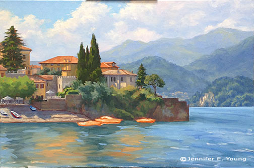


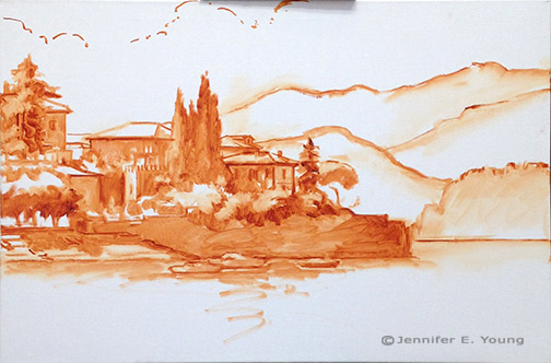
 Varenna Study
Oil on canvas, 6"x9"
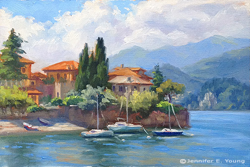
Varenna Study
Oil on canvas, 6"x9"
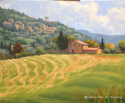


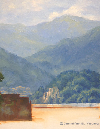
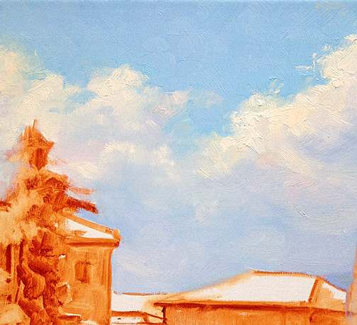
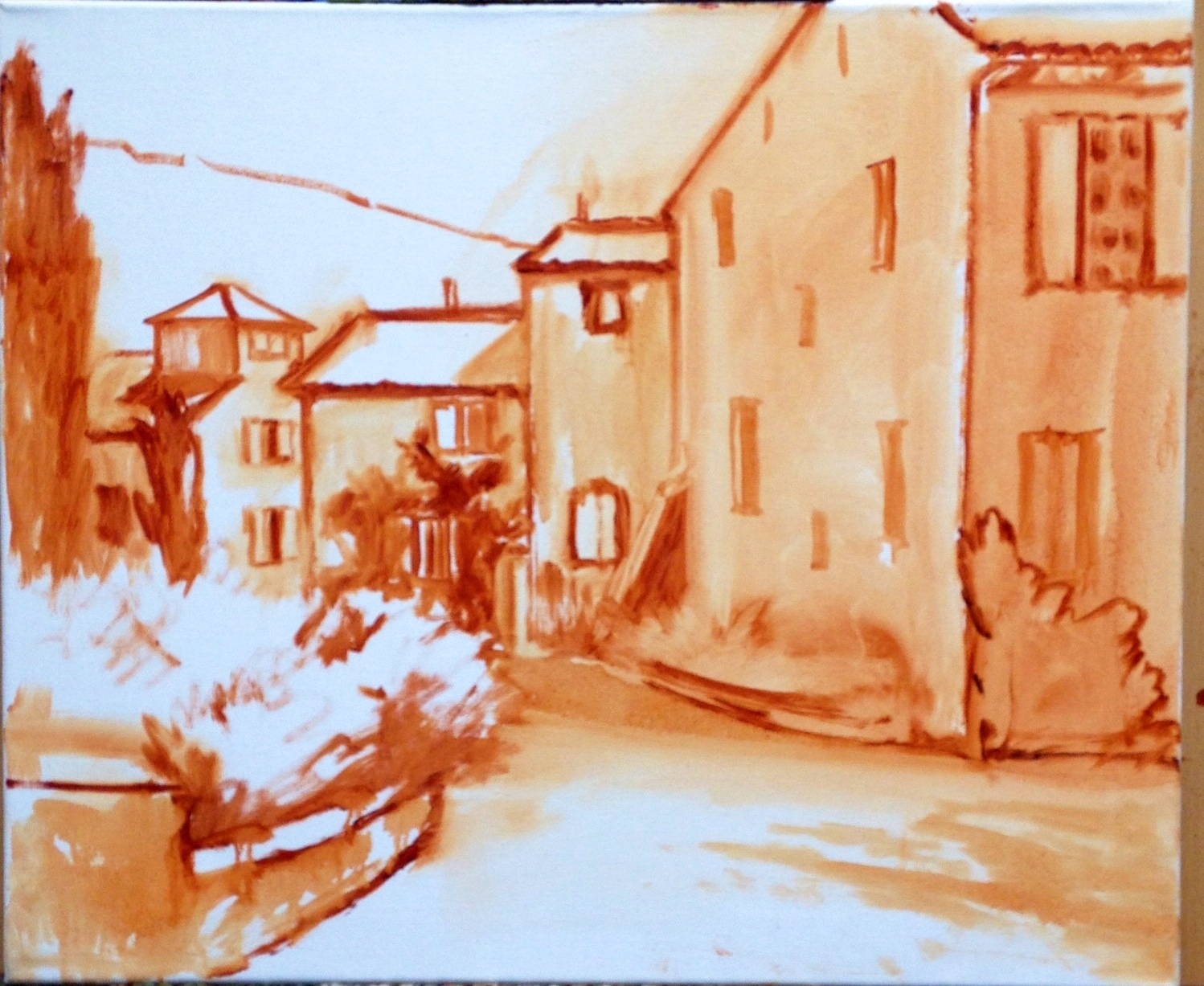
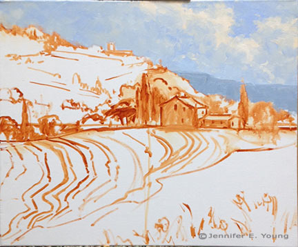 Next come the hill town and terraced hillside of the background. At this point I am still establishing the compositional elements so there is not much color or value variation. I will go back into these areas again, but I really want to develop the entire canvas to the same level before it sets up too much, as I'm not sure when my next painting session will be.
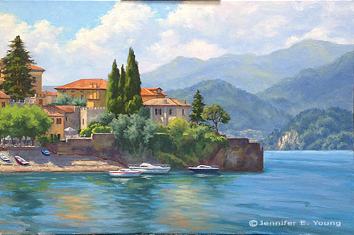
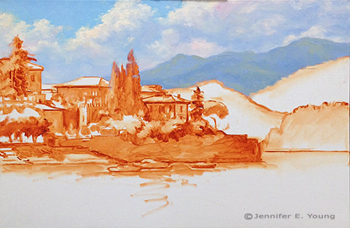
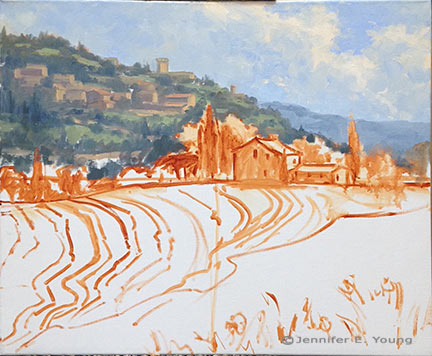 Now for the middle distance, where my area of interest (the house) resides. I decided to lower the cypress to the right of the house, as I felt there needed to be some height/shape variation in the trees flanking the house. I'll have to go back into that sky area again where I made this change to clean it up a little more. Good thing I still have plenty of that sky color on my palette! Again, I don't have much in the way of highlights yet...just a few value shifts to give certain objects a little form.
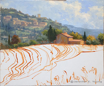 Now I'm ready to start laying in the foreground hill and those groovy hay tracks.
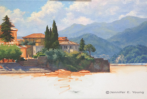
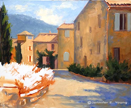
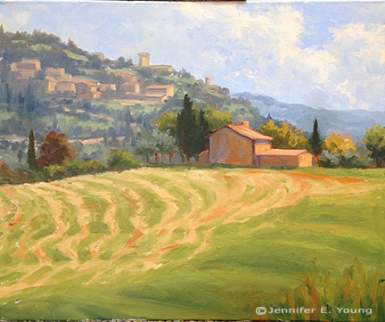 That was fun! Now I have the whole canvas covered more or less to the same level of finish. There's a good deal more to do, but this feels like a pretty good start for around 4 hours of work.


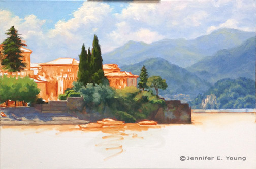
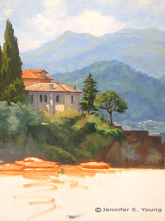
 So now I have the whole canvas covered. I started in on some of the details sooner than I would have liked, but there were a few breaks in the continuity of my painting sessions that compelled me to tackle certain areas while they were still wet. Over the next session or two I'll be finalizing the background mountains and fleshing out the flowerbeds. I'm going to do my best to finish this up in advance of Christmas. School's out for a couple of weeks for Christmas break so my studio time is about to get a lot more dicey.


 "Shadows of the Blue Ridge"
Oil on Linen, 24x30"
"Shadows of the Blue Ridge"
Oil on Linen, 24x30"
 "Morning in Gray and Gold"
Oil on Linen, 12x16"
"Morning in Gray and Gold"
Oil on Linen, 12x16"


